Green Color Meaning: Psychology, Shades and Green Logos
 7 min read
The green color meaning is rooted in nature: growth, health, freshness and balance. It is also the color of money in the US and of “go” on every traffic light, so green can feel calm and natural or confident and commercial, depending on the shade.
This guide explains what green means in psychology and culture, what different shades of green signal (with hex codes), which industries use it and why, and what famous green logos teach. You will also find green color pairings, the contrast rules for bright greens, and the mistakes that make green branding feel generic or misleading.
What does the color green mean?
Green is the color of leaves, grass and spring, so most of its meanings come from living things. On the positive side it stands for nature, health, growth, renewal, harmony and prosperity. On the negative side it can suggest envy, inexperience (“green” as in new to a job) or sickness, and very bright greens can feel artificial.
Green also has a dark chapter in design history. In 1775 the chemist Carl Wilhelm Scheele created a vivid pigment now known as Scheele’s green. It was used in wallpaper, clothing and even toys, but it contained arsenic. Today green stands for health, so the story is a good reminder that color meanings change over time.
What research says about green
There is some lab evidence behind green’s link with calm and creativity, but the studies are small. In a set of four experiments, Lichtenfeld and colleagues found that a brief glimpse of green before a task helped creative performance. In a study of 14 cyclists at the University of Essex, riders watching green nature footage reported less mood disturbance and lower effort than when the same video was gray or red.
A review of color psychology by Andrew Elliot warns that the field is still young and that context matters a lot. Green can support a message of health or freshness, but it will not prove it on its own.
Green in different cultures
- Islam: green is closely linked with Islam and with paradise, and it appears on the flags of many Muslim-majority countries.
- Ireland: green is a national color, tied to the landscape and to Saint Patrick’s Day.
- United States: paper money has been called the greenback since the 1860s, so green also means money and finance.
- China: green usually suggests health and growth, but “wearing a green hat” is an insult that means a man’s partner is unfaithful. Avoid green hats in campaigns for Chinese audiences.
To see why these associations shape how a brand is judged, read our article on the psychology behind branding.
Shades of green and what they signal
Green runs from pale mint to deep forest, and each shade sends a different message. The contrast column shows how each shade works as text on white. WCAG asks for at least 4.5:1 for body text and 3:1 for large text.
| Shade | Hex | What it signals | Contrast on white |
|---|---|---|---|
| Mint | #98FF98 | Fresh, clean, light | 1.2:1 |
| Lime green | #32CD32 | Energetic, young, digital | 2.1:1 |
| Emerald | #50C878 | Vibrant, healthy, optimistic | 2.1:1 |
| Jade | #00A86B | Balanced, modern, calm | 3.1:1 |
| Olive | #808000 | Earthy, practical, outdoors | 4.2:1 |
| Forest green | #228B22 | Natural, dependable, grounded | 4.4:1 |
| Hunter green | #355E3B | Traditional, wealthy, serious | 7.5:1 |
Notice how many greens fail as text on white. Green looks lighter to the eye than blue or red at the same strength, so only the darker greens pass body text contrast. Light greens feel fresh and suit food, wellness and apps. Dark greens feel established and suit finance, outdoor brands, golf and premium goods.
Which industries use green, and why
- Food, grocery and drinks: green suggests fresh, natural and healthy. Our fruit logo ideas show it in action.
- Energy and sustainability: green is the default color for solar, wind and recycling. See our roundup of green energy logos.
- Health and pharmacy: green crosses mark pharmacies in many countries. Our list of pharmacy logos has examples.
- Finance: green means money and growth, especially for banks and investing apps.
- Outdoors, sport and leisure: deep greens suit golf, gardening, camping and sportswear.
Famous green logos and what they teach
These logos are shown as editorial examples only. Each one is a trademark of its owner.
Spotify

Spotify’s bright green is one of the most recognizable colors in tech. Among red, blue and black media apps, it stands out at a glance. The brand mostly sets it against black, which keeps the bright green readable and bold.
Heineken
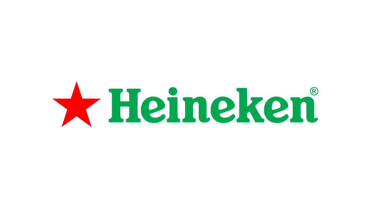
Heineken pairs a green wordmark and green bottle with a small red star. The green feels fresh and natural, while the red star gives the eye a focal point. The tilted e’s, often called smiling e’s, add a friendly touch.
TD Bank
Most banks choose navy, so TD’s green square is easy to spot on a busy street. Green suits a bank because it means money and growth, and the bold square works well on signs, cards and app icons.
Android
Android’s green robot head gives a technical product a playful face. The 2023 logo pairs the green bot with a black wordmark, which keeps the text readable while the green carries the personality.
Whole Foods Market

Whole Foods Market uses a deep green and a small leaf to signal natural and organic food. The dark shade feels trustworthy and premium rather than cheap and bright, which fits a grocery brand that charges for quality.
Lacoste
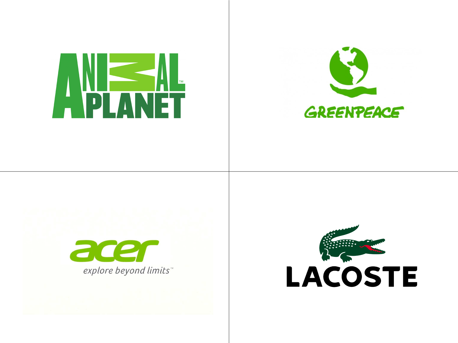
Lacoste’s green crocodile comes from the nickname of its founder, tennis player René Lacoste. The green suggests sport and grass courts, and the dark shade keeps it classic. It shows how green can feel premium, not only natural.
Green color pairings and palettes
Green works with warm and cool colors alike. These pairings are a good start.
- Hunter green and cream (#355E3B + #F5F0E6): calm, natural and premium. About 6.6:1, good for organic food and outdoor brands.
- Dark green and gold (#1B5E20 + #FFD700): rich and confident. About 5.6:1. It suits finance, golf and premium drinks. Our golf logo ideas use this pairing often.
- Green and yellow: cheerful and fresh, as Subway shows. Use a dark green, because yellow on mid green fails contrast (#228B22 + #FFC72C is only about 2.8:1).
- Mint and deep green (#98FF98 + #1B3A2B): fresh but readable, about 10.1:1. Good for wellness and skincare.
- Green and brown: earthy and grounded. Our guide to brown in branding covers that side.
Our guide to color schemes in web design shows how to balance a palette like this across a website.
Accessibility and contrast with green
Bright greens are a contrast trap. White text on a bright Spotify-style green (#1ED760) is only about 1.9:1, while black text on the same green is about 10.9:1. If your brand green is bright, use dark text on it, or keep a darker green for buttons and links.
Green also matters for color blindness. Red-green color blindness is the most common type, so never rely on green for “success” and red for “error” alone. Add icons, labels or patterns. Check every pair in the free WebAIM contrast checker.
Common mistakes with green branding
- Generic eco green. A leaf in mid green looks like every other sustainable brand. Pick a distinctive shade and shape.
- Greenwashing. Green packaging does not make a product sustainable, and vague eco claims can mislead buyers. This is called greenwashing, and in the US the FTC’s Green Guides set out what environmental claims need to back them up.
- Light green text. Mint, lime and emerald fail contrast as text. See the table above.
- Too much neon. Large areas of saturated green tire the eyes. Use it for accents and let neutrals carry the layout.
- No plan for small sizes. A pale green logo can vanish as a favicon. Our post on logo variations explains which versions every brand needs, and our article on bad branding covers more traps like this.
Is green right for your brand?
Green fits brands that want to feel natural, healthy, fresh or prosperous: food, wellness, energy, finance, outdoor and garden brands. It is a harder fit for luxury fashion or urgent sales messages, unless you choose a deep shade or pair it with a strong accent.
Compare it with its neighbors before you decide. Blue shares green’s calm but feels more corporate, while yellow adds sunshine and energy. Red, orange, purple, pink and brown each take a brand somewhere else. Our hub on brand colors brings the whole series together, with a step-by-step method for building a palette.
Frequently asked questions
What does the color green mean in branding?
Green usually signals nature, health, growth and freshness. Dark greens feel established and prosperous, while bright greens feel young, digital and energetic.
What are the negative meanings of green?
Green can suggest envy, inexperience or sickness, and bright neon greens can feel artificial. Overused eco green can also make a brand look like it is greenwashing.
What colors go well with green in a logo?
Cream, gold, white, yellow, brown and navy all pair well with green. Cream and brown feel earthy, while gold makes deep greens feel premium.
Is green a good color for a website?
Yes, if you choose the right shades. Dark greens pass contrast with white text, so they work for buttons. Use bright and light greens for accents and backgrounds, with dark text on top.
Can I use these logos?
No. The logos shown here are trademarks of their owners and appear only as editorial examples. Use them to study how green works, then design something original.
Need a green brand identity for a client?
Inkyy is a white label design and development team for agencies. Our in-house brand designers build complete identities, from logo and brand colors to guidelines, that you deliver under your own brand. See our design services or book a 15-minute call.