Choosing the color that will represent your brand is one of the most important things you will have to do during the branding process. The market you’re trying to reach or the audience you’re targeting should all play an important role in your decision to pick the pink color for your brand. This color is perceived as feminine in most western cultures. However, in Japan, pink symbolizes a warrior fallen in battle. As a result, it symbolizes masculinity. It is not difficult to see why the cultural context in which your company’s logo or marketing materials are should influence your color selection.
The emotional effect of pink color
Despite the fact that there are fewer brands that choose to incorporate the pink color into their visual identity, than those that favor primary colors, it is still relatively easy to find a lot of examples of successful use of pink color in branding. Brands that praise the value of hope, optiHef mism, and femininity often opt for the bright pink colors. In addition, the bright pink ribbon is a universal symbol of the fight against breast cancer. Vibrant pinks can suggest passion or celebrate youth and they are often used by brands that support those values.

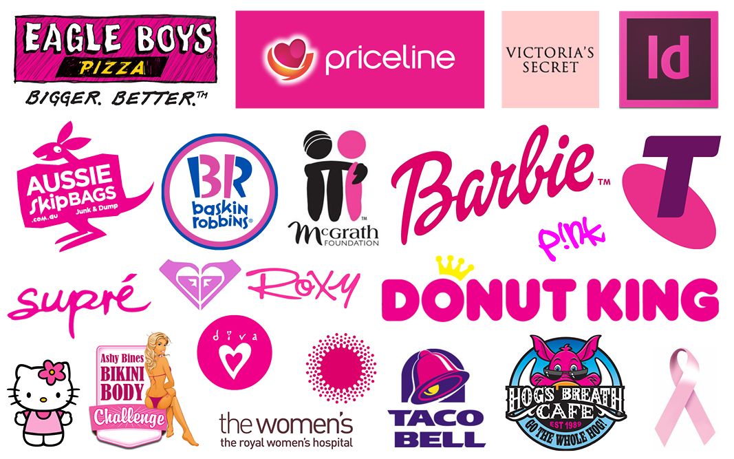
Famous pink brands
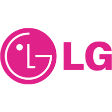
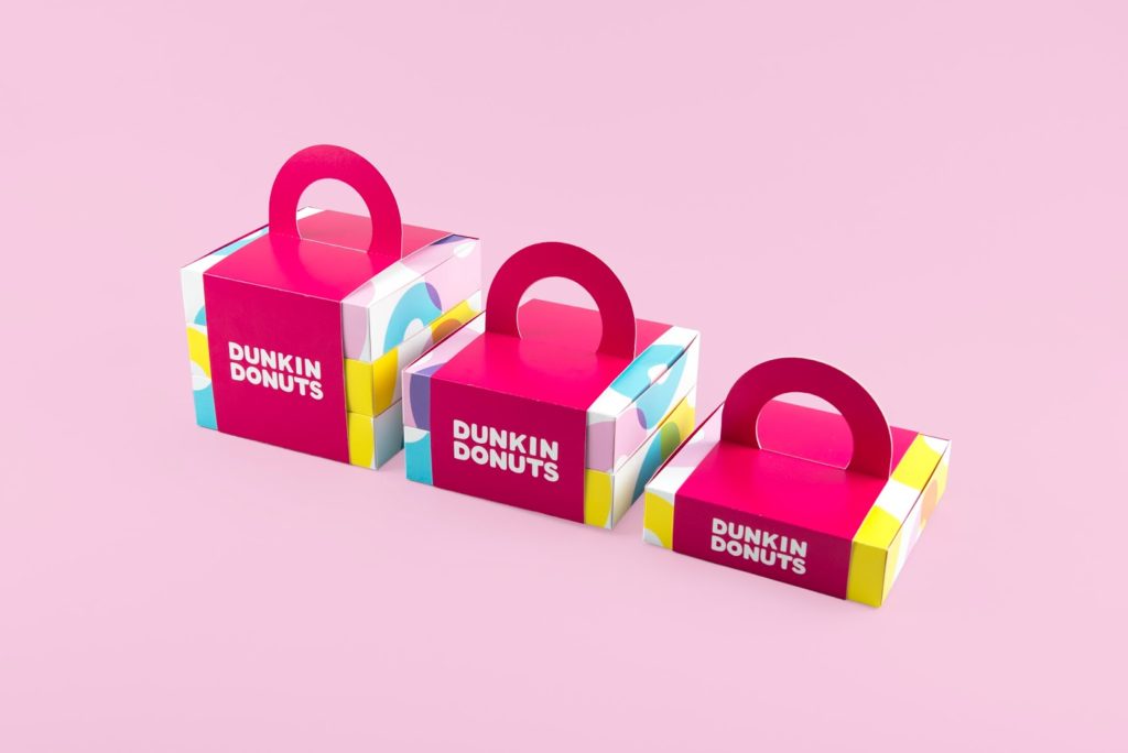
The Barbie brand is probably one of the world’s most famous brands using a pink color. It is, however, far from being the only one. Multinational corporations like T-Mobile, Dunkin’ Donuts, LG or Johnson&Johnson also have variations of this color in their logos and promotional materials. Besides the feelings of optimism, sensuality, and hope, the pink color can also represent fun, charm, tenderness or romance.
Companies that are trying to attract the attention of the female audience, both young and old are more likely to use the pink color in their branding. However, assuming that pink is a purely feminine color is a dangerous stereotype that can backfire if you build your entire branding strategy around it. Additionally, studies show that the color blue is much more popular among women than pink. You should only use the pink color in branding if it matches the company’s values since there isn’t much sense in opting for generic solutions.


The pink color can reflect a broad spectrum of feelings that can be appealing to children and adults alike. Knowing the message you want to convey through branding is going to make the process of finding the right color or colors much easier. The pink color is bright and warm, so combining it with colder colors can also be an effective solution for a company’s branding. Ultimately, whether you’re going to use this color in branding depends on a number of sociocultural factors you must consider before making the final decision. Scroll down if you would like to take a look at some of the most successful applications of the pink color.
 Book a Meeting