Font Pairing Tips: 9 Free Google Font Pairings That Work
The goal of pairing fonts is to select fonts (usually 2-3 at most) that create contrast in a complementary way. Opposites tend to attract when it comes to interpersonal relationships, and this is typically the case with pairing fonts; opposing styles can work well together.
 8 min read
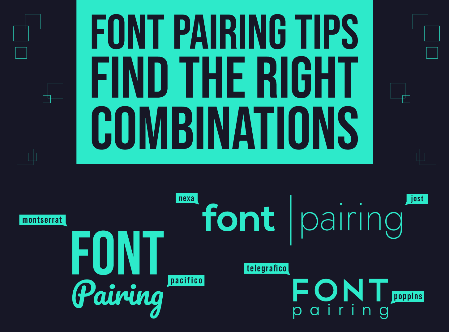
Font pairing is the skill of choosing two or three typefaces that look good together and make a page easy to read. Pick them at random, or just because you like each one alone, and the design can feel off without you knowing why. Pick them with a plan and the whole layout settles.
This guide explains the basics of font pairing, gives you seven rules that work in real projects, and shows 9 free Google Fonts pairings with a rendered example of each. All fonts used here are open source, so you can use them in client work.
The basics of font pairing
The goal is to select fonts, usually two and three at most, that create contrast in a complementary way. Opposites tend to work well. A serif next to a sans serif, or a heavy headline font next to a quiet text font, gives the reader clear roles to follow: this is the title, this is the story. See our post on typography tips for web design for the wider picture.
Knowing the main font families helps you choose:
Serif
Serif fonts have small strokes, called serifs, at the ends of letters. They look traditional and trustworthy and have a long history in books and newspapers. On screens, modern serifs such as Lora and Merriweather are comfortable to read. See our list of top 10 serif fonts.
Sans serif
Sans serif means “without serifs”. The letters have clean ends, which makes them a natural choice for interfaces, menus, buttons and body text. They range from geometric (Montserrat, Poppins) to humanist (Lato, Open Sans) and neutral (Inter, Roboto). Our guide to minimalistic fonts covers more of them.
Slab serif
Slab serifs have thick, block-like serifs. They are sturdy and friendly at the same time, and are good for headlines that need weight. Arvo and Aleo are examples.
Display and decorative fonts
These fonts carry a lot of personality and are meant for short pieces of text such as logos, posters and big headings. Use them in small doses and give them a calm partner. Our posts on distorted fonts and graffiti fonts show how far they can go.
Script and handwriting fonts
Script fonts imitate handwriting and add a personal touch. They suit invitations, greeting cards and short titles, but they become tiring in paragraphs. Pair them with a plain serif or sans serif for the text. See our best handwriting fonts.
7 rules for pairing fonts
- Create contrast, not conflict. Two fonts that are almost the same look like a mistake. Two fonts that are very different in structure, such as a serif and a sans serif, look intentional.
- Give each font a job. One font for headings, one for body text. A third, if you need it, is for small accents such as labels or captions.
- Use one family in several weights first. Many families have light, regular and bold styles. That alone often gives enough hierarchy. Add a second family only when you need a different voice.
- Match the mood to the brand. A bubbly rounded font suits a toy shop but looks wrong on a law firm’s site. Think about the personality first, then the font.
- Check proportions. Fonts with similar x-heights (the height of lowercase letters) look more harmonious side by side. If one font looks much smaller than the other at the same size, adjust one of them.
- Use size and weight to show order. The largest text signals the main message, smaller sizes show the hierarchy below it. Use capitals sparingly so the page does not feel like it is shouting. Read our guide on visual hierarchy.
- Limit yourself to three fonts. Every extra font adds noise and slows the page down. Two is usually enough.
Fonts that everyone uses by default can make a design feel generic. You do not need rare fonts, but choosing a less obvious pairing helps you stand out. Our post on font trends in web design shows what designers are trying.
9 free Google Fonts pairings that work
Each pairing below is rendered from the official font files, with the heading font above and the body font below. All of them are free on Google Fonts under the SIL Open Font License, which allows commercial use, including client work. These are suggestions to try, not strict rules. Test them with your own content before you decide.
1. Playfair Display + Lato
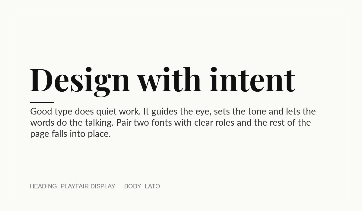
Playfair Display is a high-contrast serif with sharp, elegant details, so it works best large. Lato is a friendly, open sans serif that stays calm underneath it. Use this pair for editorial sites, boutique shops, restaurants, photographers and any brand that wants a refined but approachable tone. Heading: Playfair Display. Body: Lato.
2. Montserrat + Merriweather
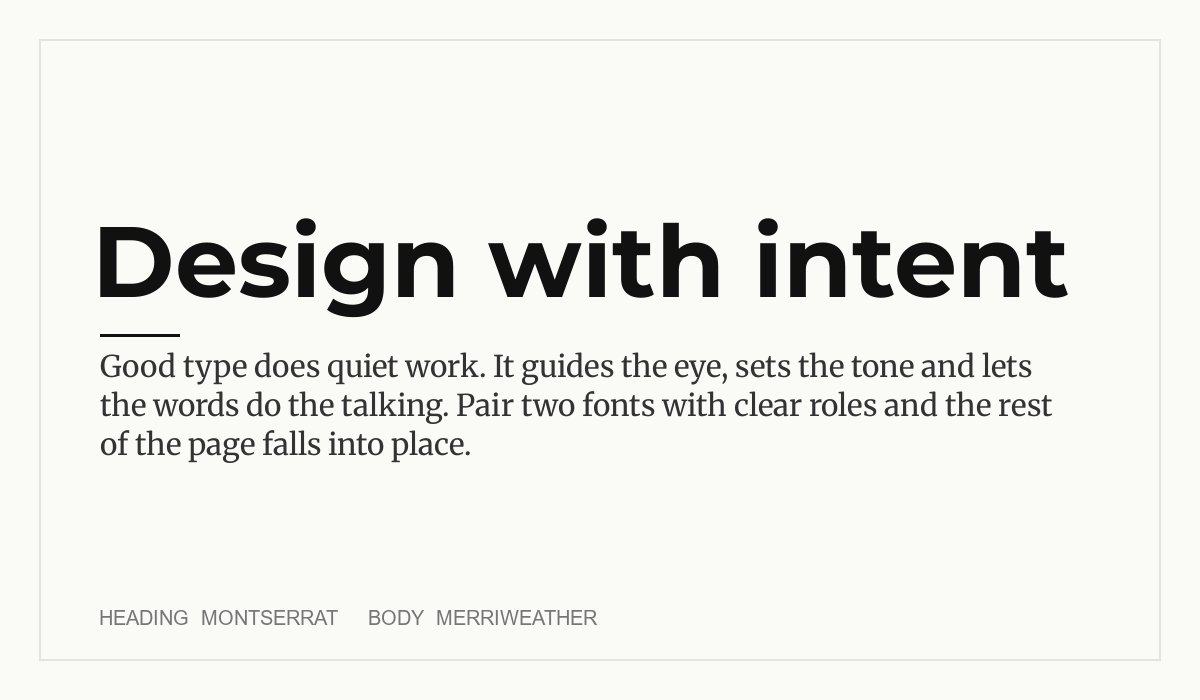
Montserrat is a wide geometric sans serif with a modern, confident feel. Merriweather is a sturdy serif made with on-screen reading in mind. The contrast between clean geometry and a traditional text face suits blogs, magazines, agencies and consultancies that want to look current but trustworthy. Heading: Montserrat. Body: Merriweather.
3. Oswald + Open Sans
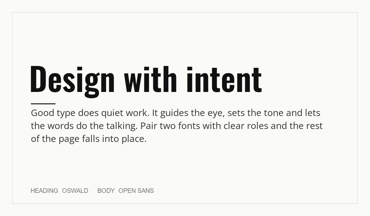
Oswald is a condensed sans serif that fits a lot of headline into a narrow column. Open Sans is a neutral humanist sans that is easy to read at small sizes. The combination works for news, sports, events, fitness and any layout that needs strong, short headlines with a plain, readable body. Heading: Oswald. Body: Open Sans.
4. Poppins + Lora
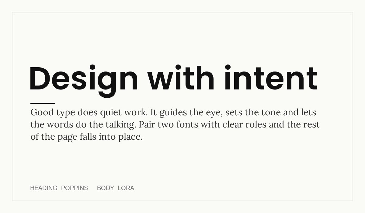
Poppins has round, geometric letters that feel clean and upbeat. Lora is a contemporary serif with calligraphic roots that adds warmth to longer text. Try it for startups, creative portfolios, education sites and lifestyle brands, especially where you want a friendly tone with a touch of tradition. Heading: Poppins. Body: Lora.
5. Alegreya + Nunito Sans
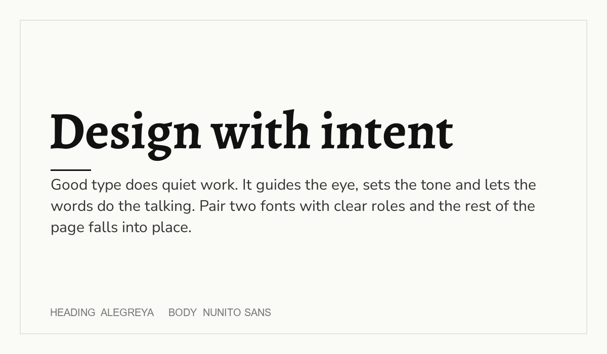
Alegreya was designed for literature and has a lively, handwritten rhythm. Nunito Sans is a balanced sans serif with softly rounded details. Together they feel warm and bookish without being old-fashioned, which suits publishers, cultural projects, craft brands and storytelling sites. Heading: Alegreya. Body: Nunito Sans.
6. Arvo + Roboto
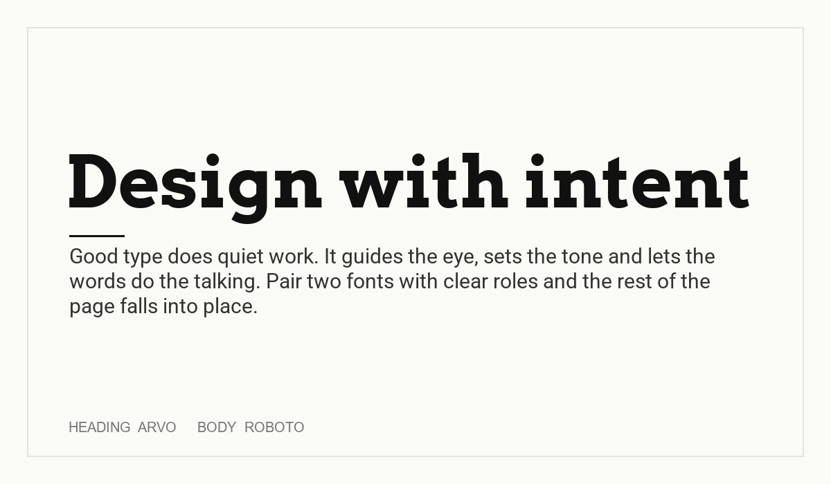
Arvo is a geometric slab serif with a solid, confident look. Roboto is a neutral, practical sans serif that works across devices. The slab gives headings character, while Roboto keeps the interface and body text clean. A good match for tools, hardware, outdoor brands, workshops and technical blogs. Heading: Arvo. Body: Roboto.
7. Dosis + Aleo
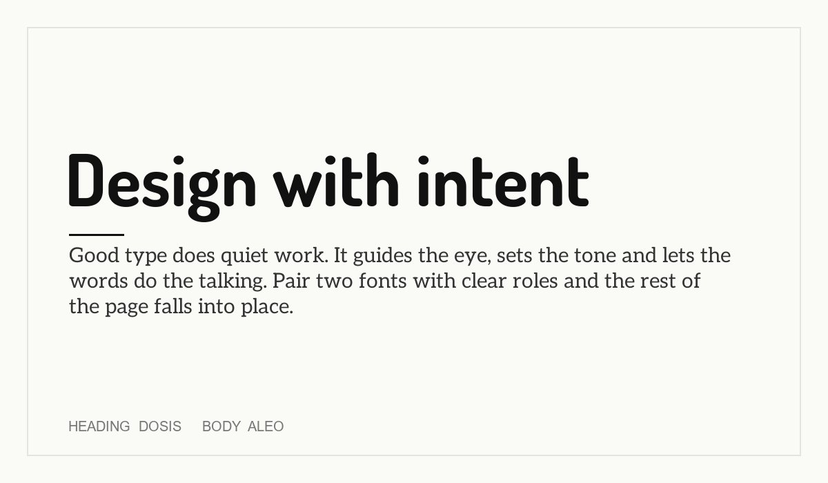
Dosis is a narrow, rounded sans serif that feels friendly and light. Aleo is a slab serif with a soft touch. Both have rounded, approachable shapes, so they sit well together while still differing in structure. Try them for food, family, community and wellbeing brands. Heading: Dosis. Body: Aleo.
8. Lora + Inter
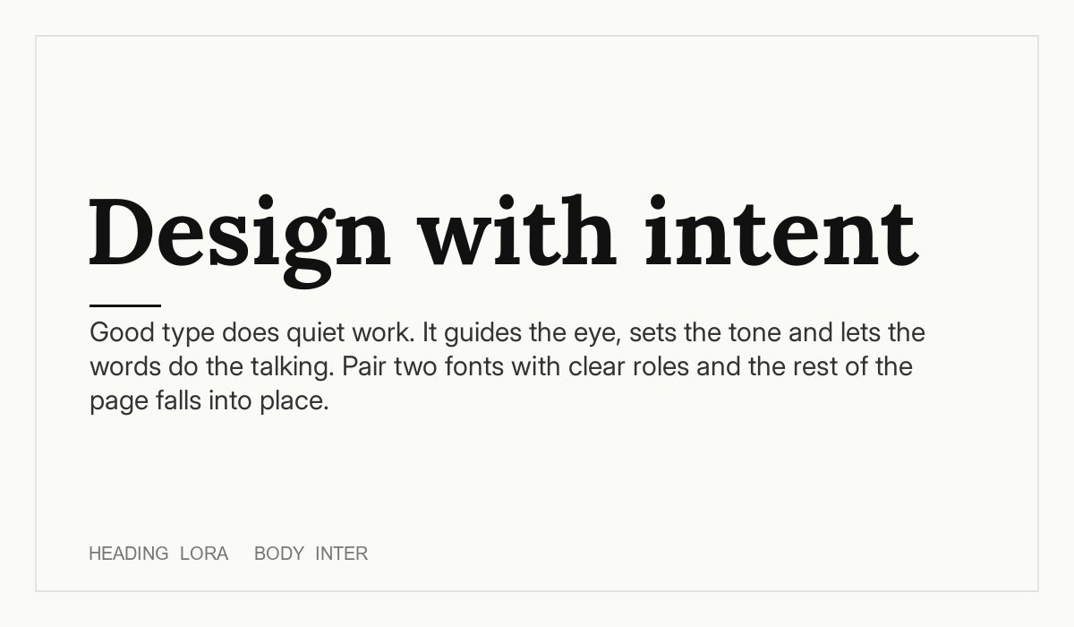
Here the serif leads. Lora headlines give a page a human, editorial voice, while Inter is a very readable sans serif built for screens. This is a safe choice for software companies that want a more personal brand, and for blogs, newsletters and long-form content. Heading: Lora. Body: Inter.
9. Oswald + Lora
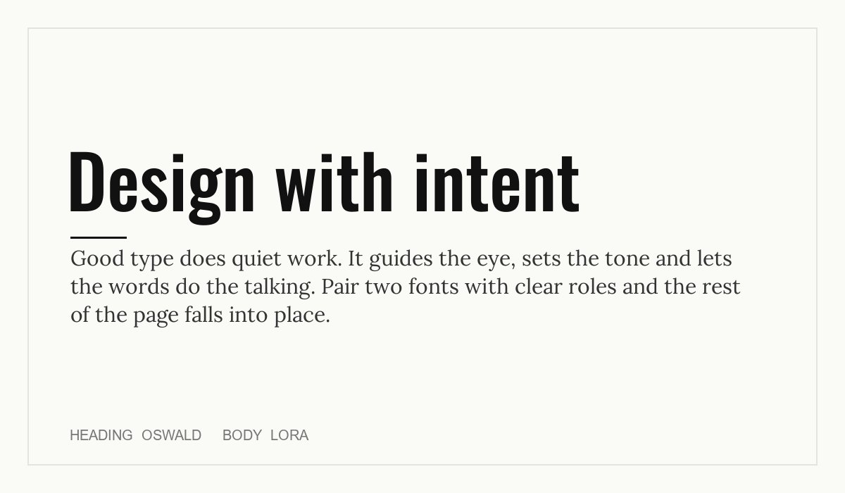
Oswald headlines are tall and direct, and Lora body text adds a readable, literary counterweight. The pair works for magazines, campaigns, sports stories and long-form journalism, where you want an urgent headline above text that people will read for several minutes. Heading: Oswald. Body: Lora.
How to use font pairings on a website
- Set the body first. Choose a comfortable size, usually 16 to 18px, a line height of around 1.5 and a line length of about 50 to 75 characters. Then size the headings from there.
- Load only what you use. Each weight and style is another file. Pick two or three weights per family, or use a variable font that holds many weights in one file.
- Consider self-hosting. Hosting the font files on your own server can improve speed and avoids a third-party request. Make sure to keep the licence file with them.
- Check contrast and size on a phone. A font that looks great on a big monitor can be too thin or too tight on a small screen. Adjust letter-spacing for headings if you need to.
- Keep it consistent. Use the same pairing for headings, buttons and body across the whole site, and write it down in a style guide so that nobody has to guess.
If you need more ideas, browse our list of 15 beautiful website fonts, our weekly fonts of the week and our guide on choosing the perfect font for your design. For a wider look at the design side, visit our design services page.
Frequently asked questions
What is font pairing?
Font pairing means choosing two or more typefaces that work together in one design. A good pairing keeps text readable, shows clear hierarchy and matches the tone of the brand.
How many fonts should I use on a website?
Two is usually enough: one for headings and one for body text. You can add a third for small accents, but more than three tends to look messy and adds load time.
Should I pair a serif with a sans serif?
It is one of the easiest ways to create contrast, and it works in most cases. You can also pair two sans serifs or two serifs if they differ clearly in weight, width or style. The aim is contrast with a reason.
Are Google Fonts free for commercial use?
The fonts in this guide are released under the SIL Open Font License, which allows commercial use, including in client projects. Always check the licence of each font you choose, because not every font on the web is free for business use.
Yes, but keep it consistent. Many designs use the heading font for buttons and navigation, and the body font for everything else. Mixing a new font into each element makes pages feel unplanned.
Need a typographic system for a client?
Inkyy is a white label design and development team for agencies. We build brand identities, style guides and websites with a clear type system under your brand, so you can deliver polished work. See our design services and development services, or book a 15-minute call.