5 Best Fonts for Designers (All Free for Commercial Use)
Not only is that the design of your website important, but so is the font you utilize. Content is the most vital thing on your website. This is why we decided to write about the importance of fonts for design and to select 5 fonts that our team likes to use.
 6 min read
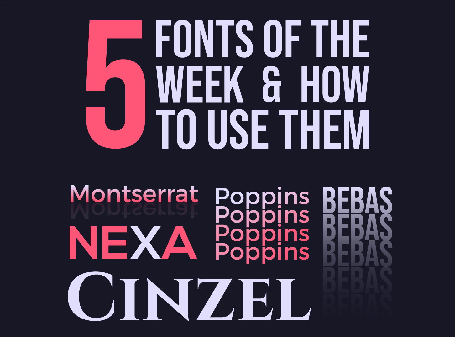
The best fonts for designers are the ones you can use again and again: readable, well made and safe for client work. This list covers five that our team reaches for, from clean sans serifs to bold headline faces.
Every font here is free for commercial use on Google Fonts under the SIL Open Font License. You get a short specimen, the weights and languages each one covers, who designed it and where to download it. We also explain which jobs each font suits and which to avoid.
How to choose a font for a design project
A good font choice starts with the job, not the font. Ask what the text must do, where it will appear and who needs to read it. These checks save time later.
- Check the licence first. Free on a download site often means personal use only. Fonts on Google Fonts use the SIL Open Font License, which allows commercial use, including in logos and on websites.
- Match the font to the job. A body font needs even spacing and a generous x-height. A display font can be loud, but only works at large sizes.
- Test your real words. Type the headline, a price and a name with an accent. Make sure the language and symbols you need are covered.
- Count the weights. A family with several weights gives you hierarchy without a second font. A single-weight font can only do one job.
- Plan the pairing. Two fonts is usually enough. Pick one with character for headlines and one calm font for reading.
If you are still deciding, read our guide on how to choose the perfect font for your design and our typography tips for better website design.
Clean sans serif fonts for websites and apps
These two geometric sans serifs are dependable all-rounders. They look modern, scale well on screens and come in enough weights to build a full type system.
1. Montserrat
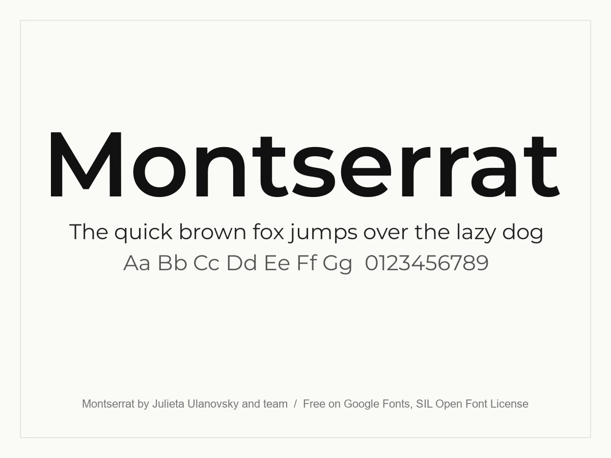
A clean geometric sans serif with wide, open letters. It was inspired by old posters and signs in the Montserrat neighbourhood of Buenos Aires. It works well for headlines, navigation and body text, which is why it shows up on so many agency and startup sites. Use a bolder weight for large headings and Regular or Medium for reading.
- Style: Geometric sans serif
- Weights: 9, from Thin to Black, plus italics
- Languages: Latin, Latin Extended, Cyrillic and Vietnamese
- Designers: Julieta Ulanovsky, Sol Matas, Juan Pablo del Peral and Jacques Le Bailly
- Licence: Free for personal and commercial use (SIL Open Font License)
- Source: Download on Google Fonts
2. Poppins
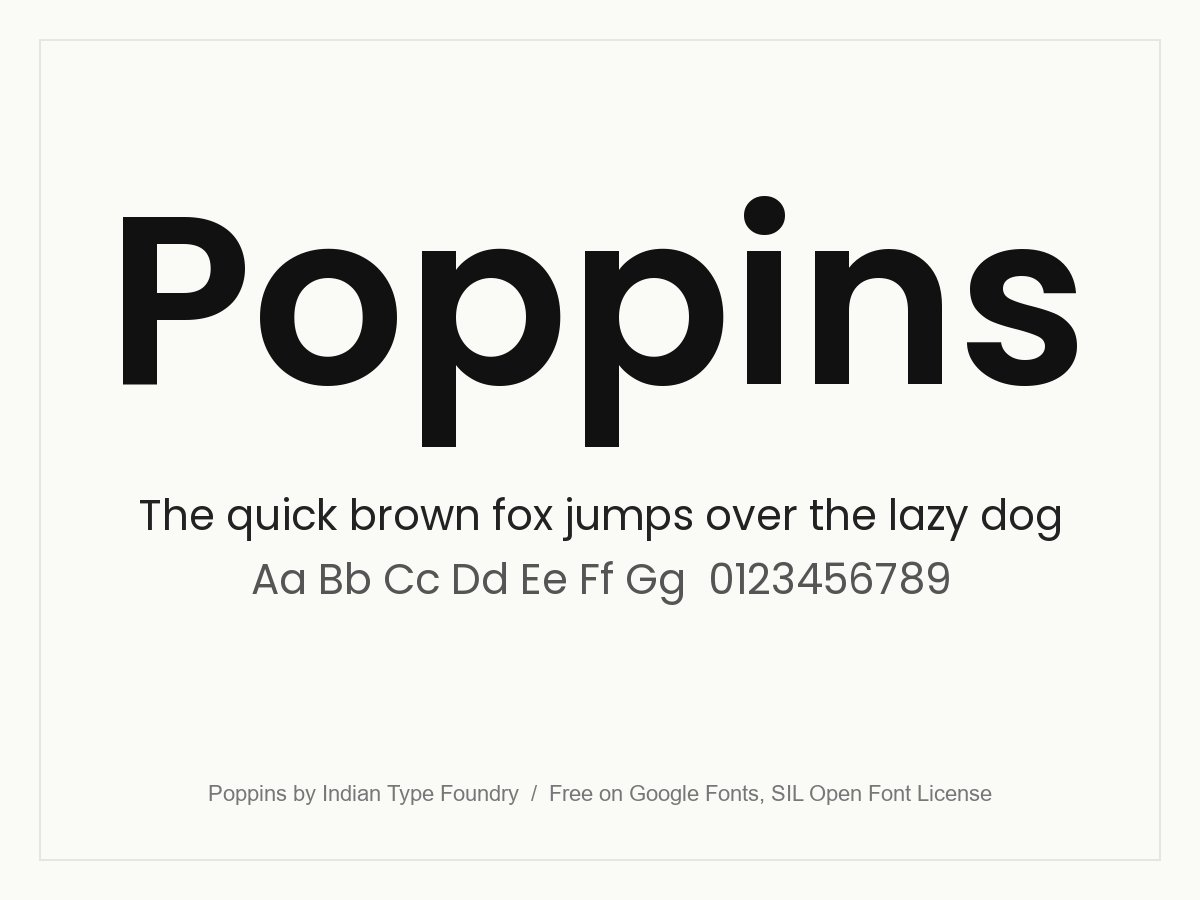
Poppins is a geometric sans serif built from near-perfect circles, with strokes of almost even thickness. The Latin letters have a fairly high x-height, so it stays readable in buttons, menus and short paragraphs. Nine weights give you a full hierarchy from a single family. It also covers Devanagari, which makes it a rare free choice for bilingual Hindi and English projects.
- Style: Geometric sans serif
- Weights: 9, from Thin to Black, plus italics
- Languages: Latin, Latin Extended and Devanagari
- Designers: Indian Type Foundry (Latin by Jonny Pinhorn, Devanagari by Ninad Kale)
- Licence: Free for personal and commercial use (SIL Open Font License)
- Source: Download on Google Fonts
Serif and display fonts for headlines
Headline fonts carry personality. Use them sparingly, at large sizes, and let a simpler font do the reading.
3. Playfair Display
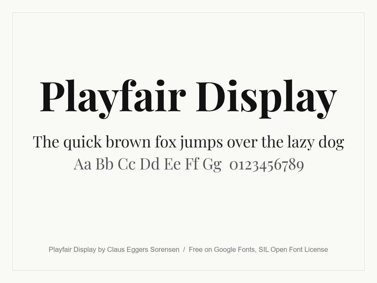
Playfair Display is a high-contrast serif with thin hairlines and heavy strokes, drawn for large sizes. It takes some influence from Baskerville and Scotch Roman types. Use it for editorial headlines, boutique brands and menus, and pair it with a simple sans serif for body text. Avoid it at small sizes, where the fine strokes start to disappear.
- Style: Transitional serif for display use
- Weights: 400 to 900, plus italics
- Languages: Latin, Latin Extended, Cyrillic and Vietnamese
- Designer: Claus Eggers Sørensen
- Licence: Free for personal and commercial use (SIL Open Font License)
- Source: Download on Google Fonts
4. Cinzel
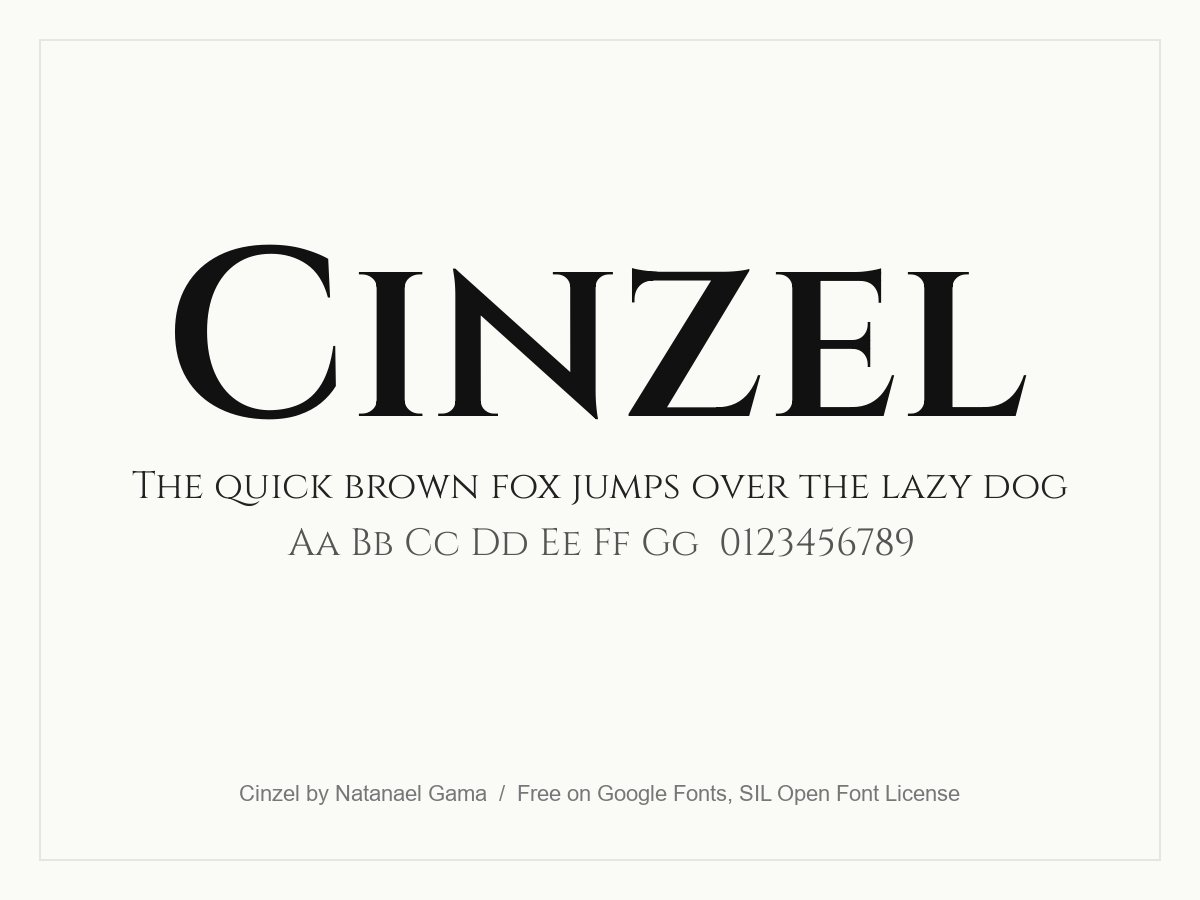
Cinzel is inspired by Roman inscriptions from the first century, with proportions based on classical lettering. The lowercase letters are drawn as small capitals, so everything reads as an inscription. That suits wine labels, hotels, film titles and heritage brands. Keep it for short headlines and logos, because long lines of capitals are tiring to read.
- Style: Classical Roman capitals
- Weights: 400 to 900
- Languages: Latin and Latin Extended
- Designer: Natanael Gama
- Licence: Free for personal and commercial use (SIL Open Font License)
- Source: Download on Google Fonts
5. Bebas Neue
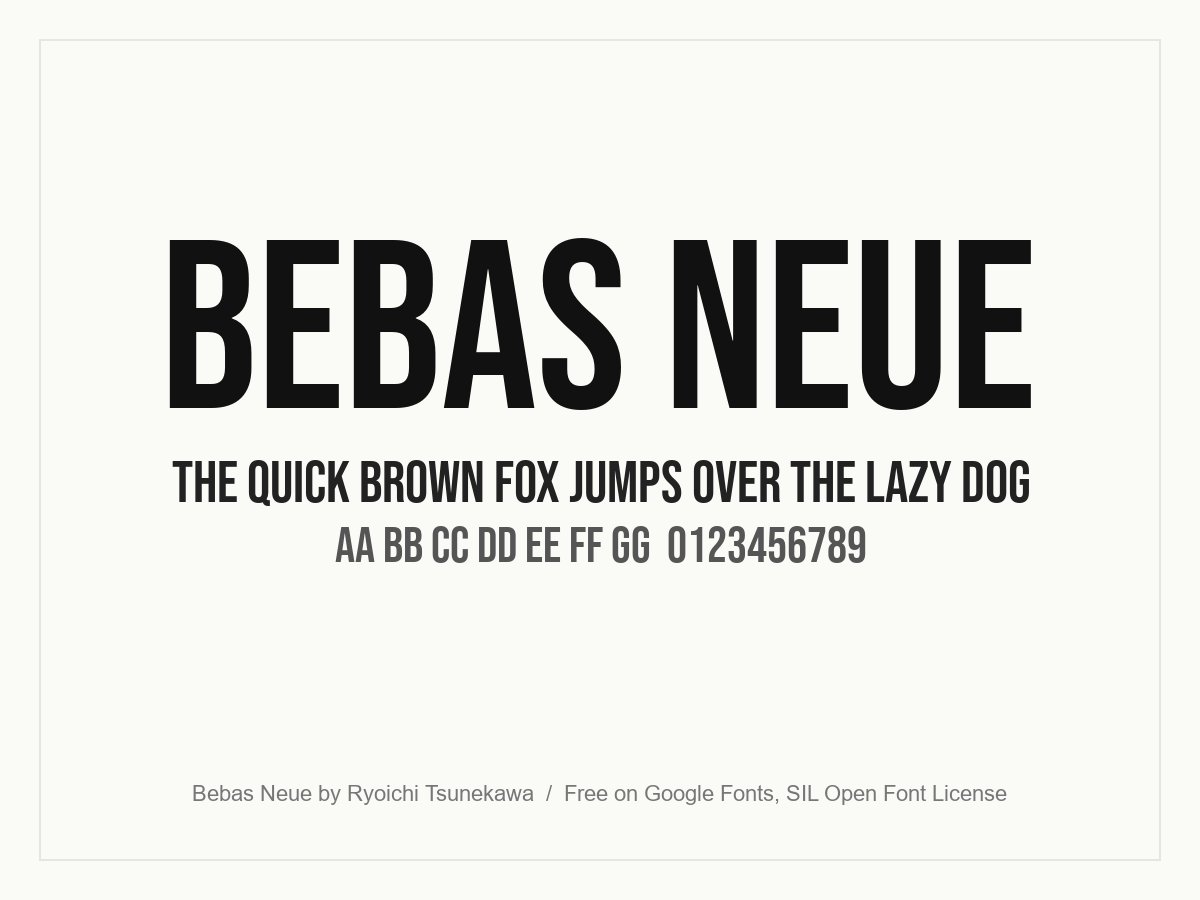
Bebas Neue is a tall, condensed, all-caps display font. It is built for headlines, captions, posters and packaging, where it saves space and still looks bold. It has one weight and no lowercase, so use it for short lines such as a hero headline or a label. Keep the letter spacing slightly open for the best result.
- Style: Condensed display sans serif, capitals only
- Weights: One (Regular)
- Languages: Latin and Latin Extended
- Designer: Ryoichi Tsunekawa
- Licence: Free for personal and commercial use (SIL Open Font License)
- Source: Download on Google Fonts
How to pair these fonts
- Playfair Display with Poppins or Montserrat. A serif headline over a clean sans serif body is a classic, high-contrast pairing.
- Bebas Neue with Montserrat. Short capitals for headlines and a light sans serif for text. It suits sports, events and bold promotions.
- Cinzel with a quiet sans serif. Use Cinzel for the logo or a page title only, then switch to Poppins or Montserrat for everything else.
- Do not mix Poppins and Montserrat. They are too similar. The result looks like a mistake rather than a choice.
For more combinations, see our font pairing tips. If you want a classic partner for a sans serif, browse our serif fonts. For a quieter look, try our minimalist fonts, or see what is changing in our font trends for web design.
Tips for using fonts well
- Limit yourself to two families. Use weights and sizes to build contrast instead of adding more fonts.
- Set a clear hierarchy. Choose sizes for headings, body and captions once, then reuse them. Our guide to visual hierarchy explains how.
- Keep body text at 16 pixels or larger on the web. Smaller text is hard to read on phones.
- Subset and self-host when speed matters. Load only the weights and character sets you use. Each extra weight is another file to download.
- Check contrast. Thin weights on a light grey background are hard to read. Test them on a real phone.
Frequently asked questions
What are the best free fonts for designers?
Montserrat, Poppins, Playfair Display, Cinzel and Bebas Neue are all strong choices, and all five are free for commercial use on Google Fonts. Montserrat and Poppins are the safest all-rounders for websites and apps.
Can I use Google Fonts in commercial work?
Yes. Google Fonts are published under open licences, mainly the SIL Open Font License and the Apache License. You can use them in client work, logos, print and websites. Always check the licence on the font page, because the licence is set per font.
Which of these fonts is best for body text?
Montserrat and Poppins both work for body text at 16 pixels or larger. Playfair Display, Cinzel and Bebas Neue are display fonts, so keep them for headlines and short labels.
Is Nexa still free?
Nexa now sits in the paid Fontfabric catalogue, with a commercial licence for the full family. An earlier version of this list included it. We replaced it with a font that has a clear free licence.
Need a brand with the right type for a client?
Inkyy is a white label design and development team for agencies. Our in-house designers choose, pair and license fonts as part of every logo, brand identity and website we create under your brand. See our design services or book a 15-minute call.