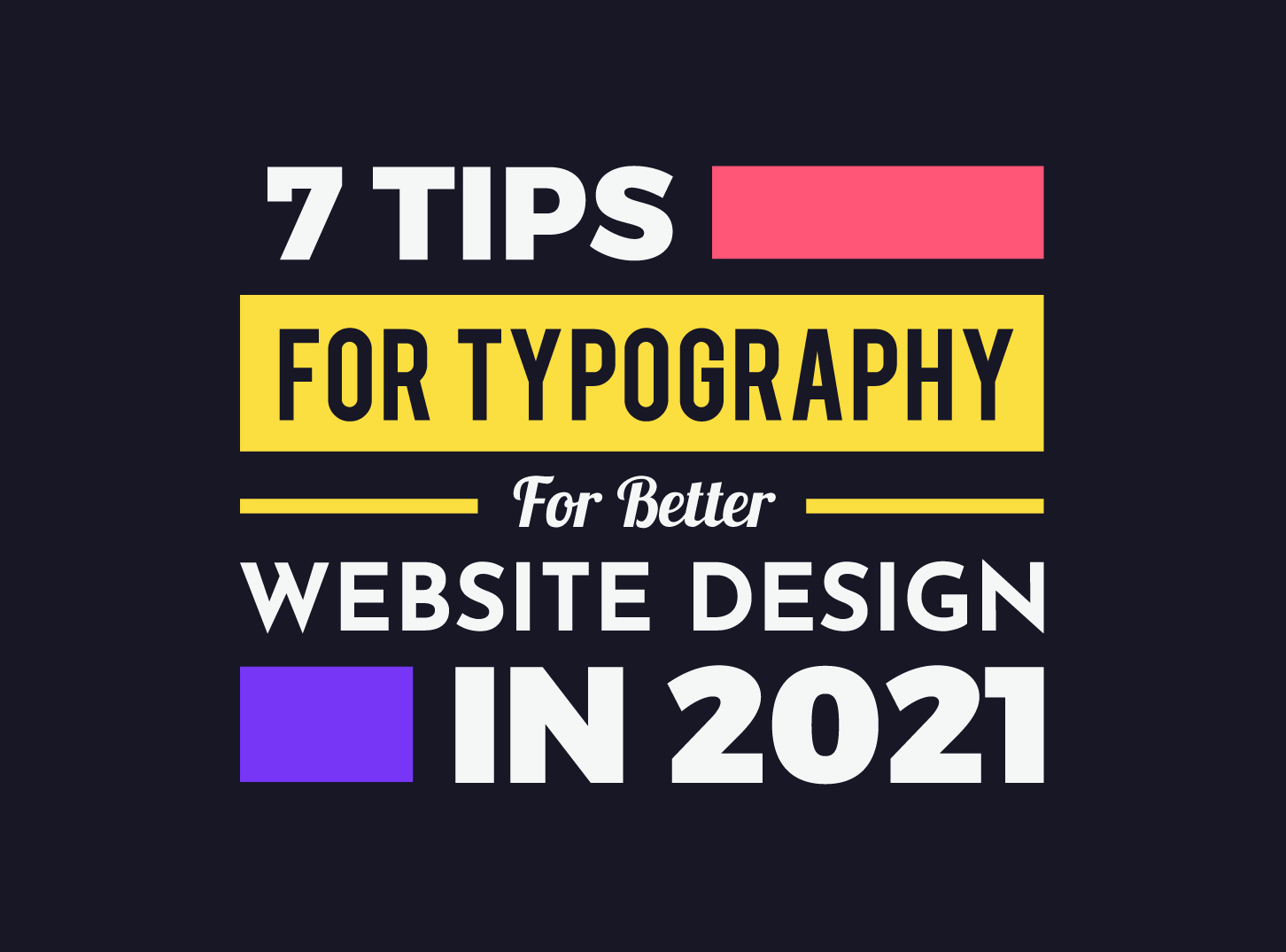
How to make typography in web design more important with this article? Hmm…
When you think of web design, the first thing that comes to mind is visual design. Maybe some pictures, geometric shapes, or something like that. Probably at the end of the list is communication.
What does this communication actually mean for web design?
It allows us to connect the user with his goal on our site. To make it easier for him to find his way to accomplish his/her “task” as quickly and easily as possible, which is why they came to our site.
As part of web design, when we mention communication, we mean the appearance of the text itself, which is on our site. That is why Typography is a vital part of the process called quality and complete web design.
Over 90% of the information on the websites comes in writing. Thus good typography allows the reading process to be light, relaxed, without any strain. It goes without saying that bad typography will drive a user of your website.
In this article, the Inkyy Web Design team will try to bring you a few principles that will allow your text and reading it, to be easier and simpler, and therefore more user friendly.
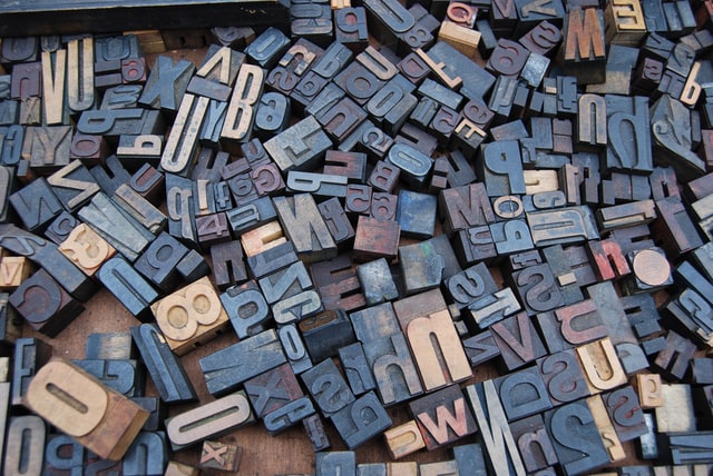
1. Use One Font Family – Don’t Over Use Font Styles
You must have entered the website once and noticed that the text itself is entirely unfathomable. I do not mean here the content of the text itself is bad. The font is a problem. It is bad. Therefore, the experience on that site is bad and it is abandoned very quickly.
A common practice for good web design is to use only one font. Of course, you can combine more, but you risk too much difference in fonts, and therefore the chances of a bad UI are bigger.

In general, it is enough to use one font family. If you want to use more than one font family, make sure that one complements the other, so that the design itself looks beautiful and modern.
2. Use Typeface That Works on All Devices
As you know, in modern web design, the website itself must be responsive. What does this mean for you as a web designer?
There is a growing presence of searches through various devices, such as a mobile phone, tablet, or something else. Therefore, your website must be adapted to all these devices.
You must choose the typeface that is displayed on the screen of all sizes, without losing its beauty, appearance, and power to “make” the user continue reading the content of your website.
3. Avoid Using All Caps For Better Typography
All Caps means the use of text where each letter is a capital letter. And that’s ok if it’s not about reading a longer text (e.g. your brand’s catchphrase).
But if you’re writing a blog post, longer information about you or your business, by no means use an all-cap. It’s not user-friendly, it’s hard to read, and if you do use all-caps, from the users’ point of view, the next logical thing to do is to hit X in the upper right corner of your browser.
4. Don’t Color Your Text

Color blindness is a normal occurrence. You can often hear that a person from your environment does not notice a difference in some colors.
Researches shows that close to 10% of the male population has this problem.
Therefore, try to use other ways to emphasize that a certain part of the sentence is more important, without coloring it in red or green, because there is a chance that someone will not see it.
Why green or red? Well, color blindness in these two colors is the most common.
5. Limit Character Length in One Line of Text
One of the more important things within any text is the length of the lines. In essence, this means how many characters will be in one line of text, before the text is dropped into the next line.
The ideal length would be between 40 and 60 characters (including white space).
The reason for this can be seen in the fact that if the length of the line is too long, the reader’s eye cannot cope with where the line begins and ends, and which line in the paragraph should be read next.
Also, the length should not be too short either. Because eyes of the readers will move to a new line in a very fast rhythm and the rhythm of reading will be lost.
6. Spacing Between Lines For Good Typography
In typography, the spacing between two rows of lines is called leading. If you want to enlarge the leading, the result is an increase in the white space between the lines in that text.
Common rule is that the leader should be 1/3 higher than the height of the character.
This allows the reader’s eye an easy, unobtrusive focus on reading, without the gap itself being either large or small and most importantly, does not interfere with reading the text.
7. Flashing Text Equals Bad Typography
If you have ever watched a video, documentary, or show, you must have seen the following sentence: “This video contains fast flashing images. It may cause seizures for people with photosensitive epilepsy…”.
Flickering (flashing) texts can cause serious health problems. And if you think that this way you will draw attention to a certain part of the text, the health of your reader should be in the first place for you as a website owner.
Let’s summarize.

Typography is a serious part of every modern and top web design.
Bad typography and bad choices can distract the reader, distract him from your site and pass on bad experiences to other, potential users.
The typography must be legible, understandable, beautiful, modern, and elegant.
Yours Inkyy Web Design & Branding Studio.
 Book a Meeting