It’s easy to spend a ton of time in front of a web design in progress, replacing font after font, never achieving the look you want to achieve. Yet, with so many design aspects, typography has rules that will make it easier for you to find the perfect font pairing.
Just choosing any two fonts to choose from, or just because you like each one separately, doesn’t mean they work well together, and if they don’t work well together, your design can suffer.
Basics of Font Pairing
The goal of pairing fonts is to select fonts (usually 2-3 at most) that create contrast in a complementary way. Opposites tend to attract when it comes to interpersonal relationships, and this is typically the case with pairing fonts; opposing styles can work well together.
The design is based on making your creativity shine, so don’t be afraid to mix and match different font styles and typographic accents.
There are 4 different types of fonts you should know about:
Serif
Best for novels and newspaper printing, serifs use thick and thin strokes to create a strong and bold look. The word “serif” refers to small strokes attached to each letter. In design, serifs go really well with their direct opposite: sans serif.
Sans serif
The name “sans serif” means exactly what it sounds like: there is no serif next to the letters. Instead, using semi-rounded details, serif fonts are great for web pages, blogs, and other flat designs. Without serifs, they have a warm and attractive feeling towards them, and they provide a feeling of stability and seriousness all the time.
Decorative fonts
They are suitable for various products and brands because decorative fonts provide more creative details than serifs and sans serifs. You will see decorative fonts used in logos, packaging, posters, and more. It is usually the central point of a text-based design and can be paired with serifs and without serifs as accompanying text.
Script fonts
They have the most personal touch of all fonts because the scripts look more like handwriting. They are perfect for wedding invitations, greeting cards, and short titles. The strokes used are more fluid than the decorative fonts and contrast well with the serifs and sans serifs as accompanying text.
Importance of Font Pairings
When fonts don’t move, it makes it difficult for viewers to read content easily, and when they struggle to read content or feel overwhelmed by competing fonts, they may not read it at all.
Similar to the color scheme, in order for users to be engaged in your design, choosing the right fonts is essential.
Moreover, it is important to choose a font that allows the title to stand out so that users know exactly what they are reading. The title is flexible because you can choose a font that is a little further away from the wall than the font you would choose for your copy.
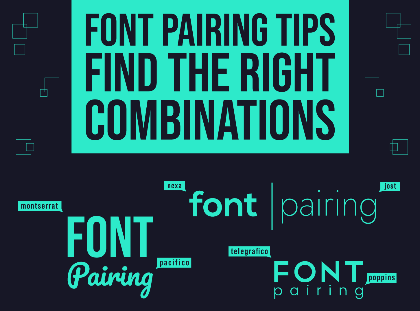
Tips For Font Pairing
Now that we’ve talked about the different types of fonts, let’s see some tips that should help you:
Use fonts that have various tones
The letter shapes we use to represent words also affect our perception. Some fonts are strict and businesslike, while others are upbeat and informal. Letters have different identities that can add meaning to the words they represent. When you choose web fonts, mixing typography with various tones adds visually nice contrasts.
When choosing the best font pairing, first think about the spirit of who or what the website will represent. The bubble typeface can be used by a toy company, but it will look inappropriate on the law firm’s website.
Use font size to indicate the order
The largest letter represents what has priority, and the decreasing sizes represent the hierarchy of content. The use of all capital letters also works well in highlighting important elements such as calls to action (CTA’s). But make sure you use capital letters sparingly; no one wants to feel like a website is yelling at them.
Integrating different typography sizes is an option for most novice designers, but there are other ways to mark the visual hierarchy.
Use ‘fresh’ fonts
There is nothing worse than seeing a design that uses a font that is boring out and overused. This can absolutely reduce your design and even make you less reliable, as many of these fonts are less professional.
When there are so many professional-looking designer fonts, why would you even opt for one of these?
Use maximum 3 fonts
Each font has a personality, and if it competes too much for attention in design, it will not turn out nice and useful. Limit yourself to two to three fonts; this saves your design from feeling irresistible to the viewer and avoids creating a sense of chaos.
Conclusion – Think About Typography
Approach your font pairs with the same level of attention that you apply when choosing a color palette. The tone of the fonts you choose, the way you style them and their readability are a big part of the web design user experience.
Find those cool fonts that speak to the personality of what you create and give visitors the best possible way to experience its content.
 Book a Meeting