



24 Horse Logo Designs for Inspiration, Grouped by Style
 8 min read
A good horse logo does a lot of work with one animal. Horses stand for strength, freedom, loyalty and speed, so you see them on stables and racing brands, but also on cars, banks, beer and tech start-ups. The hard part is that thousands of brands already use one, which makes a generic horse easy to forget.
Below are 24 horse logo designs grouped by style: equestrian and stable marks, racing and sport, minimal and geometric, mascots and illustrated logos, and finally pegasus and unicorn logos. For each one we explain what the designer did well and what kind of brand the style suits, so you can borrow ideas, not artwork.
What a horse logo says about a brand
- Power and performance: a galloping or rearing horse says speed and strength, which is why cars, engines and sports teams use it.
- Heritage and class: dressage riders, Arabian horses and gold detail feel traditional and premium, a good fit for equestrian goods, spirits and luxury brands.
- Freedom and the outdoors: wild horses and ranch scenes suit outdoor clothing, travel and western brands.
- Trust and partnership: horse and rider together, or a horse with a handler, signal care and teamwork, useful for trainers, vets and therapy services.
The common traps are the generic side-view silhouette that looks like clip art, too much anatomical detail that blurs at small sizes, and marks that sit too close to famous car badges. A horse logo also has to read the right way round: most face right, towards the text, so they look like they are moving forward.
24 horse logo ideas by style
Equestrian, stable and ranch horse logos
1. Paard Verzameld
A horse head drawn as a web of straight lines and triangles, like a low poly model reduced to its wireframe. The thin black lines and spaced capitals feel calm and gallery-like, which suits a business that curates equine art. See it in use at Paard Verzameld.
2. Dressage rider by Gareth Hardy
A detailed gold dressage horse in collected trot, with a rider in a top hat and tailcoat, set on deep racing green. The classic colour pair says heritage, which suits a livery yard, a saddlery or an equestrian clothing label. By Gareth Hardy.
3. Baxter Hill by Painted Pony Studios
There is no horse here at all. A full cheek snaffle bit runs through the letter B, and the bit’s cheek pieces form an H, so the barn’s initials and its sport share one symbol. A smart route for a hunter barn or tack shop that wants to look established rather than cute. Designed by Painted Pony Studios.
4. DK Horsemanship by Inspired Equestrian
Two heavy silver letters act as a window onto a scene: a saddled horse, a trainer in a cowboy hat holding the lead rope, a low sun and long grass. Perfect for a trainer or clinic, as long as there is also a plain DK mark for small uses. Designed by Inspired Equestrian.
5. Stallion Brand Co. by Mike Bruner
A high-stepping stallion drawn with one even, dark grey line that ends in square corners, paired with widely spaced slab serif type and a small arrow. A good fit for leather goods, western wear and craft products. By Mike Bruner.
6. Golden horse by Gardner Design
A compact gold horse built from flat shapes, with a curled tail and blocky legs that end in clean square cuts. The gradient gives it a cast-metal feel, which suits a ranch, a farm brand or a premium whisky label. By Gardner Design.
7. Drafthorse Studio by Dean Vigyikan
A muscular black draft horse with one foreleg raised stands on a plinth, like a statue, above heavy condensed lettering. It suits a creative studio, a brewery or a workwear brand that wants strength with a bit of swagger. By Dean Vigyikan, via Pinterest.
Racing, sport and speed
8. World Rider by Haris Jusovic
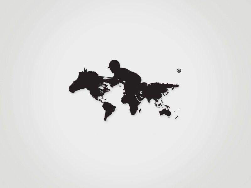
The world map turns into a racehorse: a horse head grows out of North America, and a crouched jockey in a riding helmet sits above the Atlantic. Ideal for international racing, equestrian travel or a global sports network. By Haris Jusovic.
9. Racehorse 13 by Gardner Design
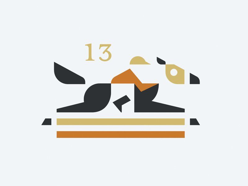
A racehorse and jockey stretched almost flat at full gallop, built from a few sharp black, orange and tan shapes. Two stripes underneath suggest the rail and the track. A strong idea for a racing syndicate, a betting app or a sports bar. By Gardner Design.
10. Trojan Horse by Pavlov Visuals
A horse head in the shape of a chess knight, with speed lines running behind it, a red sun and a gold triangle. It would work for a sports team, a strategy game or an agency that likes a story behind its name. By Pavlov Visuals.
11. Bronco Electric by Gregory Grigoriou
A bucking bronco whose body zigzags like a lightning bolt, in a single flat red. The horse and the bolt are the same shape, so the name is told twice without any extra detail. A memorable mark for an electrician, an energy drink or a rodeo event. By Gregory Grigoriou.
Minimal, line and geometric horse logos
12. Champ by Gardner Design
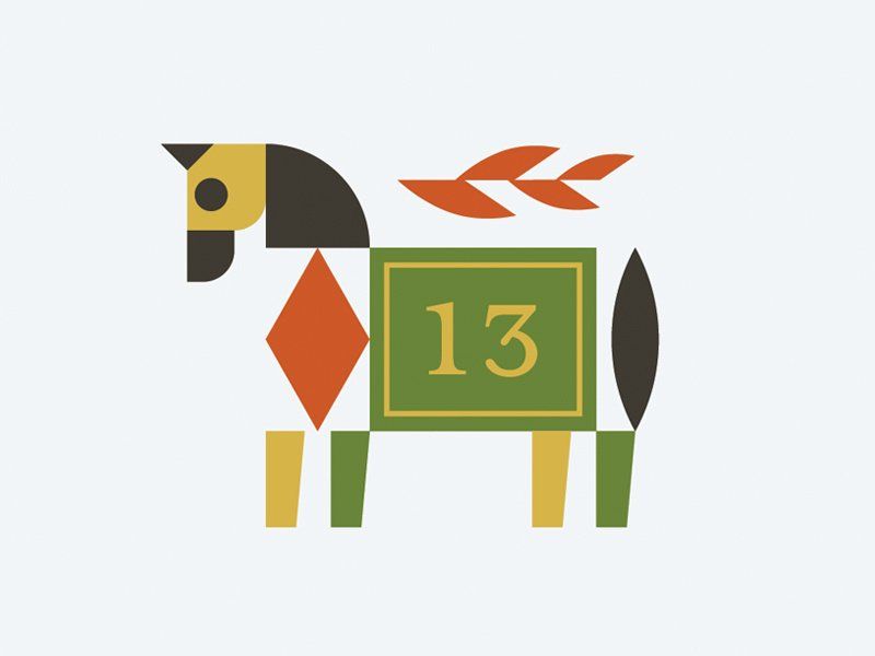
A horse assembled from simple blocks: a mustard head, a red diamond chest, leaf-shaped mane and a green saddle cloth with the number 13. Great for a toy brand, a kids’ riding school or a farm shop. By Gardner Design.
13. Iron Horse by doublecreative
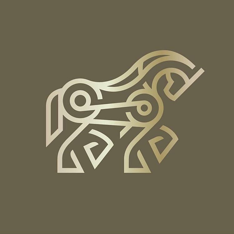
A horse made from one line weight, with gear-like circles at the joints and spirals for hooves. The interlocking curves recall Celtic knotwork and machinery at the same time. That double feel suits an engineering firm, a motorcycle workshop or a premium spirits label. By doublecreative, via Pinterest.
14. Horset by Raj Kumar
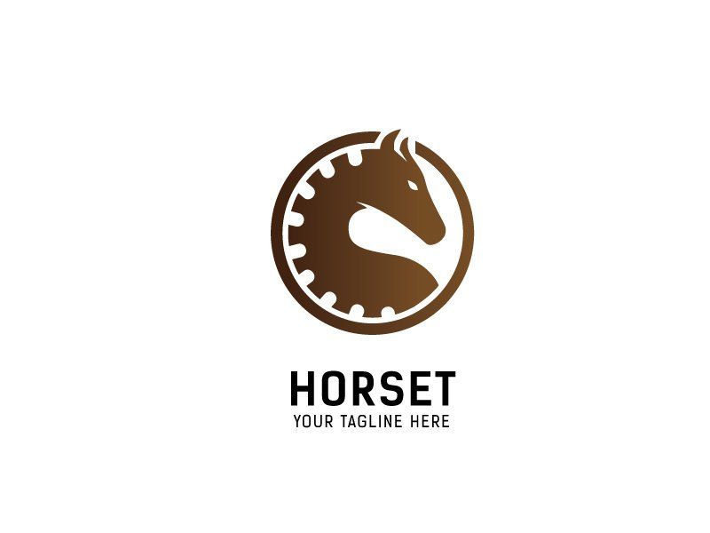
A brown horse head sits inside a ring of gear teeth, so the mark says horsepower without spelling it out. A practical choice for a garage, a tractor dealer or a farm equipment brand. By Raj Kumar.
15. Mental Horsepower by Gregory Grigoriou
A horse seen from the front, with a brain cut into its chest in negative space. Smart for a coaching business, a sports psychologist or a learning platform. By Gregory Grigoriou.
16. Heart Horse by Yoga Perdana
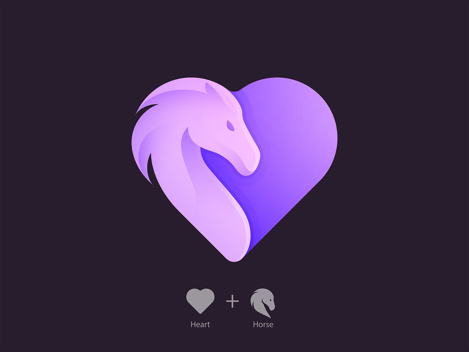
A heart whose left half curls into a horse head with a soft, flowing mane, finished in lilac to violet gradients. It suits an equine therapy centre, a horse rescue or a riding club aimed at young riders. By Yoga Perdana.
Mascot, gradient and illustrated horse logos
17. Stable
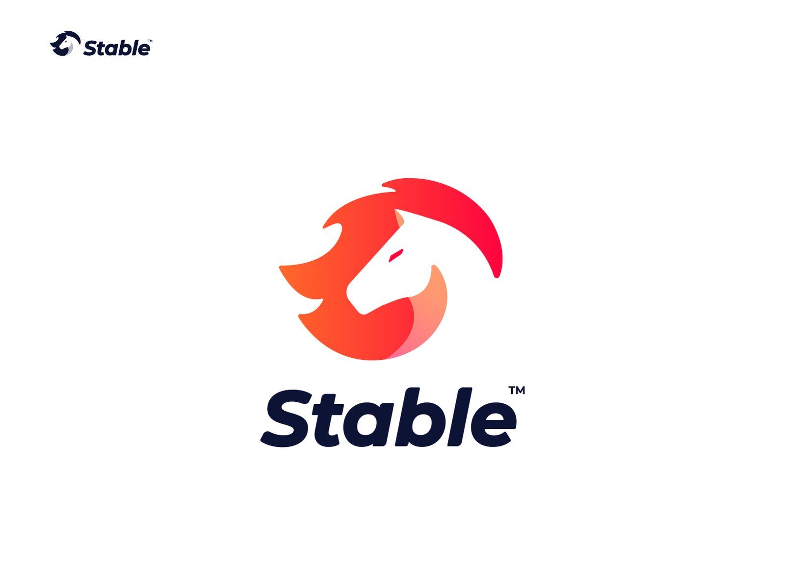
A red to orange horse head with a mane that curls up and over like a flame, using negative space for the face. The look is modern and app-ready, so it would suit a fintech app, a delivery service or a software product. Seen on Dribbble.
18. Gradient horse
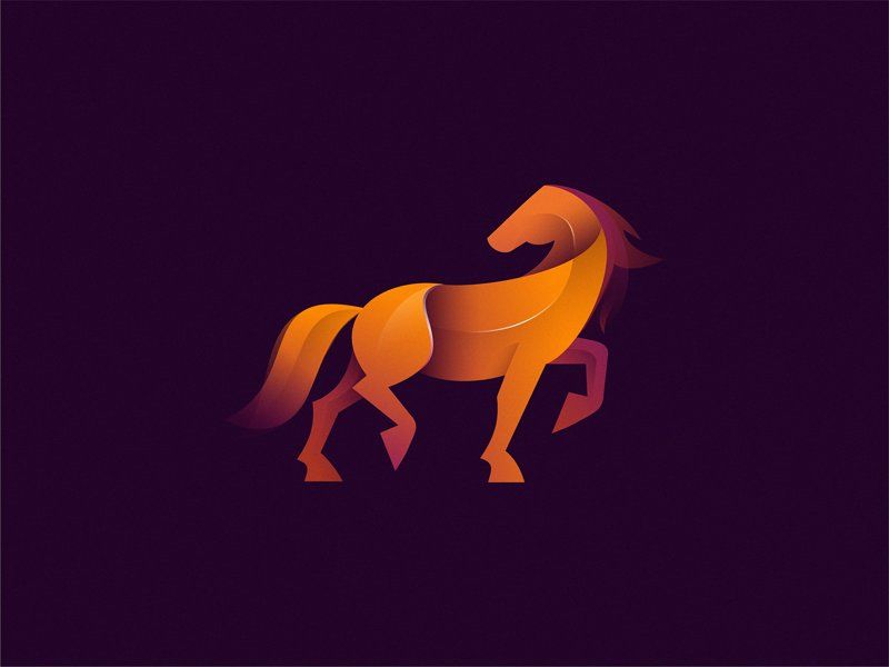
A trotting horse made of smooth overlapping shapes in orange, red and amber, glowing against deep purple. It looks best on screens, so think of a streaming channel, a game studio or a tech brand, and plan a flat version for print. Seen on Dribbble.
19. Rearing horse by Daniel Bodea
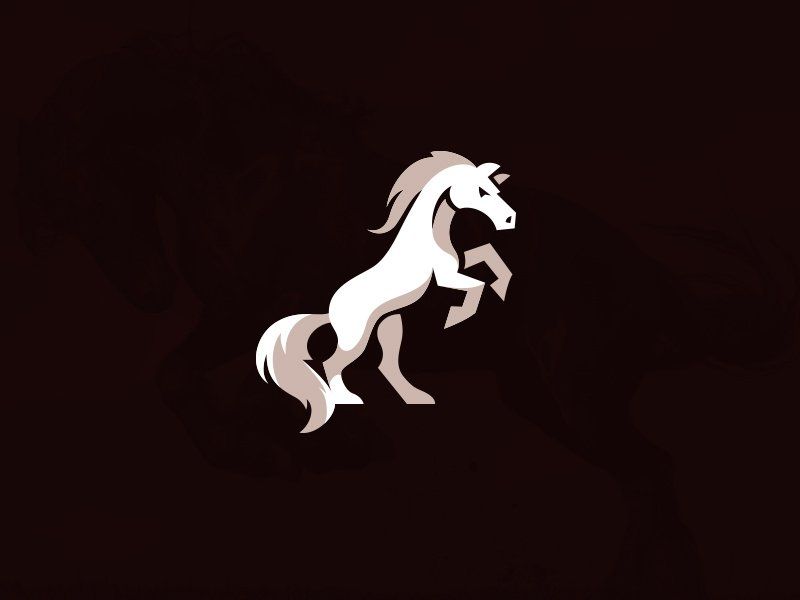
A white horse rearing up on its hind legs, with grey shading in the mane and tail to give it volume. A strong mascot for a sports club, a craft beer or an outdoor brand. By Daniel Bodea.
20. Arabian horse by Abdullah Abbas
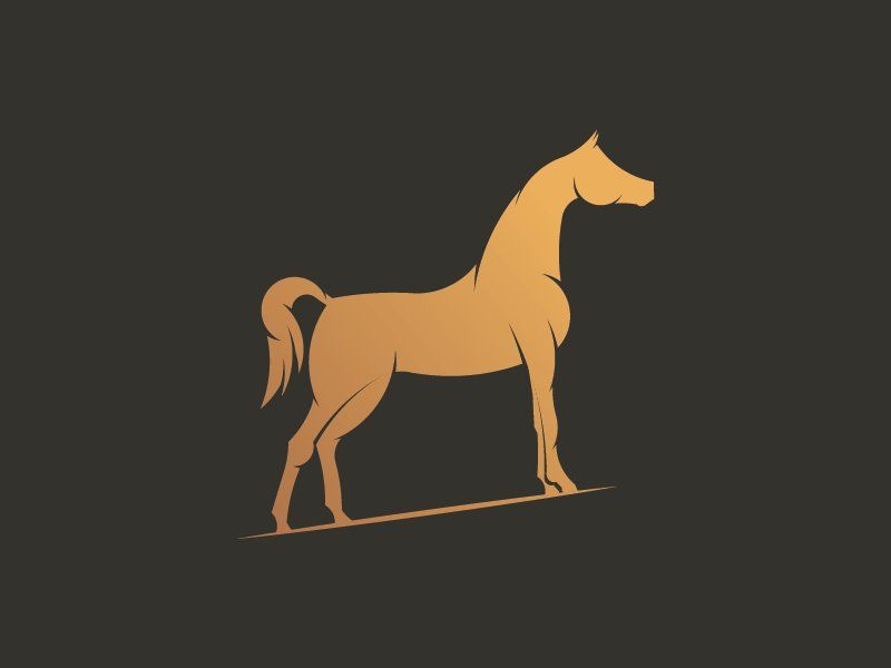
A tan Arabian horse standing proud with its tail held high, on a thin ground line. The dished face and arched neck are the details that make the breed clear. A natural fit for an Arabian stud, a perfume house or a luxury travel brand. By Abdullah Abbas.
Pegasus and unicorn logos
21. Winged Horse by Matt Kauzlarich
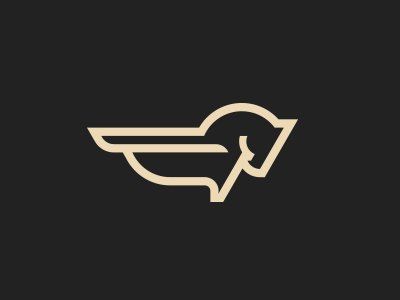
A pegasus reduced to a horse head and a pair of wings, all drawn with the same cream outline. A good direction for a courier, an airline start-up or a running brand. By Matt Kauzlarich.
22. Bridle Creek by QYZ Designs
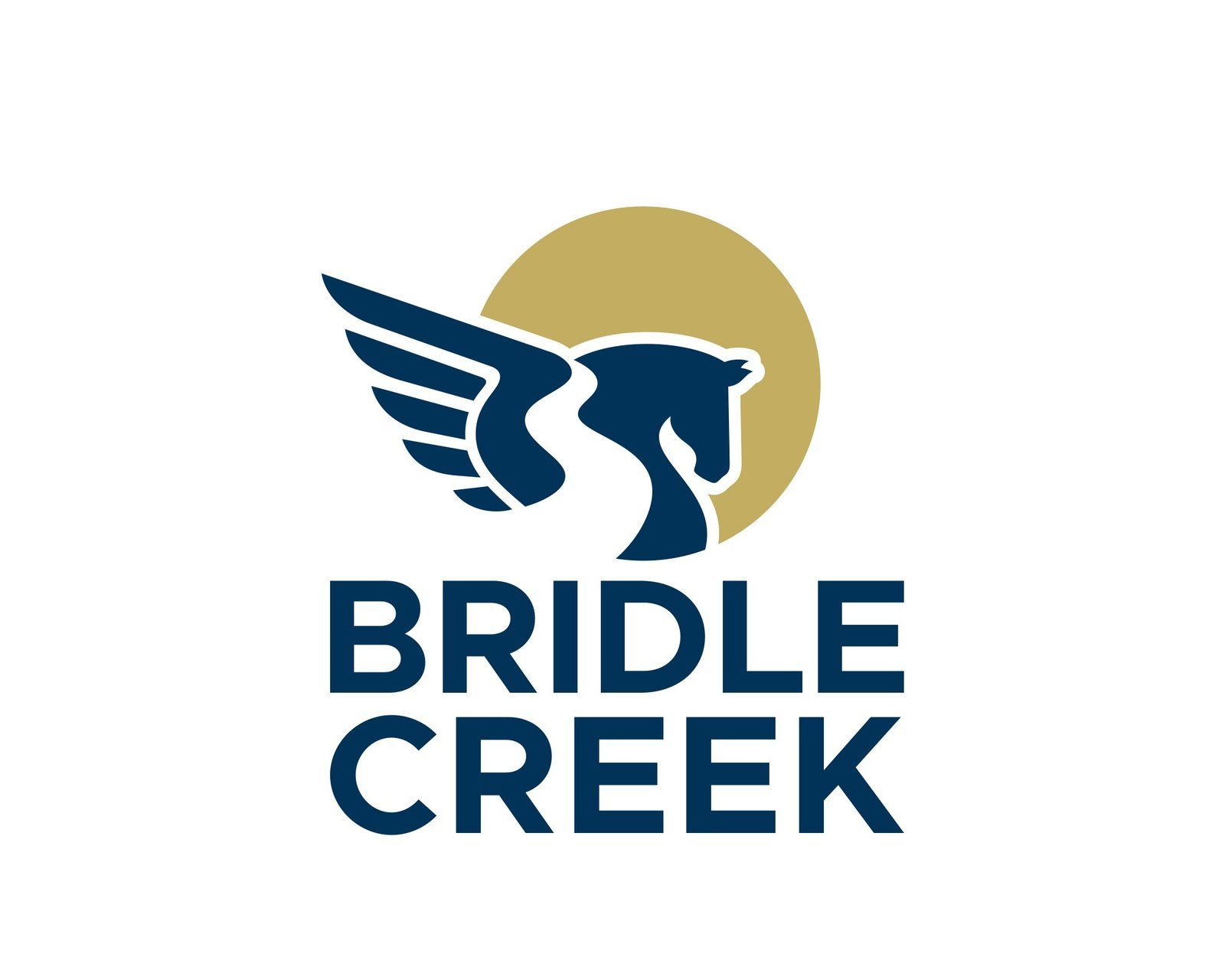
A navy pegasus head with spread wings in front of a gold circle, above a bold sans serif name. The designer cut a creek into the shape as negative space, which ties the icon to the place name. Navy and gold read as trustworthy, so it suits real estate, a housing development or a country club. Designed by QYZ Designs.
23. Creartive
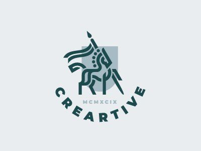
A rearing horse in dark teal line art with a paintbrush rising from its forehead like a unicorn horn. A playful idea for a creative agency, an art school or an illustrator. Seen on Dribbble.
24. Cox Mason by arkum
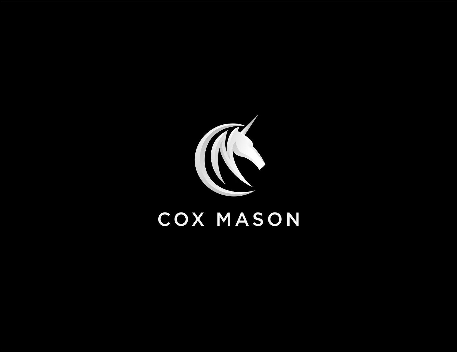
A silver unicorn head drawn with a few curved strokes that, as the designer points out, also suggest a C and an M for Cox Mason. Silver on black keeps the unicorn serious instead of whimsical, which matters for a financial firm. Designed by arkum.
Tips for designing a horse logo
- Choose the pose first. A head alone is calm and compact, a gallop is fast, a rearing horse is bold and a standing horse is proud. The pose carries more meaning than the colour.
- Get the anatomy right. Horse people notice wrong leg joints and odd necks at once. Study real photos, even if the final mark is very simple.
- Find a second idea. A snaffle bit, a brain, a lightning bolt or a map turns a common symbol into something specific. Our key principles of logo design explain why one clear idea beats decoration.
- Test it small. Check the logo at favicon and app icon size, and keep a simpler head-only version. Plan your logo variations early.
- Pick colours with intent. Browns and tans feel natural and earthy, navy and gold feel established, and bright gradients feel digital. Our guide to brown in branding goes deeper.
Looking for more animal and style ideas? Browse our collections of lion logos, wolf logos and esports mascot logos, or see minimalist logo ideas and low poly logo designs.
Frequently asked questions
What does a horse logo symbolise?
Mostly strength, freedom, speed and loyalty. A racing horse adds competition, a dressage horse adds tradition and class, and a pegasus or unicorn adds ambition and imagination.
Can I use these horse logos for my business?
No. Every design here belongs to its designer or to the brand that owns it. Use them for inspiration on style, shape and colour, then have an original horse logo made for your brand.
Which way should a horse face in a logo?
Usually to the right. In left-to-right reading cultures a horse facing right looks like it is moving forward and towards the brand name. A horse facing left can feel like it is turning away.
What is the difference between an equestrian logo and a horse logo?
An equestrian logo usually refers to the sport and its culture: riders, tack, dressage, show jumping or stables. A horse logo can be any brand that uses the animal as a symbol, from a car maker to a coffee roaster.
Need a horse logo for a client?
Inkyy is a white label design and development team for agencies. Our in-house brand designers create original logos and full identities that you deliver under your own brand. See our design services or book a 15-minute call.


