



16 Low Poly Logo Designs and Geometric Logo Ideas
 7 min read
A low poly logo builds its shape from flat triangles, each shaded a little differently, so the mark looks carved, folded or cut like a gem. It is a popular style for gaming, tech and outdoor brands, and it sits inside the wider family of geometric logo design.
Below are 16 low poly and geometric logo designs, grouped into animals, letters, and objects and landscapes. For each one we look at what works and what kind of brand it suits. We also cover when the style is a good idea, and why every low poly logo needs a flat backup version.
What a low poly logo is, and when it suits a brand
“Low poly” comes from 3D graphics, where a model with few polygons looks angular and faceted. Early video games looked like this because computers could not handle more detail. In logo design, the term describes a mark drawn as a mesh of flat triangles, with light and dark tones that suggest depth. A geometric logo is the broader idea: any mark built from simple shapes, grids and straight lines. Low poly is one of its most decorative versions.
- Tech, gaming and apps: facets read as digital and three-dimensional, which fits software, studios and esports teams.
- Outdoor and travel: triangles naturally suggest mountains, rocks and crystals.
- Creative and youth brands: multicolour facets feel playful and energetic.
- Premium products: a restrained palette with fine facets can feel like cut glass or a gemstone.
The main trap is size. A low poly logo rarely works small. Below about 32 pixels the facets blur into a muddy shape, and fine colour shifts disappear on a favicon, a stamp or an embroidered shirt. The fix is to design a flat version from day one: a solid silhouette or a simplified shape with a handful of facets, in one or two colours. Other traps are using too many colours, copying stock “polygon animal” art, and choosing the style for a brand that needs to feel calm or traditional, such as a law firm.
Low poly animal logos
1. Polycat by Barış Onay
A cat head made from a few large red and orange facets, paired with a calm serif wordmark. The low facet count is the smart part: the shape still reads when it is small, and it hints at a gem as much as a cat. A good fit for a pet brand, a shop or a small studio.
2. Foxy by Stevan Rodic
Large, clean facets in warm orange and red, with white planes for the cheek and chest. It feels closer to origami than to a 3D mesh, which keeps it tidy. Suits a creative agency, a tech start-up or a brand that wants to look quick and clever.
3. Unicorn by Stevan Rodic
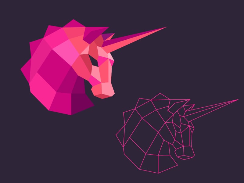
A pink unicorn head shown next to its own wireframe, which is a useful look at how a low poly mark is built. The long, thin horn gives the shape a strong direction. A natural choice for a start-up, a kids’ brand or a beauty product, though the horn would need thickening for small sizes.
4. Ram head by Alex Tass
A front-facing ram with big curled horns, coloured in a single orange-to-red range. Keeping to one hue makes the facets feel like folded paper rather than a busy mosaic. Strong and symmetrical, it suits a fitness brand, a finance product or an outdoor company.
5. Havsule by M Vog
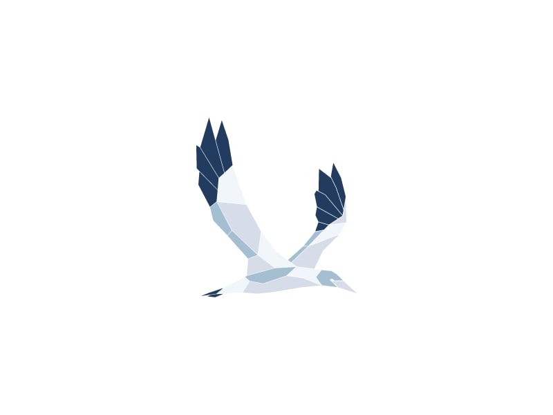
A gannet-like seabird with raised wings, drawn in pale greys with navy tips. The raised wings form a V, so the silhouette works even without the facets. A calm, coastal option for a travel, sailing or seafood brand.
6. Mark 6 low poly bird by Prashanth
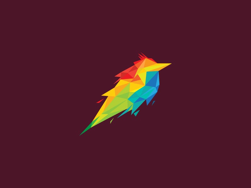
A small bird in red, yellow, green and blue facets, with a tail that breaks into shards as if it is speeding forward. It shows how a dark background makes multicolour facets glow. Fits a creative studio, a music brand or a kids’ app.
7. Hydra by Alberto Alves

The many heads of the hydra rise in sharp blue spikes that also read as a crown or a wave. With a wide, spaced-out wordmark below, it looks ready for a gaming studio, a cybersecurity firm or a tech product.
Geometric letter logos
8. Low Poly Q by Roma Korolev
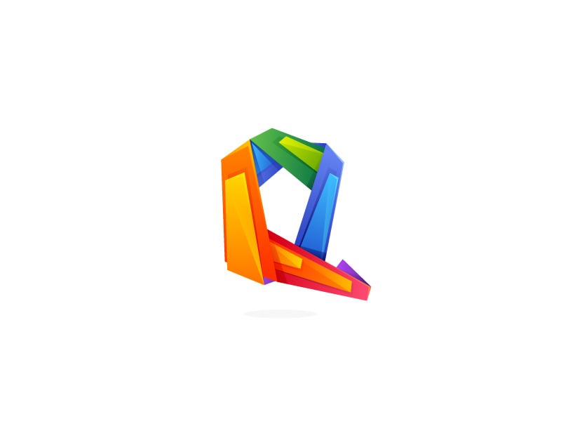
A Q drawn as a faceted ribbon that folds back on itself, in a full rainbow of colours. The bands have real thickness, so the letter looks solid rather than flat. A lively monogram for a media, app or event brand whose name starts with Q.
9. D monogram by Alex Tass
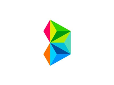
A handful of coloured triangles form a D, and the same shape can be read as a rocket. It proves that a geometric logo does not need hundreds of facets to feel three-dimensional. Made for a games studio, and a fit for any digital product that wants a bright, simple mark.
10. Astor paper trade by Nikolay Stepanchenko
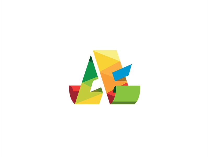
An A built from folded strips that look like sheets of paper, which ties the letter to a paper trading business. The facets carry the idea instead of just decorating the letter. A good model for any brand where the material or product can shape the logo.
11. Crystal C by Alex Tass
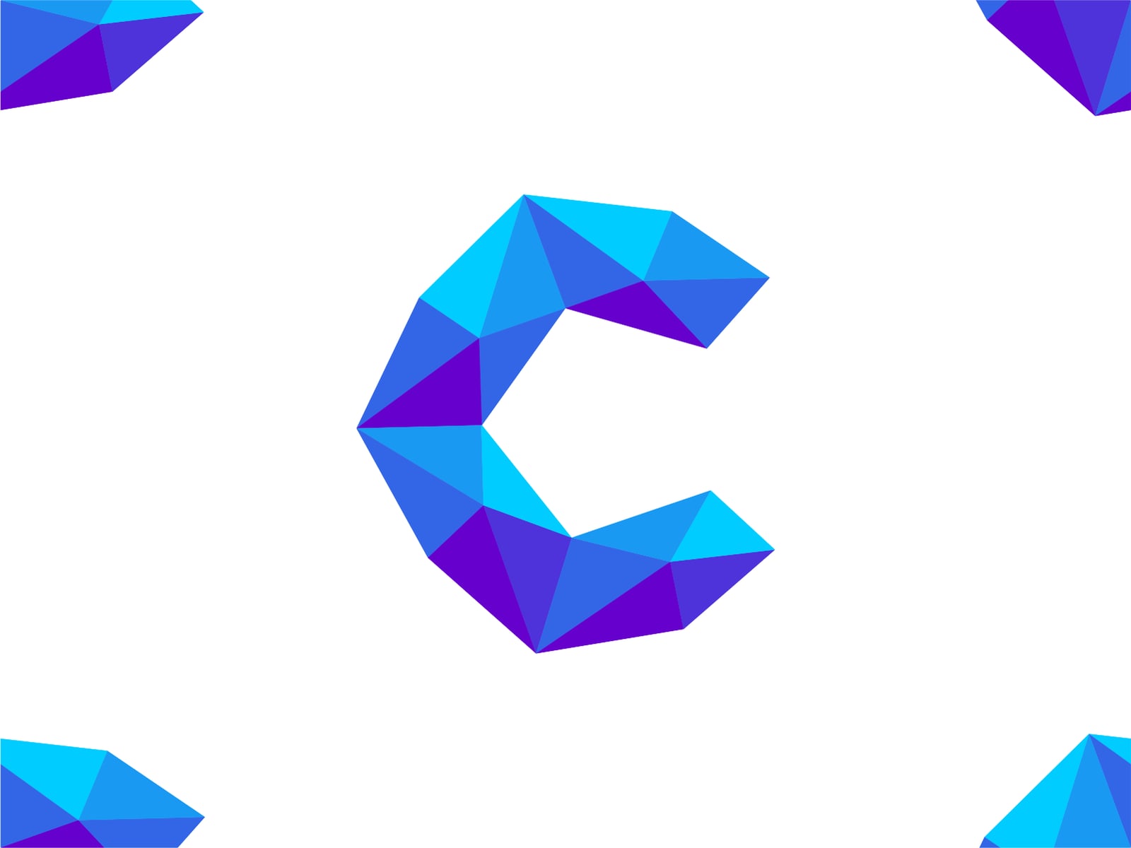
A chunky C in blue and violet facets, like a cut gemstone. The two-colour palette keeps it clean, and the thick letterform should hold up better at small sizes than most low poly marks. Suits a jewellery, crypto or software brand built around clarity.
Geometric logos for objects and landscapes
12. Stacked by Alex Tass
An orange faceted anvil next to a rounded black wordmark, for a fitness and training app. The anvil says strength and iron without showing a dumbbell, and the facets make it feel hand-forged. A fit for gyms, strength coaching and tool brands.
13. Career Development by Alexander Wende
A blue book whose open edge forms the profile of a face, so learning and the person are one shape. The cool blue range keeps it serious enough for education. A clever direction for coaching, training and e-learning brands.
14. Geometric heart by Alex Tass
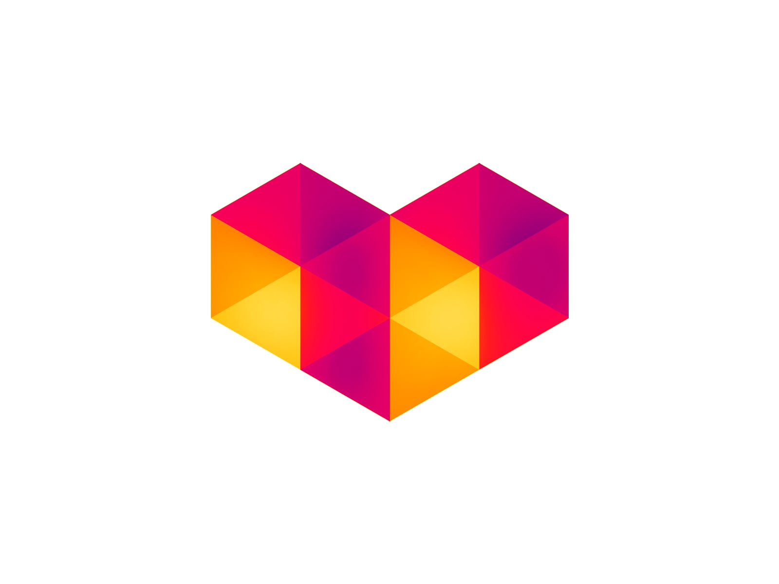
A heart built on a triangle grid, shaded from magenta to warm yellow. The outline is simple and pixel-like, so it would work as an app icon or a “like” button. Suits dating apps, social platforms and creator tools.
15. Zion National Park badge by Eric Cleckner
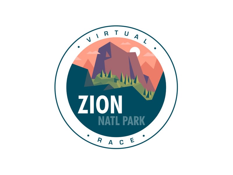
A round badge for a virtual race, with Zion’s rock walls drawn in pink and purple facets above bold condensed type. Here low poly is used for scenery inside a badge, which is a softer way to use the style. Ideal for events, outdoor clubs and tourism.
16. Rocky Mountain National Park badge by Eric Cleckner
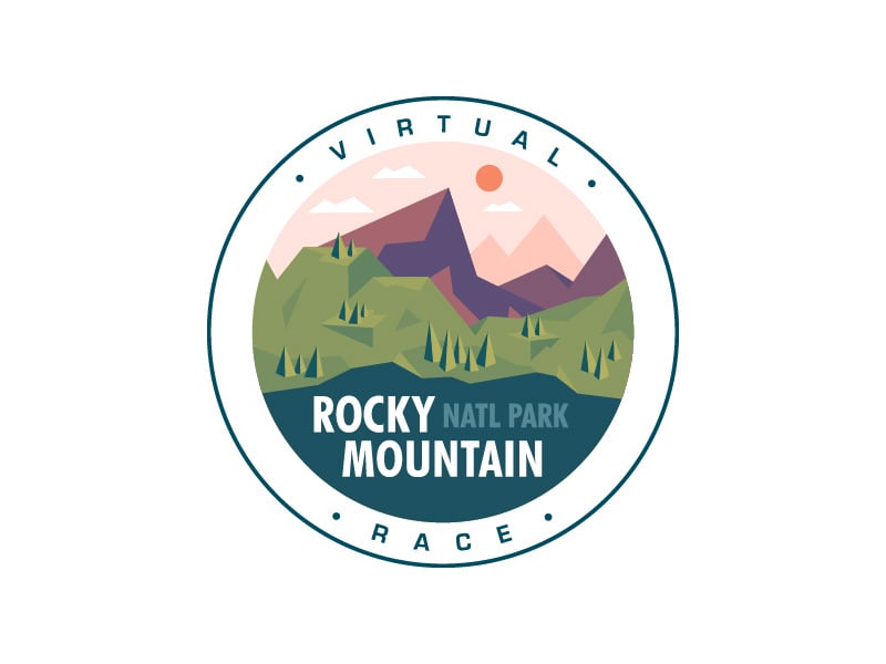
From the same series, with layered purple peaks and green slopes dotted with pines. Mountains are the most natural subject for low poly, because real peaks already look faceted. A template for a hiking brand, a cabin rental or a race series.
Tips for designing a low poly logo
- Start with a flat silhouette. If the shape does not work as a solid black form, the facets will not save it.
- Use fewer facets than you think. Big triangles look deliberate. Hundreds of tiny ones look like a filter.
- Limit the palette. One hue in light and dark tones, as in the ram and the crystal C, looks cleaner than a rainbow.
- Make the facets mean something. Folded paper for a paper trader, rock faces for a park, gem cuts for a jeweller.
- Plan a flat version. Build a one-colour or two-tone version for favicons, stamps, embroidery and low-quality print. Here is how to plan your logo variations.
- Test it small. Check the mark at 32px and 16px before you present it to a client.
Want more ideas? See our collections of fox logos, cat logos and 8-bit logos, another style that borrows from early computer graphics. For the opposite approach, browse these minimalist logo ideas, or read the key principles of logo design.
Frequently asked questions
What is the difference between a low poly logo and a geometric logo?
A geometric logo is any mark built from simple shapes such as circles, squares and triangles. A low poly logo is a specific kind of geometric logo, made from a mesh of triangles with shading that suggests a 3D form.
Does a low poly logo work at small sizes?
Usually not on its own. The facets merge below about 32 pixels. Keep the detailed version for large uses and pair it with a flat, simplified version for favicons, app icons and print.
Can I use these logos?
No. Every logo here belongs to its designer or their client. Use them for inspiration on shape, colour and facet style, then have an original logo made for your brand.
Which software is used to make a low poly logo?
Most designers draw the triangles by hand in a vector tool such as Adobe Illustrator, Figma or Affinity Designer, so the final logo scales without losing quality. 3D software like Blender can help with reference, but the finished logo should be a vector file.
Need a logo for a client?
Inkyy is a white label design and development team for agencies. Our in-house brand designers create original logos, including geometric and low poly marks with the flat versions they need, that you deliver under your own brand. See our design services or book a 15-minute call.


