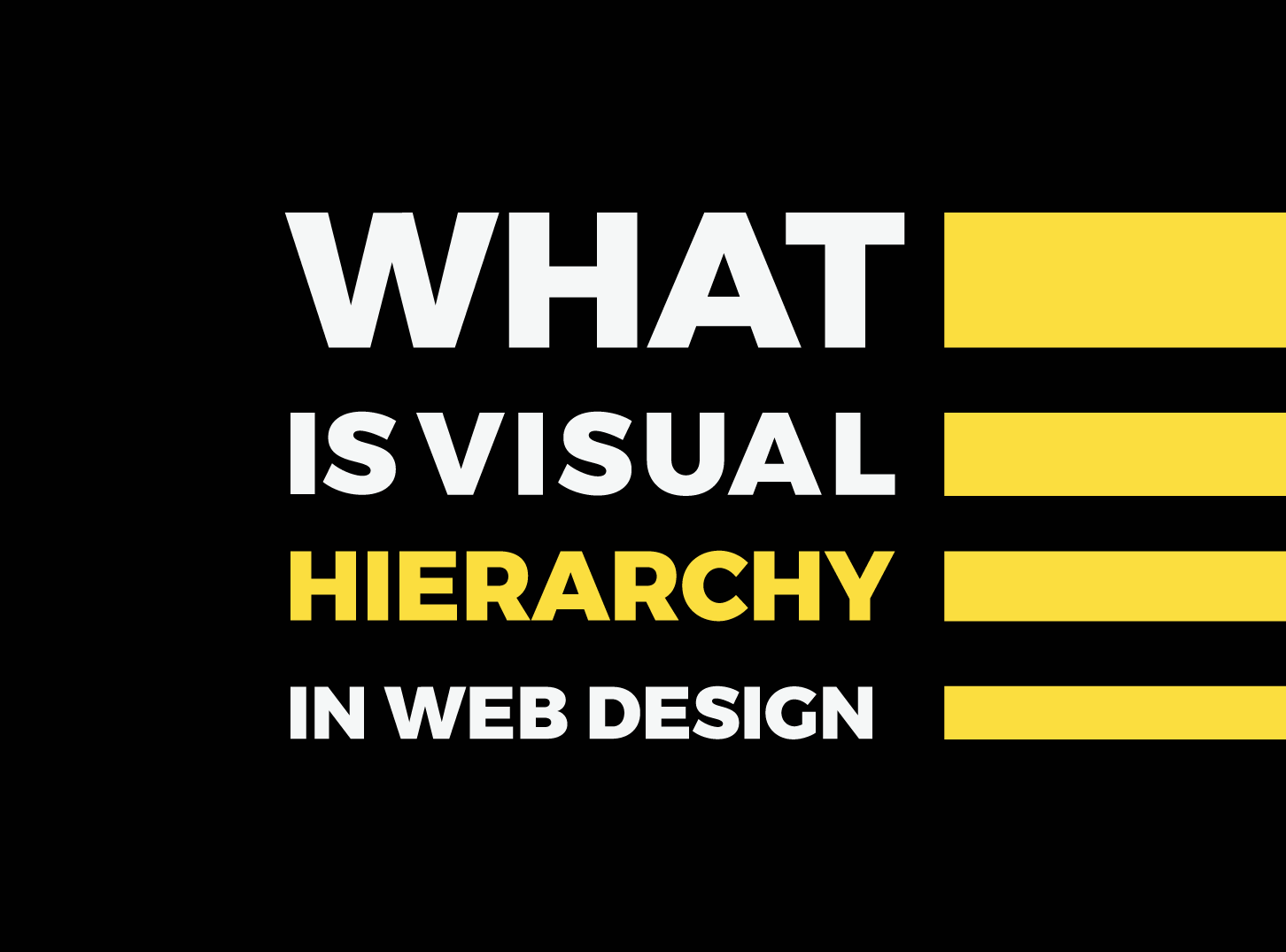
What is Visual Hierarchy?
Visual Hierarchy represents, probably, the most important principle in proper and good web design. It is used to describe the arranging process of elements by their importance on a web page.
Visual hierarchy’s purpose is to influence the user and make their focus turn to the most important elements on our website.
Implemented properly, the visual hierarchy can guide users to desired actions and make their eyes pay attention to the elements that we find more important on our web page.
Visual Hierarchy & Its Importance in UX/UI Design
Visual hierarchy has a key role in web design. It allows you to plan and set up your website UI architecture. It will help your users to go through and navigate easier through your webshop, or website.
UX represents everything that users experience when using a product. The designers’ job is to make that experience as good as possible. This is where Visual Hierarchy comes in handy.
UX design is focused on removing any kind of resistance, thus enhancing the usability and experience of users while buying, using, or doing anything with the product that your website offers. Proper usage of visual hierarchy is of most importance here.
Here are some of the principles that will make your usage of visual hierarchy better and make UX even better.
The Best Way to Incorporate Visual Hierarchy In Your Web Design
Even if it seems that designing a website isn’t all that much, you are mistaken.
Read this Inkyy Web Design Studio article, where we mentioned few basic principles for good web design in 2021, and find out how to prepare, before your start creating something new.
There are a lot of different components that are supposed to “click” together when creating a brand new website.
As we are today writing about visual hierarchy, there are few principles (elements) that you should follow:
- Size – Most of the times, larger elements attract more attention
- Color – The brighter the color, the more attention it attracts
- Contrast – Contrasting colors are easy to catch with users eyes
- Proximity – Few elements that are positioned close to each other seem related
- Alignment & Whitespace – Eyes are attracted to space around & between elements
- Texture & Style – Flat texture doesn’t attract as much attention as the rich texture
There is a thin line between good and bad website design. Following the above elements will make your website better. Your design and visual hierarchy are essential for user conversion and attracting new users.
There are a lot more factors that need your attention when creating a website, like functionalities, SEO, navigation, but more about them in some other articles in the future.
The F – Pattern In Visual Hierarchy
Different studies have proven that most users’ eyes focus first on the images and content that is on the top. What does this mean?
For websites, that contain more text, like blogs, F-Pattern is frequent among readers. Those studies, that we mentioned above, have shown that we, usually, read in the F-shaped pattern.
It is proven that this kind of path is the easiest. It allows the user to look over images and content in a fast manner, and collect as much information as the eyes can “grab” in the fastest time.
Let’s try to explain through an example.
Let’s say that I am a new visitor to your blog page. You want to catch my attention and get me “hooked” on that particular article as fast as you can.
My eyes start scanning for keywords and visual cues from left to right, and they start at the top of the page. We will assume that the web page is designed properly.
When I find a title, subtitle, or something that I like, I start reading it normally. Horizontally. From left to right. The process repeats itself, and my eyes continue to follow visual cues, go down on the left side of the web page, and read from left to right in the horizontal line.
The end result is a shape that can resemble letter F, or even a letter E.
Most of the well-designed websites use this kind of pattern to drive readers’ attention to key points of their website, and “hook” them on the content, as we mentioned in our example.
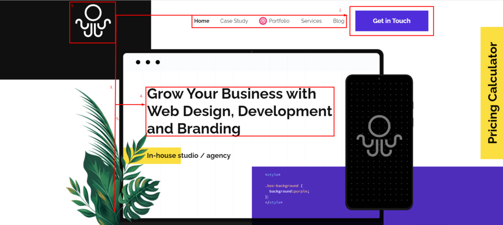
As you can see in the above image, most of the important information and content can be seen immediately. Combination of that content with CTA (Call To Action) allows users to see and use everything they wanted in few seconds.
Content & F-Pattern
You all know the saying. Content is king, but don’t add too much content to a web page. It can confuse and distract the user from the essential and focal points of the page.
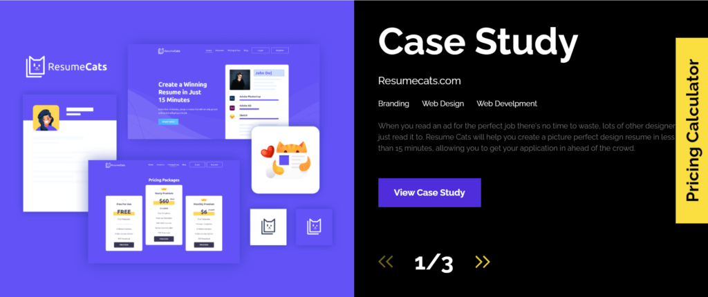
As a web designer, you should consider the F-Pattern in Visual Hierarchy as a guideline, rather than a template. Sometimes it can get a little bit boring and you can get an “already seen” feeling, so you can mix it up, as Inkyy Web Desing & Branding Studio did it after the initial content (picture below), or visit this link, and see it with your own eyes.
Web Design & The Golden Ratio
First of all, let answer the question what is the Golden Ratio? The easiest way to answer this question is to say that this ratio is actually a number. A very unique number. The golden number. The Greek letter φ represents the Golden Ratio. Its value is 1.61…
Of course that you don’t need to know the exact number for great web design.
You should know that Golden Ratio can be found in nature, and it allows the creation of well-balanced designs.
The Golden Ration applies to web design. Just look at the Twitter layout. It can grab your attention without any effort with its dynamic layouts.
Following the golden ratio is probably the easiest way to establish a proper visual hierarchy on your website and web page.
Conclusion
Lets finish this topic with a small conclusion about visual hierarchy.
Visual Hierarchy represents a very important tool in the process of creating your website.
It can improve, or destroy the UX. It allows easy navigation through your website, it points out the most important elements of your website.
You can use different principles and elements to make your website pop. You can use golden ratio proportions. Increase your buttons and all clickable objects. You can even use the minimalistic approach to web design. You can use all of the mentioned above. It is up to you.
It doesn’t matter which tool, trick, element, or principle you use for your website and the creation of visual hierarchy on your page. Remember to keep it balanced. To avoid confusion and to follow the users’ desires. To grab his attention and guide it through the website.
The best way to achieve this is with well constructed visual hierarchy.
If you liked this article, follow Inkyy Web Design Studio on Instagram. There you can find new designs, mockups, as well as all the latest information about our blog posts, and the entire Inkyy Web Design & Branding Studio.
 Book a Meeting