


20 Best Minimalist Fonts for Clean, Modern Design
 12 min read
Minimalist fonts strip type back to what matters: clear shapes, even strokes and plenty of white space. They make a logo feel confident, a website feel calm and a brand feel modern. The catch is that many clean fonts look alike, and “free” often means free for personal use only.
We picked 20 minimalist fonts and grouped them by style: geometric sans, grotesque and neo-grotesque, humanist sans, minimal serif and display. Every font has a specimen, its weights, the languages it covers where known, and a checked licence. 19 are free for commercial use, and the one that is not is clearly marked.
What makes a font minimalist?
A minimalist font is a typeface with no decoration it does not need. In practice, most clean fonts share a few traits:
- Simple construction. Letters are built from basic shapes, with no swashes, ornaments or heavy texture.
- Low or even contrast. Most minimalist sans serifs have strokes of nearly the same thickness. Minimal serifs keep their serifs small and sharp.
- Open space. Generous counters (the space inside letters like o and e) and comfortable default spacing keep the type light.
- A complete family. Minimal design leans on weight and size for hierarchy, not on extra fonts. A family with several weights does more work than any single trendy font.
Before you download, check three things. First, the licence: fonts on Google Fonts use the SIL Open Font License, which allows commercial use, while many fonts on sites like DaFont are for personal use only. Second, the character set: type your real words, including accents and numbers. Third, web use: a desktop-only licence usually does not cover embedding the font on a website.
Geometric sans serif fonts
Built from circles, straight lines and even strokes. Geometric sans serifs are the classic minimalist fonts: calm, modern and very clean in logos and headlines.
1. DM Sans
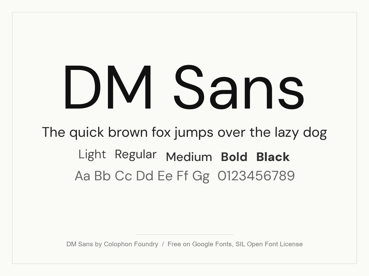
A low-contrast geometric sans from Colophon Foundry with round, open letters and generous spacing. It feels friendly without being playful, so it suits SaaS products, startups and clean brand identities. The optical size axis keeps small text crisp and lets large headlines tighten up.
- Style: Low-contrast geometric sans
- Weights: Variable, 100 to 1000, with italics and an optical size axis
- Languages: Latin
- Designer: Colophon Foundry
- Licence: Free for personal and commercial use (SIL Open Font License)
- Source: Download on Google Fonts
2. Outfit
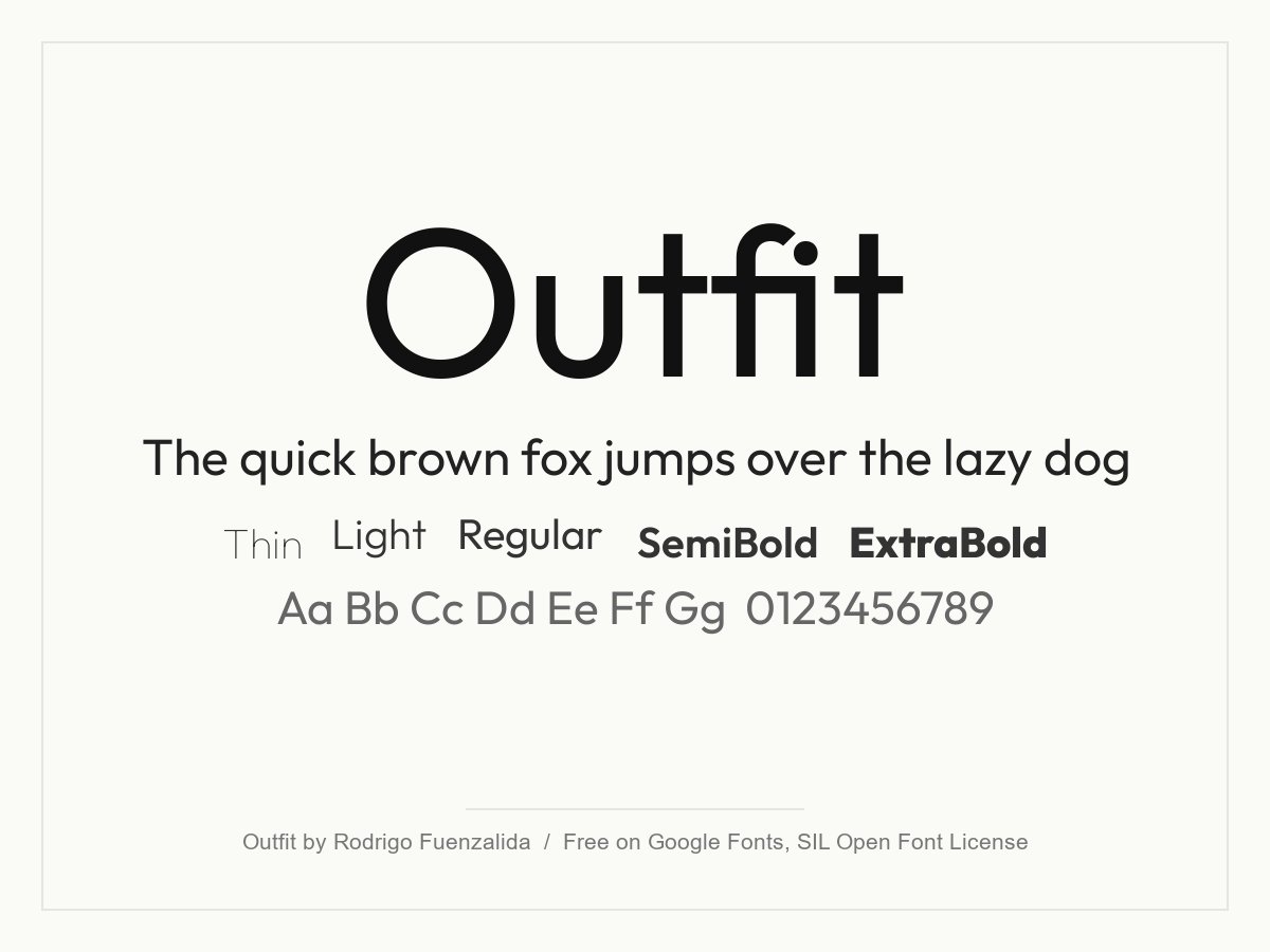
A tidy geometric sans made for the brand automation platform Outfit. The letters are simple and round, with very little detail to distract the eye. It works well for tech brands, app interfaces and short, confident headlines.
- Style: Geometric sans
- Weights: Variable, 100 to 900
- Languages: Latin
- Designer: Rodrigo Fuenzalida, for Smartsheet (Outfit)
- Licence: Free for personal and commercial use (SIL Open Font License)
- Source: Download on Google Fonts
3. Jost
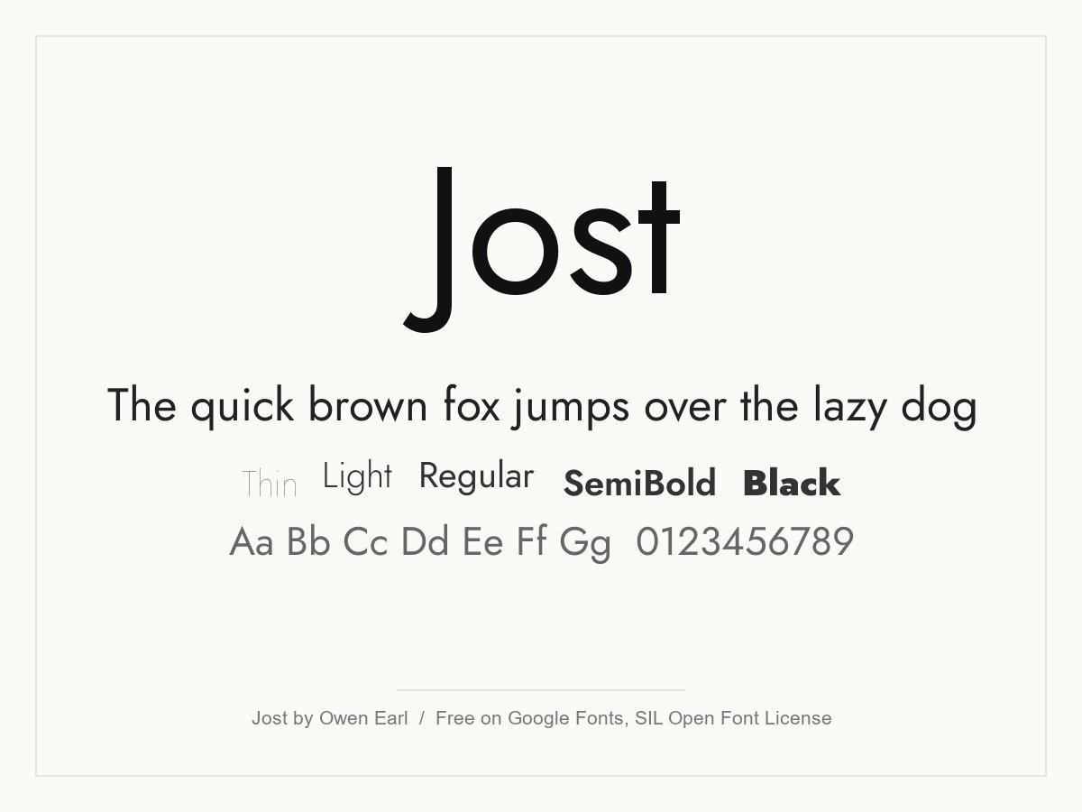
Jost takes its cues from the German geometric sans serifs of the 1920s, so if you like Futura, start here. Round bowls, even strokes and simple, upright shapes give it a clean, slightly classic look. Use it for fashion, architecture and editorial headlines.
- Style: Futura-inspired geometric sans
- Weights: Variable, 100 to 900, with italics
- Languages: Latin and Cyrillic
- Designer: Owen Earl (indestructible type*)
- Licence: Free for personal and commercial use (SIL Open Font License)
- Source: Download on Google Fonts
4. Poppins
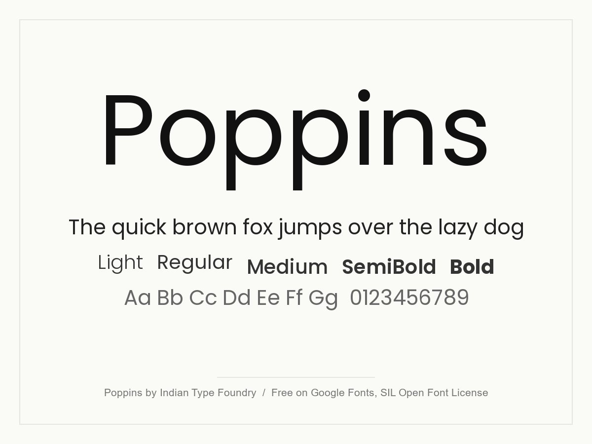
One of the most used geometric sans serifs on the web, with near-perfect circles and even strokes. It is very legible in buttons, headings and short paragraphs, and it covers Devanagari as well as Latin. Because it is everywhere, pair it with a distinctive colour or logo so the brand does not look generic.
- Style: Geometric sans
- Weights: 9 weights, 100 to 900, each with an italic
- Languages: Latin and Devanagari
- Designer: Indian Type Foundry, Jonny Pinhorn and Ninad Kale
- Licence: Free for personal and commercial use (SIL Open Font License)
- Source: Download on Google Fonts
5. Geo Sans Light
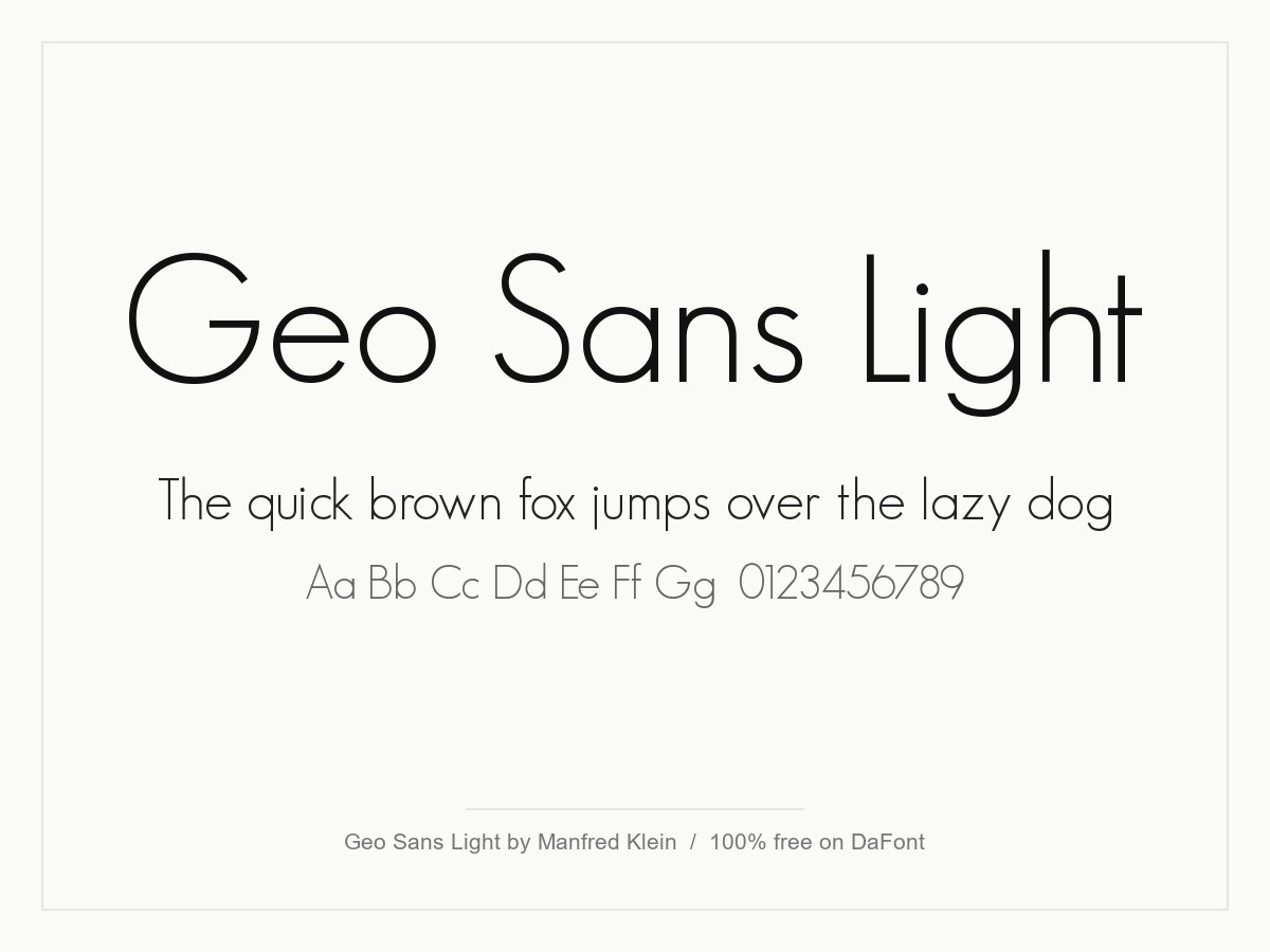
A thin, airy geometric sans by Manfred Klein, and one of the originals from this list. It has a single light weight and an oblique, so it is a headline and logo font, not a text face. Set it large with some extra letter spacing for beauty, wellness and interior brands.
- Style: Light geometric sans
- Weights: One (Light), plus an oblique
- Characters: 235 glyphs, including accented letters
- Designer: Manfred Klein
- Licence: 100% free, including commercial use (as listed on DaFont)
- Source: Download on DaFont
Grotesque and neo-grotesque fonts
Neutral, slightly tighter sans serifs in the Helvetica tradition. They do not shout, which is why so many clean, modern brands and interfaces use them.
6. Inter
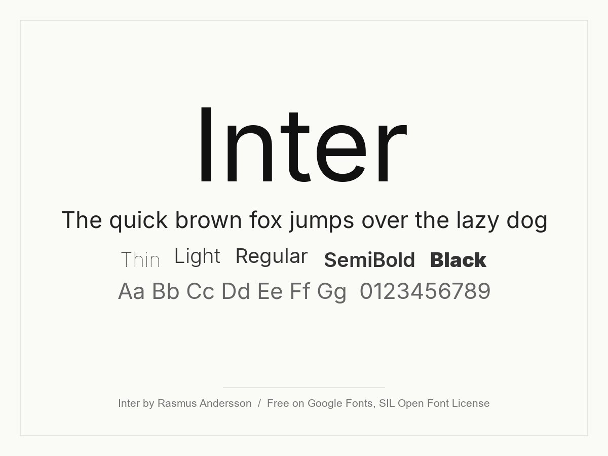
Inter was designed by Rasmus Andersson for computer screens, with a tall x-height and open shapes that stay readable at small sizes. It is the default choice for many product teams and design systems. For a minimal website or app, it is hard to beat as a body and UI font.
- Style: Neo-grotesque UI sans
- Weights: Variable, 100 to 900, with italics and an optical size axis
- Languages: Latin, Cyrillic, Greek and Vietnamese
- Designer: Rasmus Andersson
- Licence: Free for personal and commercial use (SIL Open Font License)
- Source: Download on Google Fonts
7. Roboto
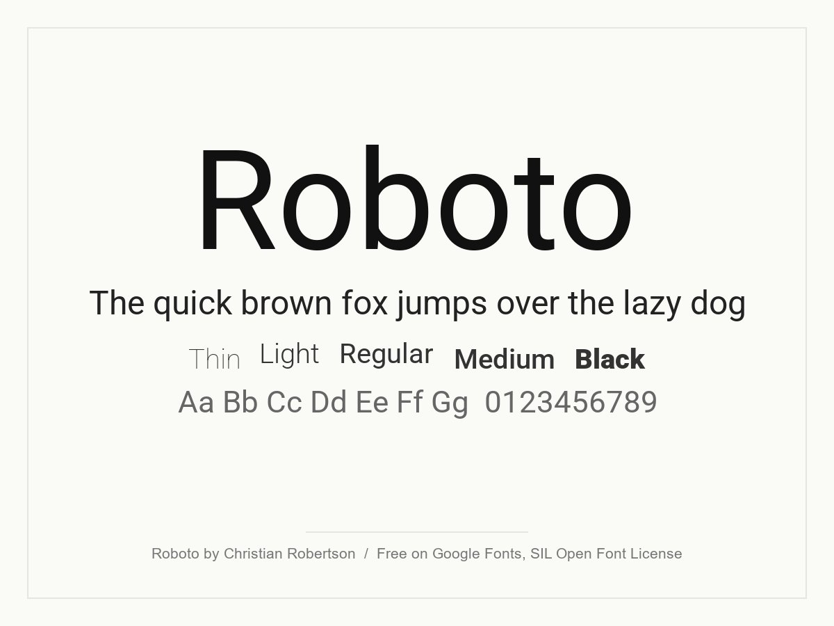
Google’s Android font, and one of the originals from this list. It mixes a mechanical, neo-grotesque skeleton with open, friendly curves, so it reads well in long text. The huge language support and width axis make it a safe, neutral pick for interfaces and corporate sites.
- Style: Neo-grotesque sans
- Weights: Variable, 100 to 900, with italics and a width axis
- Languages: Latin, Cyrillic, Greek and Vietnamese
- Designer: Christian Robertson
- Licence: Free for personal and commercial use (SIL Open Font License)
- Source: Download on Google Fonts
8. Manrope
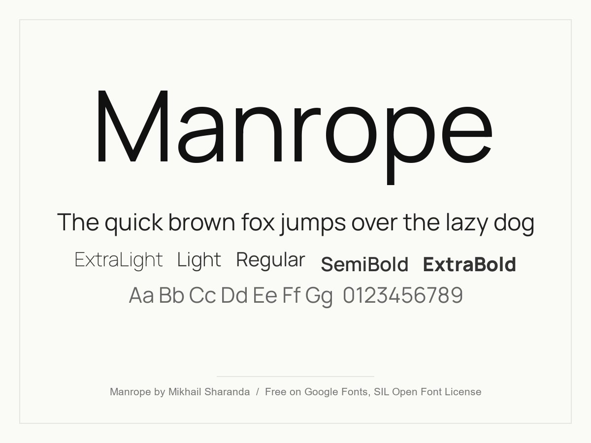
A modern sans that sits between grotesque and geometric, with slightly condensed letters and very even colour. It looks technical but warm, which suits fintech, SaaS dashboards and minimal portfolios. The light weights are good for big, quiet headlines.
- Style: Semi-condensed grotesque with geometric details
- Weights: Variable, 200 to 800
- Languages: Latin, Cyrillic, Greek and Vietnamese
- Designer: Mikhail Sharanda
- Licence: Free for personal and commercial use (SIL Open Font License)
- Source: Download on Google Fonts
9. Space Grotesk
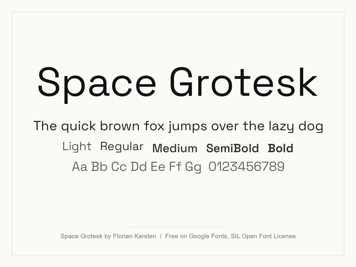
Space Grotesk grew out of the monospaced Space Mono, and it keeps some of its quirky letter shapes. That gives a clean layout a bit of personality. It is a good fit for tech, crypto, architecture and creative studios.
- Style: Grotesque with mono-inspired details
- Weights: Variable, 300 to 700
- Languages: Latin and Vietnamese
- Designer: Florian Karsten
- Licence: Free for personal and commercial use (SIL Open Font License)
- Source: Download on Google Fonts
10. Work Sans
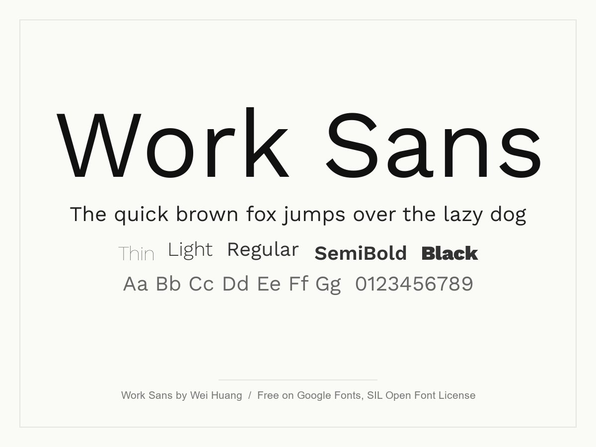
Based loosely on early grotesques, Work Sans has wide letters and simple shapes. The middle weights are tuned for screen text, and the extremes work as display type. Use it for websites, posters and brands that want a clean look with a slight vintage edge.
- Style: Grotesque sans
- Weights: Variable, 100 to 900, with italics
- Languages: Latin and Vietnamese
- Designer: Wei Huang
- Licence: Free for personal and commercial use (SIL Open Font License)
- Source: Download on Google Fonts
Humanist sans serif fonts
Humanist fonts follow the shapes of handwriting, with open curves and slight changes in stroke width. They feel warmer than geometric fonts and are very easy to read in long text.
11. Source Sans 3
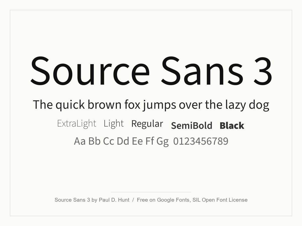
Adobe’s first open source type family, designed by Paul D. Hunt. It is clear, unfussy and comfortable in long passages, so it works for documentation, reports and content-heavy websites. Source Serif 4, further down this list, is designed to sit next to it.
- Style: Humanist sans
- Weights: Variable, 200 to 900, with italics
- Languages: Latin, Cyrillic, Greek and Vietnamese
- Designer: Paul D. Hunt (Adobe)
- Licence: Free for personal and commercial use (SIL Open Font License)
- Source: Download on Google Fonts
12. Open Sans
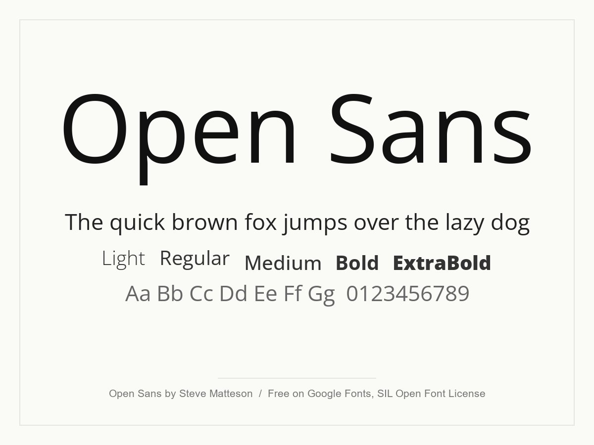
Open Sans has upright stress, open shapes and a neutral, friendly tone. It is one of the most readable free fonts for body text on screens and in print. It covers a long list of scripts, including Hebrew, which makes it practical for multilingual sites.
- Style: Humanist sans
- Weights: Variable, 300 to 800, with italics and a width axis
- Languages: Latin, Cyrillic, Greek, Hebrew and Vietnamese
- Designer: Steve Matteson
- Licence: Free for personal and commercial use (SIL Open Font License)
- Source: Download on Google Fonts
13. Hattori Hanzo
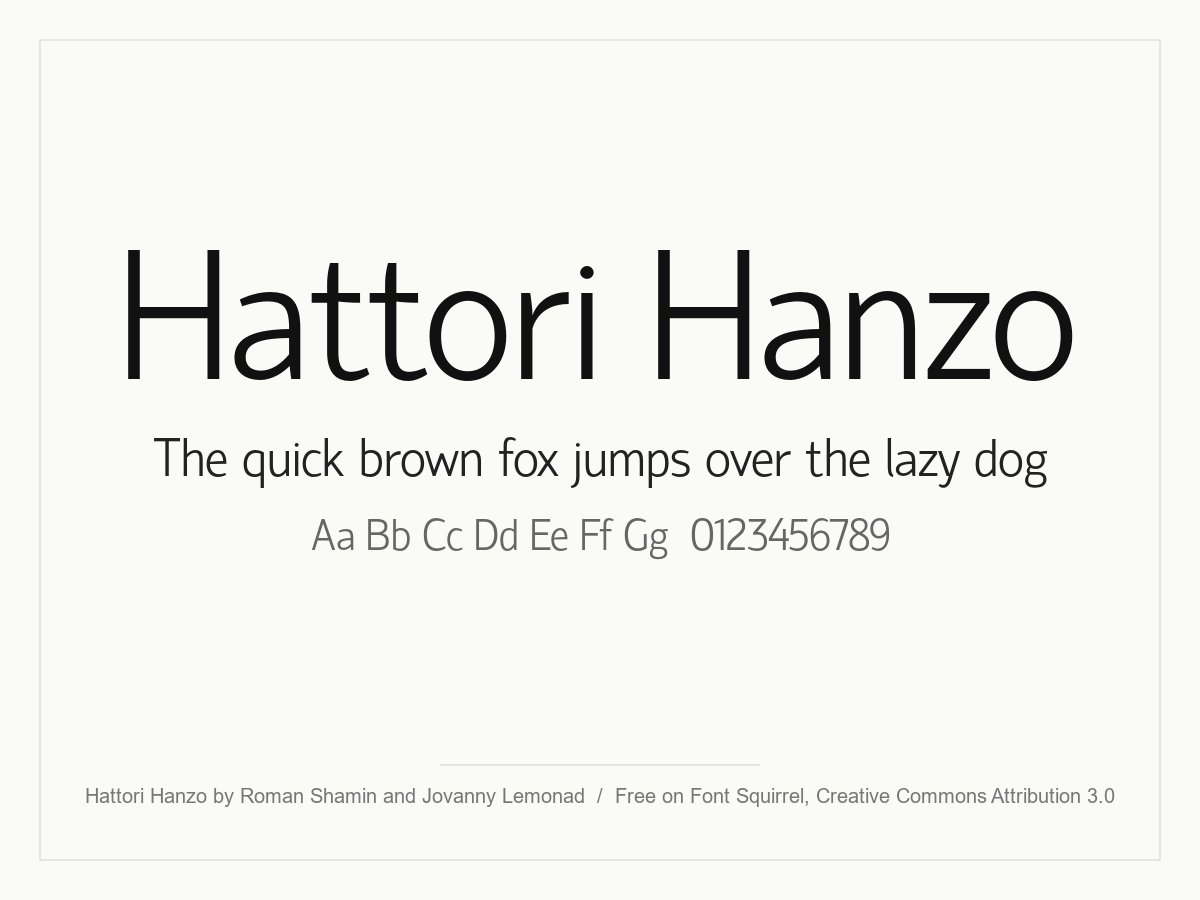
A light, slightly condensed sans with soft curves and a calm rhythm, and one of the originals from this list. It has a regular and an italic, so it is best for headings, packaging and short text. The licence allows commercial use as long as you credit the designers.
- Style: Light humanist sans
- Weights: One (Regular), plus an italic
- Designer: Roman Shamin and Jovanny Lemonad
- Licence: Free for personal and commercial use with credit to the designers (Creative Commons Attribution 3.0)
- Source: Download on Font Squirrel
Minimal serif fonts
Minimalism is not only sans serif. These serifs have clean details and plenty of white space, so they bring a calm, editorial feel to a simple layout.
14. Instrument Serif
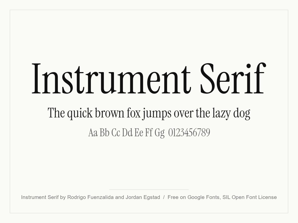
A condensed display serif with sharp, simple serifs and a contemporary look. It is a favourite for big editorial headlines on minimal websites, often paired with a neutral sans such as Inter. It only comes in Regular and Italic, so use it for headlines and quotes.
- Style: Condensed display serif
- Weights: One (Regular), plus an italic
- Languages: Latin
- Designer: Rodrigo Fuenzalida and Jordan Egstad
- Licence: Free for personal and commercial use (SIL Open Font License)
- Source: Download on Google Fonts
15. Cormorant Garamond
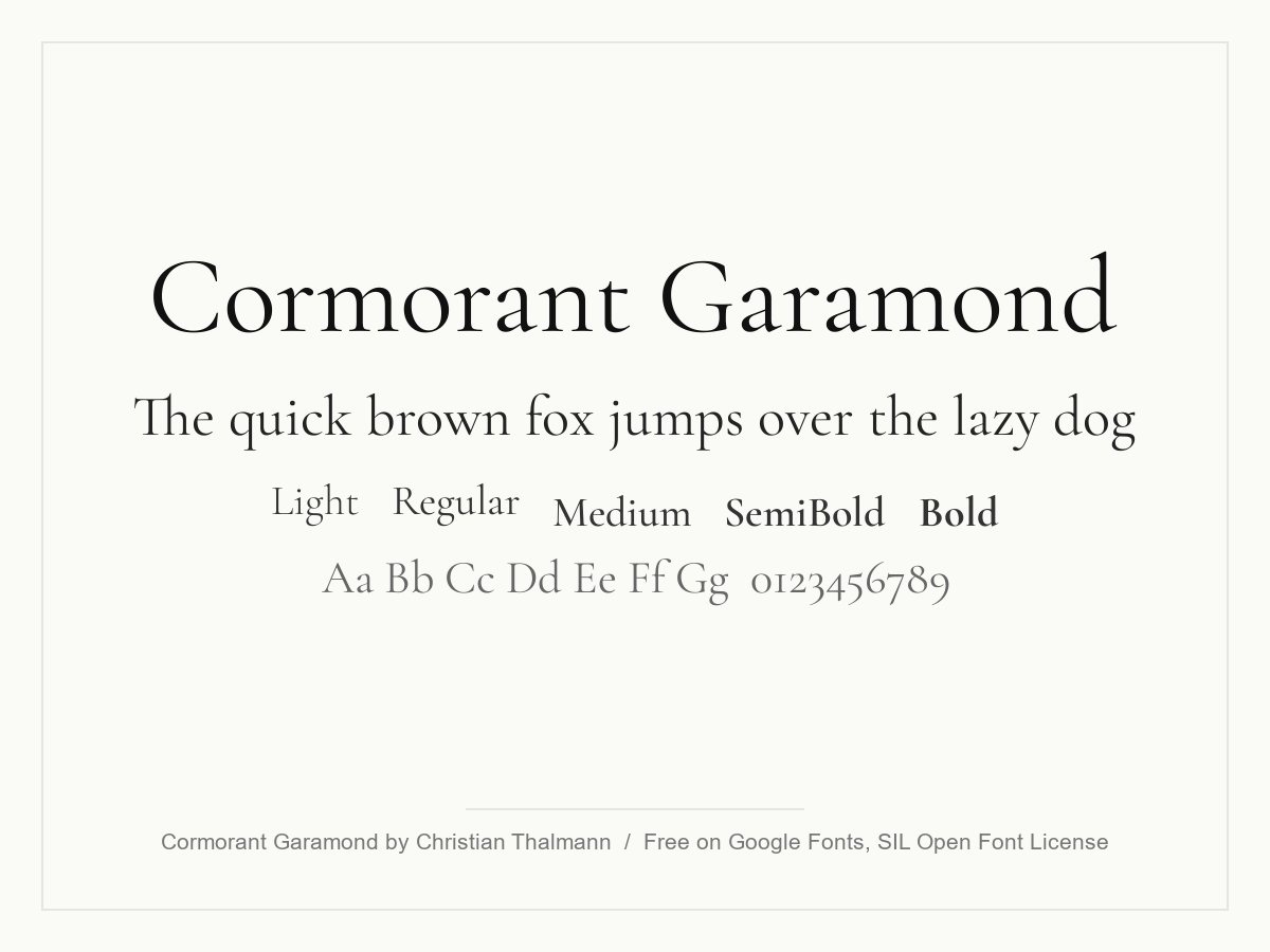
A refined Garamond-style display serif with high contrast and small, delicate details. It looks quietly luxurious in large sizes, which makes it popular with fashion, beauty, wedding and hospitality brands. At small sizes the thin strokes fade, so keep it for headings.
- Style: High-contrast Garamond display serif
- Weights: Variable, 300 to 700, with italics
- Languages: Latin, Cyrillic and Vietnamese
- Designer: Christian Thalmann
- Licence: Free for personal and commercial use (SIL Open Font License)
- Source: Download on Google Fonts
16. Source Serif 4
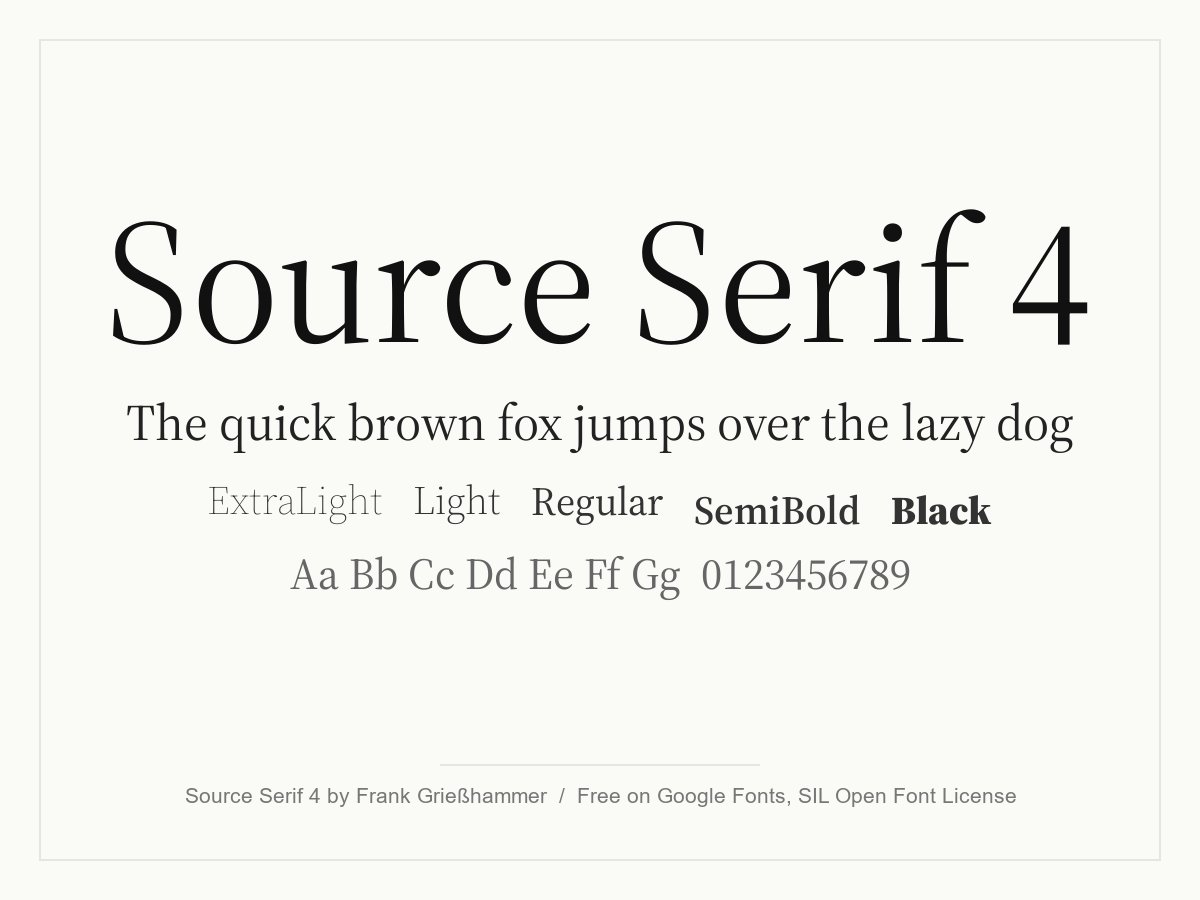
A sturdy transitional serif from Adobe, designed by Frank Grießhammer as a partner for Source Sans. Its optical size axis adjusts the letters for captions, body text and big headlines. Choose it when a minimal site needs serious, readable long-form text.
- Style: Transitional text serif
- Weights: Variable, 200 to 900, with italics and an optical size axis
- Languages: Latin, Cyrillic, Greek and Vietnamese
- Designer: Frank Grießhammer (Adobe)
- Licence: Free for personal and commercial use (SIL Open Font License)
- Source: Download on Google Fonts
17. Newsreader
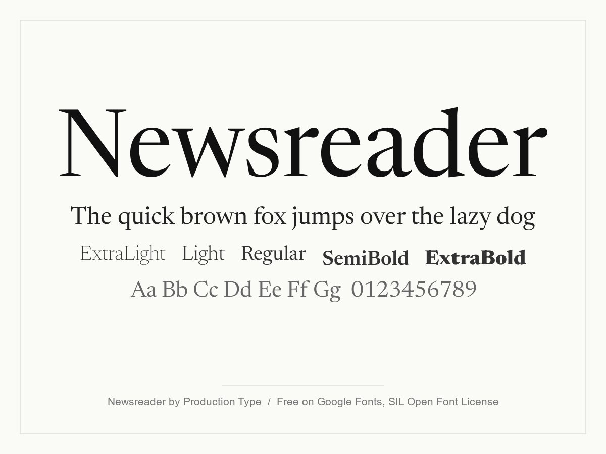
Production Type designed Newsreader for reading news and long articles on screen. It has a gentle, contemporary feel and a wide optical size range, so it looks good in both headlines and body text. It suits blogs, magazines and any content-first brand.
- Style: Contemporary text serif
- Weights: Variable, 200 to 800, with italics and an optical size axis
- Languages: Latin and Vietnamese
- Designer: Production Type
- Licence: Free for personal and commercial use (SIL Open Font License)
- Source: Download on Google Fonts
Minimalist display fonts
Fonts made for big sizes: logos, posters, hero headings. Use them for a few words and let a simpler font handle the rest.
18. Raleway
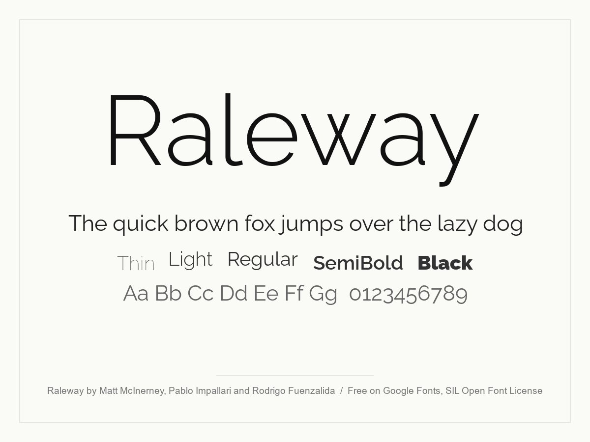
Raleway started as a single thin weight and grew into a full family, and it is one of the originals from this list. Its light weights, distinctive w and old-style numbers give it an elegant, airy look. It works best for headings and logos; for body text, switch on lining numbers or use a plainer sans.
- Style: Elegant display sans
- Weights: Variable, 100 to 900, with italics
- Languages: Latin, Cyrillic and Vietnamese
- Designer: Matt McInerney, Pablo Impallari and Rodrigo Fuenzalida
- Licence: Free for personal and commercial use (SIL Open Font License)
- Source: Download on Google Fonts
19. Bebas Neue
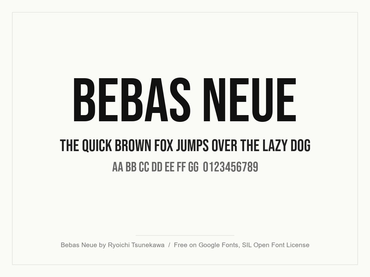
A tall, condensed, all-caps sans that has become a standard for posters, film titles and bold web headers. The narrow letters let you set a big headline in a small space. Pair it with a neutral sans for the body text, and add a little letter spacing at smaller sizes.
- Style: Condensed all-caps display sans
- Weights: One (Regular)
- Languages: Latin
- Designer: Ryoichi Tsunekawa (Dharma Type)
- Licence: Free for personal and commercial use (SIL Open Font License)
- Source: Download on Google Fonts
20. Telegrafico

A wide, all-caps geometric font by Salvo Nicolosi, and one of the originals from this list. The stretched letters look technical and spacious, which suits tech logos, music covers and short headings. It only has capitals and a basic character set, so test your words before you commit.
- Style: Wide all-caps geometric display
- Characters: 57 glyphs in an all-caps design
- Designer: Salvo Nicolosi (ficod)
- Licence: Free for personal use. The designer asks for a donation if you use it in paid work
- Source: Download on DaFont
How to use minimalist fonts well
A clean font does not make a clean design on its own. With so little decoration, every choice about weight, size and spacing shows. These habits keep minimal type looking deliberate rather than empty.
Build hierarchy with weight and size
Use one family and create contrast with weights: for example Light or Regular for body text, SemiBold for subheadings and a large, lighter weight for the main headline. A big jump in size reads as more confident than a small one. Two or three sizes on a page are usually enough.
Give the type room
Minimal layouts depend on white space. Set body text at a comfortable size (16 to 18px on the web), use a line height of about 1.4 to 1.6, and keep lines to roughly 60 to 75 characters. Tighten the line height for large headlines, where the default looks too loose.
Adjust letter spacing by size
Large headlines in geometric fonts often look better with slightly tighter tracking. Small capitals, labels and all-caps fonts such as Bebas Neue need a little extra space to stay readable. Our post on letter spacing in web design explains how small changes affect readability.
Pair with contrast, not with more of the same
Two similar sans serifs fight each other. Pair a minimalist sans with a minimal serif instead, such as Inter with Instrument Serif, DM Sans with Newsreader or Source Sans 3 with Source Serif 4. Or keep one family for everything. See our font pairing tips for more combinations, and our guide on how to choose the perfect font for your design.
Test on real screens
Thin weights such as Geo Sans Light, Raleway Thin or Cormorant Garamond Light can disappear on phones and low-contrast backgrounds. Check your type at real size on a phone before you sign off, and keep hairline weights for large headings only.
For more typography advice, read our typography tips for better website design and our overview of font trends in web design. If you are building a clean brand from scratch, our minimalist logo design ideas show how simple type works in a logo, and our list of serif fonts has more options for a classic partner.
Frequently asked questions
What is the most minimalist font?
There is no single answer, but geometric sans serifs are the purest form of minimalist type. Jost, DM Sans and Outfit are good free choices. If you want something neutral rather than geometric, Inter is the most versatile clean font on this list.
Are minimalist fonts free for commercial use?
Many are. All the Google Fonts in this list use the SIL Open Font License, so you can use them in client work, logos and products for free. Geo Sans Light is listed as 100% free, Hattori Hanzo needs a credit to its designers, and Telegrafico is free for personal use only.
What clean font is similar to Apple’s?
Apple uses its own San Francisco family, which is licensed only for designing for Apple platforms. Inter is the closest free alternative for websites and apps. It is also a neo-grotesque designed for screens, with a similar tall x-height and neutral tone.
Should I use a serif or a sans serif for a minimalist brand?
Use a sans serif if you want the brand to feel modern, technical or friendly. Choose a minimal serif such as Instrument Serif or Cormorant Garamond for a more editorial, premium or classic feel. Many minimal brands use both: a serif for headlines and a sans serif for everything else.
Need a clean, minimal brand for a client?
Inkyy is a white label design and development team for agencies. Our in-house designers choose, pair and license fonts as part of every logo, brand identity and website we create under your brand. See our design services or book a 15-minute call.


