Blue Color Meaning: Psychology, Shades and Blue Logos
 8 min read
The blue color meaning most people agree on is trust: calm, stable, competent and safe. That is why so many banks, tech companies, airlines and healthcare brands reach for blue first, and why it is also one of the hardest colors to stand out with.
This guide explains what blue means in psychology and culture, what different shades of blue signal (with hex codes), which industries use it and why, and what famous blue logos teach. You will also find blue color pairings, the contrast rules for bright blues, and the mistakes that make blue branding feel generic.
What does the color blue mean?
Blue is the color of the sky and the sea, so it carries ideas of space, depth and calm. On the positive side it stands for trust, loyalty, intelligence, peace and reliability. On the negative side it can feel cold, distant or conservative, and in English “feeling blue” means feeling sad.
Blue was once rare and costly. The ancient Egyptians made one of the first synthetic pigments, Egyptian blue, and in Renaissance Europe ultramarine was ground from lapis lazuli and was at times valued as highly as gold. Painters often saved it for the robes of the Virgin Mary. Chemistry is still finding new blues: YInMn blue was discovered by accident in a university lab in 2009.
What research says about blue
Blue is very popular. A YouGov survey in 10 countries across four continents found blue was the most liked color in every one of them.
Claims about what blue does to the mind need more care. A 2009 study in Science by Mehta and Zhu suggested blue helped creative tasks while red helped detail work, but a later replication attempt did not find the same effect. A review of color psychology by Andrew Elliot makes the wider point: context matters a lot. Blue supports a message of trust, but it cannot create trust on its own.
Blue in different cultures
- Europe and North America: blue is linked with authority, calm and corporate life, from police uniforms to the “blue chip” stocks of the business world.
- Middle East and Mediterranean: blue nazar amulets are used to ward off the evil eye, so blue also suggests protection.
- South Asia: Hindu gods such as Krishna and Vishnu are often shown with blue skin, linking the color with the divine and the infinite.
- East Asia: several languages, including Chinese and Japanese, have long used one word for both blue and green, so the line between the two is less sharp than in English.
To see why these associations shape how a brand is judged, read our article on the psychology behind branding.
Shades of blue and what they signal
Blue runs from pale powder blue to near-black navy, and the message changes along the way. The contrast column shows how each shade works as text on white. WCAG asks for at least 4.5:1 for body text and 3:1 for large text.
| Shade | Hex | What it signals | Contrast on white |
|---|---|---|---|
| Powder blue | #B0E0E6 | Soft, clean, gentle | 1.4:1 |
| Baby blue | #89CFF0 | Fresh, young, friendly | 1.7:1 |
| Dodger blue | #1E90FF | Bright, digital, energetic | 3.2:1 |
| Azure | #007FFF | Open, modern, optimistic | 3.8:1 |
| Royal blue | #4169E1 | Confident, lively, dependable | 4.8:1 |
| Cobalt | #0047AB | Strong, professional, clear | 8.4:1 |
| Navy | #000080 | Serious, established, formal | 16.0:1 |
Light blues feel airy and calm, so they suit wellness, travel, baby products and cleaning brands. Mid blues feel friendly and digital. Dark blues feel serious and expert, which is why navy is so common in finance, law and consulting.
The TOMS logo shows how a light blue can still feel strong. Its pale blue and white stripes recall the flag of Argentina, where the brand’s story began, and black type does the reading work that light blue cannot.
Which industries use blue, and why
- Banks, insurance and payments: navy and cobalt suggest stability and care with money.
- Tech and software: bright blues feel clean, logical and digital. That is one reason so many apps and platforms use them.
- Healthcare and pharmacy: blue feels clinical and calm. See our roundup of pharmacy logos for examples.
- Law and professional services: dark blue reads as expert and discreet. Our list of law firm logos shows how common it is.
- Travel, water and cleaning: light blues suggest sky, sea and freshness.
HP’s blue circle is a classic tech example: a single friendly blue, a simple shape and two letters that still read at very small sizes.
Famous blue logos and what they teach
These logos are shown as editorial examples only. Each one is a trademark of its owner.
IBM
IBM’s striped logo was designed by Paul Rand, and the company is so tied to the color that it is nicknamed “Big Blue”. It shows how a blue brand can become a name in its own right when the color is used for decades without change.
Samsung
Samsung uses a deep, rich blue. Its corporate logo puts white letters inside a blue ellipse, and the plain wordmark shown here appears across its products and marketing. The open A, with no crossbar, gives a common color a detail people remember.
LinkedIn’s mid blue fits a network built on careers and professional trust. Blue is common across social apps, so LinkedIn leans on its “in” box, which works on its own as an app icon. It is a good reminder to plan a compact mark, not just a color.
American Express
The American Express “Blue Box” puts white lettering on a bright blue square. The box makes the logo easy to spot on a card, a shop door or a payment screen. In finance, where navy is everywhere, a brighter blue helps a brand feel modern without losing trust.
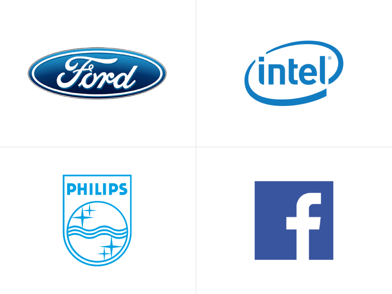
Ford
Ford’s Blue Oval has framed its script wordmark for nearly a century. The deep blue gives a heritage feel, while the script adds a human, handmade touch. It shows that a blue logo does not have to feel cold.
Blue color pairings and palettes
Blue is easy to pair. These pairings are a good start.
- Navy and orange (#000080 + #FFA500): opposite colors on the wheel, so the pair feels lively and balanced. About 8.1:1 contrast.
- Navy and gold (#000080 + #FFD700): classic, premium and confident. About 11.4:1, so gold text on navy reads well.
- Cobalt and white (#0047AB + #FFFFFF): clean and corporate. About 8.4:1, safe for buttons and links.
- Powder blue and dark slate (#B0E0E6 + #1F3A5F): soft but readable, about 8.0:1. It suits wellness, healthcare and baby brands.
- Blue and green: fresh and natural, popular with water, energy and eco brands. Our guide to green in branding covers that side.
Our guide to color schemes in web design shows how to balance a palette like this across a website.
Accessibility and contrast with blue
Dark blues are among the easiest colors to use accessibly. Navy and cobalt pass body text contrast on white with plenty of room. The trap is the bright middle of the range. White text on a bright #1E90FF button is only about 3.2:1, which fails for normal text. Royal blue (#4169E1) passes at about 4.8:1, and darker blues give more margin.
Light blues are background colors, not text colors. Powder blue on white is about 1.4:1. Blue is also the shade most often used for links, so keep links underlined or clearly different in weight, not only in color. Blue and purple can be hard to tell apart for people with some types of color blindness, so add labels to charts. Check every pair in the free WebAIM contrast checker.
Common mistakes with blue branding
- Blending in. Blue is so common in finance and tech that a generic mid blue looks like every competitor. Pick a clear shade and give it a distinctive shape or accent.
- Too cold. A layout of only navy and gray can feel distant. Add a warm accent, friendly type or real photography.
- Bright blue buttons with white text. Many popular bright blues fail contrast. See the table above.
- No plan for small sizes and dark mode. Navy can vanish on a dark background. Our post on logo variations explains which versions every brand needs, and our article on bad branding covers more traps like this.
Is blue right for your brand?
Blue fits brands that want to feel trustworthy, calm, expert or dependable: finance, tech, healthcare, law, travel and B2B services. It is a harder fit for brands that need to feel warm, indulgent or urgent unless you pair it with a warm accent.
Compare it with its neighbors before you decide. Green shares blue’s calm but adds nature and growth, while purple is more creative and premium. Red, orange, yellow, pink and brown each take a brand somewhere else. Our hub on brand colors brings the whole series together, with a step-by-step method for building a palette.
Frequently asked questions
What does the color blue mean in branding?
Blue usually signals trust, reliability, calm and expertise. Dark blues feel serious and established, while light blues feel fresh, open and gentle.
What are the negative meanings of blue?
Blue can feel cold, distant, conservative or sad. In crowded sectors such as banking and tech, it can also make a brand look generic.
Why do so many tech and finance companies use blue?
Blue suggests stability and clear thinking, which both sectors want to signal. It is also widely liked and reads well on screens, which makes it a low-risk choice.
What colors go well with blue in a logo?
Orange, gold, white, cream, green and cool grays all pair well with blue. Orange and gold add warmth, while white and gray keep it clean and corporate.
Can I use these logos?
No. The logos shown here are trademarks of their owners and appear only as editorial examples. Use them to study how blue works, then design something original.
Need a blue brand identity for a client?
Inkyy is a white label design and development team for agencies. Our in-house brand designers build complete identities, from logo and brand colors to guidelines, that you deliver under your own brand. See our design services or book a 15-minute call.