



18 Law Firm Logo Ideas and What Makes Each One Work
 8 min read
A law firm logo has one job before it has any style: make a nervous stranger feel the firm is competent and safe to call. Most firms reach for the same few symbols to do it, so the real work is making a familiar idea feel specific to one practice.
Below are 18 law firm logo designs, grouped by approach: columns, scales, shields, monograms and animals. For each one we note what works and what kind of practice it suits, so you can take the ideas, not the artwork, into your own lawyer logo.
What a law firm logo says about a firm
- Columns and temples: courts, institutions and permanence. Safe, but easy to make generic.
- Scales and gavels: fairness and the courtroom. The most overused symbols in the niche.
- Shields and swords: protection and defence. A good match for injury, criminal and insurance work.
- Monograms and seals: heritage and partner names. Useful for long names and solo attorneys.
- Animals: character. An owl says wisdom, a lion says strength, a dog says loyalty.
Clients often arrive stressed, so restraint pays. A calm palette such as navy, charcoal or deep green, gold or copper used sparingly, and clear serif or clean sans-serif type all signal trust. For more on why, see our piece on the psychology behind branding and the role of blue in branding.
The common traps are the gavel and scales clip art everyone has seen, thin gold lines that vanish at small sizes, and a mark that could belong to any firm in any city. The examples below avoid most of them.
18 law firm logo ideas
Columns and pillars
Columns say court, institution and permanence. They are the safe choice for a firm that wants to look established, so the trick is making one that still feels like your firm.
1. Horsley Law Center
A gold Ionic column doubles as the letter H, so the initial and the law symbol are one shape. Gold on near-black navy feels formal without being loud. The firm name sits below in a classic serif, which keeps the whole mark traditional. Design by Rifqi Fadhlurrahman Halim on Dribbble.
2. Providentia Law
A flat navy temple front sits above the name in serif capitals, with LAW spaced out between two rules. It uses one colour and no tricks, so it will print and stamp cleanly. The temple is a very common law symbol, so the spaced typography does most of the work of making it feel like a real firm. Design by RudiVixel on 99designs.
3. Mirzaian Law Firm
A thin gold circle carries the firm name around a simple column. The seal format suits stationery, certificates and foil stamping, and it signals tradition. Fine lines need a heavier version for small web sizes. Design by wcosta design on 99designs.
Scales, gavels and justice symbols
Scales and gavels are the clichés of the niche. They still work when the designer gives them a twist or a clear job in the layout.
4. Houston Law Firm
The letter H is built from a gavel, with the head and handle forming the uprights and the crossbar. It is one idea in one colour and instantly readable. This kind of initial-plus-object mark suits a firm whose name starts with a strong letter. Design by Maskon Brands on Dribbble.
5. Sam Law Firm
The scales stand on a pen nib, which links justice with drafting and advocacy. The condensed capitals give it a modern, compact feel next to the gold symbol. The tagline in the artwork is placeholder text, so replace it in a real project. Design by Ryan Fauzi on Dribbble.
6. Accident Injury Resource

The scales are drawn tilted, as if weighing a claim, with an ornate stem that gives them a hand-drawn character. One dark teal-blue colour keeps it calm. It was made for a lawyer referral service for accident victims, and it shows how a tilt can add story to a standard symbol. Design by csoki on 99designs.
Shields and crests
A shield says protection and defence. It fits criminal defence, injury and insurance work, where clients want someone on their side.
7. Shield Law Firm
Scales sit inside a shield outline whose top edge reads like an open book. Muted gold on deep indigo is a classic pairing, and the widely spaced serif keeps it dignified. Several ideas are packed into one line drawing, so keep the stroke weight even when you scale it down. Design by Ahmed mahmoud on Dribbble.
8. Midas Law
A bearded king in a crown is drawn in clean black lines inside a shield. The name and the king are a neat pun, and the slab serif wordmark matches the strong lines. It works in black and white, which suits a confident boutique firm. Design by Dániel Domonkos on Dribbble.
9. The Sepulveda Law Group
A sword runs down through a nested shield, a direct picture of defending a client. Two tones of blue keep it corporate and calm. A good model for firms in disputes and litigation, though a sword can read as aggressive if the rest of the brand is not warm. Design by Yantoagri on 99designs.
10. The S.C. Law Firm
A blindfolded Lady Justice portrait sits in a brown shield, paired with a script “The” and sturdy capitals. It is more illustrative than most marks here, which gives it warmth. Make a simplified icon for small sizes, because the portrait detail will blur at favicon scale. Design by Tijana M. on 99designs.
Monograms and initials
Initials suit firms with long partner names and solo practitioners who want a lawyer logo that feels personal. The challenge is making the letters unique.
11. Henry Eye Legal Services
An H with an eye inside its crossbar turns the name into a symbol of vigilance and insight. Copper on dark green feels rich and a little unexpected for the sector. The mark is simple enough to emboss, stamp or use as a social avatar. Design by Kanades on Dribbble.
12. Peter Harrison Attorney at Law
The P and H share a stem in an outline monogram, stacked over a widely spaced slab serif name. The bright blue on near-black reads clearly on screens. This is a tidy template for a solo attorney who wants a personal mark. Design by Dusan Klepic on Dribbble.
13. Miller Weaver
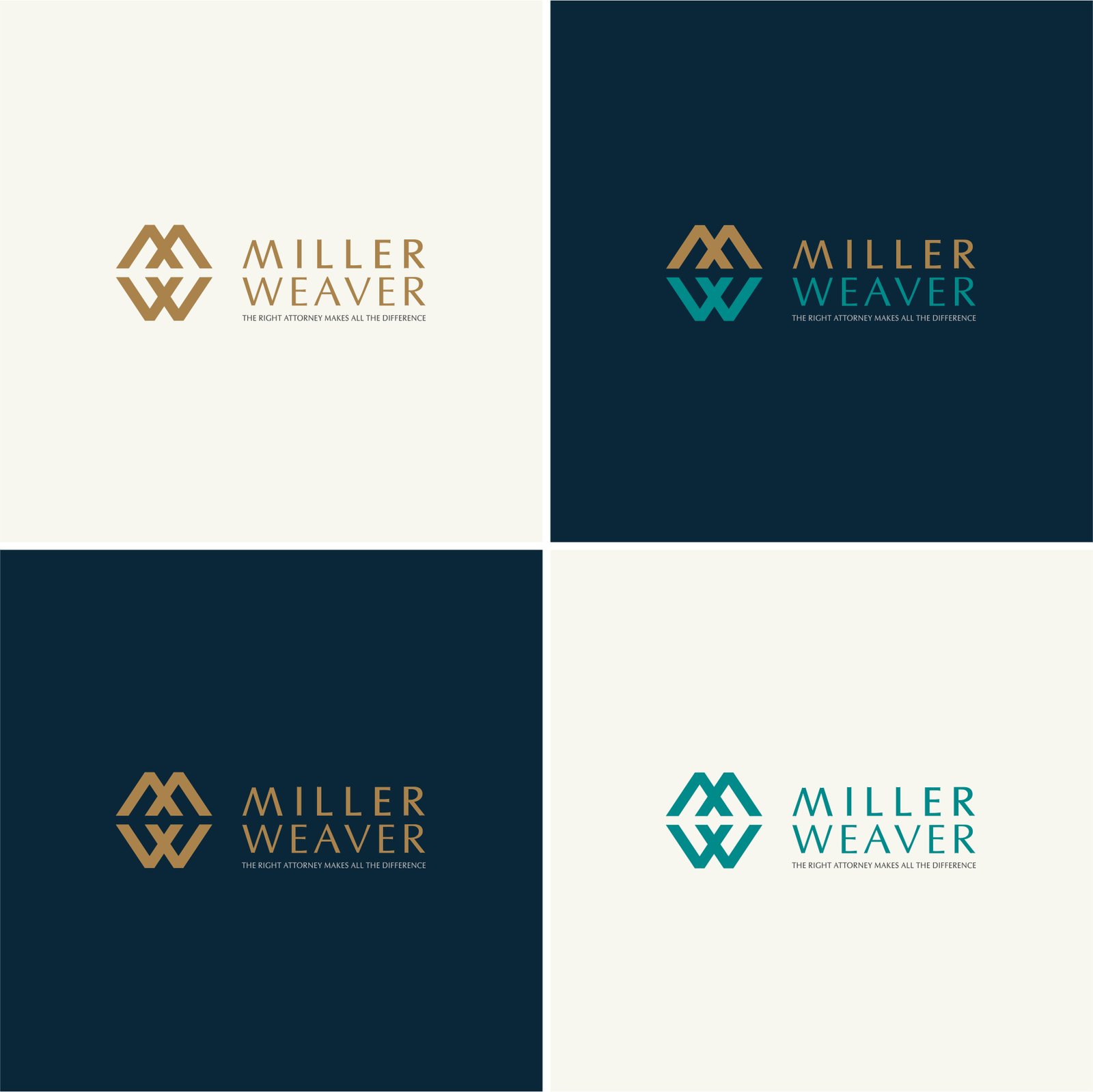
The M and W interlock into one geometric mark beside a light serif wordmark. The board shows it in gold and teal on cream and navy, which proves the logo holds up in more than one colour. A good reference for presenting a monogram system to a client. Design by Bitza_Z on 99designs.
14. Merbaum & Becker
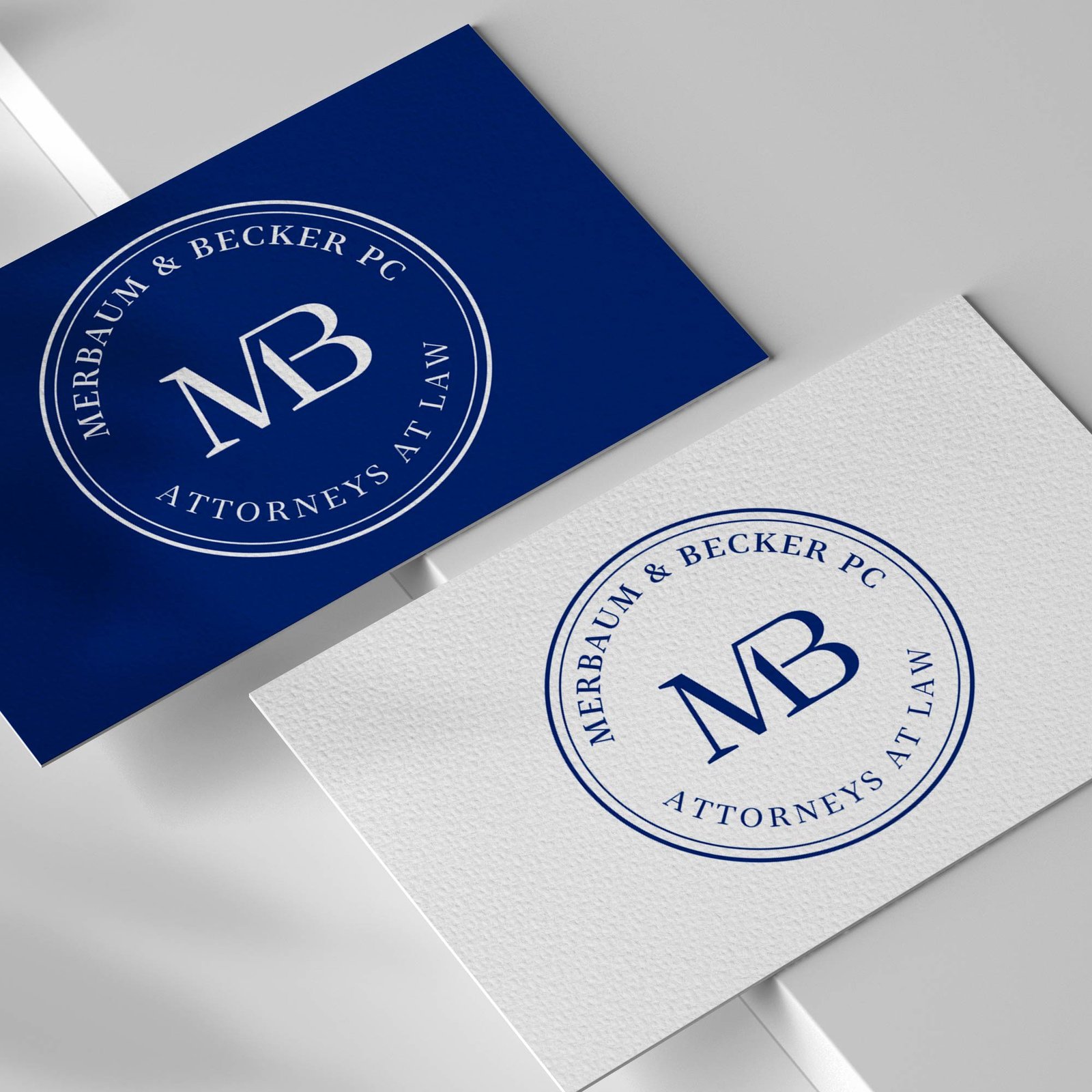
An MB monogram sits inside a ring that carries the firm name and “Attorneys at Law”, shown on navy and white business cards. The ring gives it the weight of a notary seal. It suits an established partnership that wants to look serious on paper. Design by Xevora on 99designs.
Animals and mascots
Animals add personality to a sector that tends to look alike. Pick the animal for what it says about your firm, not because it looks good.
15. Wise Law
An owl whose body is an Ionic column, so wisdom and the courthouse arrive in one shape. The muted taupe on charcoal feels calm and scholarly, not aggressive. It would suit a firm that sells advice more than courtroom battles. Design by square69 on Dribbble.
16. Denktaş Law Firm
A black owl sits between two laurel branches with a small gavel at its base, next to spaced sans-serif capitals. Solid black shapes make it tough and easy to reproduce. The wide horizontal layout works well in a website header. Design by Seyhan on Dribbble.
17. McKenzie Law Firm
A seated lion is drawn in one confident orange outline against navy. The line style is modern and the colour contrast is strong. Lions signal strength and authority, which suits a firm that wants to feel assertive without looking old-fashioned. Design by Creoeuvre on Dribbble.
18. Alphadog Law Firm
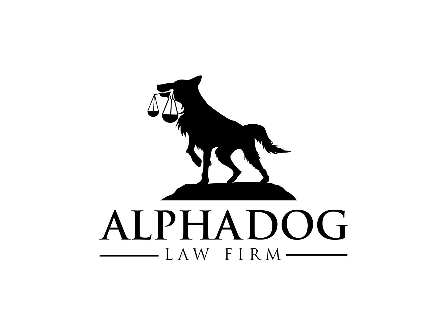
A dog stands on a mound with the scales of justice hanging from its mouth. It is a literal picture of a loyal, loud advocate, and the solid silhouette works in one colour. It is playful, so it suits a firm with a bold personal-injury or trial reputation. Design by VectoruX on 99designs.
Tips for designing a law firm logo
- Choose the message first. Decide whether the firm should feel traditional, protective or modern, then choose a symbol that fits. Our key principles of logo design are a good checklist.
- Avoid the obvious pair. If you use scales or a gavel, give it a twist, such as the pen nib or the letter H above, or skip it and lead with initials.
- Keep it simple. A law firm logo appears on letterheads, stamps, court filings and phone screens. Try one-colour and small versions. Our minimalist logo ideas show how little a mark needs.
- Use gold and navy with care. They are the default for the sector. Charcoal, deep green or burgundy can set a firm apart while still feeling serious.
- Plan the variations. You will need a full logo, an icon, and a one-colour version. See the logo variations guide.
- Choose type that reads. A clear serif or a clean sans-serif beats a decorative script for the firm name.
Want more inspiration? Browse our luxury logo ideas, lion logo designs and monogram icon vectors. If you also need a site for the firm, read our guide to web design for a family lawyer, and see all our design services.
Frequently asked questions
What makes a good law firm logo?
It looks serious, stays clear at small sizes and tells people what the firm stands for. Simple shapes, a limited palette and readable type matter more than a clever illustration.
What symbols are used in law firm logos?
The most common are scales of justice, columns, gavels, shields and initials. Animals such as owls and lions are used for wisdom and strength.
What colours work for a lawyer logo?
Navy, charcoal and deep green suggest trust and stability. Gold or copper adds a premium touch. Use bright colours only as a small accent.
Can I use these logos?
No. Every design here belongs to its designer. Use them for inspiration on style, shape and colour, then have an original logo made for your firm.
Need a logo for a client?
Inkyy is a white label design and development team for agencies. Our in-house brand designers create original logos and full identities that you deliver under your own brand. See our design services or book a 15-minute call.


