


15 Beautiful Fonts for Websites, All Free for Commercial Use
When it involves creating professional-looking websites, it is vital to think about the colors and pictures you employ and also the fonts. Inkyy's list of 15 fonts that will upgrade your web design is here.
 10 min read
Beautiful fonts do more than look good. They set the tone of a website, make text easy to read and help visitors trust a brand within seconds. The hard part is choosing beautiful fonts that are readable on every device, load quickly and are licensed for commercial work.
We picked 15 beautiful fonts for websites and grouped them into sans serif, condensed and rounded sans serif, and serif and slab serif styles. Every font has a specimen, its weights, the languages it covers, its designer and a checked licence. All 15 are free for commercial use on Google Fonts.
What to check before you choose a website font
- Licence. Fonts on Google Fonts use the SIL Open Font License, which allows commercial use, including client work. Many fonts on other sites are free for personal use only. Always read the licence.
- Readability. Test the font at body size on a phone. Letters should be open, with clear differences between characters such as I, l and 1.
- Weights. A family with several weights lets you build hierarchy without adding a second font. Load only the weights you use.
- Languages. If your site has accents or other scripts, check that the font supports them. Several fonts here cover Cyrillic, Greek or Vietnamese.
- Performance. Every extra font file slows the page down. Variable fonts pack many weights into one file, and self-hosting the files can help speed and privacy.
- Personality. The font should match the brand. Our guide on how to choose the perfect font for your design helps you decide.
The original version of this list included Helvetica and Times New Roman. We removed them because both are commercial typefaces that need a licence for web use. Inter and Lora take their places: they fill the same roles and are free for commercial work.
Sans serif fonts for websites
Sans serifs are the default choice for interfaces and body text. They stay clear on small screens, load quickly and suit almost every kind of brand. Here are seven that are well made and widely tested.
1. Montserrat
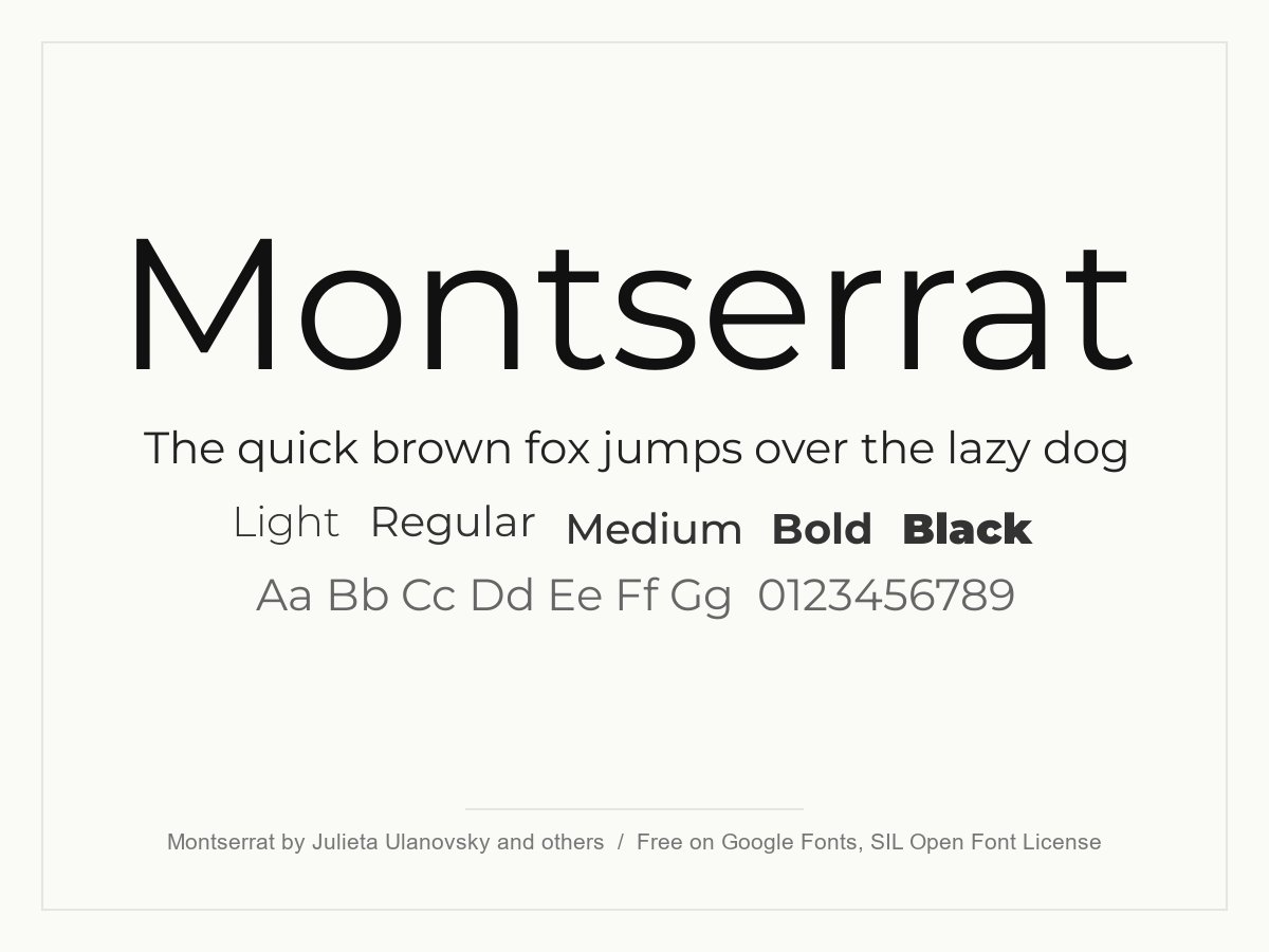
Montserrat is a geometric sans with wide, round letters and a confident, urban feel. It looks best in headlines, navigation and buttons, which is why you see it so often on agency and start-up sites. At small sizes its wide shapes take up more room than most fonts, so give body text a little more line height or pair it with a narrower font.
- Style: Geometric sans serif
- Weights: Variable, 100 to 900, with italics
- Languages: Latin, Cyrillic and Vietnamese
- Designer: Julieta Ulanovsky, Sol Matas, Juan Pablo del Peral and Jacques Le Bailly
- Licence: Free for personal and commercial use (SIL Open Font License)
- Source: Download on Google Fonts
2. Poppins
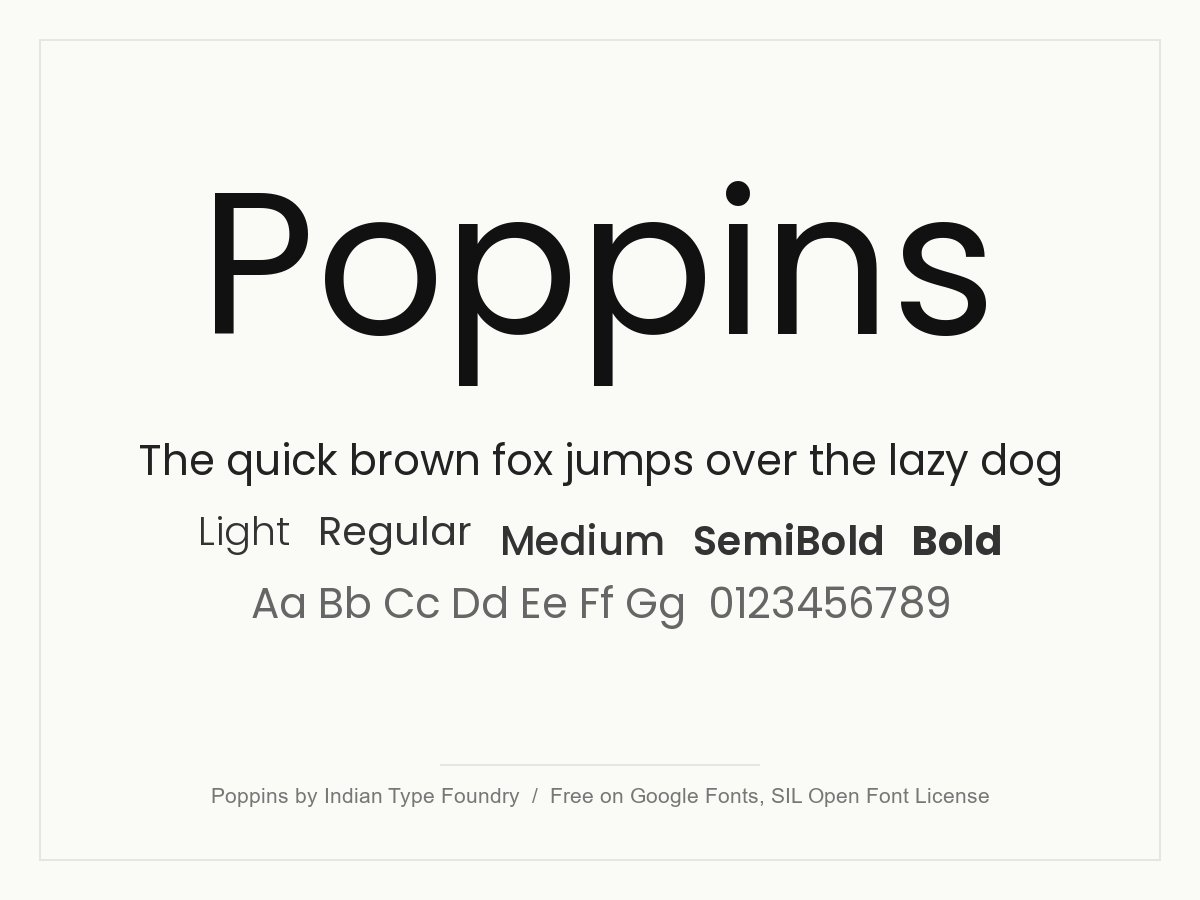
Poppins is a geometric sans with near-perfect circles and an even rhythm. It feels modern and friendly, so it suits portfolios, apps and creative brands. It comes in nine separate weights, but each weight you load adds to page size, so choose two or three.
- Style: Geometric sans serif
- Weights: Nine weights, 100 to 900, with italics
- Languages: Latin and Devanagari
- Designer: Indian Type Foundry, Jonny Pinhorn and Ninad Kale
- Licence: Free for personal and commercial use (SIL Open Font License)
- Source: Download on Google Fonts
3. Lato
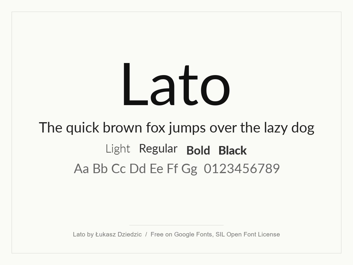
Lato was designed to look serious without feeling cold. The semi-rounded shapes are warm, and the letters stay readable in long paragraphs. It is a dependable choice for corporate, finance, health and education websites, where you want a modern but friendly voice.
- Style: Humanist sans serif
- Weights: Nine weights, 100 to 900, with italics
- Languages: Latin, Cyrillic, Greek and Vietnamese
- Designer: Łukasz Dziedzic
- Licence: Free for personal and commercial use (SIL Open Font License)
- Source: Download on Google Fonts
4. Roboto
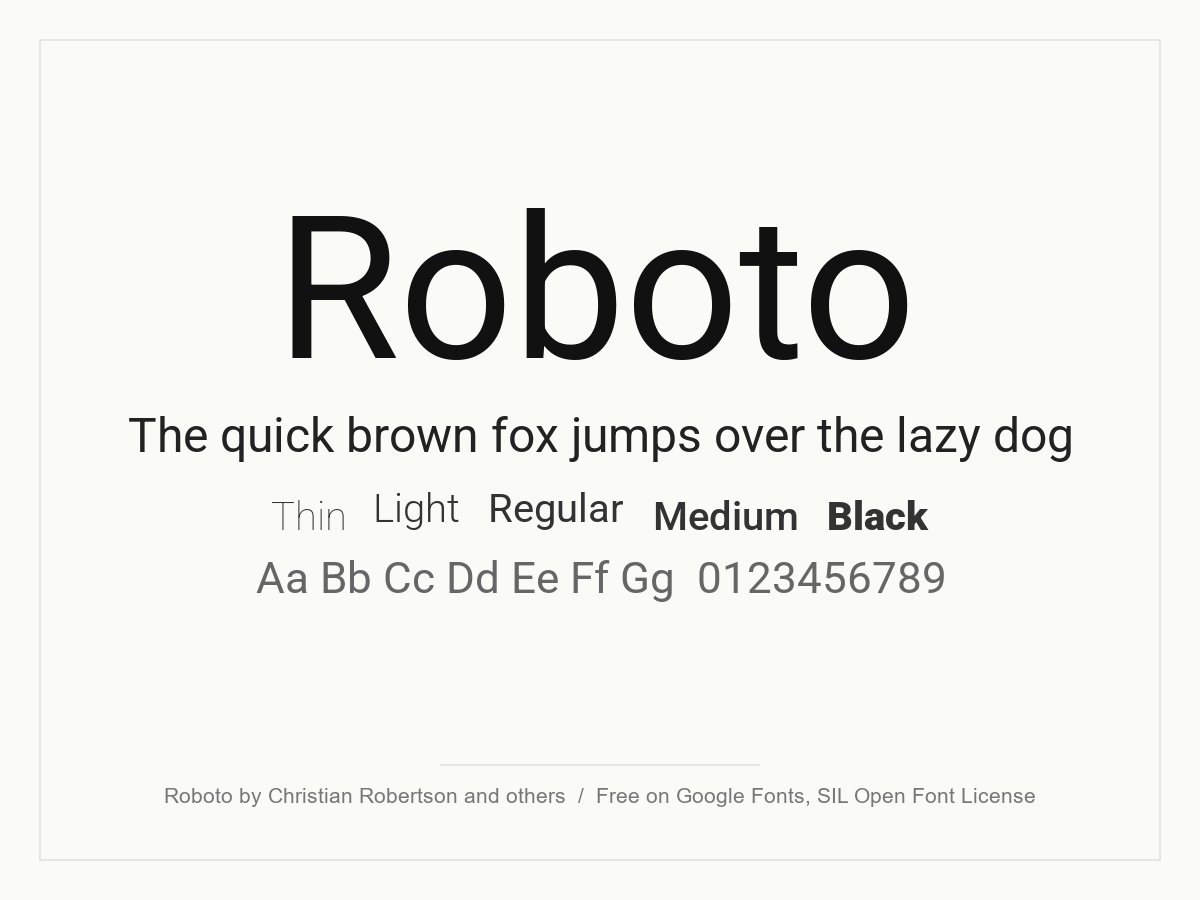
Roboto is a neo-grotesque with mechanical skeleton shapes and open curves, which makes it feel both technical and friendly. It was made for screens and is a safe pick for dashboards, web apps and content sites. It is so common that it will not make a brand stand out, so use it where function matters more than personality.
- Style: Neo-grotesque sans serif
- Weights: Variable, 100 to 900, with a width axis
- Languages: Latin, Cyrillic, Greek and Vietnamese
- Designer: Christian Robertson, ParaType and Font Bureau
- Licence: Free for personal and commercial use (SIL Open Font License)
- Source: Download on Google Fonts
5. Inter
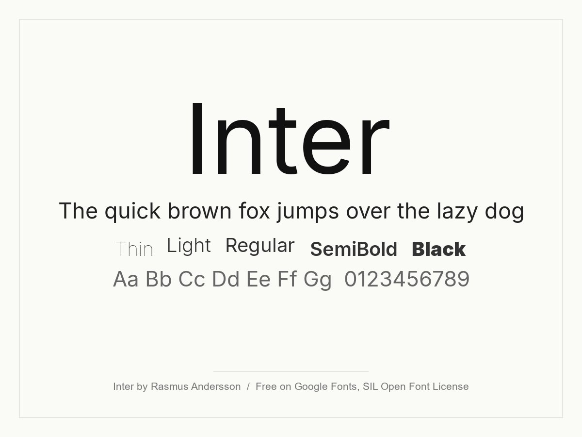
Inter was designed for user interfaces. Its tall x-height and careful spacing keep text crisp at small sizes, and it works as a free stand-in for Helvetica. Use it for body text, tables, forms and product pages. The optical size axis lets large headings tighten up automatically on modern browsers.
- Style: Neo-grotesque sans serif
- Weights: Variable, 100 to 900, with an optical size axis
- Languages: Latin, Cyrillic, Greek and Vietnamese
- Designer: Rasmus Andersson
- Licence: Free for personal and commercial use (SIL Open Font License)
- Source: Download on Google Fonts
6. Open Sans
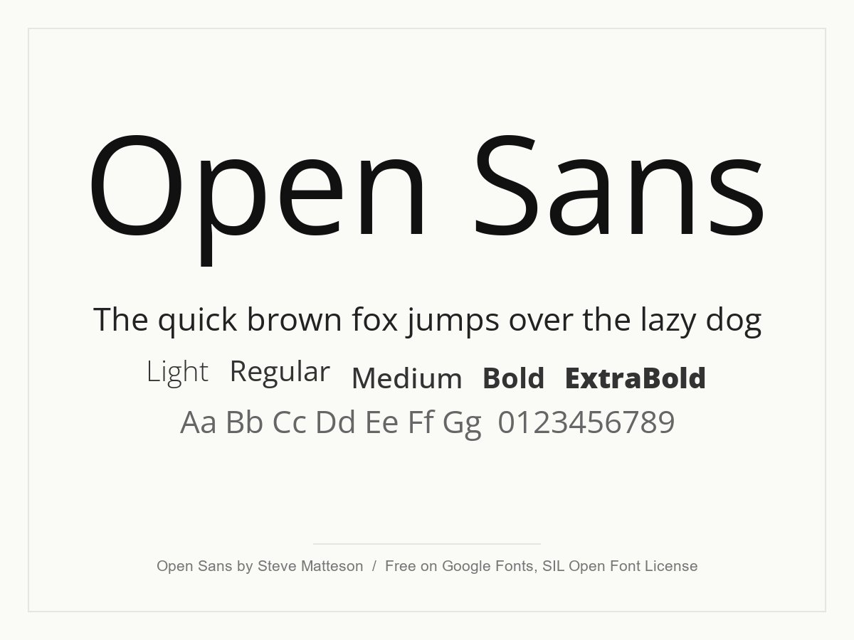
Open Sans is one of the most used web fonts. It has open shapes and a neutral, friendly tone, and it supports many languages, including Hebrew. If a site has to serve readers in several scripts and you need one font that simply works, this is a strong option.
- Style: Humanist sans serif
- Weights: Variable, 300 to 800, with a width axis and italics
- Languages: Latin, Cyrillic, Greek, Hebrew and Vietnamese
- Designer: Steve Matteson
- Licence: Free for personal and commercial use (SIL Open Font License)
- Source: Download on Google Fonts
7. Nunito Sans
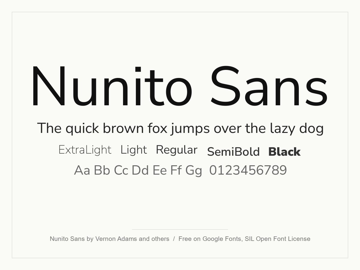
Nunito Sans is the version of Nunito with square-cut ends instead of rounded ones, so it feels calmer and more business-like. It is soft, readable and has a wide range of weights, which suits SaaS products, health brands and editorial sites. Variable axes for width and optical size give you extra control.
- Style: Humanist sans serif
- Weights: Variable, 200 to 1000, with width and optical size axes
- Languages: Latin, Cyrillic and Vietnamese
- Designer: Vernon Adams, Jacques Le Bailly, Manvel Shmavonyan and Alexei Vanyashin
- Licence: Free for personal and commercial use (SIL Open Font License)
- Source: Download on Google Fonts
Condensed and rounded sans serif fonts
Narrow letters let you fit longer headings into small spaces and give a design a distinct look. Use these for headlines, labels and navigation, not for long paragraphs.
8. Oswald
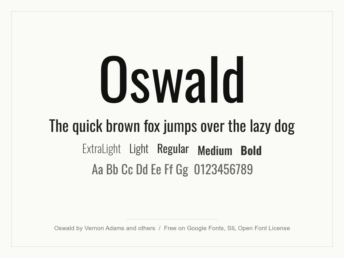
Oswald is a condensed sans serif based on the gothic typefaces of the 19th century. The tall, narrow letters make strong headlines, news-style layouts and sports or fitness brands. It is not a serif font, and it is not meant for long body text, so pair it with a roomier sans or a serif.
- Style: Condensed sans serif
- Weights: Variable, 200 to 700
- Languages: Latin, Cyrillic and Vietnamese
- Designer: Vernon Adams, Kalapi Gajjar and Cyreal
- Licence: Free for personal and commercial use (SIL Open Font License)
- Source: Download on Google Fonts
9. Dosis
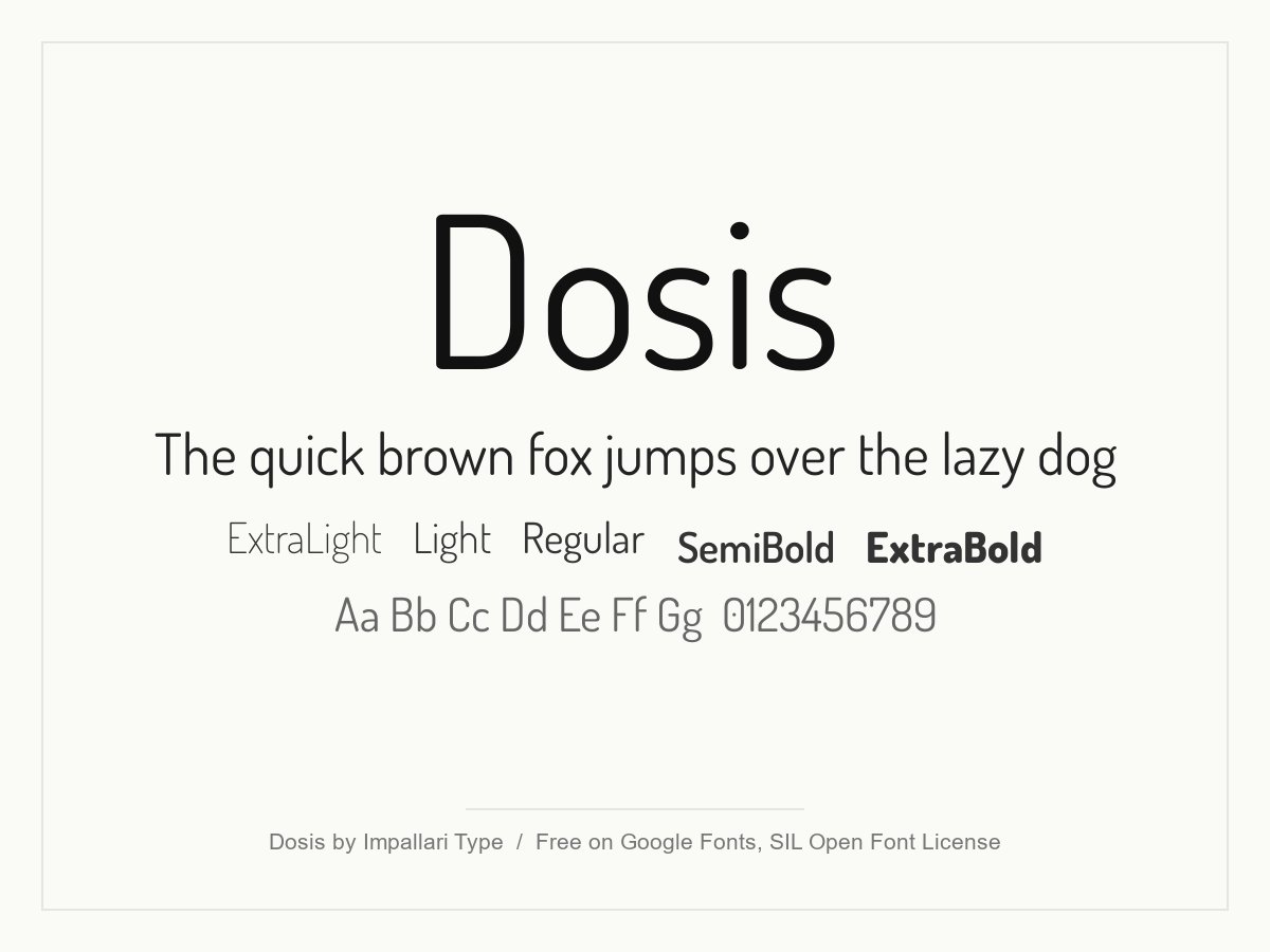
Dosis is a narrow sans with softly rounded stroke ends. It looks light and friendly, which suits wellness brands, food, children’s products and some tech sites. Thin weights get weak on photos and small screens, so use Regular or heavier for text and keep the light cuts for large headings.
- Style: Rounded narrow sans serif
- Weights: Variable, 200 to 800
- Languages: Latin and Vietnamese
- Designer: Impallari Type
- Licence: Free for personal and commercial use (SIL Open Font License)
- Source: Download on Google Fonts
Serif and slab serif fonts
Serif fonts add tradition, trust and a sense of craft. Slab serifs, with their heavy rectangular serifs, add a more solid, modern voice. These six cover reading, editorial and display uses.
10. Merriweather
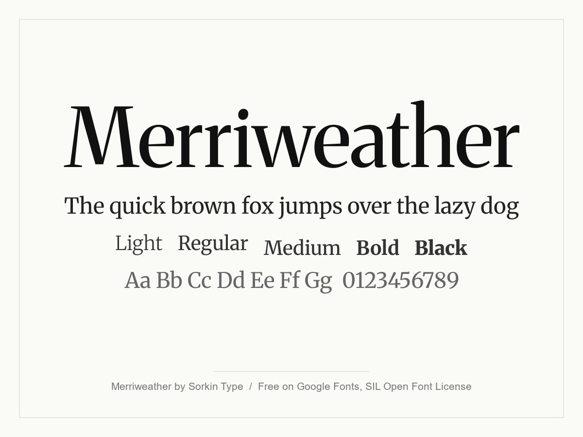
Merriweather was designed for comfortable reading on screens. It has sturdy serifs, a large x-height and slightly condensed letters, so long articles stay readable even at small sizes. It is a good match for blogs, news and brands that want to feel serious and established.
- Style: Text serif
- Weights: Variable, 300 to 900, with width and optical size axes
- Languages: Latin, Cyrillic and Vietnamese
- Designer: Sorkin Type
- Licence: Free for personal and commercial use (SIL Open Font License)
- Source: Download on Google Fonts
11. Lora
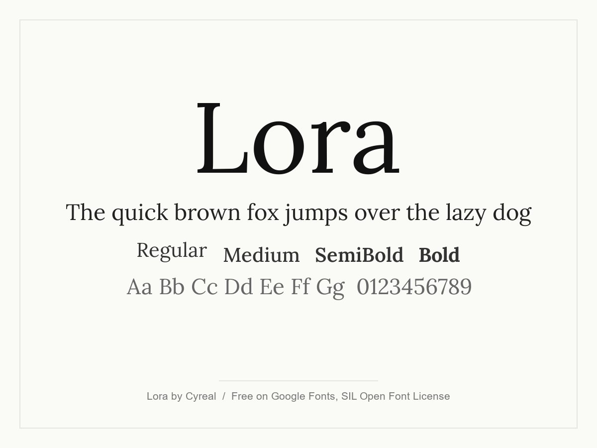
Lora is a well-balanced contemporary serif with moderate contrast and brushed curves. It reads well in body text and still has enough character for headings. It is a free alternative to Times New Roman for any website that wants a serif that feels current rather than default.
- Style: Contemporary text serif
- Weights: Variable, 400 to 700, with italics
- Languages: Latin, Cyrillic and Vietnamese
- Designer: Cyreal
- Licence: Free for personal and commercial use (SIL Open Font License)
- Source: Download on Google Fonts
12. Alegreya
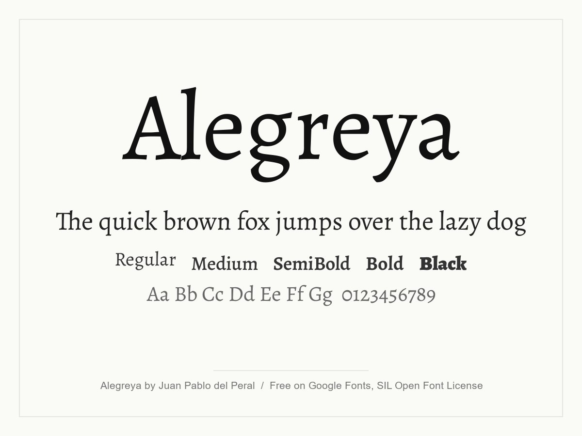
Alegreya has a calligraphic feel with lively, slightly uneven letterforms. It was designed for literature, so it keeps long text engaging without tiring the eye. Use it for blogs, books, culture and food sites where a human touch matters.
- Style: Calligraphic text serif
- Weights: Variable, 400 to 900, with italics
- Languages: Latin, Cyrillic, Greek and Vietnamese
- Designer: Juan Pablo del Peral and HT Fonts
- Licence: Free for personal and commercial use (SIL Open Font License)
- Source: Download on Google Fonts
13. Playfair Display
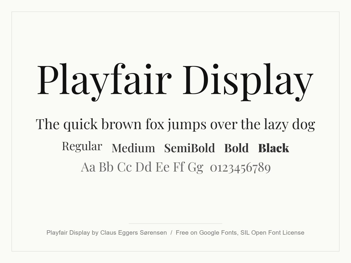
Playfair Display is a high-contrast serif with thin hairlines and heavy stems. It looks elegant and a little fashionable, so it suits editorial headings, boutique hotels, beauty and lifestyle brands. Use it large, because the hairlines get weak in small text, and keep body copy in a plainer font.
- Style: High-contrast display serif
- Weights: Variable, 400 to 900, with italics
- Languages: Latin, Cyrillic and Vietnamese
- Designer: Claus Eggers Sørensen
- Licence: Free for personal and commercial use (SIL Open Font License)
- Source: Download on Google Fonts
14. Arvo
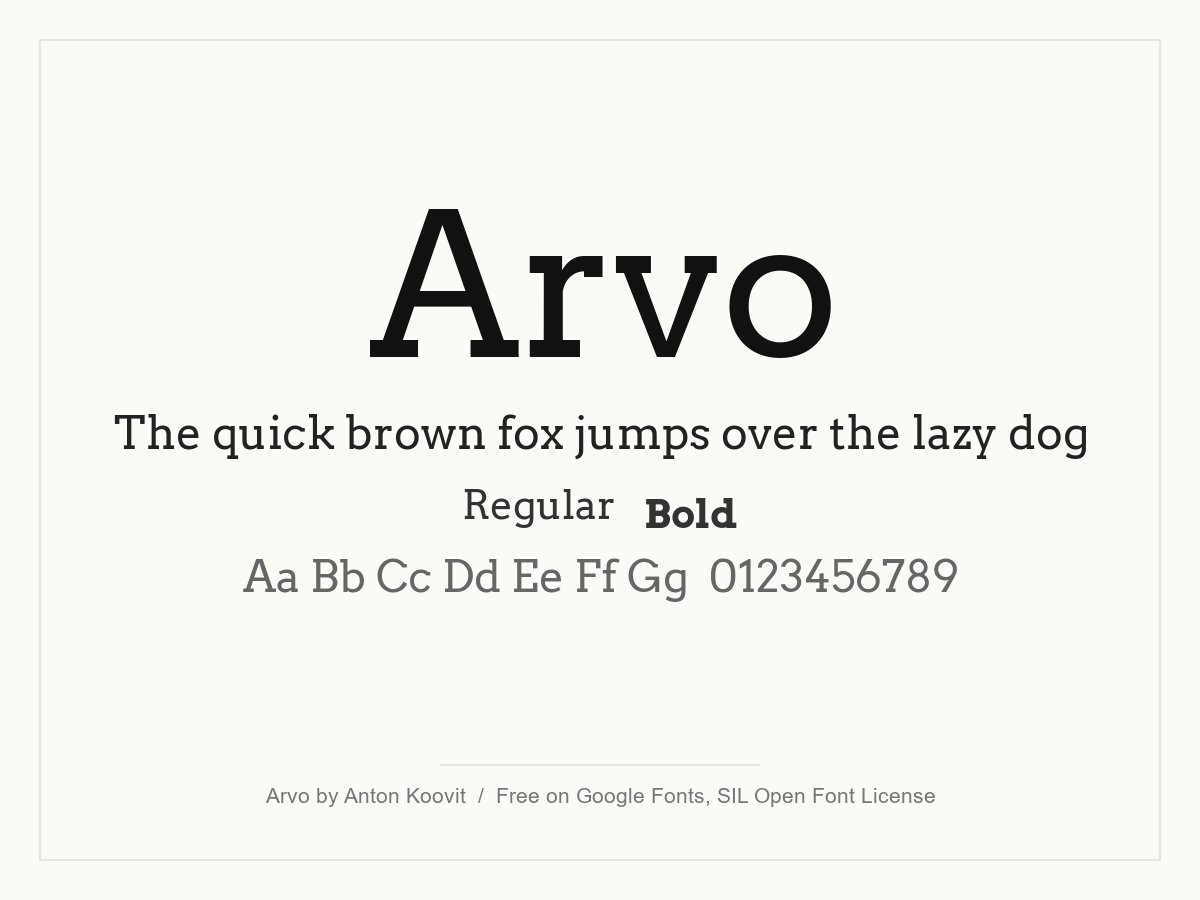
Arvo is a geometric slab serif with even strokes and sturdy, rectangular serifs. It reads clearly and feels both modern and classic. It only has Regular and Bold (plus italics), which keeps loading light, and it suits shops, craft brands and headings that need a solid voice.
- Style: Geometric slab serif
- Weights: Regular and Bold, with italics
- Languages: Latin
- Designer: Anton Koovit
- Licence: Free for personal and commercial use (SIL Open Font License)
- Source: Download on Google Fonts
15. Aleo
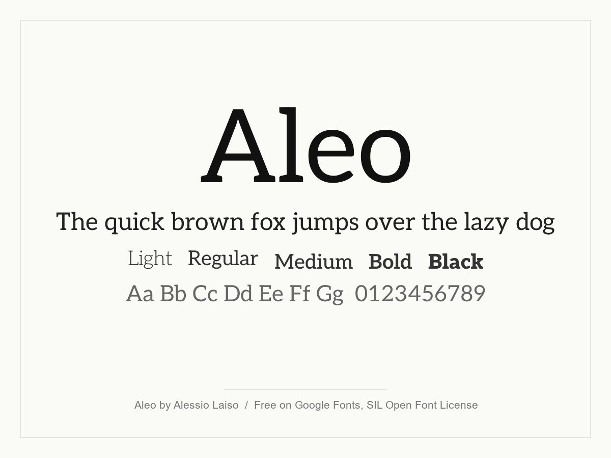
Aleo is a slab serif with softer, semi-rounded shapes, so it is friendlier than most slabs. It works for body text as well as headings and offers a wide weight range. Try it for start-ups, education and any brand that wants a warm, modern serif.
- Style: Soft slab serif
- Weights: Variable, 100 to 900, with italics
- Languages: Latin and Vietnamese
- Designer: Alessio Laiso
- Licence: Free for personal and commercial use (SIL Open Font License)
- Source: Download on Google Fonts
How to pair beautiful fonts
Most websites need two fonts at most: one for headings and one for body text. These pairings are easy to start from:
- Playfair Display with Lato or Open Sans. An elegant serif heading above a neutral sans.
- Montserrat with Merriweather. A bold geometric heading with a readable serif for long text.
- Oswald with Lora. A narrow, strong headline over a warm book-style text face.
- Poppins with Inter. Two clean sans fonts with enough difference in shape and weight to give contrast.
- Arvo with Roboto. A sturdy slab for headings with a plain, screen-ready sans.
Our posts on font pairing and typography tips for website design explain why contrast works. For more ideas, see top serif fonts, minimalist fonts and font trends in web design.
Tips for using fonts on a website
- Use 16px or larger for body text. Set line height around 1.5 and keep lines to roughly 60 to 75 characters.
- Limit weights. Two or three per font is enough. Extra weights add page weight without adding value.
- Create hierarchy with size and weight, not with many different fonts.
- Set a fallback. Add a system font stack so text shows straight away while the web font loads.
- Check spacing. Large headings often need tighter tracking and small capitals need more. Read why letter spacing matters.
- Check contrast. Light grey text or thin weights on a busy photo are hard to read.
- Test on real devices before you sign off the design.
Typography also affects how people see a brand. Read our article on upgrading brand perception with a beautiful website and our guide to web design principles. You can also browse our design services.
Frequently asked questions
What are the best free fonts for a website?
For body text, Inter, Open Sans, Lato and Roboto are reliable and free. For headings, Montserrat, Poppins, Playfair Display and Oswald offer more character. All of them are free on Google Fonts.
Are Google Fonts free for commercial use?
Yes. Fonts on Google Fonts use open licences such as the SIL Open Font License, which allow commercial use, including client work, logos and products. You do not have to pay or credit the designer, although a credit is appreciated.
How many fonts should a website use?
Two is enough for most sites: one for headings and one for text. Some sites use a single family with several weights. More than three fonts usually makes a page look messy and loads more slowly.
Should I use Helvetica or Times New Roman on my website?
You can list them in a font stack, because most devices include a similar system font. You cannot upload and serve them as web fonts without a licence. Inter and Lora are good free alternatives that you can host yourself.
Need typography for a client’s website?
Inkyy is a white label design and development team for agencies. Our in-house designers choose, pair and license fonts as part of every website, logo and brand identity we create under your brand. See our design services and development services, or book a 15-minute call.


