


What Does Web Design Represent?
Web design is a fundamental part of a process called web development. As a crucial segment of web development, adequate web design is also very important for the final product. It can often be heard that if you show interest in web design, that there is a little artist in you. Let’s look at this topic quite realistically. In 2021, how not to be excited about web design and creating your first website.
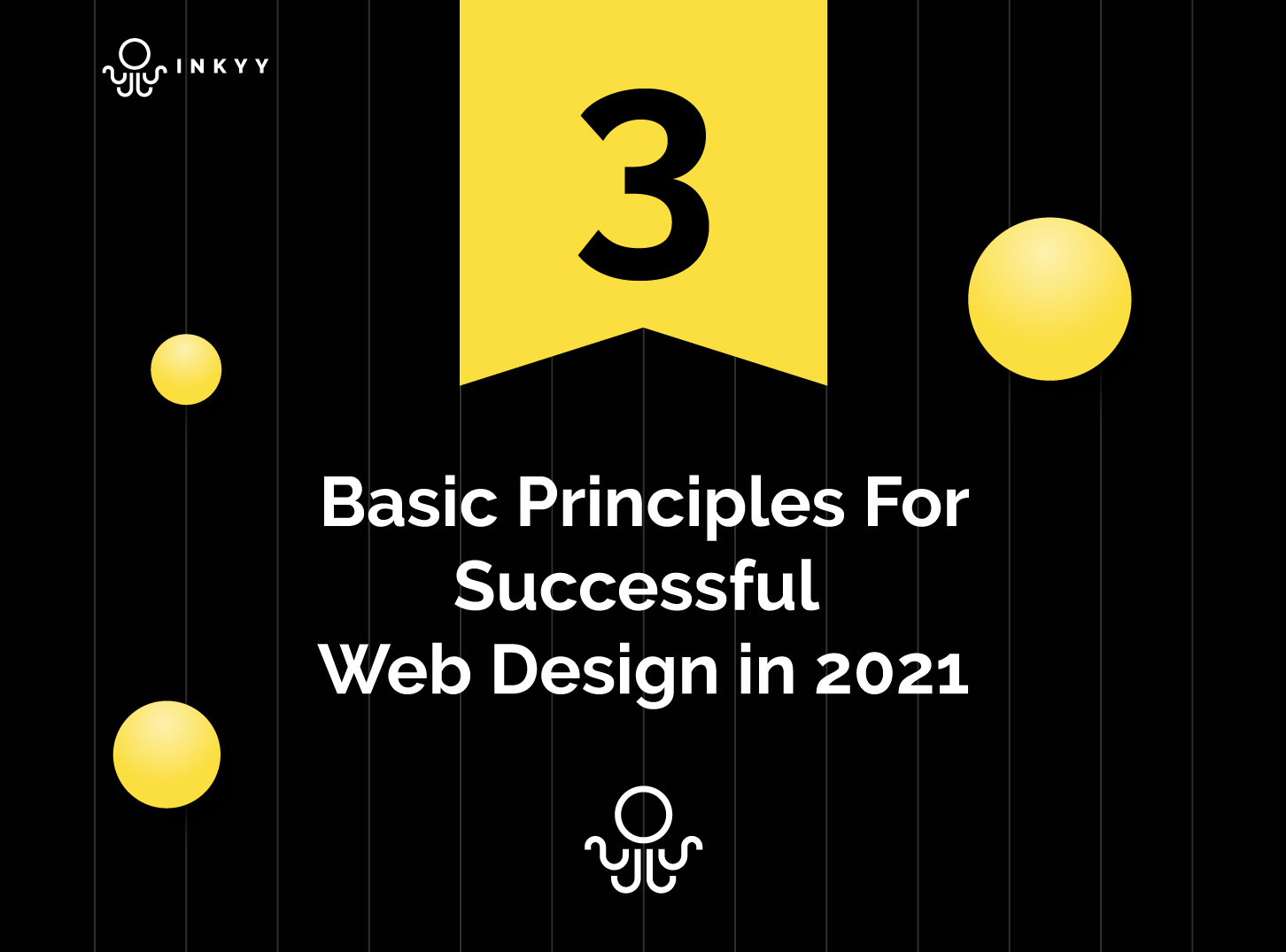
Web design, in a simple sense, is a kind of craft and the ability to create a masterpiece, art, which will elevate your business to new heights. Designing a website can be a serious challenge and at times difficult. In the ocean of websites (there are billions in question) only a small part is adequately set up and designed. Therefore, even if there are several main principles of web design, today we will present 3 basic ones, which must be followed in order for your future website to look modern, adequate, and meet all the needs of a potential visitor. If you do not understand who to turn to, for help, to realize your ideas, Inkyy is the right place for you, and you can find out more here about Inkyy Web Design Studio.
Easy Navigation. Very important, one of the most important, if not the most important thing in modern web design. This principle must be constantly in mind when designing a modern website. According to various studies, more than 90% of people who regularly use the Internet, believe that easy navigation is one of the most important features of a modern and good website. If we look exclusively from the logical side, then this percentage is understandable.
If it is difficult and impossible to find your way through a new website then we have a problem. Poor navigation causes a potential customer (client) to leave your site even before they find the information they entered, and that’s not the worst. That person, who had an unpleasant experience during a visit to your site, will leave a bad review, comment, or tell someone not to use your services, and thus, your business loses potential customers!
There are a few details you should pay attention to when creating a navigation bar. Make it as user-friendly and easy to master as possible, because you have to remember, that even if it is 2021, we still have a lot of “online illiterate” people in the world.
Your navigation should be as simple as possible with minimal options to make it easier for the user to navigate and find all the important information within a few seconds.
The next detail to pay attention to is the reduction and mitigation of drop-down menu options. To make it, if we already have to have a drop-menu, to make it as minimal and clear as possible.
Then, you should use real-world words or words that are suitable for the language in which the site will operate. Never use slang words from your own language, because they can be interpreted in various ways and distract potential customers.
Last, but not least, the number of clicks. Make sure that number of clicks on the website is reduced. This means that the user should go through your site in a few clicks, along with and across, and find everything that interests him.
Responsive Design – Mobile & Other Device Friendly Web Design
Before we delve deeper into this topic, the first and foremost thing you need to know is that more and more people are doing their searches via mobile phones and other devices, and not desktops or laptops. You can run into the figure that, about 35% of searches are performed via a desktop or laptop computer. The rest, 65%, goes to mobile, tablet, and similar devices. Now that we’ve seen the numbers, let’s go a little deeper into the responsive design for your websites.

Responsive Design means that the website fits well with all other devices (desktop computers, laptops, mobiles, tablets) and their aspect ratios. Aspect ratios are the height and width of the display of that device. There is no person in the world who does not require that every website has its own mobile version. If by any chance a particular website does not have a mobile version, when accessing that website via a mobile device, the customer experiences an initial bad impression.
This results in a negative review, and potentially losing a client forever. It is the responsibility of the website designer to avoid such a situation. The web designer will fulfill his/her obligation by adapting the website to all possible resolutions and device sizes. The website design must be adequate for all types of devices that exist on the market. Use these few tips for responsive design:
- Optimize images – adjust their size for each device
- Adequately positioned buttons – allow simple and easy button use on smaller screens
- Test – Through various tools whether the full potential of the website has been realized
Visual Hierarchy – Web Designer’s Job to Arrange the Content Clearly
Visual hierarchy is one of the primary web design principles. If this principle is followed to the maximum, the user realizes that the web designer has done his job phenomenally. Visual Hierarchy represents the order in which the human eye perceives what it sees.
To make it easier for you, we will explain what this principle means through example. Imagine a picture with four circles of different sizes and that these circles are filled with different colors. If we told you to look at a picture and arrange the circles from largest to smallest based on that image, you would do it in less than a few seconds. And that’s Visual Hierarchy. What does this mean for your new website?

Certain parts of your website are more important than others. So logically, you want these more important parts to attract more attention to the user. If your website has as part of its menu, for example, 15 items, ask yourself if they are all necessary and very important? Where do you want the user to click? Which parts of the site are important to you and therefore highlight those important parts in the menu while removing the less important ones. As we wrote in the first principle, easy navigation is a crucial part of website design.
Visual Hierarchy doesn’t just come in font size, menu sorting, and things like that. Online shops often highlight the add to cart or message button in a different color, a bright one, to draw the customer’s attention to click on that button. By doing so, you are converting the visitor into a customer. When that happens, Visual Hierarchy has shone in full splendor, and thus the web designer has done his job in a superb way.
Conclusion – Proper Web Design
And if web design is considered, to some extent, art, it is still not the same as art. It should be taken into account that many design principles still match. So, with the adequate application of these principles, your website will be made as you imagined.
Of course, these are not all principles from the sphere of website design. We decided to list these three because we consider them crucial for successful website designing and creating a new website for your business.
You can find more texts like this on the Inkyy blog page. Of course, for any inquiries, suggestions, or advice you can contact Inkyy Web Design Studio at any time.
 Book a Meeting