Mistakes in web design are a common thing. In the year 2021, not even a good website for your business is enough. Only the best web design is considered. Only the best functionalities.
Converting users from visitors to buyers is crucial. Especially after the corona pandemic started in 2020. Most of the buying and selling is transferred to online shops.
Here is where a good, user-friendly website, with great web design, and proper SEO comes in hand.
We won’t write a long introduction, will will go straight to those mistakes in web design that you sholud avoid. About proper web design and its principles, you can learn more here.
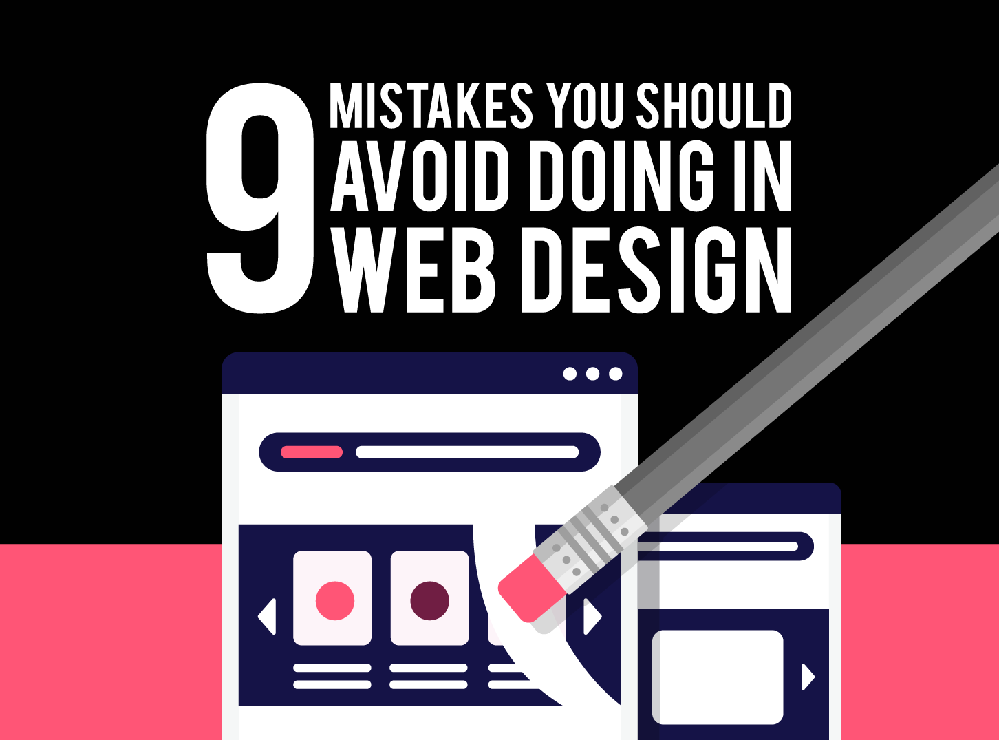
You came to Inkyy Blog to see those 9 mistakes that you should avoid doing in web design, and that is what we will show you.
So let’s get started.
1. Too Much Content Creates Confusion & Bad User Experience
Portray your business information right away. A proper display of your most significant information, about your business, will make users stay and continue their experience on your website.
If a visitor (user, customer) doesn’t get initial and proper info about your business in few seconds of arriving on your site, he/she will leave.
Don’t put too much info. It will create a messy page. No one will be able to manage and find what are they looking for if your web page has a ton of images, text, videos, etc.
Another negative thing with too much content is the slow loading time. So, be very careful with the content that you put on your homepage.
2. Not Prioritising Grid-Based Layout
Web design is evolving every single day. The speed of transformation of modern web design techniques, elements, and patterns is astonishing.
We know that, as a designer, you can get comfortable with the “old ways” of doing things. Try to eradicate that habit. Try to adapt. If you don’t adapt, you will safer, and your designs too.
Using flexbox, float, breakpoints, and similar organizing content is the old way. Try to modernize. CSS grids and guides are important for modern, good-looking websites and designs.
It doesn’t mean that all of the “old way” elements are not good. They are. They just need to be used properly, with a modern approach. That is why grid-based layouts, which you can find out more about here, are very important.
Use them!
3. Not Making Your Website Responsive
I think that everybody, who is interested in web design, understands why responsive design is the most important thing when creating a website.

Almost 65% of searches on the internet come from smart devices, that are not desktop computers. Mobile phones or tablets are prime examples.
We will simplify it for you. Responsive design = good user experience on all devices. This leads to users making your website a priority, and converting them from visitors to buyers is much easier.
No responsive design = No Users. You know the end of this path.
4. No Contact Page or Contact Info
I still can get my head around that there are websites without contact information or a page. I just can’t.
Your business demands from you make a contact page or put your contact information in some part of your website (footer). How can you conduct business, online or not, without giving your contact info to your potential customers?
Please, make your contact information visible. Just…make it!
5. Duplicate Page Titles
The title of each page on your website is important. This text is written between <title> tag in <head> section of your HTML code.
Don’t use a generic title for all of your pages. It will harm your website.
The benefits of a good title for your website are there, even if you don’t see them.
A good title will display visitors a lot of needed information about the page on which they are then. This is a plus, as the visitor will quickly figure out if they are in the right place or not.
Also, keep in mind, search engine result page (SERP) shows the title of your page. This means that the titles are it is very important for the SEO part of your website.
6. Bad CTA
CTA is the gateway to your business. It will attract the users’ attention and will “command” them to do something.
Click here! Get 20% off! Learn more. Those are just some examples that you will see when visiting different online shops. Your CTA must be understandable. It has to be clear so that the visitor understands what to do!
But don’t be too aggressive with it. You can produce a counter effect and become annoying. That will hurt your business. So, keep the form-filling to a minimum, wait a few minutes before your CTA pops up, and try to make them simple and easy to understand.
We can’t stress enough the importance of proper navigation. We wrote a whole article about this topic. But, we need to mention it again.
Navigation is everything. It is the heart and soul of your website. It helps customers go through your website and find everything they need in a matter of seconds.
With a hidden navigation menu, your online webshop is dead. Trust us. Your customers will not find what are they looking for, and will leave your website fast.
Your business’s competition will be grateful. So, keep in mind, proper navigation, easy to use, visible IS A MUST!
8. Low-Quality Images
One of the most integral parts of proper web design is a good image. If your images don’t make your audience stick their eyes on your web page, you have a problem, my friend.
Graphics, and graphic design, learn more about it here, are essential to your website. Proper images save time. They allow users to find out a ton of information without reading text.
Don’t allow low-quality images on your website. It will drive away your potential customers and hurt your business.
9. Missing Your Targeted Customers
Most of the websites are an online part of a small business. So, as a business owner, you understand that knowing your target customers is essential.
Years of experience owning your business, in combination with brainstorming, helped you to make a profile of your ideal customer. This is just as important in web design.
Your website has to look and feel natural. It has to look like an extension of your business, as an arm is to a human body.
Don’t make your website something that it is not! If your business is about plumbing, make your website appealing to your customers, you don’t need to make it about football, it will just look weird.
Identify and profile your target audience, and try to make their experience on your website as good as it can be.
I hope these 9 mistakes will help you understand what does a proper web design for your website means. It will allow your business to grow.
Avoid these mistakes, and if you don’t know how to correct them, hire professionals like Inkyy Web Design Studio to resolve those mistakes for your.
 Book a Meeting