


Website navigation is a part of your website that is too often left unchecked and is created after the pages and other content. Recent studies have shown that only half of internet users can find their way to relevant content with ease.
If every other user on your website can find his/her way through your page to relevant content then we have a big problem.
User experience (UX) is one of the most important things that you have to pay attention to when creating websites or any kind of content.
If a user comes to your website, and can’t figure out where is the information that he/she is looking for, your website design is bad, and your website navigation is even worse.
This leads to higher bounce rates, lower time on the website, and if your website is an eCommerce shop, it can affect your sales.
Inkyy Website Design Studio is here for you.
In this article, we will write about proper navigation for your websites and how to achieve that with these few tips and steps.
Lets’s go!
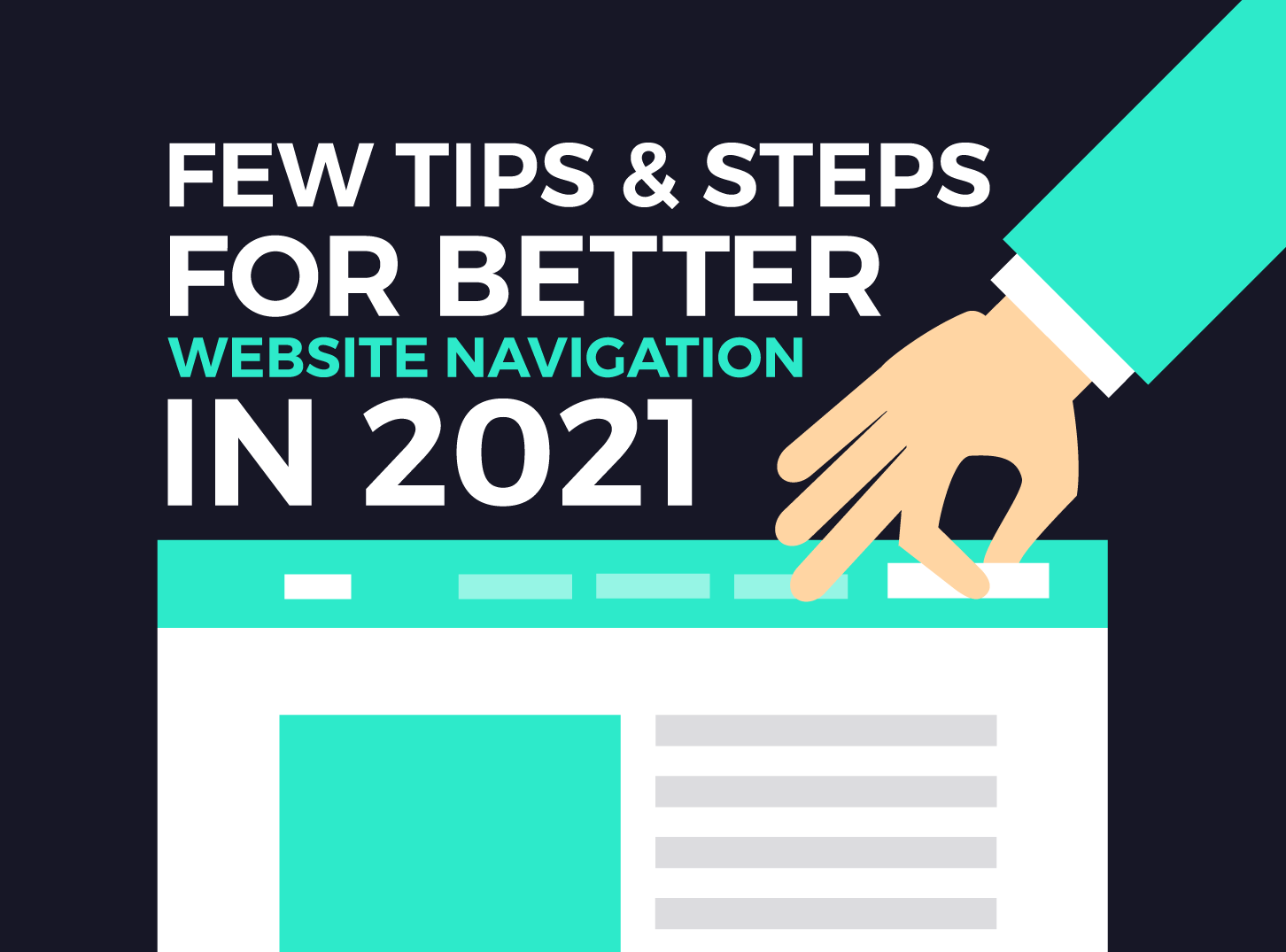
What Does Website Navigation Represent?
Website navigation is the process of navigating users through your pages, apps, or websites on the internet. For this, we use technology that is called hypertext.
Hypertext represents a textual part on web pages that use hyperlinks to connect them to other pages on the internet. It is also good to know that a hyperlink is a link that allows you to follow the referred URL.

URL “tells” the browser which files to access and shows its data so that the user can see it. Internal links are used to show users different parts and pages of the same domain, while external links lead to other websites.
Website navigation uses menus with internal links so that the user can have easier access to the pages on your website. Good navigation equals a good user experience which will boost visits to your website, and so on.
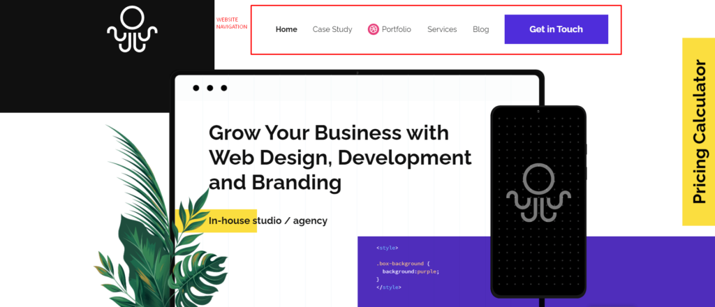
Website Navigation Menu
A website navigation menu, or simply a menu, is a set of internal links that users use for navigation through your website.
Most of the menus are located at the top of the website. This section of a website is called the header. Typical pages that go in menus are about us, blog, contact, services, pricing, features, portfolio, and similar.
If the visited website is a blog, then in the menu, you will see different categories. And through that menu, you will access them.
Now when you understand the basics, let’s find out a few great tricks for better navigation for your website.
Preparation & Planning For Navigation
Any time you are starting a new project, the most important thing is to start from the very beginning. In this case, a good starting point is trying to figure out what features or pages your website will offer.
Everything important for proper website design will come. But first, you have to prepare a proper plan and hierarchy for your website.
At the early stages of any web project, a navigation menu is typically referred to as a sitemap. It is mostly put together as a spreadsheet or a diagram. It allows developers to see, and imagine the future website. After that, they can start working on its design and functionalities, following proper web design principles.
Use Web Conventions
Conventions are ideas that are already in use and are proven. 99% of people know that those ideas work and are successful. When that kind of idea is created and is proven to work, it becomes, so to say, a common language.
Proper web design and website navigation is full of these conventions.
These design conventions for website navigation work so well, that if you access a website in a different language, that you, as a user don’t understand and can’t speak, you can still more or less navigate yourself through the website.
And that is the point of using web conventions when creating your website navigation and menu.
Link Your Logo to Homepage
It is an easy function. It seems like a logical move. But trust me, I encountered a lot of websites that don’t have this function.
In more than 90% of websites, the logo is located in the top left corner. It is supposed to be linked and has the function when clicked, to take you back to the homepage.
This convention is widely implemented and is one of the best followed in the website navigation world.
Responsive Website Navigation
Responsive design for your website is a must. There is no point in creating a website and not making it responsive for other smart devices like mobile phones or tablets.
The reason for this is that in 2021 around 50% of searches are conducted by mobile or other devices, and the other 50% by desktop computers.
It is pretty simple. If you don’t make your website and navigation responsive, you will lose on bad web design every other user that access your website.
Responsive navigation is a trend using a compact navigation style, called the “hamburger” menu. The icon is represented by three horizontal lines. For more information about lines in graphic and web design, you can read this article.
“Hamburger” Menu
The reason for the creation of the “hamburger” menu is that mobile searches rapidly grow from 2011 (share was about 7%) to 2021 (share about 50%), and responsive navigation was needed.

The “normal” menu was okay for desktops, but for mobile, a new way was needed, a menu that wouldn’t take too much space. So, the “hamburger” icon was the solution. Its compact size and ability to be stored in the top right or left corner, and not take too much space.
The functionality of this kind of menu varies from site to site, but its main function is to slide in, slide out, or pop up. You may even see hamburger menus on the desktop version of the website, and it is just fine to use it.
The design for the hamburger menu and its levels must be appropriately done. The user isn’t supposed to get confused about how to navigate.
The problem with navigation in these menus occurs mostly on mobile phones because the responsive design wasn’t met for all available phones, and the navigation itself can get a little bit confusing.
Inkyy Web Design & Branding Studio recommendation is to use menus that drop down up to 3 or 4 levels and use arrows or lines that can be used as buttons so that the user can tap on that particular part of the menu, and it will expand, Also, use different colors for different levels of navigation. It is user-friendly, it is better and easier.
Fixed Website Navigation
Fixed, or sticky navigation is a website menu that sticks at the top of the page, even when you scroll down. It will not disappear.
A sticky menu can be implemented on any website, but you must pay attention to the design itself. Does this kind of menu suit your website and navigation purposes?
My personal opinion is that a fixed, or sticky menu is a great way to make your navigation user-friendly. Your website offers easy navigation to users at all times. But, before you make your menu fixed, check if it is the best solution for your particular website.
Conclusion – Inkyy is Here to Help Your Navigation & Design
These are just a few tips and steps that you can use to make your website navigation better and easier. That kind of navigation will make users “stick” with your website.
Easier navigation will allow them to find everything that they are looking for. After that, through recommendations, and proper SEO, you will attract more users, clients, or customers, depending on the purpose of your website.
Inkyy Website Design & Branding studio is here to help you with your website design. If you don’t know what should you do, how to approach the design of your website, leave it to professionals.
You can contact us at any time through this contact form. As you are on our website, check out how did we manage our navigation. Also visit our portfolio page, where you will see all of the successful projects that the Inkyy team has finished.
Feel free to leave any suggestions, comments, or critics in the comment section. For any request, you can also send us a DM on our IG page, which you can find here.
As we said at the start of this article, Inkyy Website Design Studio is here for you!
 Book a Meeting