Lines in Graphic Design: Types, Meaning and How to Use Them
What are lines in graphic design, what is the best way to use them, and which styles and types of them are used in graphic design find out in this article.
 7 min read
Lines in graphic design do far more than draw edges. A line can split a page in two, lead the eye to a button, make a logo feel fast or calm, and hold a whole layout together without anyone noticing it is there. It is the simplest element a designer has, and one of the most useful.
This guide covers the main types of lines, what each one tends to communicate, and how designers use lines in layouts, logos, typography and user interfaces. Practical tips and a short FAQ follow at the end.
What is a line in graphic design?
The classic definition is a point moving through space. In practice, a line is any mark that is noticeably longer than it is wide, or any edge the eye reads as a path. Lines are one of the core elements of graphic design, alongside shape, colour, type, texture and space.
Every line has a few properties you can change:
- Direction: horizontal, vertical, diagonal or curved.
- Weight: thin lines feel light and delicate, thick lines feel bold and heavy.
- Style: solid, dashed, dotted, tapered or hand-drawn.
- Length: short marks add rhythm, long lines connect and divide.
- Colour and texture: a soft grey rule recedes, a bright brush stroke shouts.
Types of lines in graphic design
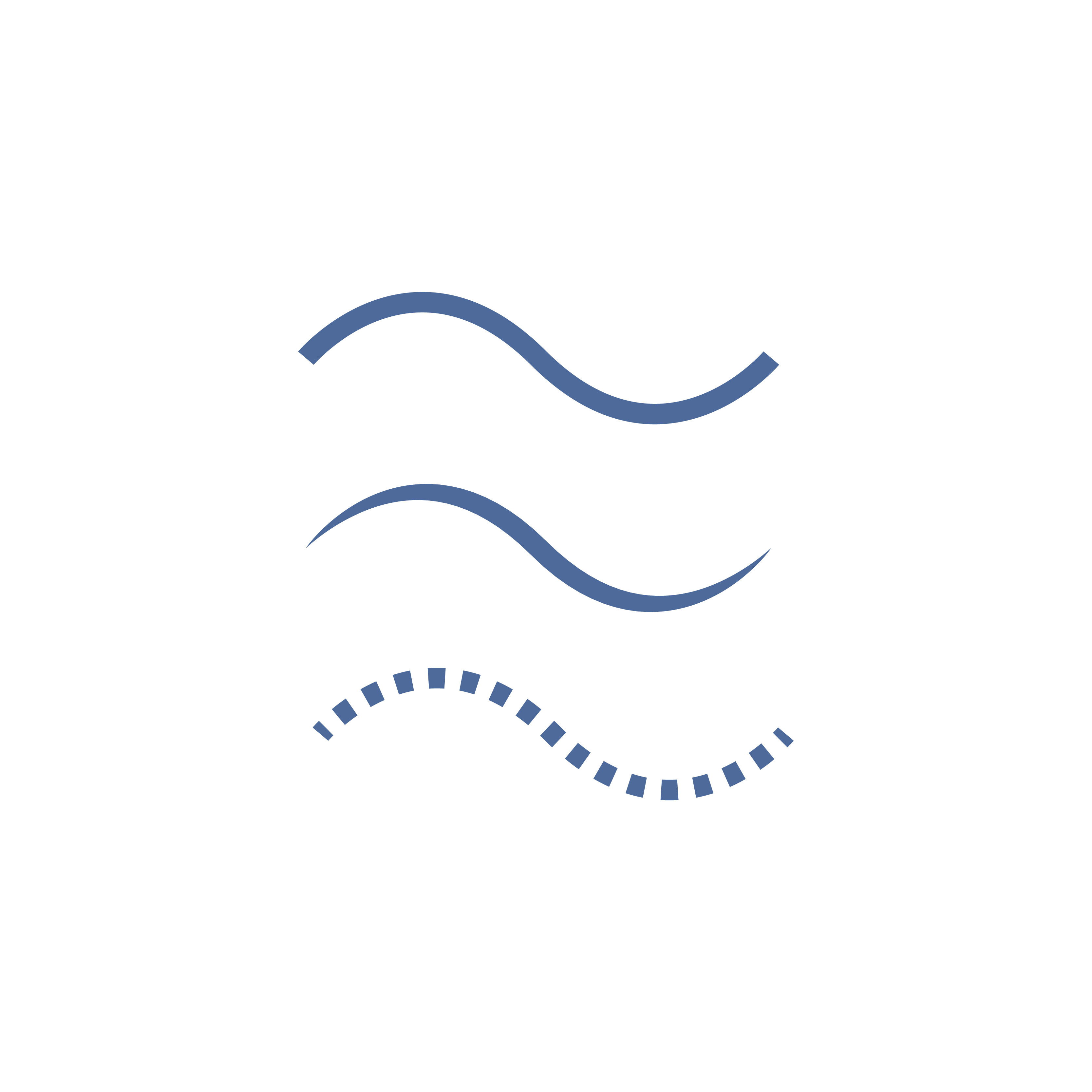
The illustrations below show each direction in three styles: a solid line of even weight, a tapered line that is thickest in the middle, and a dashed line. The direction sets the mood. The style changes how strong or light that mood feels.
Horizontal lines
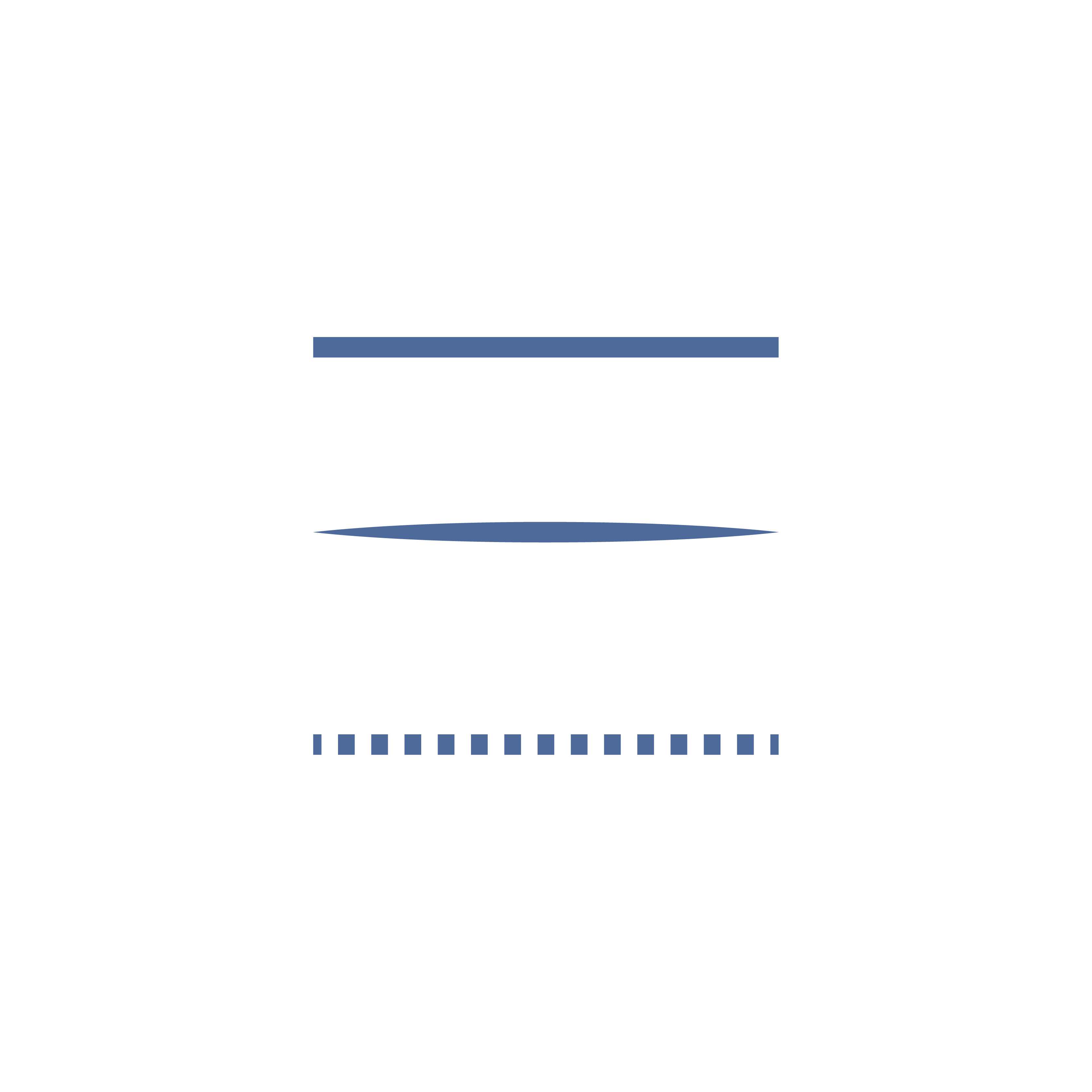
Horizontal lines follow the horizon, so they read as calm, stable and at rest. They are the workhorse of layout: rules under headings, dividers between sections, table rows and the baseline that text sits on. Use them when you want order and quiet structure.
Vertical lines
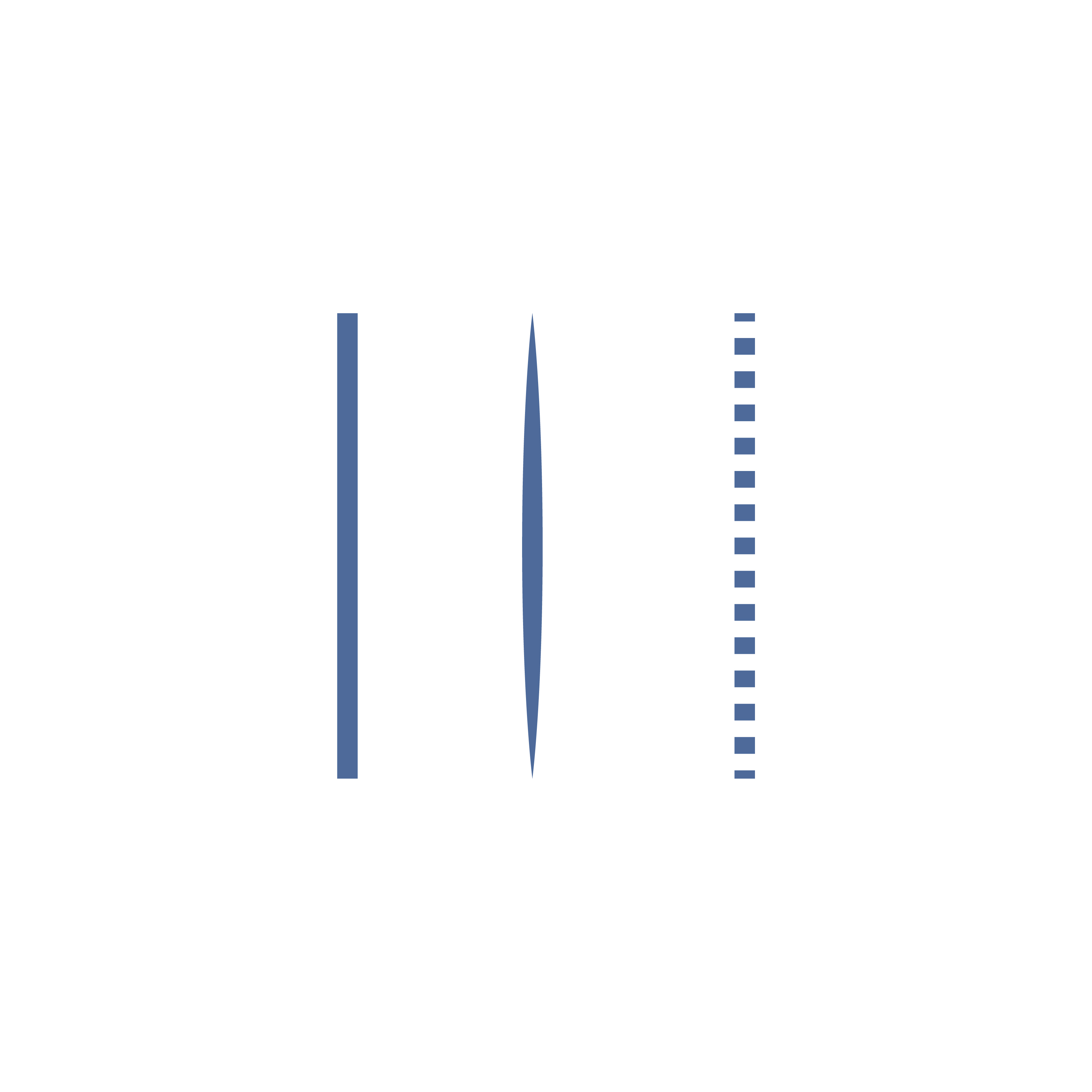
Vertical lines point upwards, so they suggest height, strength and formality. Think of columns on a building or tall, narrow type. In layouts they separate columns of content and sidebars. Thick vertical strokes feel solid and dependable. Thin ones feel elegant.
Diagonal lines
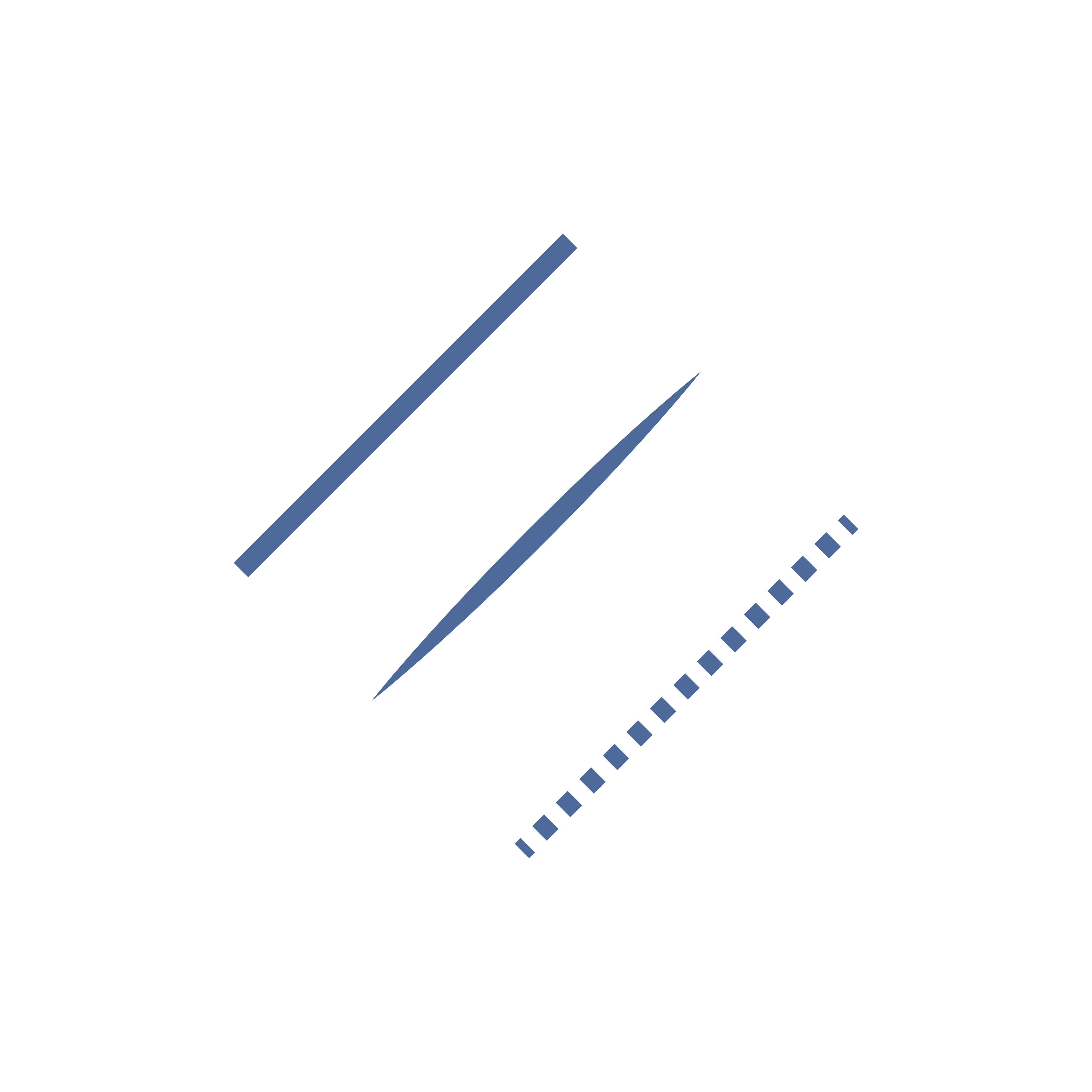
Diagonals look as if they are falling or climbing, which gives them energy, speed and tension. A line rising to the right usually reads as growth or progress. Diagonals also create depth through perspective. Sports, energy and tech brands use them often, and a single diagonal can make a static layout feel alive.
Curved lines
Curves feel soft, natural and friendly. Gentle waves suggest water, comfort and smooth movement, which is why they turn up in wellness, travel and food brands. Tight, irregular curves feel more playful or restless. Curves are less predictable than straight lines, so they are good at guiding the eye along a path.
Zigzag lines
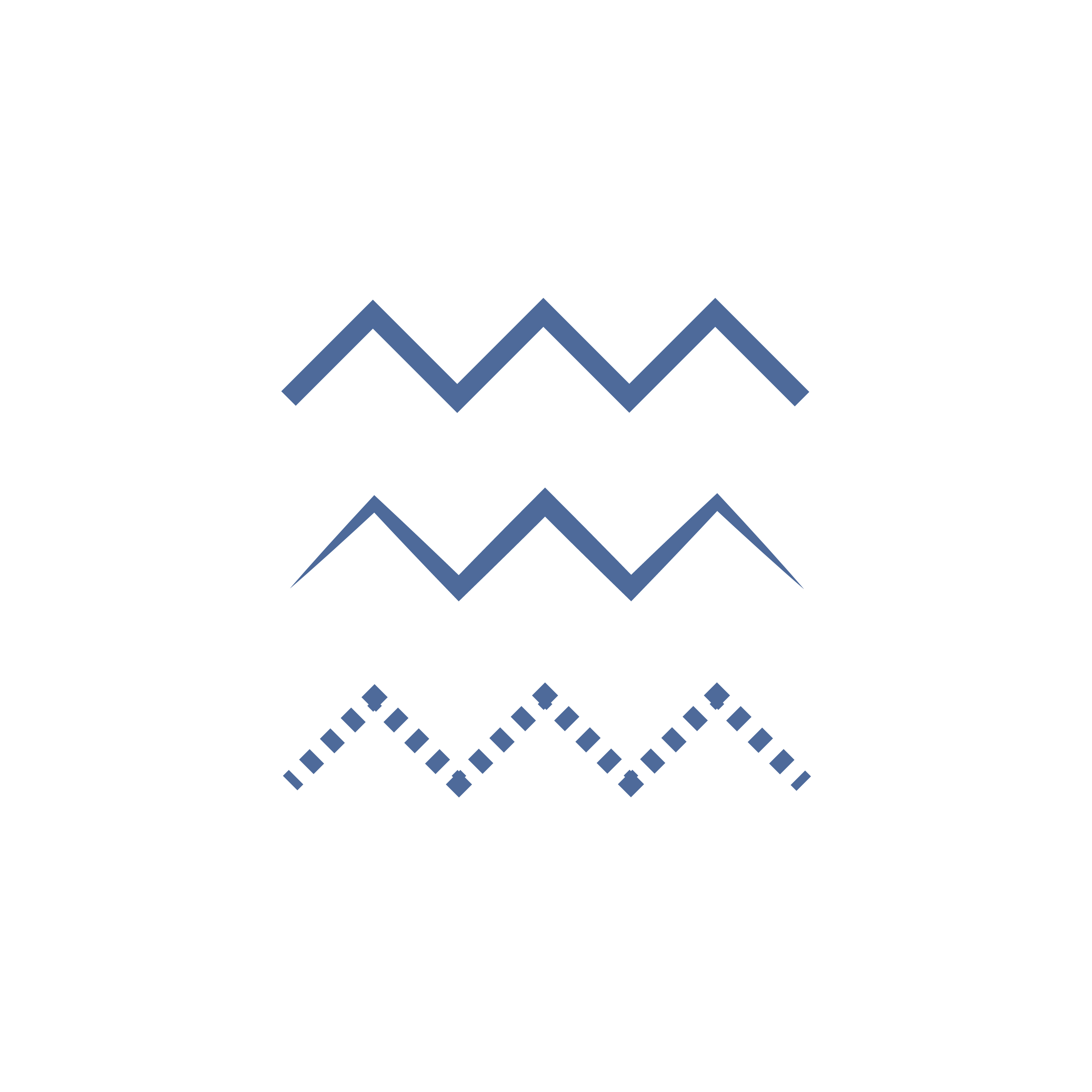
A zigzag is a chain of diagonals, so it multiplies their energy. Sharp changes of direction read as excitement, noise or danger: think of lightning bolts, warning tape and electrical symbols. Used lightly, as a border or pattern, zigzags add a playful, retro feel.
Implied lines
An implied line is never drawn. The eye creates it by joining separate elements: a row of icons, a list of aligned headings, the gaze of a person in a photo or the edge where two colours meet. The Gestalt principle of continuity explains why we see them, as covered in our guide to Gestalt theory in design. Strong alignment is the most common source of implied lines in layout.
Contour lines
Contour lines describe the outline of a form. Line art illustrations, outline icons and single-line drawings rely on them. A clean contour with an even weight looks modern and precise. A contour that varies in weight gives a more hand-drawn, expressive result.
Texture lines
Many lines placed close together create texture and tone. Hatching, cross-hatching, engraved banknote patterns and line-based halftones all build shading out of lines. They add depth and a crafted feel, but they need enough size and resolution to print or display cleanly.
Line styles and weight
Style is a second layer of meaning on top of direction:
- Continuous lines are solid from start to end. They feel definite and connect things firmly.
- Dashed and dotted lines break the path into pieces. They suggest something optional, temporary or in progress, such as a cut line, a route on a map or a placeholder.
- Tapered lines change weight along their length. They feel organic and calligraphic, like a brush or pen stroke.
- Weight contrast sets hierarchy. A heavy rule above a section title and a hairline between list items tells the reader which divisions matter most.
How to use lines in graphic design
In layout
Lines organise content. Rules separate sections, borders group related items, and arrows or curved paths lead readers from one step to the next. The grid itself is a set of invisible lines, and following one keeps a page consistent. See our guide to grid-based layout. A diagonal line or a line pointing at a call to action is a simple way to direct attention and support visual hierarchy.
In logos
Lines carry a lot of meaning in a small space. The Nike swoosh is a single curved stroke that suggests motion. The three diagonal bars of the adidas performance logo form a rising mountain shape. IBM’s logo uses horizontal stripes across the letters, which feel steady and fast at the same time. Monoline logos, drawn with one even stroke weight, are popular because they stay clean at small sizes. Our minimalist logo ideas include several line-based marks, and the key principles of logo design explain why simplicity matters.
In typography
Type is made of lines. Every letter is built from strokes, and the contrast between thick and thin strokes defines much of a typeface’s character. Text also sits on invisible guide lines: the baseline, the x-height and the cap height. Rows of text form implied horizontal lines, and a ragged or justified edge forms a vertical one. Underlines, rules and strikethroughs add meaning on top. Choosing a typeface with the right stroke style is covered in our guide to choosing the perfect font.
In UI and web design
Interfaces use lines for dividers, card borders, input fields, tab indicators, progress bars and outline icons. A few rules keep them working:
- Use space before lines. If spacing alone separates two groups, a divider only adds clutter.
- Keep icon stroke weights consistent across a set, for example all at 1.5px or all at 2px.
- Make important lines visible. Input borders and focus outlines need enough contrast against the background for people with low vision.
- Use a heavier or coloured line to show state, such as the active tab or a selected field.
Tips for using lines well
- Give every line a job. Divide, connect, guide or decorate. If it does none of these, remove it.
- Limit your line styles. Two or three weights and one or two styles per project keep a design consistent.
- Match the line to the message. Straight and horizontal for calm and trust, diagonal for energy, curved for warmth.
- Watch the thin lines. Hairlines can disappear on screens and in print. Test them at real size.
- Use implied lines through alignment. A layout with strong alignment often needs fewer drawn lines.
Common mistakes with lines
- Boxing everything in. Borders around every element make a layout feel cramped. Group with space first.
- Mixing too many styles. Solid, dashed, dotted and hand-drawn lines on one page look accidental, not designed.
- Fighting the grid. A line that is slightly off the grid or out of alignment draws attention for the wrong reason.
- Ignoring the mood. Jagged, diagonal lines on a calm healthcare brand, or stiff straight rules on a children’s product, send mixed signals.
Frequently asked questions
What are the main types of lines in graphic design?
Horizontal, vertical, diagonal, curved and zigzag lines are defined by direction. Implied, contour and texture lines are defined by how they are made or used. Each type can be solid, dashed, dotted or tapered.
What do different lines communicate?
As a rule of thumb, horizontal lines feel calm, vertical lines feel strong and formal, diagonal lines feel energetic, curved lines feel soft and zigzags feel tense or exciting. Context, colour and weight can shift these meanings.
What is an implied line?
A line the viewer sees but nobody drew. It forms when the eye connects aligned elements, a sequence of shapes, or the direction someone in an image is looking.
What is line weight?
Line weight is the thickness of a line. Heavier lines draw more attention and feel stronger. Lighter lines feel delicate and recede. Varying weight is a simple way to show which parts of a design matter most.
Why are lines important in design?
Lines create structure, separate and group content, lead the eye and set the mood. They are also the building blocks of shapes, letters and icons, so almost every design depends on them.
Need design work for a client?
Inkyy is a white label design and development team for agencies. Our in-house designers create logos, layouts and interfaces that you deliver under your own brand. See our design services or book a 15-minute call.