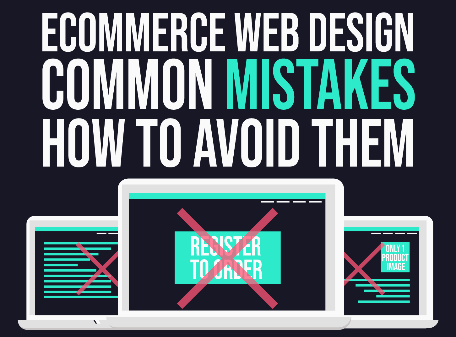
Online sales can open up huge new markets for many companies. That is why avoiding e-commerce web design mistakes is essential.
There are many things to consider when designing an e-commerce website, it’s not as simple as throwing software to buy and put products in a database.
Online stores make a lot of mistakes every day, and everything can be avoided with a little careful planning.
Even if you already make some of these mistakes, most of them are easy enough to fix. Avoiding them will greatly improve your customer experience.
What is E-commerce Web Design?
E-commerce design refers to the process of creating an online store for your company in which you can target customers online and sell them remotely.
Designing an e-commerce website involves planning, designing with the latest trends in web design, and editing your products and content for successful display on the Internet.
To continue, we must first find out what a successful e-commerce website looks like.
What Does a Successful E-commerce Website Look Like?
There are several important elements when designing a successful e-commerce website, including the following:
Responsive design
Your website needs to be customizable, which means it will adapt to the user’s device. Today we use a wide range of devices to access online stores, from smartphones to laptops, therefore your website must adapt to that.
When someone comes to your e-commerce website, they should be able to navigate it without having to think twice. It should come to them intuitively.
After all, the Internet is based only on convenience. At the end of the day, no one will work on finding your products.
High-Quality images
Original, high-quality images that show your products in the best possible light are imperative. Remember, do not use stock images.
Consistent design elements
Consistency is very important when it comes to building a solid and identifiable brand image.
For instance, if you use different colors and fonts throughout the website, it will look inconsistent, creating a confusing brand presence.
Simplicity in design is important to maintain if you want a special look and style.
Designed with mobile users in mind
Finally, designing with a mobile user in mind is critical. This is because Google has stated that mobile websites will be considered first in the rankings. Furthermore, smartphones are the most popular devices used to access the Internet today.
E-commerce Web Design Mistakes
The following are the most common mistakes that e-commerce sites make.
Consider tips before embarking on a new e-commerce project or when thinking about your current e-commerce website and make sure you follow the recommendations outlined here.
A lack of detailed product information
When shopping in a store, you have the advantage that you can pick up the item, feel it, look from every angle, and read all the information on the packaging or labels.
Online shopping eliminates this interaction. E-commerce websites need to do everything they can to improve their in-store shopping experience.
Low-Quality images
Poor quality images are bad for your e-commerce site and generate sales because no one will be forced to buy one of your products if the images do not do it justice.
One of the biggest mistakes we see that many people make is filling web pages with pictures. This sets your brand apart.
Instead, you need to make sure you have a good range of visual products that display your item from different angles so that people understand what they are buying.
Hiding contact information
Consumers want to know that they are dealing with the right company when submitting credit card information. They want to know that if they have a problem, they will be able to talk to a real person and get the help they need.
If your site doesn’t provide any contact information or hides it so consumers can’t easily find it, they’re less likely to trust your site, so they’re less likely to do business with you.
Too many pop-ups
Too many pop-ups distract users and annoy them! Think about your experience with pop-ups, browse a website, and constantly get random messages that pop up and distract you from what you’re trying to do. This is one of the most annoying e-commerce web design mistakes that you can make.
One place where pop-ups of any nature should never exist is during the payment process.
When someone tries to buy a product from your website, the worst thing you can do is distract them and potentially irritate them in the process. Unfortunately, this can often lead to lost sales.
Small product images
Since consumers cannot physically handle the products you sell before ordering on your website, you need to do as much as possible to recreate and enhance that experience. Images of small products do not work effectively.
Consider Tips Above To Avoid E-commerce Web Design Mistakes
Online sales today are more sustainable than ever, not only does it allow you to enter new and distant markets, but it offers customers a safe way to buy what they need when they want it.
It also allows companies to significantly reduce costs. However, you must remember that every other business is online and you must ensure that your e-commerce website is professionally designed.


 Book a Meeting


