


If you take a look at most of the modern and popular websites on the internet, you will see that they are displaying a world-class design. They likely used a grid-based layout when creating them.
Grids are there to guide us. They don’t guarantee that your website design will be top-notch, but they do help us with the process of creating a great design.
Grids are there to add structure, in combination with other design principles and elements, enabling the designer to ease his/her way to the end of designing a website.
A good web designer will know when to use the grid-based fundamentals, but he/she will also know when it is necessary to deviate from these basics and allow his/her creation greater freedom.
What Is A Grid?
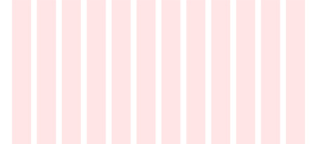
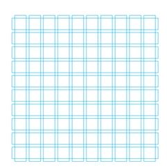
Basically, the grid is a structure that is composed of a series of lines. These lines are vertical or intersecting. Those lines divide a page into columns.
This structure on a page is there to help designers arrange content. Of course, most of the time, the lines aren’t visible, but the structure helps you manage your proportions and alignment between the elements that are featured on the web page.
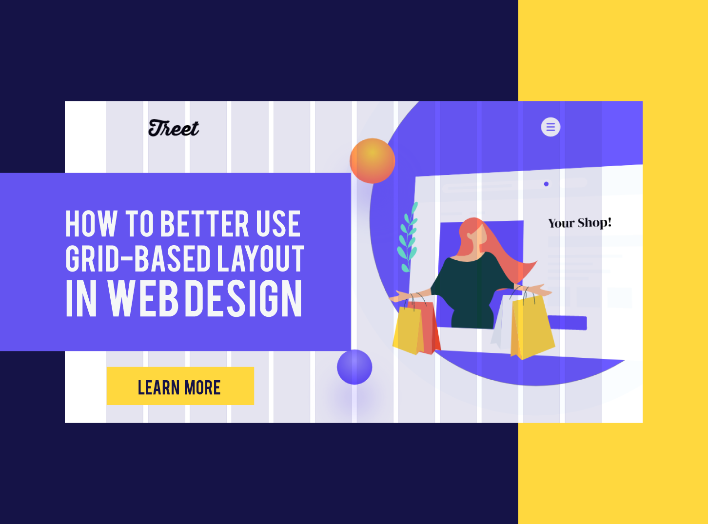
The grid-based layout is, so to say, a framework for your page layout. Web designers use this grid framework to better organize elements on a web page. Elements like: text sections, images, decorative elements, and the rest necessary graphic elements that are needed for a proper, modern web design and web page.
The grid originated in print design for books. It soon took on wide applications, and now grid-based layouts can be found in various types of designs, including web design.
Best Practices When Using Grid-Based Layout in Web Design
Becoming a top-notch web designer is not easy. There are a lot of techniques and principles that you need to master. One of those techniques is the usage of grid-based layouts in web design.
There is a lot of different elements that compose a good grid structure of your website. Variety of grid-types in combination with the thought process to figure out which grid type suits your needs, content, and design for a website that you are creating.
We will try to make this topic easier for understanding breaking it down into smaller pieces.
Let’s start!
1. Understand Your Grid-Based Layout “Body”
All grids in website design, no matter how big or small, or how simple or complex, have common components that define them as a grid-based layout:
Columns
Columns are considered as building blocks of grids. They represent vertical sections that span the height of the content area.
The great thing when using columns is that the more columns there are in the grid, the more options you have, or the more flexible the grid is.
Width of the columns are created by designer, but there are always some standard practices that most of the designer use. It is common to use 12 on desktop, 8 on a tablet, and 4 on mobile. Also, mostly, grids have 60-80px column widths. This width is an essential part of the design, as it represents where the content will be.
Rows
As you may have guessed, rows are the horizontal sections of a grid. Sometimes web designers don’t pay attention to rows, and this can make a problem with the design. Proper usage of rows in grid-based layouts of your pages is a must!
Modules
When rows and columns intersect, they for space. That space is called modules. Modules are commonly referred to as content modules, and they represent the building block of a page. Much of the design elements fit in these content modules, elements like text, images, buttons, videos, etc.
Gutters
Gutters represent the space (lines) between columns and rows. Common gutter size is around 20px.
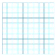
They form negative space between columns and rows, and their usage is most significant in masonry layout, where designers pay much attention to gutter width and its effect on the page layout.
Margins
Margins are the negative space between the outer edge of the content on your page and the format. Think about margins as ‘outside gutters’. The margins are sized differently for every device. They vary a lot, especially between desktop and mobile devices.
2. Choose The Proper Grid Layout
A grid-based layout implies a square-based structure. That doesn’t mean that the grid-based layout can’t be different. There are many sub-types of grids. Each type is unique, and it is used in web design, even if you don’t know that.
There is a big chance that you, as a web designer, used some type of grid-based layout for your page, but you didn’t realize it.
A few of the most famous grid-based layouts are:
- Block Grid
- Column Grid
- Modular Grid
- Hierarchical Grid
3. Responsive Design is Essential
Responsive design, at its core, means your page and its layout and content will be adaptable throughout desktop PCs, as well as through all of the smart devices, like tablets, mobile phones, that use different widths.
There is a difference between regular web design grids and responsive grids. Design grids are fixed to a baseline grid. The responsive grids are fluid. It means that columns scale, change, and reorient when the user changes his viewport.
The best example of a responsive grid is to see your content and page layout change, as it shrinks, or becomes larger when you change your browser widths/dimensions. This kind of grid-based layout will automatically arrange and show your content and the information from the page in a logical way, and make the user experience on your website much better.
4. The Rule of Thirds
The Rule of Thirds represents a web design technique. This technique will help designers create a visually beautiful page while making a balanced grid-based layout while completing your page design with image placement.
This technique places a grid, that makes your page divided into thirds, both horizontally and vertically. The result is nine equal parts of the page, formed by lines intersection.
The definition of The Rule of Thirds states that placing items that are crucial to the website on the thirds of an image, will draw users’ attention to them in a more impactful, and more appealing way.
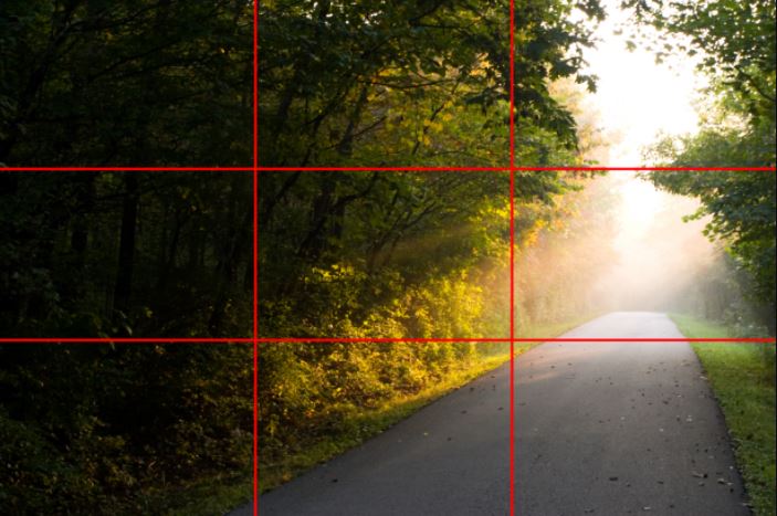
This rule, in web design, is used mostly to determinate some, or all, important grid-based layout design decisions like what type of grid to use, where to place most important elements, image ratios, negative space between and around elements, just to mention few.
Build Your Website With Inkyy & Use Proper Grid-Based Layout
Now that you learn more about grid-based layout, what it is, how to use it, which types of elements are included in the grid-based layout, it is the perfect time to start building your website.
Inkyy Web Design Studio is fully equipped with professionals that know exactly how to use the grid-based layout, and to combine modern design patterns, principles, and techniques to create your website or app.
Feel free to contact us through this contact form.
See you on the Inkyy Blog page on Wednesday, when we will write you about mistakes that you should avoid doing in modern Web Design!
 Book a Meeting