Purple Color Meaning: Psychology, Shades and Purple Logos
 8 min read
The purple color meaning has deep roots: royalty, luxury, creativity and a touch of mystery. For most of history purple was the most expensive color you could wear, and that sense of rarity still shapes how people read a purple brand today.
This guide explains what purple means in psychology and culture, what different shades of purple signal (with hex codes), which industries use it and why, and what famous purple logos teach. You will also find purple color pairings, the contrast rules for light and dark purples, and the mistakes that make purple branding feel dated or vague.
What does the color purple mean?
Purple sits between red and blue, with some of red’s warmth and some of blue’s calm. On the positive side it stands for luxury, wisdom, imagination, spirituality and individuality. On the negative side it can feel artificial, moody or self-important, especially in large areas of bright violet.
The royal link comes from real history. Ancient Tyrian purple dye was made from sea snails, and it took a huge number of them to dye a single garment. In Rome, purple cloth became a mark of emperors and the elite. That changed in 1856, when William Henry Perkin made the first synthetic dye, mauveine, by accident. Purple became affordable, but the old sense of status never fully left it.
What research says about purple
Purple is studied less than red or blue, so be careful with confident claims. A study across 30 nations by Jonauskaite and colleagues found that many color and emotion links are shared around the world, with local differences shaped by language and geography.
A review of color psychology by Andrew Elliot makes the same point: the field is still young, and context matters a lot. Purple will not make a product feel premium on its own, but it supports that message when the rest of the design does too.
Purple in different cultures
- Europe: purple carries royal and religious meaning, from imperial robes to the purple worn by bishops and used in Advent and Lent.
- Victorian Britain: mauve and lilac were worn for half-mourning, so purple has a quieter, more solemn side too.
- Japan: deep purple was the color of the highest court rank in the early imperial system, and it is still linked with nobility and refinement.
- Modern activism: purple is tied to women’s suffrage, International Women’s Day and several awareness campaigns.
To see why these associations shape how a brand is judged, read our article on the psychology behind branding.
Shades of purple and what they signal
Purple runs from pale lavender to near-black aubergine, and the message changes a lot along the way. The contrast column shows how each shade works as text on white. WCAG asks for at least 4.5:1 for body text and 3:1 for large text.
| Shade | Hex | What it signals | Contrast on white |
|---|---|---|---|
| Lavender | #E6E6FA | Soft, calm, clean | 1.2:1 |
| Lilac | #C8A2C8 | Gentle, romantic, nostalgic | 2.2:1 |
| Orchid | #DA70D6 | Playful, creative, floral | 2.9:1 |
| Amethyst | #9966CC | Imaginative, friendly, modern | 4.1:1 |
| Royal purple | #7851A9 | Confident, creative, premium | 5.9:1 |
| Purple | #6A0DAD | Bold, rich, distinctive | 9.2:1 |
| Indigo | #4B0082 | Deep, wise, serious | 13.0:1 |
Most mid and dark purples pass body text contrast on white with room to spare. The pale end is the problem: lavender and lilac are background colors, never text colors. Light purples feel soft and calm, so they suit wellness, beauty and baby products. Deep purples feel richer and more serious, and they suit chocolate, finance, education and luxury goods.
Which industries use purple, and why
- Chocolate and sweets: purple wrappers suggest indulgence and a small treat. In the UK, Cadbury even went to court to protect its purple, and lost an appeal against Nestlé over how widely it could register the color.
- Beauty and wellness: lilac and lavender feel calm, clean and caring. Our roundup of beauty brand logos shows how often soft purples appear.
- Tech, gaming and streaming: bright violet stands apart from the many blue tech brands and feels creative and a bit rebellious.
- Luxury and premium goods: deep purple with gold or cream recalls its royal history. See our list of luxury logo design ideas for examples.
- Education and charities: purple suggests wisdom and dignity without feeling as corporate as navy.
Famous purple logos and what they teach
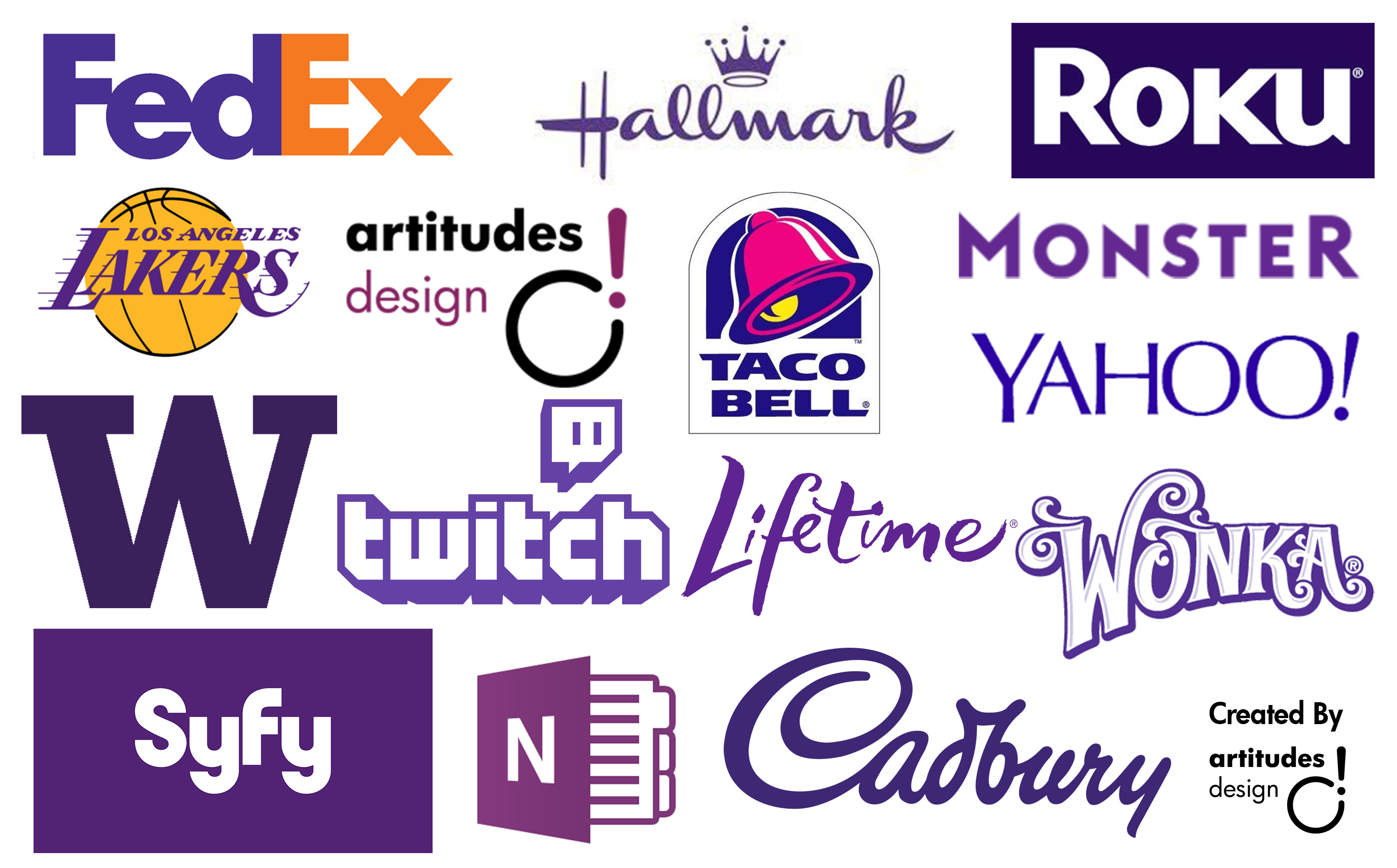
These logos are shown as editorial examples only. Each one is a trademark of its owner.
FedEx
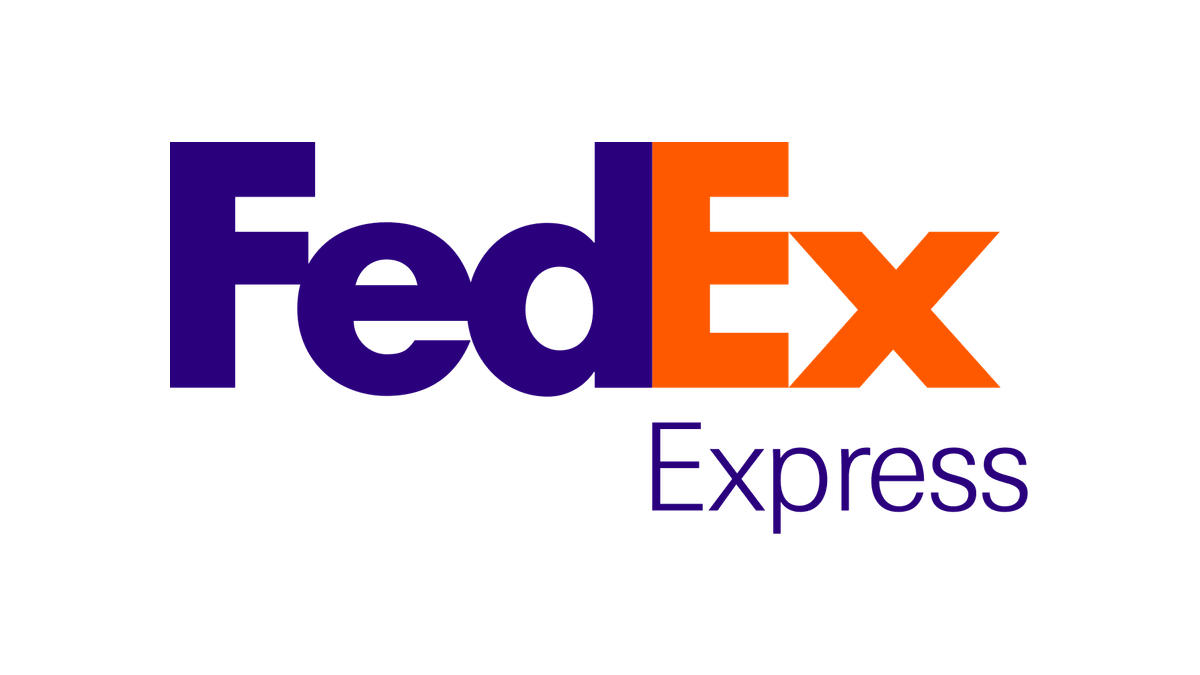
FedEx pairs a deep purple “Fed” with an orange “Ex”, and the white space between the E and the x forms a hidden arrow. The purple keeps the brand serious and dependable, while the orange adds speed and energy. Purple makes a steady base for a brighter accent.
Twitch

Twitch uses a bright, slightly blue violet across its logo, app and the Glitch speech bubble icon. Among blue and red platforms, the purple is easy to spot and feels playful, which suits a gaming community.
Yahoo
Yahoo has used purple for years, and its 2019 logo kept the color while making the letters bolder and simpler. The bright violet helps an older brand look current, and it ties together very different products such as mail, news and finance.
Milka
Milka has wrapped its chocolate in lilac since the first bars in 1901, and its lilac cow appears in its advertising. The soft purple is so tied to the brand that a lilac bar on a shelf is recognized before the name is read. Like Cadbury, it shows how a food brand can own a shade of purple and make it feel like indulgence.
Hallmark
Hallmark’s purple script and crown lean into purple’s royal side. The crown, the handwriting and the color together suggest quality and care, which fits a brand built on greeting cards and gifts.
Purple color pairings and palettes
Purple can lead a palette or support a brighter accent. These pairings are a good start.
- Purple and gold (#4B0082 + #FFD700): rich, royal and festive. Gold on deep indigo has a contrast ratio of about 9.2:1, so it works for text as well as accents.
- Purple and orange: energetic and confident, as FedEx shows. Keep the two apart or give each its own role, because orange on dark purple is only about 4.0:1.
- Deep purple and cream (#5B2C83 + #F5F0E6): calm and refined. About 8.7:1, good for editorial, education and premium food.
- Lavender and dark plum (#E6E6FA + #2E1A47): soft but readable, about 12.6:1. It suits beauty, wellness and skincare.
- Purple and pink: playful and young. Popular with gaming, apps and entertainment. Add a neutral so it does not feel sugary. Our guide to pink in branding covers that side.
Our guide to color schemes in web design shows how to balance a palette like this across a website.
Accessibility and contrast with purple
Purple brings two accessibility questions. First, light purples have very low contrast on white. Lavender text on white is about 1.2:1, so use lavender only for backgrounds and put dark text on top. Second, bright violets sit in the middle of the range. #9146FF, a typical bright streaming purple, is about 4.6:1 against white and about 4.5:1 against black. That just passes for body text, with no margin for thin fonts.
Purple and blue can also be hard to tell apart for people with some types of color blindness, so do not rely on a purple versus blue difference alone in charts or status labels. Add labels or icons. Check every pair in the free WebAIM contrast checker.
Common mistakes with purple branding
- Choosing a vague purple. Purple is crowded in some sectors, especially beauty and chocolate. Pick a clear shade and own it, or the brand will look like a copy.
- Too much bright violet. Large areas of saturated purple feel artificial and tire the eyes. Use it for the logo and key accents, and let neutrals carry the layout.
- Pale purple text. Lilac and lavender fail contrast as text. See the table above.
- Screen colors that do not print. Bright RGB violets often look dull or bluish in CMYK. Define a Pantone match and test real prints.
- No plan for small sizes. A light purple logo can vanish as a favicon. Our post on logo variations explains which versions every brand needs, and our article on bad branding covers more traps like this.
Is purple right for your brand?
Purple fits brands that want to feel creative, premium, wise or a little different: chocolate, beauty, wellness, gaming, education and luxury. It is a harder fit for brands that need to feel cheap and cheerful or fast and urgent, unless you pair it with a warm accent such as orange or yellow.
Compare it with its neighbors before you decide. Red in branding is louder and more urgent, while blue is calmer and more corporate. Pink is purple’s playful cousin, and orange, yellow, green and brown each take a brand somewhere else. Our hub on brand colors brings the whole series together, with a step-by-step method for building a palette.
Frequently asked questions
What does the color purple mean in branding?
Purple usually signals luxury, creativity, wisdom and imagination. Deep purples feel premium and serious, while light purples feel calm, soft and caring.
What are the negative meanings of purple?
Purple can feel artificial, moody or pretentious, especially in very bright violets used over large areas. In some traditions, such as Victorian half-mourning, it also has a solemn side.
What colors go well with purple in a logo?
Gold, cream, white, orange, pink and cool grays all pair well with purple. Gold and cream make deep purples feel premium, while orange and pink add energy.
Is purple a good color for a website?
Yes, if you choose the right shades. Mid and dark purples pass contrast with white text, so they work for buttons and links. Keep light purples for backgrounds.
Can I use these logos?
No. The logos shown here are trademarks of their owners and appear only as editorial examples. Use them to study how purple works, then design something original.
Need a purple brand identity for a client?
Inkyy is a white label design and development team for agencies. Our in-house brand designers build complete identities, from logo and brand colors to guidelines, that you deliver under your own brand. See our design services or book a 15-minute call.