20 Beauty Logo Ideas for Skincare, Makeup and Salons
 9 min read
A beauty logo has to do more work than most. It sits on a lipstick lid, a salon window, a jar of cream and an Instagram profile, and it has to look good on all of them while hinting at price, mood and who the brand is for.
Below are 20 beauty logo designs grouped by business type: skincare, makeup and cosmetics, salons and spas, and hair and nails. Most are concepts by independent designers. A few are famous cosmetic brand logos, included as editorial examples. For each one we note what works and which kind of brand the style suits, so you can borrow the thinking for your own project.
What a beauty logo says about a brand
- Script and handwriting: personal, artisan and feminine. Common for makeup artists, lash and brow studios and boutique salons.
- Thin serifs and wide letter spacing: premium and calm. The default for luxury skincare and fragrance.
- Bold sans serif: confident, accessible and fun. Typical of mass-market makeup brands.
- Leaves, drops and flowers: natural, clean and gentle. Good for organic skincare and spas.
- Faces and silhouettes: warm and human. Popular with salons, but only memorable when there is a second idea in the drawing.
The common traps are the generic woman’s profile in a circle, hairline strokes that vanish when the logo is printed on a small tube, rose gold that turns muddy brown without real foil, and scripts so ornate that nobody can read the name. Several examples below show smart ways around these.
20 beauty logo ideas by business type
Skincare logos
1. Bevara by Kristina
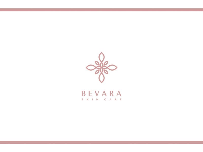
A small line ornament in dusty pink, part flower and part cross-stitch, sits above a widely spaced serif wordmark and a tiny SKIN CARE line. There is a lot of white space and nothing shouts. That quiet confidence suits clean, minimal skincare sold in white or frosted packaging.
2. Total Derma by Dileny
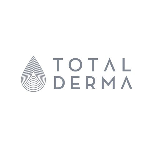
A water drop drawn with concentric outlines, like ripples or a fingerprint, next to a light grey wordmark where the A has no crossbar. The drop says hydration and the cool grey says clinic rather than spa. A good direction for a dermatology line or a distributor of science-led skincare.
3. Matcha Naturals by MoOnS
A bold black M built from leaf and petal shapes, set beside a compact two-line wordmark. It is one of the few logos here that would still read clearly stamped small on a jar lid. Natural skincare brands often go soft and pale, so a strong black mark like this stands out on the shelf.
4. Uprooted by Sandeep Roy
An arched emblem in copper line work holds sun rays at the top and a leaf inside a drop below. The brief was handcrafted skincare made with herbs and oils, and the emblem reads like an apothecary label. The dark maroon and copper palette feels warm and premium, ideal for small-batch and organic ranges.
5. Shiseido (famous brand)
The Japanese beauty group uses a red serif wordmark whose S letters sweep out in long, calligraphic curves. That one detail makes the name recognisable even from across a shop floor. It shows how a single custom letter can carry a whole brand, which is often a stronger route than adding an icon. Shiseido is a registered trademark of its owner. Logo image via Wikimedia Commons.
6. Clinique (famous brand)
Black flared capitals sit between two thin rules, with no symbol at all. The look is closer to a pharmacy label than a fashion brand, which matches Clinique’s clinical, dermatologist-led positioning. If your skincare client sells on science and trust, this is the tone to study. Clinique is a registered trademark of its owner. Logo image via Wikimedia Commons.
Makeup and cosmetic logos
7. Nawara by Kristina
An ornate N monogram with small leaf flourishes, shown in rose gold foil on textured white paper above a classic serif wordmark. The presentation shows the logo as it would look on a box or a business card. Rose gold only works this well when it is printed as real foil, so plan the budget for it.
8. Dove Lady by Shibu PG
Inside a black circle, a woman with closed eyes and a flower in her hair turns into a white dove at the neck. It is a smart use of negative space, and the high-contrast wordmark with its joined LA keeps the elegant tone. A face in a circle is a crowded idea in this industry, but the dove gives this one a story of its own.
9. Soi Belle by aleT
A sketched woman with a tall, curly updo in a soft tan, above the name in a loose black handwritten script. The illustration feels like a fashion drawing, so it suits a makeup studio, a lash or brow artist or a boutique beauty brand. Keep a simpler text-only version for small uses, because the fine hair lines will fill in when printed small.
10. NYX Professional Makeup (famous brand)
Heavy geometric letters, a tiny heart and a line of widely spaced capitals. The wordmark is loud and simple, which suits an affordable, trend-driven makeup brand sold in drugstores and on social media. Compare it with the delicate scripts above: bold type says accessible and fun, thin type says exclusive. NYX is a registered trademark of its owner. Logo image via Wikimedia Commons.
11. NARS (famous brand)
Four thin capitals pushed so close together that they overlap and share strokes. It is pure typography with no icon, and it still feels designed rather than typed. The brand was founded by makeup artist François Nars, and the edgy, fashion-led wordmark matches that backstage image. NARS is a registered trademark of its owner. Logo image via Wikimedia Commons.
Salon and spa logos
12. Flower Girl by Vick Ben
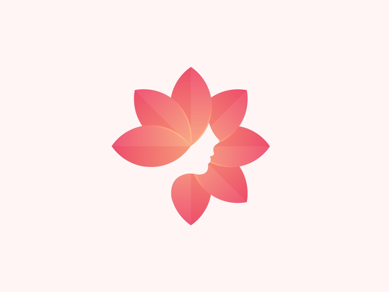
A coral pink lotus with soft gradients, where the gap between the petals forms a woman’s profile. You see the flower first and the face a second later, and that small surprise makes it memorable. It suits a beauty salon, a spa or a skincare clinic, and it would make a striking app icon.
13. Didur Beauty Center by Dmitry Litvinenko
A dandelion clock whose seeds end in little hearts, with two of them drifting away. The grey mark and clean sans serif on a peach background feel friendly rather than glamorous. A good fit for a neighbourhood beauty centre that wants to look caring and approachable.
14. The Studio Greenwich by chilibrand
A figure sitting cross-legged is drawn in one teal line from overlapping circles, above a grey lowercase wordmark and the tagline Mindfulness and more. The rounded shapes feel calm and open. It suits wellness studios, day spas and yoga spaces more than glamour-led salons.
15. Eternal Oasis Massage by vraione
A pink and blue feather curls into a crescent moon, with a few stars, above a white script and spaced capitals. The night-sky background sets an evening, wind-down mood. The detailed feather needs a flat version for signage and stamps, but as a hero image it is very atmospheric for a massage or holistic therapy studio.
Hair and nail logos
16. Flower in Her Hair by Carlos Puentes
A woman with long auburn hair and closed eyes wears a white flower, all held inside a rounded shape with a thick navy outline. The bold outline keeps the illustration readable at small sizes and gives it a sticker-like charm. Warm and playful, it suits a hair salon, a natural hair care line or a beauty shop with a younger audience.
17. Color To Dye For by merci dsgn
A skull wears a towering magenta hairdo with a heart cut into it, above a chunky navy serif. The brief was a start-up selling custom dyed wigs to a young audience, and the pop art skull plus the pun in the name hit that mark. It proves a beauty logo does not have to be soft and pastel.
18. Smoke Show Salon by Moonlit Fox
A hand-drawn woman in black and white, whose long wavy hair dissolves into smoke-like lines around her. The decorative wordmark below has an Art Deco feel. The illustration is the selling point, so it works best large: on the salon window, a tote bag or the website header.
19. Diamond Nails by shaka88
A pink line diamond with an interlaced star pattern inside, above white spaced capitals on deep navy. The mark is literal, but the geometric line work makes it feel crafted rather than clip art. Pink on navy is a fresh alternative to the usual pink on white for nail salons.
20. Claws Hand and Foot Spa by Milica2505
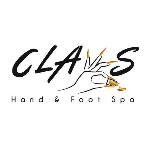
In the brushy black wordmark, the W is replaced by a line-drawn hand with long gold nails tipping a bottle of gold polish. The idea explains the business in one glance. It is busy for a favicon, so pair it with a simple monogram for social and booking apps.
Tips for designing a beauty logo
- Design for the packaging first. Mock the logo up on a lipstick lid, a pump bottle and a jar label before you show the client. Most beauty logos fail on a tiny cap, not on a slide.
- Test one colour, foil and emboss. Beauty packaging is often printed in a single colour, hot foiled or blind embossed. A mark that only works in gradients will struggle.
- Choose type with care. In this industry the font often is the logo, as Clinique and NARS show. Our guide to font pairing helps you match a wordmark with packaging copy.
- Use colour on purpose. Blush and nude tones feel soft and natural, black and gold feel luxurious, and bright magenta feels bold and young. Read more about pink in branding and purple in branding.
- Plan the variations. You will need a full lockup, a monogram for social avatars and a simple version for stamps and stickers. Here is how to plan logo variations.
Looking for more ideas? Browse our collections of feminine logos, luxury logo ideas and minimalist logo designs.
Frequently asked questions
What makes a good beauty logo?
It is simple enough to print small on packaging, it fits the price point of the products, and it has one idea that sets it apart, such as a custom letter, a clever use of negative space or a distinctive colour.
What colours work best for a cosmetic logo?
Black, white, blush pink, nude and metallic gold or rose gold are the most common. They are safe but crowded, so many newer brands use a single bold colour, like a deep green or a bright magenta, to stand out on the shelf.
What font should I use for a makeup logo?
A high-contrast serif or a wide spaced sans serif feels premium, a handwritten script feels personal, and a heavy geometric sans feels bold and accessible. Whatever you choose, make sure the name is readable at small sizes.
Can I use these logos?
No. The designer concepts belong to their designers, and the famous brand logos are registered trademarks of their owners. Use them for inspiration on style, shape and colour, then have an original logo made for your brand.
Need a beauty logo for a client?
Inkyy is a white label design and development team for agencies. Our in-house brand designers create original logos, packaging-ready identities and brand guidelines that you deliver under your own brand. See our design services or book a 15-minute call.