8 Ecommerce Website Mistakes to Avoid and How to Fix Them
There are many things to consider when designing an e-commerce website, it’s not as simple as throwing software to buy and put products in a database. Which web design mistakes to avoid, and how should you design your e-commerce website, you can find out in the new blog article from Inkyy Web Design & Branding Studio.
 5 min read
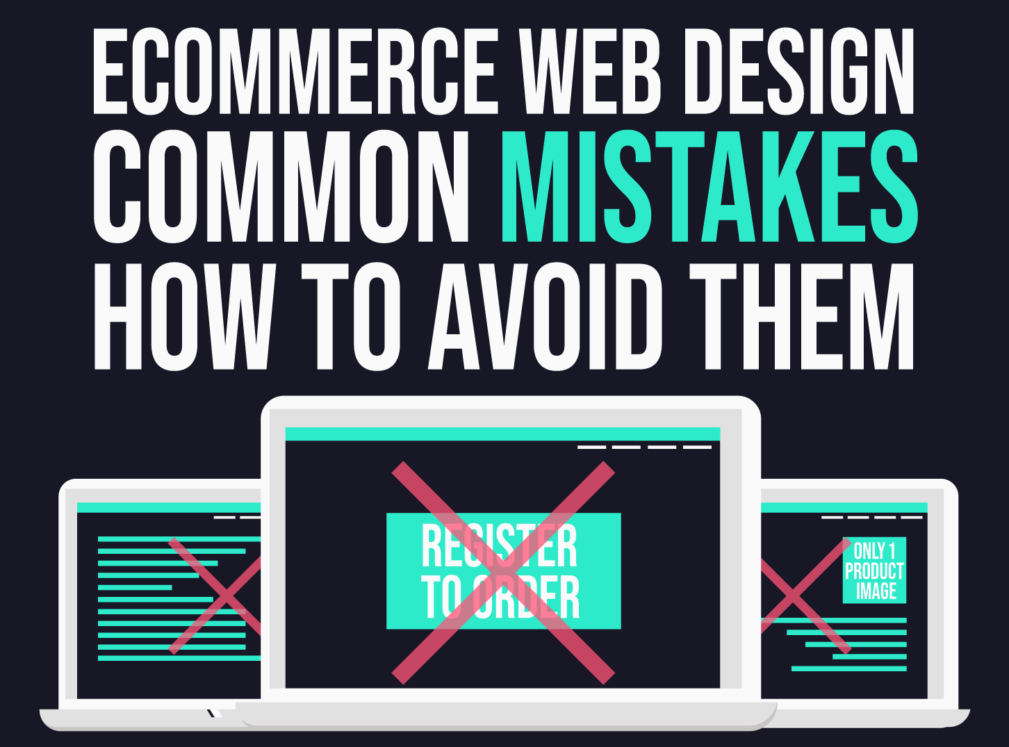
Most ecommerce website mistakes are easy to fix once you know where to look. Online stores open up large new markets, but a confusing or untrustworthy design sends shoppers to a competitor within seconds.
Below are eight ecommerce website mistakes we see again and again, with a clear fix for each. Start with a short look at what a good shop needs, so you can judge your own store against it.
What a successful ecommerce website needs
Ecommerce web design is the work of planning, designing and building an online shop where people can browse, choose and pay. A store that sells well usually gets five things right:
- Responsive design. The shop adapts to phones, tablets and laptops. Google predominantly uses the mobile version of a page for indexing, so mobile quality affects search too. See our web design tips for SEO.
- Easy navigation. Visitors find products without thinking. Our guide to website navigation covers the details.
- Good product photography. Clear, original images that show the product in its best light.
- Consistent design. The same colours, fonts and button styles across every page. Simple, consistent design builds a recognisable brand.
- A short route to payment. Few steps, clear prices and no surprises.
Fixing the mistakes below rarely needs a full redesign. In most stores a few focused changes to product pages, mobile layout and checkout make the biggest difference.
8 ecommerce website mistakes to avoid
1. Thin product information
In a shop you can pick up an item, turn it over and read the label. Online, the product page has to do all of that. Missing sizes, materials, dimensions, delivery times or care instructions leave shoppers guessing, and they will not guess for long.
Fix it: write descriptions that answer the questions customers ask most. Add a spec table, a size guide and delivery and returns information on the page.
2. Weak or small product images
Low-resolution, dark or tiny photos make products look cheap. A single small image does not show texture, scale or detail. Filling a page with too many unrelated pictures also hurts clarity.
Fix it: use sharp photos on a clean background, with several angles, a zoom function and one image showing the product in use. Use original photography where you can, because generic stock images make a shop look like every other. Compress files so pages load quickly. Choose a strong lead image for each category page too.
3. Hiding contact and trust information
Before shoppers enter card details they want to know who is behind the shop and how to reach them if something goes wrong. If your phone number, email, address, returns policy or company details are hard to find, trust drops.
Fix it: put contact details in the header or footer on every page. Add a clear returns policy, delivery information and secure payment logos near the checkout.
4. Intrusive pop-ups
Pop-ups can be useful, but too many interrupt people who are trying to buy. A newsletter box that covers the product on the first visit, or a message that appears during payment, is one of the fastest ways to lose a sale. On mobile, Google may also penalise intrusive overlays that block content.
Fix it: show a pop-up only when it has a clear purpose, delay it, make it easy to close and never show one on the checkout. Read our guide to pop-up design practices.
5. A slow or awkward mobile experience
Many shoppers use a phone. Tiny buttons, tables that scroll sideways and pages that take seconds to load drive them away. A store that looks fine on a desktop can still be hard to use on a small screen.
Fix it: design the mobile layout first and test the full journey on real devices. Keep buttons large, forms short and pages light. Check your Core Web Vitals report in Google Search Console.
6. Confusing navigation and weak search
If shoppers cannot find a product within a few clicks, they leave. Menus with too many items, unclear category names and a search box that returns nothing are common problems.
Fix it: group products into clear categories with plain names, add filters for size, price, colour and brand, and make sure search handles typos and shows suggestions.
7. A long or forced checkout
Forcing people to create an account before paying, asking for information you do not need or hiding the total until the last step all cause abandoned baskets.
Fix it: offer guest checkout, show the total with delivery and tax early, support the payment methods your customers use and let people review their basket before paying.
8. No reviews or other social proof
Shoppers trust other shoppers. A product with no reviews, no ratings and no customer photos feels risky, especially from a brand they do not know.
Fix it: collect reviews after purchase and show ratings on product and category pages. Respond to negative reviews politely and show your replies.
Quick wins you can do this week
- Add your delivery and returns information to every product page.
- Compress your largest product images and check the page speed again.
- Remove or delay any pop-up that appears in the first few seconds.
- Put a phone number or email address in the header.
- Show the number of reviews next to the star rating.
None of these needs a redesign. Together they remove friction at the moments when shoppers decide whether to trust you.
How to check your own store
Set aside an hour and go through the shop as a first-time customer on a phone. Find a product, read the details, add it to the basket and get to the final payment step. Write down every moment you hesitate. Then check your analytics for pages where many visitors leave. Fix the biggest problems first.
For a wider list of problems that affect any site, read our posts on common web design mistakes and 9 mistakes to avoid in web design. For positive ideas to try next, see our 5 ecommerce design tips, and our guide to ecommerce personalization.
Frequently asked questions
What is the biggest ecommerce website mistake?
There is no single answer, but a slow, hard-to-use mobile experience and a long checkout cause the most lost sales. Fix those first, then work on product pages and trust signals.
Why do people abandon their baskets?
Common reasons are surprise costs, a forced account, a long checkout, security worries and slow pages. Showing the full price early, offering guest checkout and keeping forms short address most of them.
How many product images should I show?
Show enough to answer the buyer’s questions. For most products that means three to six images, including close-ups, different angles and a photo in use. Add a zoom option.
Should I use pop-ups on an online store?
Only sparingly. A single well-timed pop-up, such as a newsletter offer shown after someone has browsed for a while, can work. Never show one during checkout, and make sure it is easy to close.
Need an ecommerce website for a client?
Inkyy is a white label design and development team for agencies. Our in-house team designs and builds online stores, from product pages to checkout, under your brand. See our design services or book a 15-minute call.