Website Style Guide: What to Include and How to Build One
 8 min read
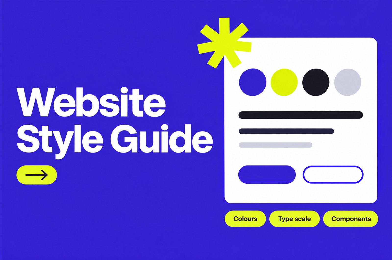
A website style guide is the single document that tells designers, developers and content editors how every part of a site should look and behave. It covers colours, type, spacing, buttons, forms and the small rules that keep page 40 looking like page 1.
For an agency, it is also a handoff tool. A good one cuts revision rounds, keeps freelancers and partners on the same page, and stops a client site from drifting after launch. This guide covers what to put in it, how to build one in seven steps, and how to hand it to developers so it actually gets used.
Website style guide vs brand guidelines vs design system
These three terms get mixed up, and the search results for “website style guide” mix them too. They overlap, but they answer different questions.
| Brand guidelines | Website style guide | Design system | |
|---|---|---|---|
| Main question | Who is this brand? | How does this website look and behave? | How do we build many products the same way? |
| Covers | Logo, colours, tone of voice, print and social use | Web type scale, colour roles, spacing, components, states, imagery on screen | Style guide plus coded components, tokens, usage docs and governance |
| Main users | Marketing, print, any vendor | Web designers, developers, content editors | Product and engineering teams |
| Typical size | 10 to 60 pages | One page or one Figma file | A whole site or library |
| Right for | Every brand | Most agency client websites | Large companies with several digital products |
Most agency clients need brand guidelines and a website style guide. Very few need a full design system. If the client already has brand guidelines, the website style guide translates them for the screen. If they do not, the style guide often becomes the first real brand reference they own.
What to include in a website style guide
Keep it practical. Every item below should answer a question a designer or developer will ask while building a page.
1. Colour palette with roles
List every colour with its HEX value, then give each one a job. “Primary”, “text”, “background”, “border”, “success”, “error” and “link” are more useful than “Blue 2”. Roles tell people where a colour belongs, not just what it is. Add contrast pairs that pass (for example, white text on the primary colour) and pairs that fail, so nobody has to guess. Our guide to website colour schemes covers how to build the palette itself.
2. Typography and type scale
Name the fonts, the weights you actually license and load, and a fixed scale for H1 to H6, body, small text and captions. Give each size a line height and, where needed, letter spacing. Include mobile sizes, because a 56px desktop heading rarely works on a phone. If you are still choosing fonts, see our notes on font pairing and letter spacing.
3. Spacing scale and grid
This is the section most style guides skip, and it is the one that causes the most “it looks a bit off” feedback. Pick a base unit (4px or 8px is common) and a short list of allowed values, such as 4, 8, 16, 24, 32, 48, 64 and 96. Define container width, column count and gutters for desktop, tablet and mobile. A clear grid-based layout makes this easy to follow.
4. Components and their states
Show each reusable piece: buttons, links, form fields, cards, navigation, alerts, accordions, tabs and modals. For each one, show every state, not just the default. A button needs default, hover, focus, active, disabled and loading. A form field needs empty, filled, focus, error and disabled. Missing states are where developers improvise, and improvised states are where sites start to look inconsistent.
5. Imagery and icons
Set rules for photo style, crop ratios (for example 16:9 for blog headers, 1:1 for team photos), corner radius, and file formats. Pick one icon set, one stroke width and one size grid. Mixing icon sets is one of the fastest ways to make a site look assembled rather than designed.
6. Accessibility rules
Write the minimums into the guide so they are not left to memory. Under WCAG 2.2 level AA, normal text needs a contrast ratio of at least 4.5:1, and large text (about 24px regular or 18.5px bold) needs at least 3:1. UI components and focus indicators need 3:1 against adjacent colours. Click and tap targets should be at least 24 by 24 CSS pixels, with a few exceptions. Note that brand colours are not exempt from the contrast rules, only logos are.
7. Voice and content patterns
Keep this short. Button label style (“Book a call”, not “Submit”), sentence case or title case for headings, date and number formats, and how to write error messages. Content editors will thank you, and the site will read as one voice after the client starts adding pages.
How to build a website style guide in 7 steps
- Audit what exists. On a redesign, screenshot every button, heading and form on the current site. You will usually find several button styles and many font sizes. That list becomes the case for the style guide.
- Start from the brand. Pull logo files, colours and fonts from the brand guidelines. Check font licences cover web use.
- Set the foundations first. Colour roles, type scale and spacing scale. Do not design components until these are locked.
- Design components from real pages. Build the homepage and one inner page, then extract the parts you used. This keeps the guide grounded in what the site needs, not a wish list.
- Add every state. Go component by component and add hover, focus, error and disabled states.
- Check accessibility. Run every text and background pair through a contrast checker and fix the ones that fail before handoff.
- Publish it where people work. A Figma page, a shared link or a page inside the site itself. A PDF in an email gets lost.
This fits naturally into a normal web design process: foundations come after the wireframe stage and before full page design.
Handing the style guide to developers
A style guide only works if it ends up in the code. That means turning visual rules into named values that developers can use directly.
- Use design tokens. Name values once (colour-primary, space-16, font-size-h2) and use the same names in the design file and the code. The Design Tokens Community Group published its first stable format specification in October 2025, so there is now a shared format that tools can read.
- Map tokens to the platform. In WordPress block themes, colours, font sizes and spacing presets live in theme.json, so editors only pick approved values. In Webflow, variables and classes do the same job. In custom builds, CSS custom properties are the simple option.
- Name components the same way in design and code. If the designer calls it “Card / Service” the developer should not call it “box-2”.
- Document the edge cases. Long headings, missing images, three cards instead of four. Developers hit these on day one.
Website style guide checklist
Use this before you call the guide finished.
- Every colour has a HEX value and a role.
- Text and background pairs are marked pass or fail for contrast.
- Type scale covers H1 to H6, body, small text and captions, on desktop and mobile.
- Spacing uses a fixed scale, and the grid is defined per breakpoint.
- Buttons, links and form fields show all states, including focus.
- Image ratios, radius and icon set are defined.
- Tokens or variables match names in the design file.
- There is an owner and a version number or “last updated” date.
- The guide lives in one shared place the client can access.
Common mistakes to avoid
- Too many options. Six button styles is not a system. Two or three (primary, secondary, text link) cover most sites.
- Only showing the happy path. No error states, no empty states, no long-text examples.
- Building it after the site. A guide written after launch documents the inconsistencies instead of preventing them.
- No owner. Someone needs to approve changes, or the guide stops matching the live site within months.
- Ignoring visual hierarchy. A type scale where H2 and H3 look almost the same will not help readers scan the page.
How agencies use style guides with partners
When an agency brings in freelancers or a white label partner, the style guide is what keeps the output looking like one team made it. It replaces long briefing calls with a reference everyone can check. It also protects the agency: if the client relationship moves to a new team later, the rules for the site go with it.
From the studio: we treat the focus state of buttons and links as a required item before any page goes to development. It takes a few minutes to design, it is easy to forget, and it is one of the first things to fail a keyboard test. Designing it in the style guide means the developer never has to invent one.
Frequently asked questions
What is a website style guide?
It is a reference that defines how a website looks and behaves: colours, typography, spacing, components and their states. Designers, developers and editors use it to keep every page consistent.
What is the difference between a style guide and brand guidelines?
Brand guidelines define the brand across every channel, including print and social. A website style guide applies those rules to the screen and adds web-specific detail like spacing, components and interaction states.
How long should a website style guide be?
For most business websites, one Figma page or one web page is enough. If it needs a table of contents to navigate, it is probably closer to a design system.
Who should own the style guide after launch?
One named person, usually the lead designer at the agency or the marketing lead on the client side. They approve changes and update the version date.
Need a design team that builds to a style guide?
Inkyy is a white label design and development team for agencies. We design websites with a clear style guide and build them in WordPress, Webflow or custom code, all under your brand. See our design services or book a call to talk through your next project.