Brand Guidelines: What to Include and a Simple Template
 9 min read
Brand guidelines are the rulebook for how a brand looks, sounds and behaves. They explain how to use the logo, colours, fonts, images and tone of voice, so every post, web page, pitch deck and package looks like it comes from the same company.
This guide covers what brand guidelines are, what to include, how to create them step by step, which format to choose and which mistakes to avoid. At the end you will find a simple brand guidelines template outline that you can copy for your own brand or for a client.
What are brand guidelines?
Brand guidelines are a document that records the rules of a brand in one place. You will also hear them called a brand guide, brand book, style guide or brand standards. The terms overlap. Some people use “style guide” for the visual rules only and “brand book” for a fuller document that also tells the brand story.
A good document answers four questions: who are we, how do we look, how do we sound and how do we apply all this? It is not the same as brand strategy. Strategy decides what the brand stands for. Guidelines record those decisions and show people how to use them. Our brand strategy framework covers the first part, and our guide to visual brand identity covers the elements the guidelines will describe.
Why you need brand guidelines
Every business benefits from brand guidelines, whatever its size or budget. Even a one-person company works with designers, printers, freelancers and social platforms, and each of them needs to know the rules.
- Consistency. People recognise a brand that looks and sounds the same everywhere. Inconsistent branding makes a company look careless. Our post on bad branding shows how quickly it happens.
- Speed. A new designer, writer or agency can start work from the document instead of asking the same questions again and again.
- Quality control. You can review work against clear rules, not personal taste. That means fewer rounds of feedback.
- Freedom with limits. Good guidelines say what must stay fixed and what can change, so creative people can work without breaking the brand.
Keep the document practical. Anyone should be able to understand the brand after reading it once. A short, clear guide that people use is better than a long one that nobody opens.
What to include in brand guidelines
There is no fixed length. A small company can cover the essentials in a few pages, and a large organisation may need 60 or more. What matters is that the document includes the elements below, with examples for each.
Brand foundation
Start with the reasons behind the design. Write down your mission, values, target audience and positioning, plus three or four personality traits such as “friendly, precise, calm”. Keep this to a page. Every later choice, from colours to wording, should connect back to it.
Logo usage and clear space
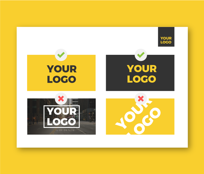
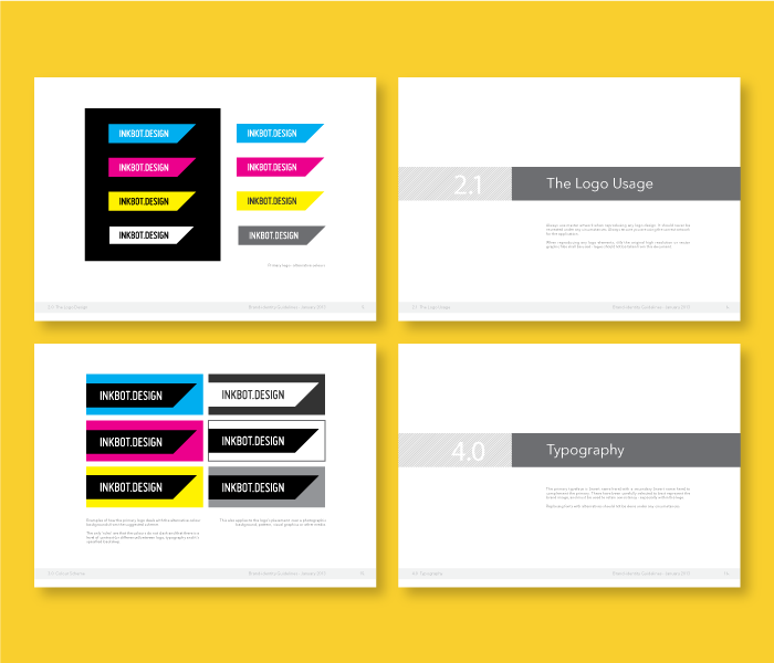
Show the primary logo and all its variations: horizontal, stacked, icon only, one colour and reversed for dark backgrounds. Explain where each one is used. For example, the horizontal logo goes in a website header and the icon goes on a profile picture or favicon. Our post on logo variations lists the versions every business needs.
Then set the technical rules. Clear space is the empty area around the logo that no other element may enter, and it is usually measured with part of the logo itself, such as the height of one letter. Add a minimum size for print and screen, approved background colours and a list of misuse examples: stretched, rotated, recoloured, outlined or placed on a busy photo.
Colour palette with codes
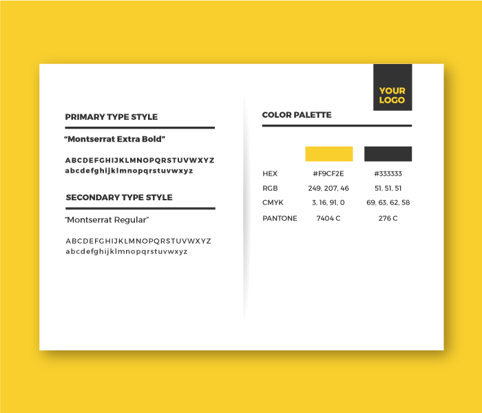
List your primary colours, which usually appear in the logo, and your secondary colours, which give more options for websites, flyers and packaging. Add a neutral or two for text and backgrounds. For each colour, give the HEX and RGB values for screens, CMYK for print and a Pantone reference if you print with spot colours.
Say how much of each colour to use, for example 60 per cent neutral, 30 per cent primary and 10 per cent accent. Check contrast too: body text normally needs a contrast ratio of at least 4.5 to 1 against its background to meet accessibility guidelines. For colour meanings, see our guide to colours and branding.
Typography
Name the exact fonts, with a primary and a secondary typeface. Say which one is used for the logo, headlines, subheads, body text and social posts. Add sizes, weights and line spacing for the main text styles, and tell people where to download the fonts and what licence they have.
Also list a fallback font, such as a system font, for places where your brand font is not available, like email. If you are still choosing fonts, read our tips on font pairing first.
Imagery and graphics
This section sets the look of your photos, illustrations, icons and patterns. Describe the subjects, light, colours, crops and mood you want, and add good and bad examples. Include your mascot or illustration style if you have one, and say where approved images can be found and who owns them. New photographers and designers will rely on this page the most.
Voice and tone
Brand voice is the personality of your writing. It stays the same everywhere. Tone changes with the situation: a support reply is calmer than a launch post. Describe your voice with three or four traits, and show how each one sounds with short examples of what to say and what to avoid. Note the practical rules too, such as British or American spelling, how to write product names and which words you never use.
Applications
Finish with real examples of the brand in use: business cards, letterheads, email signatures, social media posts, presentations, website layouts, packaging and uniforms. Seeing the rules applied makes them easier to follow than any description. When you present a new identity to a client, our examples of professional logo presentations show how to display these applications well.
How to create brand guidelines, step by step
- Audit what you have. Collect every logo file, font, colour, brochure, social post and slide deck. Note what is inconsistent and what already works.
- Define the foundation. Write the mission, values, audience and voice before you design any pages. If you are building a brand from scratch, our brand design process covers the steps that come first.
- Finalise the core assets. Prepare clean logo files in vector (SVG or EPS) and PNG, confirm the colour values and set up the fonts. Rules written about unfinished assets will need rewriting.
- Write the rules with examples. For every rule, show the right way and the wrong way. Explain the reason as well, because people follow rules they understand.
- Choose the structure and length. Match the document to the people who will use it. A freelancer needs a short guide, while a franchise network needs a detailed one.
- Design the document in your own brand. Use your colours, fonts and layout style. Use a simple grid, plenty of white space and large visuals, so the pages are quick to scan.
- Test it. Ask someone who does not know the brand to make a social post or a slide using only the guide. Every question they ask shows a gap.
- Share it and keep it current. Put it in one place, name an owner, add a version number and review it at least once a year or after any rebrand.
Formats: PDF or online brand portal
You can deliver brand guidelines as a PDF or as an online page or brand portal. Both work. The right choice depends on how many people use the guide and how often the brand changes.
PDF brand guidelines
- Pros: quick to make, works offline, easy to email and to print, and you control the layout down to the last detail.
- Cons: it goes out of date, old copies keep circulating, large files are slow to share, and people must download logos and fonts from somewhere else.
Online brand portal
- Pros: one live source of truth, updates reach everyone at once, search and navigation are built in, and logos, templates and fonts can sit beside the rules for direct download.
- Cons: it takes more time to set up, dedicated platforms such as Frontify cost money, and you need access control. A simple Notion page or a shared Figma file is a cheaper start.
For a small business, a PDF plus a shared folder of logo files is enough. If many freelancers, partners or departments use the brand, an online version is easier to maintain. Many teams use both: a short PDF to send to suppliers and a live page as the master copy.
Common mistakes with brand guidelines
- Making it too long or too vague. A 60-page document that nobody reads fails. So does a page of slogans with no rules.
- Showing no examples. “Use the logo with enough space” means little without a diagram and a measurement.
- Leaving out print values. A palette with only HEX codes gives printers nothing to match. Add CMYK and Pantone values.
- Forgetting the files. Rules without downloadable logos and fonts push people to find their own, usually the wrong ones.
- Being too rigid. If the rules leave no room to move, people ignore them. Say what is fixed and what is flexible.
- Ignoring accessibility. Colour pairs with poor contrast and tiny type look fine in a PDF and fail on a real page.
- Never updating it. Guidelines that describe last year’s brand do more harm than none at all.
- Copying a template without adapting it. A template gives a structure. The content must reflect your own brand.
Brand guidelines template: a simple outline
Use this outline as your brand guidelines template. Delete sections you do not need. A young business can fit most of it in 8 to 10 pages, and you can add detail as the brand grows. Designers can use the same list as a base for client projects.
- Cover and contents. Brand name, document title, version and date.
- Brand introduction. Mission, vision, values, target audience and a short brand story.
- Personality and positioning. Three or four personality traits and a one-line positioning statement.
- Logo. Primary logo, variations, clear space, minimum size, approved backgrounds and misuse examples.
- Colour. Primary, secondary and neutral colours with HEX, RGB, CMYK and Pantone codes, usage proportions and contrast pairs.
- Typography. Primary and secondary fonts, text styles with sizes and spacing, fallback fonts and download links.
- Imagery. Photography style, illustration style, icons, patterns and image do and do not examples.
- Voice and tone. Voice traits, tone by situation, example phrases, spelling rules and words to avoid.
- Applications. Stationery, social media, website, presentations, packaging and signage, each with an example.
- Assets and contact. Links to logo files, fonts and templates, the name of the brand owner and the review date.
Frequently asked questions
What is the difference between brand guidelines and a style guide?
A style guide usually covers only the visual rules: logo, colours, fonts and layout. Brand guidelines are broader and also include the brand purpose, values, voice and tone. In everyday use the two terms are often swapped.
How long should brand guidelines be?
As long as the people using them need. A small business can cover the essentials in 5 to 10 pages. A large company with many products and regions may need 40 pages or more. Shorter and clear beats longer and complete.
Do small businesses need brand guidelines?
Yes. A two-page version with the logo rules, colour codes, fonts and tone of voice already prevents most inconsistency. You can expand it when the team or the number of channels grows.
Who creates brand guidelines?
Usually the designer or agency that creates the identity, with input from the people who run the brand. The designer knows the logic behind each choice, which makes the document much more useful.
Need brand guidelines for a client?
Inkyy is a white label design and development team for agencies. Our in-house designers create logos, brand identities and brand guidelines under your brand, ready to hand over. See our design services or book a 15-minute call.