Why is the web design presentation important as much as the design itself? How do you present your design work and create a great first impression? We took the time to find great examples and explain the importance of a good presentation for a website.
Take your time to find the style that will prove the most effective and complement your work.
Here are some great examples of how to present web design:
1. Two-Part Onepager Web Design Presentation
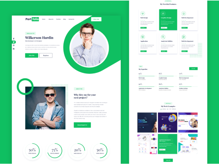
Sometimes, one page is all you need to have on your website. You can easily incorporate all the vital information you require. By using distinct sections, you can differentiate testimonials, contact, about me, and multiple ‘call to action’ buttons. The problem may appear when you present your web design to a client. Without an easy way to navigate, the client may have trouble understanding how the website will feel when developed.
Consider using the style on the web design presentation similar to the example below.
The designer took the liberty to slice the design into two parts. This way, you can keep the first impression of the landing page in focus. Additionally, you can present the rest of the page and all the details needed.
2. Background Image and Drop Shadow
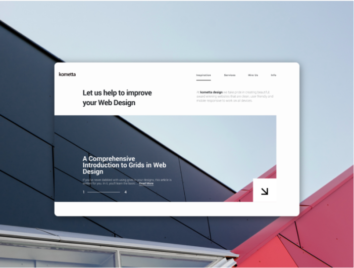
Simple, yet visually appealing is the ideal to strive for in any design. That is especially true with web design. Notice how the structural line flows from the background to the actual image of the landing page.
Just a touch of drop shadow effect is enough to make the design visible.
3. Complementary Flat Background Color
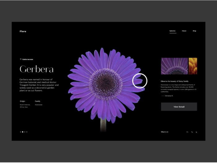
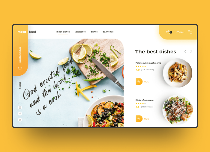
While we are a matter of simple, yet effective designs. Here is another great example. Sometimes just adding a background in a complementary color can mean a world for the design.
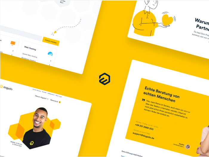
4. Website Redesign Presentation
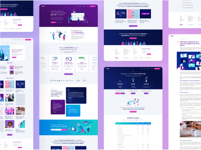
Side by side web design presentation is excellent for presenting multiple concepts, or various pages of a website.
It is a lot busier and detailed, but a viable way to present.
Find a way to structure and organize all of the pages so they are easier to comprehend.
5. Perspective Presentation
This way of presenting is commonly used in business card design.
However, you can see it works for web design as well.
The central focus is on branding and making sure your website fits your brand instead of the content of the website.
6. Outside the Box
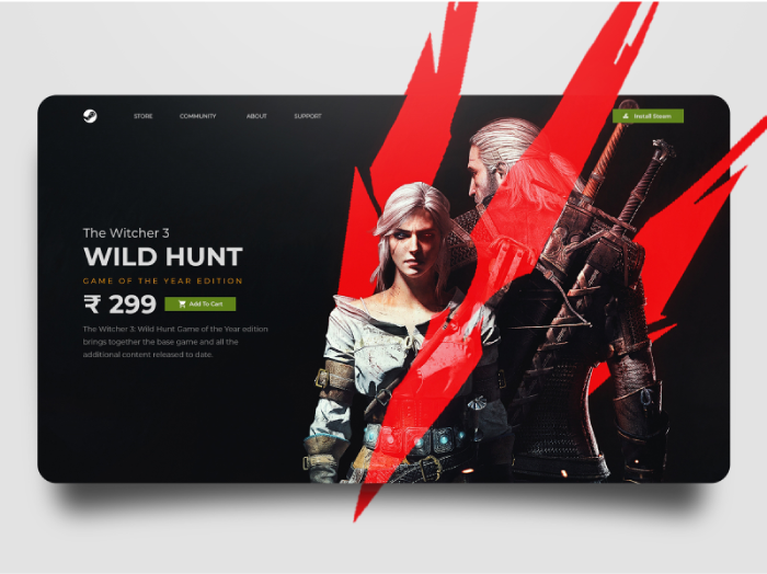
Think Outside The Box! No better way to put it for this fantastic presentation. Just extending these red shapes to the outside of the landing page box, makes the characters and the entire design come to life.
7. Hovering Screen Design Presentation
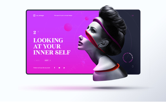
This presentation is the most sophisticated design presentation on our list. 3D elements and shadow give a surreal impression of a hovering design.
8. Organic Nature Inspired Presentation
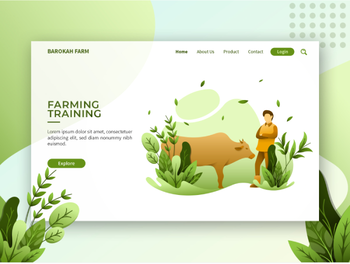
In contrast to the surreal presentation above, we have an organic, nature-inspired example. The greenery looks so live that it feels almost like it’s animated, even though it’s a static web presentation.
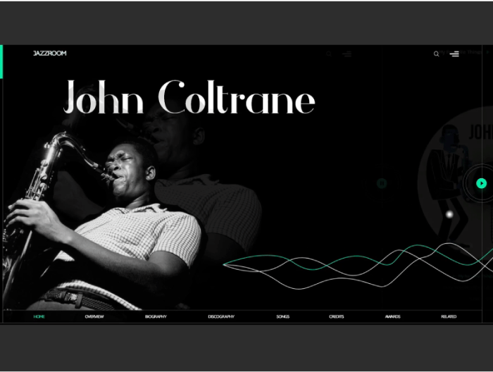
9. Animated Music Website Presentation
Moving away from static website presentations, here is a refreshment. A tiny animation can bring the design to life. In this example, the only thing animated is the thin sound waves. And it looks fantastic. You can check the animation by clicking here.
10. Video Animation Web Presentation
Another interesting example is the use of a timelapse video. Such as one that will probably be used on the actual site. With animations and videos incorporated into the presentation, there is no need for fancy backgrounds. Keeping it simple is the way to go. Again, you can check the animation by clicking here.
