How to Choose a Font: 7 Steps for Web and Brand Design
Inkyy Web Design & Branding Studio is bringing you a guide on how to choose a perfect font for your modern website design.
 6 min read
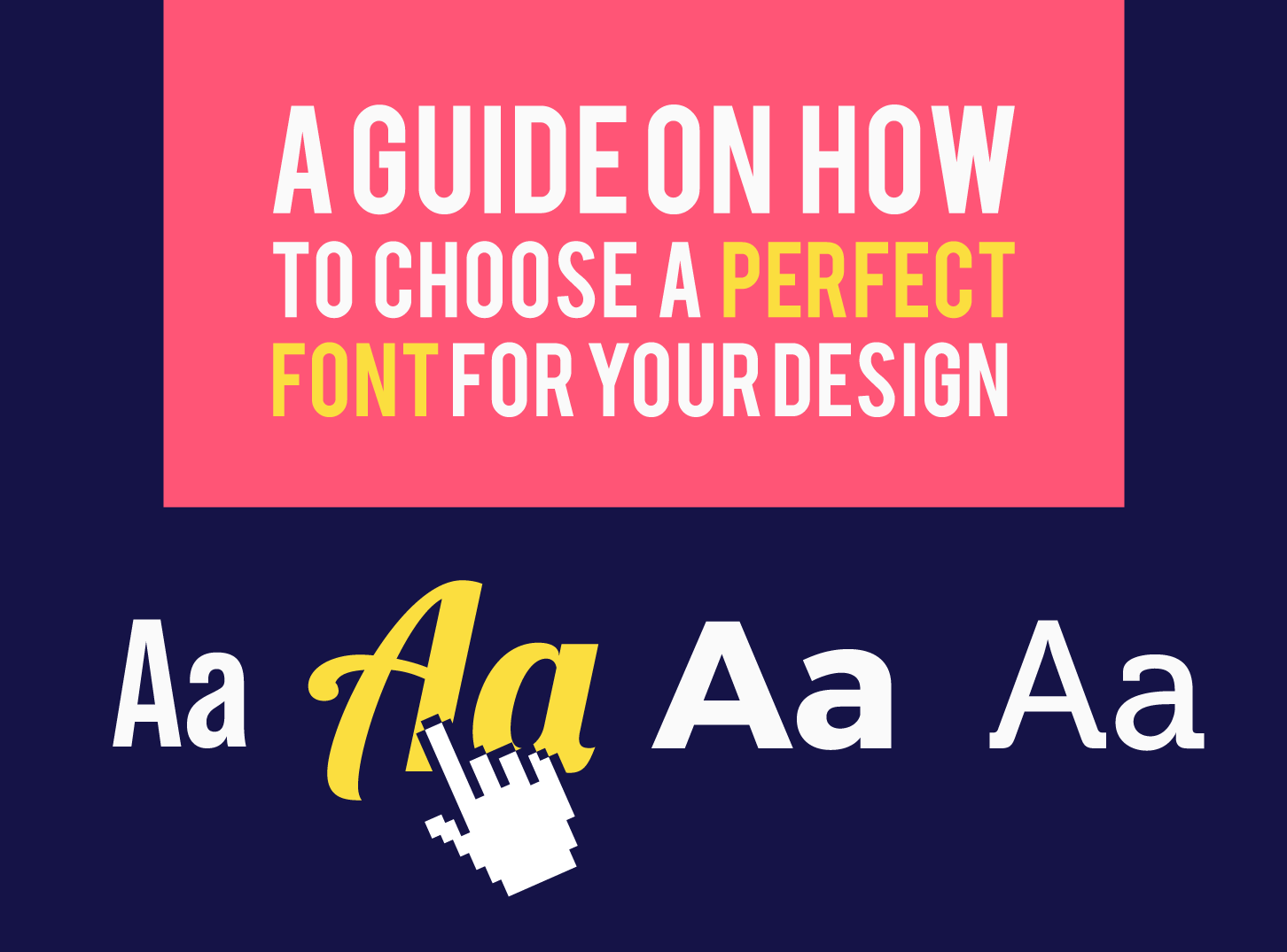
Knowing how to choose a font is one of the quickest ways to improve a design. People underestimate typography because it seems like a small detail, but a font shapes how readable a page is and what a brand feels like before anyone reads a single line.
This guide walks through seven steps for choosing a font for a website or brand, from personality and readability to language support, pairing and licensing. You will also find common mistakes to avoid.
Why the font you choose matters
Text makes up most of a typical website, so typography does a lot of the work. A good font helps people read comfortably, signals the personality of the business and keeps a layout consistent. A poor one makes content tiring to read and a brand harder to trust.
There are no strict rules about which font fits which brand. Personality is partly about familiarity, and what feels modern today can feel dated later. That is why it is better to follow a process than to pick a font because it looks nice on its own.
How to choose a font in 7 steps
1. Define your brand personality
Start with the brand, not the font list. Is the business traditional, minimal and modern, or fun and unusual? Write down three adjectives, for example “calm, expert, friendly”. Our guide to brand perception has more questions that help you find your brand personality.
2. Understand the main font categories
Each family of typefaces carries a different mood:
- Serif: classic, trusted and editorial. A good fit for law, publishing, luxury and education.
- Sans-serif: clean, modern and neutral. The default for tech, startups and most body text on screens.
- Slab serif: sturdy and confident, with a vintage or industrial feel.
- Script and handwriting: personal and elegant, but hard to read at length. Use for short accents only.
- Display: bold and distinctive. Best for large headlines and logos, never for paragraphs.
For ideas in each style, see our lists of serif fonts and minimalist fonts.
3. Put readability first
A font may look beautiful in a headline and be tiring in a paragraph. Body text needs open letter shapes, a generous x-height and clear differences between similar characters. Aim for body text of at least 16 pixels, comfortable line spacing and strong contrast with the background. Our post on typography tips for better website design covers sizes and spacing in more detail.
4. Check language and character support
Your site may be read around the world. Even if you write in one language, many visitors use their browser to translate the page. If your font only contains basic Latin letters, the browser may swap in a different font for accented or non-Latin characters, and the layout will look inconsistent.
Choose a font family that supports the languages and special characters you need, and check that it includes the punctuation, numerals and symbols your content uses. Many modern families support several scripts.
5. Pair fonts with care
Most designs work well with two fonts, one for headings and one for body text. Choose fonts that contrast clearly but share a similar feel. For a vintage clothing shop, an old-style slab serif such as Arvo for headlines and a clear sans-serif such as Open Sans for text gives a balanced, retro-modern look.
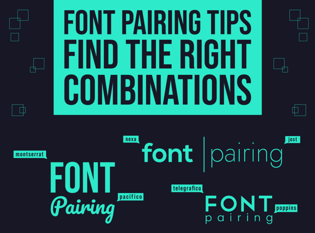
For a law firm or a premium cosmetics brand, elegant serifs such as Frank Ruhl Libre or Playfair Display say reliability with a touch of class. Our font pairing tips show more combinations that work.
6. Rank your fonts by importance
Use no more than two or three fonts. Give each a clear role, as Design Shack explains:
- Primary font: used for headings and the most visible text. It carries the brand’s personality.
- Secondary font: used for body text, descriptions and articles. It must be very readable.
- Accent font (optional): reserved for calls to action, labels or the logo.
7. Check licensing and performance
Web fonts are now as dependable as system fonts, with a much bigger choice. Google Fonts offers a large library that is free to use, and commercial foundries sell fonts for a one-off fee or a subscription. Always read the licence, especially for logos, apps and print.
Fonts also affect speed. Each weight and style is an extra file, so load only what you use, host files efficiently and make sure text stays visible while the font loads. A custom typeface is a big investment, so start with existing families before commissioning one.
Font choices by type of brand
These are starting points, not rules:
- Law, finance and healthcare: a refined serif for headings with a neutral sans-serif for text.
- Tech and startups: a geometric or grotesque sans-serif in a few weights.
- Creative and lifestyle brands: a characterful display or script font for headings, kept simple elsewhere.
- Vintage and craft brands: a slab serif or old-style serif with a clean text font.
Our overview of font trends in web design shows what is popular now, while our list of beautiful fonts gives you ready-to-use options.
Test your fonts before you commit
Set your chosen fonts in a real page, not a specimen sheet. Use actual headlines, a long paragraph, a button and a form label. View them on a phone, on a laptop and in a bright room. Ask someone who has not seen the design to read a paragraph aloud and tell you where they stumble. If the text is easy to read and still feels like your brand, you have the right choice.
Common font mistakes to avoid
- Using too many fonts. More than three makes a page look chaotic.
- Decorative fonts for body text. They are hard to read in long paragraphs.
- Tiny or light text. Thin weights at small sizes vanish on many screens.
- Poor contrast. Light grey text on white looks soft but is hard to read.
- Ignoring spacing. Line height and letter spacing matter as much as the font itself.
Still undecided? Match the style to your goal. Choose a serif to feel traditional, a clean sans-serif to feel modern and minimal, and combine the two to land somewhere in between.
Frequently asked questions
How many fonts should a website use?
Two is usually enough, one for headings and one for body text. A third can work as an accent, but anything beyond that makes the design feel unplanned and can slow the page down.
What is the best font for a website?
There is no single best font. Choose one that is readable at small sizes, supports your languages and matches your brand personality. Popular safe choices include Open Sans, Roboto, Lato and Inter.
Should I use a serif or a sans-serif font on my website?
Both work on screens today. Sans-serif suits a modern, clean look and is common for body text. Serif suits classic, editorial or premium brands. Test with real content before you decide.
Are Google Fonts free for commercial use?
Most Google Fonts are open source and free for commercial use, but each family has its own licence, so check it before using one in a logo, product or print project.
Need typography and branding for a client?
Inkyy is a white label design and development team for agencies. Our in-house designers build brand identities and websites with typography that works, ready for you to deliver under your own name. See our design and development services or book a 15-minute call.