5 Ecommerce Design Tips That Help You Sell Online
Web design plays a vital role in creating a successful e-commerce website. The best product in the world can be easily overlooked if the design does not exist to support the presentation. So, we wanted to offer you 5 design tips that will make your e-commerce website flourish.
 6 min read
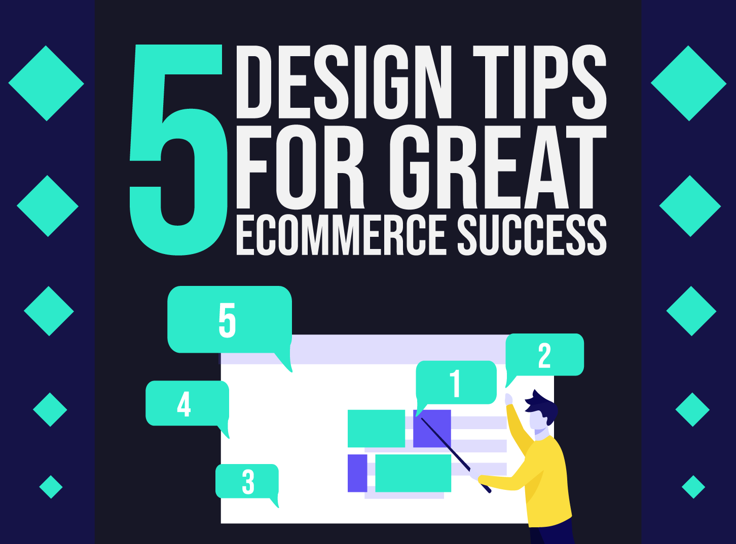
Good ecommerce design tips are simple: make it easy to find a product, trust the shop and pay. The best product in the world is easy to miss if the design does not support the sale.
Here are five ecommerce design tips that help an online store sell, followed by a short checklist for product pages and checkout. They apply to a small shop on Shopify or WooCommerce as much as to a custom build.
What makes ecommerce design different
Ecommerce design is the design of an online store: the layout, navigation, product pages, basket and checkout. A brand site only has to explain what you do. A shop has to help a stranger choose, trust and pay, often on a phone, in a few minutes.
That means every element is judged by one question: does it help the visitor buy? Style still matters, because it builds trust. But it comes second to clarity. For a wider look at what a shop needs, see our list of features every successful e-commerce website has.
5 ecommerce design tips that help you sell
1. Keep it simple
Simple is the first rule of ecommerce design. Every extra banner, widget or animation competes with the buy button. Give each page one main job. On a product page that is “add to basket”. On a category page it is “pick a product”.
- Use plenty of white space around products and prices.
- Limit the colour palette, and keep one colour for the main call to action.
- Remove anything that does not help someone choose or pay.
2. Use high-quality product images
Shoppers cannot touch the product, so photos do the job of the shelf. Use sharp, well-lit images on a clean background, with several angles and a zoom option. Add a photo of the product in use, or at scale, so people can judge its size. For clothing, show it on a person.
Keep file sizes under control so pages stay fast. Compress images, use modern formats such as WebP where your platform supports them, and give every image descriptive alt text. Our guide to the hero image shows how to choose a strong lead image for a page.
3. Design around the shopper
Build the store around how people actually shop. Look at what your visitors search for, which categories they open and where they leave. Then fix those places first.
- Make search and filters easy to find, and show the number of results.
- Keep the menu short and descriptive. See our tips on website navigation.
- Write product descriptions that answer real questions about size, material, delivery and returns.
- Ask customers for feedback with a short survey after purchase.
4. Make branding a priority
People buy from shops they trust. A clear brand, with a consistent logo, colours, type and tone of voice, tells visitors that a real business stands behind the shop. A generic template with no identity looks risky, especially when someone is about to enter card details.
Define your brand first, then carry it through the whole store, from the header to the packaging inserts. Our post on upgrading brand perception with a website explains why this matters.
5. Show social proof
Social proof means showing that other people bought and liked the product. Customer reviews and star ratings are the strongest form. Add them to product pages, and show the number of reviews next to the rating. Photos from customers and a few short quotes on the home page also help.
Social media icons in the footer are fine for staying in touch, but they are not social proof. Open them in a new tab so people do not lose their place in the basket.
Together these five tips make a store easier to use and easier to trust. They also make later improvements, such as personalised recommendations, much easier to add, because the foundations are clear and consistent.
A quick checklist for product pages and checkout
- Price, delivery cost and returns policy are visible before the basket. Surprise costs at the end are a common reason people abandon a purchase.
- One clear “Add to basket” button above the fold on mobile.
- Guest checkout is available, and the form asks only for what you need.
- Several payment options that your customers recognise, such as cards and digital wallets.
- Trust signals near the payment step: contact details, a secure connection and a clear returns policy.
- Mobile first. Test the whole journey on a phone, with one thumb.
Speed matters too. Slow pages lose shoppers, so keep scripts and images light, as covered in our web design tips for SEO.
Design for phones and speed
Many shoppers browse and buy on a phone, so design the mobile store first and scale up, not the other way round. Make buttons large enough to tap, keep the basket one tap away and avoid pop-ups that cover the product. Google also uses the mobile version of your pages for indexing, so a weak mobile page affects search visibility as well.
Speed is part of the design. Large images, heavy sliders and many third-party scripts slow pages down. Test with PageSpeed Insights, remove what you do not need and lazy-load images below the fold.
Pick a platform that fits the design
Your platform sets limits on what you can design. Hosted tools such as Shopify are quick to launch and handle payments and security for you. WooCommerce on WordPress gives more control over layout and content, but needs more care with updates and hosting. A custom build suits stores with unusual products or workflows. Choose the platform first, then design within what it does well.
Keep improving your store
Design is never finished. Look at your analytics, watch recordings of real sessions and test one change at a time. Personal touches, such as relevant recommendations, can lift results once the basics work. See our guide to ecommerce personalization for ideas. And check that you are not making the problems listed in our post on ecommerce web design mistakes.
Frequently asked questions
What is the most important part of ecommerce design?
Clarity. Visitors should see what you sell, what it costs and how to buy it within a few seconds. After that, strong product images, a fast mobile experience and a simple checkout have the biggest effect.
How many products should I show per page?
There is no fixed number. Show enough to let people compare, but not so many that the page is slow or overwhelming. Use filters and sorting, and add a “load more” or page links for long lists.
Do I need a custom design for my online store?
Not always. A good theme on a platform such as Shopify or WooCommerce is enough for many small shops. A custom design makes sense when you have a distinctive brand, complex products or specific conversion goals that a template cannot support.
What is social proof in ecommerce?
Social proof is any sign that other customers bought and liked the product. Reviews, star ratings, customer photos and testimonials are the most common examples.
Need an ecommerce design for a client?
Inkyy is a white label design and development team for agencies. Our in-house team designs and builds online stores under your brand, from product pages to checkout. See our design services or book a 15-minute call.