Why Use Mockups: 7 Reasons Designers Rely on Them
Mockups are creative, often photorealistic presentations that review how a design can look or function in the real world. Inkyy will explore mockups, what are they, and why should you use them.
 6 min read
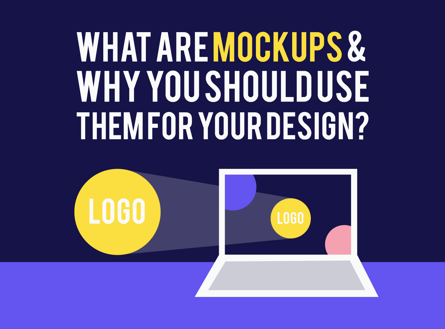
Why use mockups? Because a design that looks right on a flat canvas can still fail once it meets the real world. A mockup shows a logo on a bag, a website on a laptop or a label on a bottle before anything is built or printed, so you can fix problems while they are cheap.
This guide explains what mockups are, the seven main reasons designers and agencies rely on them, how they differ from wireframes and prototypes, and how to choose and use them well. Links to free mockup collections are included.
What is a mockup?
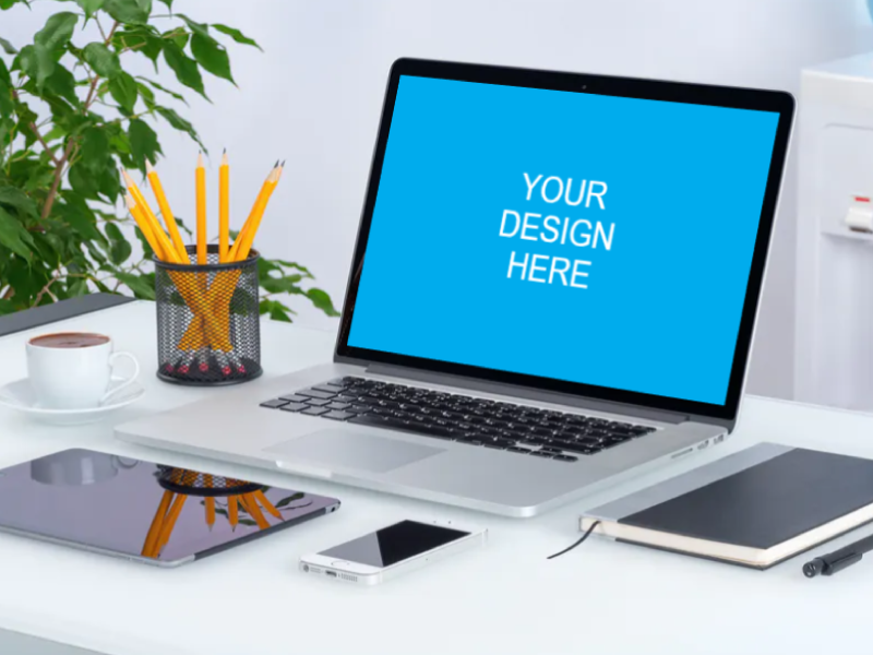
The word covers two related things. In web and app design, a mockup is a static, high-fidelity picture of a screen. It shows the final colours, fonts, images and layout, but nothing is clickable yet. In branding and marketing, a mockup is a realistic scene, usually built from a photo, where you place your design on an object such as a laptop, a t-shirt or a poster.
Both do the same job. They turn an idea into something a client, a developer or an investor can judge quickly.
Why use mockups: 7 reasons
1. You see the design before it is built
A mockup lets you check spacing, contrast, image crops and hierarchy at full fidelity. Changing a colour or a layout in a design file takes minutes. Changing it after development takes days. That alone makes mockups worth the time.
2. Clients give better feedback
Most clients cannot judge a flat logo or a grey wireframe. Show them the same design on a real-looking laptop or storefront and they react straight away, with specific comments instead of vague worries. A mockup helps people picture the result.
3. Sign-off becomes clearer
An approved mockup is a shared reference. It reduces arguments about what was agreed, because everyone can point at the same picture. This is especially useful in agency work, where several people review the same project.
4. Developers get a clear target
Developers build from mockups. They use them to estimate effort, to take exact colours, sizes and fonts, and to see which parts need animation or interaction. Note anything that moves, such as sliders or menus, because a static image cannot show it. Without a mockup, the first build is a guess.
5. You can win over stakeholders and investors
A polished picture of an app or product makes a pitch more convincing. It shows that the idea is real and that the team knows the direction. You do not need working software to make that point.
6. Logos and brand work look better in context
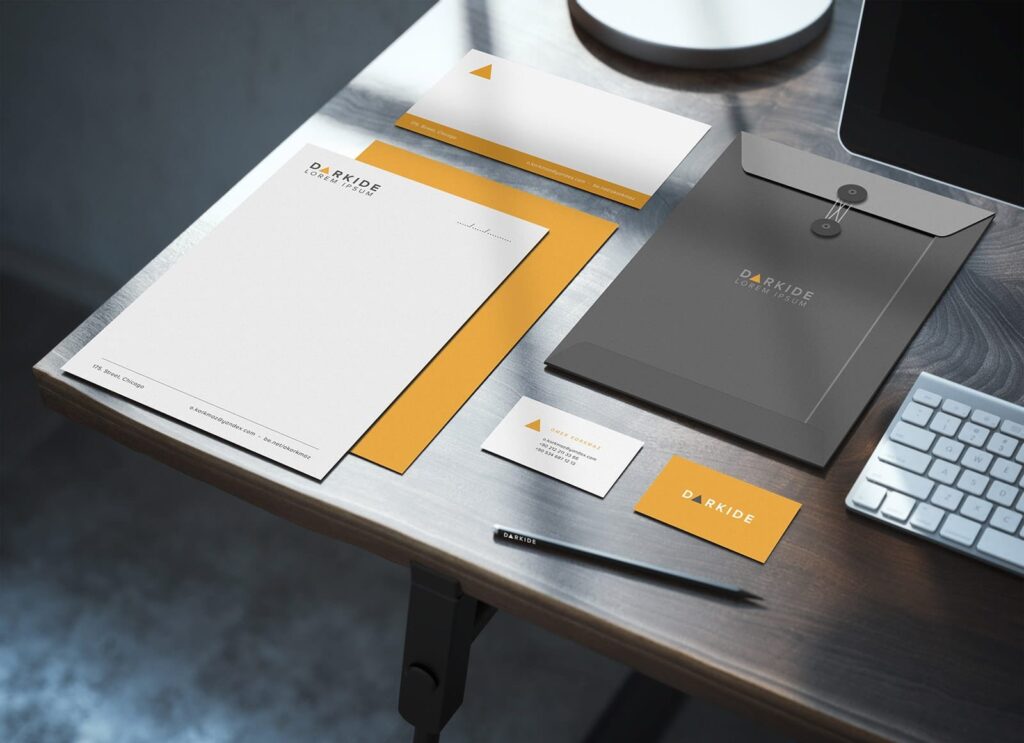
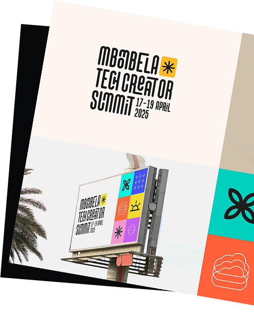
A logo on a plain white background tells only part of the story. On a business card, a sign or a uniform it shows how it scales, how it reads and how it feels. A strong presentation includes both the flat logo and the mockups. See our examples of logo presentation for ideas.
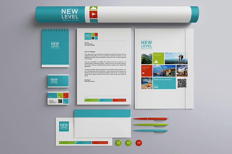
7. Your portfolio and social posts improve
Designers who show their work in realistic scenes attract clients who like that look. Mockups also make better social media content than flat exports, because people stop for a photo-like image far more readily than for a screenshot.
Mockups, wireframes and prototypes
These three are often confused, but they come at different stages of a project:
- Wireframe: a simple, low-fidelity layout that shows structure and content placement. Read what a wireframe is and why it matters.
- Mockup: a high-fidelity static design with real colours, type and imagery.
- Prototype: an interactive version that behaves like the final product, used for usability testing.
A typical flow runs from wireframe to mockup to prototype to development. For small projects you can skip the prototype, but skipping the mockup is rarely a good idea.
How to choose a mockup
If you are using ready-made mockup files, a few checks save time:
- File format. PSD files with smart objects let you drop a design in and update it in one step. Figma and Sketch files do the same in those tools. Plain PNG or JPG scenes need manual placement.
- Resolution. Choose a file large enough for how you will use it. For a hero image or print, look for 3,000 pixels or more on the long side.
- Editability. Check that the colour of the object, the background and the shadows can be changed.
- Realism. Look at the lighting, perspective and shadows. A believable scene helps; a clumsy one hurts.
- Licence. Read it. Some free mockups allow commercial use, others need a credit or forbid resale. When in doubt, check the author’s page.
Our free collections are a good place to start: laptop mockups, stationery mockups, t-shirt mockups and iPhone mockups.
How mockups fit into a website project
On a typical website project the mockup stage looks like this:
- Gather the brand assets: logo, colours, fonts and photography.
- Design the key templates first, usually the home page, an inner page and the mobile version of both.
- Use real headlines and images instead of placeholder text, so the client reviews the actual message.
- Annotate anything interactive, such as menus, forms, sliders and hover effects.
- Share a link in a tool such as Figma so the client can comment on the design directly.
- Get written approval before development starts, and track any later changes as new requests.
This order keeps the project calm. Everyone has seen the destination before the building begins.
Tips for using mockups well
- Match the scene to the brand. A fashion label and a law firm need very different settings.
- Keep the design the hero. Busy backgrounds or props steal attention from the work.
- Use one style across a set. Matching lighting and angles make a presentation feel professional.
- Show the flat design too. Clients need to see the detail without perspective or shadows.
- Do not over-polish early. Use quick mockups for concepts and save the fine detail for final presentations.
- Compress for the web. Export optimised images so your portfolio and emails load fast.
- Respect licences. Credit authors when asked and never resell the mockup file itself.
For more on creating them for websites, Creative Bloq has a useful guide. To present your finished work, see our examples of web design presentation.
Frequently asked questions
What is the difference between a mockup and a wireframe?
A wireframe is a low-fidelity layout that shows structure. A mockup adds the real visual design: colours, typography, images and spacing. Wireframes come first, mockups second.
Do I need a mockup before building a website?
It is strongly recommended. A mockup lets the client approve the look before development starts and gives developers an exact reference, which avoids costly rework.
Are mockups only for web design?
No. Designers use mockups for logos, packaging, stationery, apparel, signage, posters and apps. Any design that will end up on a surface or a screen can benefit.
Where can I find free mockups?
Many sites offer free PSD and Figma mockups, and we list some of the best in our free mockup collections. Always check the licence before using one in a commercial project.
Need mockup-ready design for a client?
Inkyy is a white label design and development team for agencies. Our in-house team designs brands, websites and presentations that you deliver under your own name. See our design and development services or book a 15-minute call.