15 Coming Soon Page Examples and How to Design Yours
 9 min read
A coming soon page is the first thing people see of a product that does not exist yet. Its job is simple: turn curiosity into a list of people who want to hear from you on launch day.
This guide covers what every coming soon page needs, including the privacy note under the form and whether the page should be indexed. Then we look at 15 coming soon page examples, grouped by approach: countdown, waitlist, teaser visual and minimal, with notes on what works and what to fix.
What every coming soon page needs
Good coming soon page design is mostly about saying less, but saying the right things. Make sure the page has these parts:
- A clear value proposition. One sentence on what is launching and who it is for. “We are building something awesome” is not one.
- Email capture. One field, one button and a reason to sign up: a launch alert, early access or a discount. Every extra field lowers sign-ups.
- A launch date or countdown, if the date is firm. A timer stuck at zero looks abandoned. If the date might move, use a season or a progress bar.
- Social proof. A real waitlist count, the founders’ names or a quote from a beta tester. Use only numbers you can stand behind.
- A privacy notice for the form. Say what you will send and how often, and link to your privacy policy. Ask for marketing consent separately with an unticked checkbox, and send a confirmation email.
- Brand basics. Logo, colours that match the product, social links and a contact email.
Noindex or indexable?
Decide this before launch. If the page sits on the domain you will launch on and describes a real product, leave it indexable with a normal 200 status, so people searching for the brand can find it. If it is an empty placeholder or a staging copy, add a noindex robots meta tag, and do not block it in robots.txt, or crawlers will never see the tag. For short planned maintenance on a live site, use a maintenance page that returns a 503 status with a Retry-After header instead.
15 coming soon page examples
The examples mix Dribbble concepts, free templates and live pages built in Webflow and Framer, grouped by approach so you can jump to the one that fits your launch.
Countdown coming soon pages
A countdown works when the launch date is fixed and public, such as an event, a product drop or a store opening.
1. Digital agency countdown by Femi Abolaji
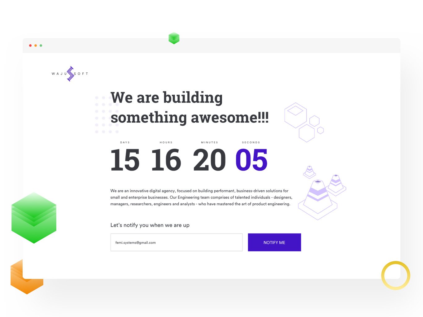
The countdown is the hero: four big numbers, with the seconds picked out in purple, above one short paragraph and a single Notify me field. Isometric cubes in the margins add depth without competing with the form. The weak spot is the headline, “We are building something awesome!!!”, which says nothing about what is coming. Design by Femi Abolaji, view the shot on Dribbble.
2. Cherie dating app by Inkyy

Our own concept for Cherie, a dating app. A boxed countdown sits above a subscribe field, and an iPhone shows the app’s login screen, so visitors see the product they are signing up for. The orange-to-pink gradient runs through the buttons, timer borders and background shapes. A small note explains that the app is free and supported by donations, which answers an obvious question early.
3. Countdown waitlist template by Michael Slotta
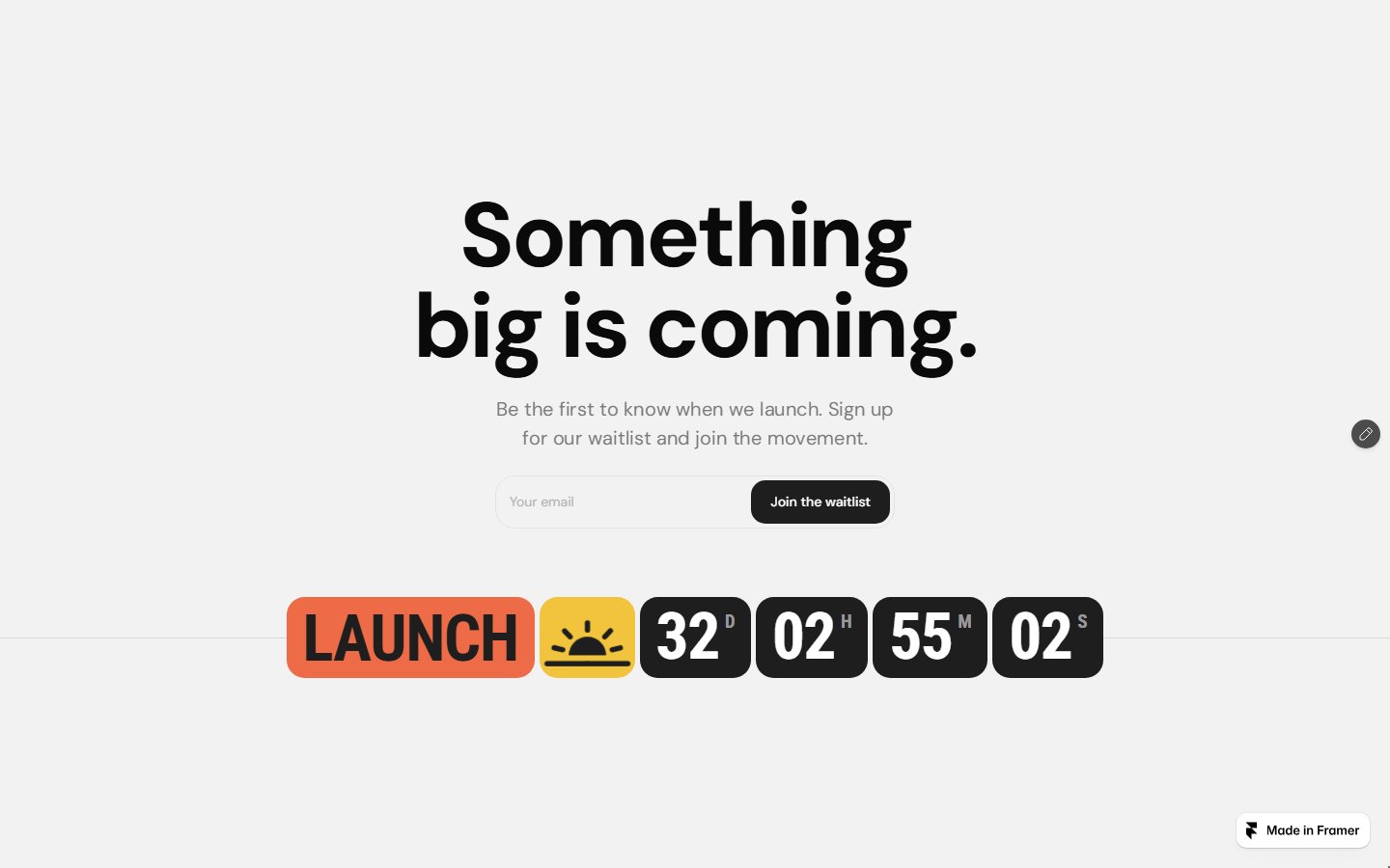
One light grey screen with a bold headline, one line of copy, an email field and a dark Join the waitlist button. The countdown is styled as chunky tiles next to an orange LAUNCH label, so the date feels like an event. A free Framer template that can be live in an afternoon; just swap the generic headline for what you are launching.
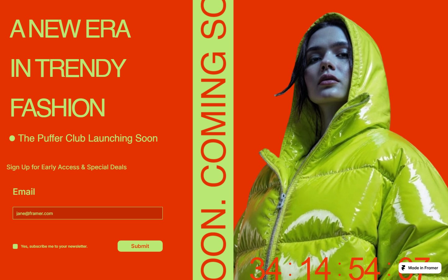
4. The Puffer Club, Comingsoonly template by Shivam
Orange-red and lime green, a model in a green puffer jacket and COMING SOON running down a vertical strip. The form offers early access and deals, with the newsletter opt-in as a separate checkbox, which is the right way to handle consent. A large countdown runs along the bottom. Free on the Framer Marketplace, and a good fit for a streetwear drop.
5. Dark countdown template by TheSprkl
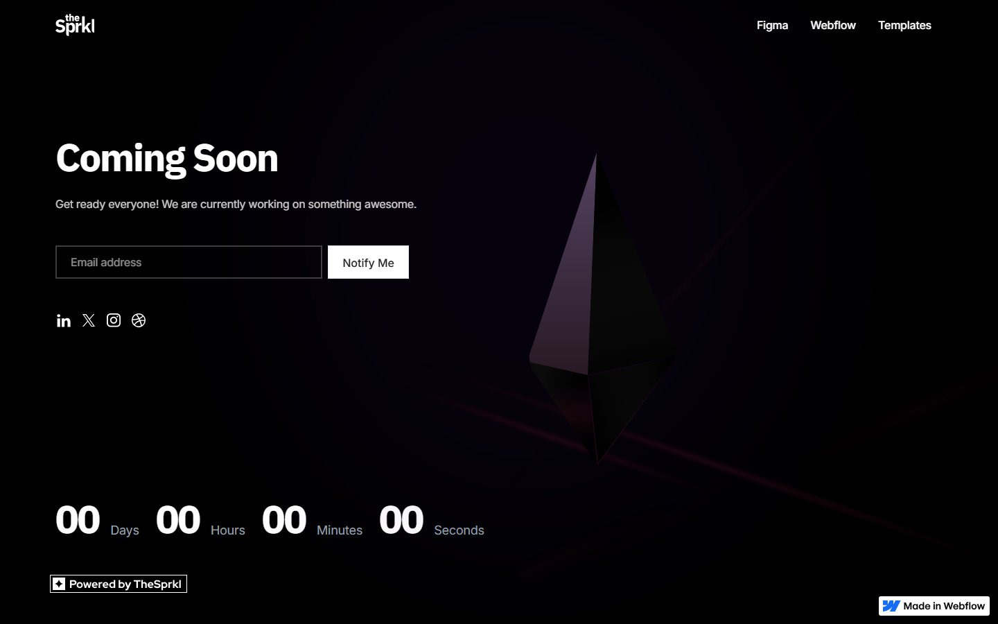
A faceted 3D crystal behind the copy, a Notify me form, social icons and a countdown along the bottom. When we checked the live Webflow cloneable, the counter read 00 across the board. That is the most common countdown mistake: the date passes and nobody updates the page, so plan what it says once the timer runs out.
Waitlist coming soon pages
A waitlist page leads with the product and treats the email field as a ticket in. It suits apps, SaaS products and private betas where the launch date is still flexible.
6. Fairhand, Soon template by BuiltByKern
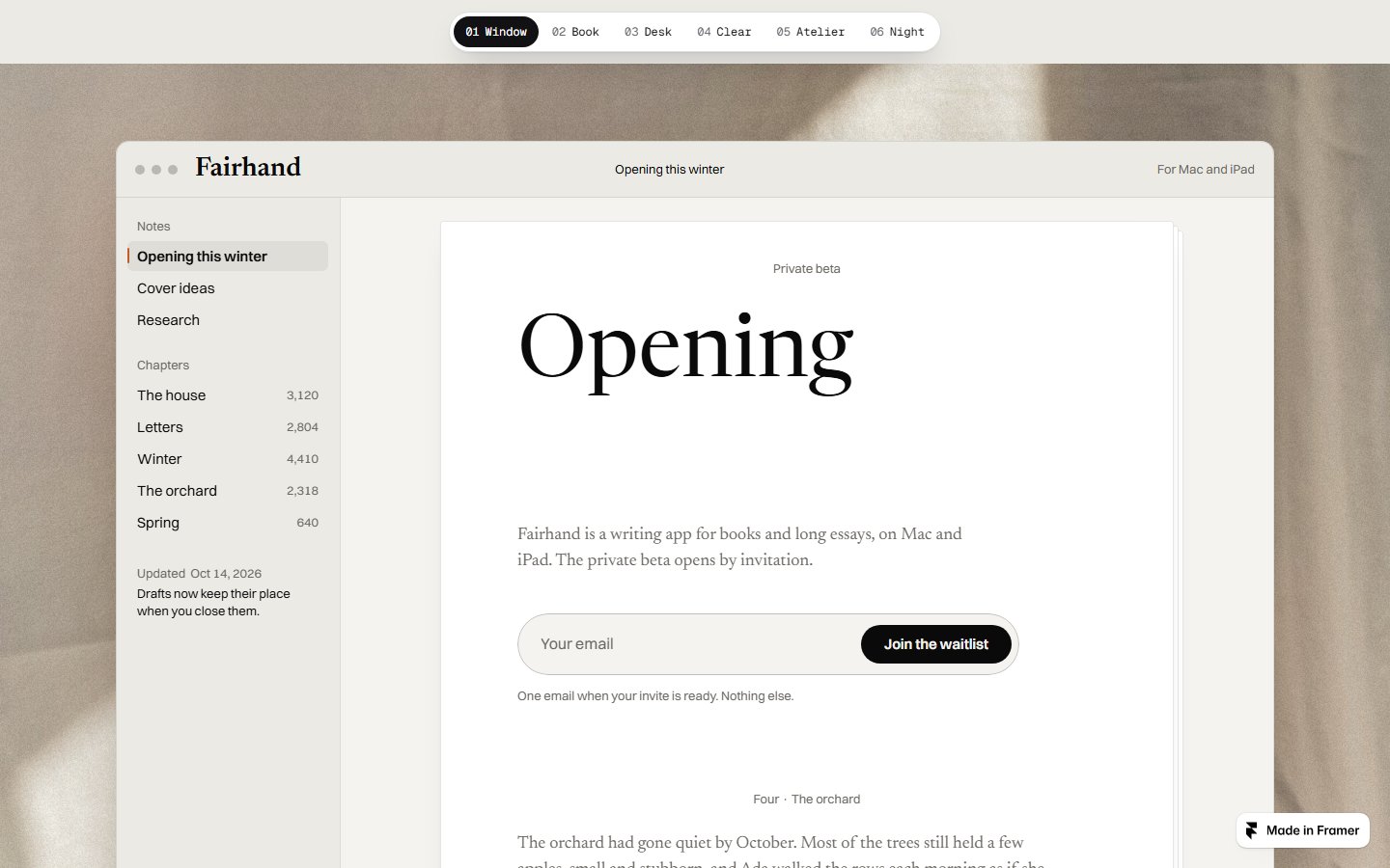
This free Framer template shows a writing app called Fairhand inside a desktop app window, so the page doubles as a product preview. The copy says what it is (a writing app for books and long essays, on Mac and iPad) and how access works (a private beta by invitation). Under the form, one line reads “One email when your invite is ready. Nothing else.” The clearest privacy promise in this list.
7. mylife coaching course
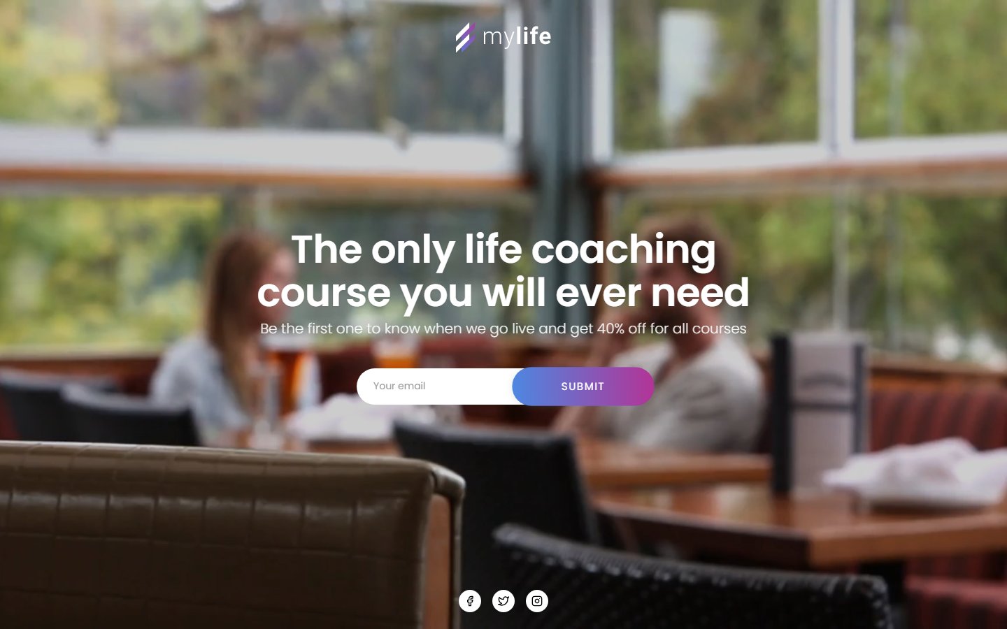
A full-screen café photo, a headline about a life coaching course and a pill-shaped email form with a purple gradient button. The subline gives a reason to sign up now: be first to know and get 40% off all courses. A launch discount is one of the simplest ways to earn an email address; just check the contrast of white text on a busy photo. See the live page.
8. aircart NFT marketplace
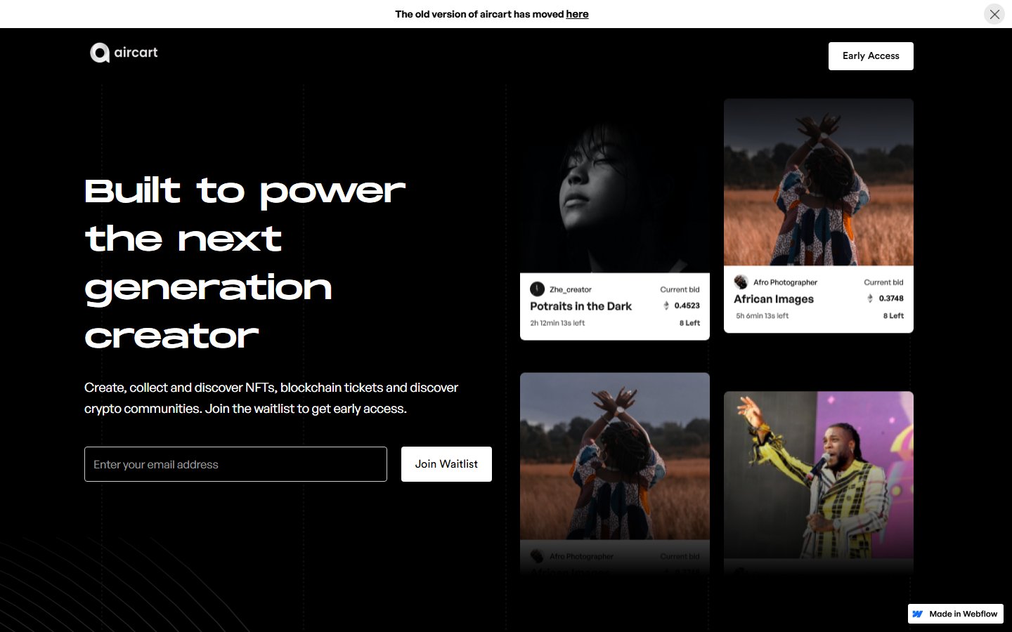
A black page with a wide geometric headline, one sentence on what the product does and a Join Waitlist form. Four sample cards with photos, creator names and bid details show the product instead of describing it, and an Early Access button in the header repeats the action. View it on Made in Webflow.
9. Devity workout app
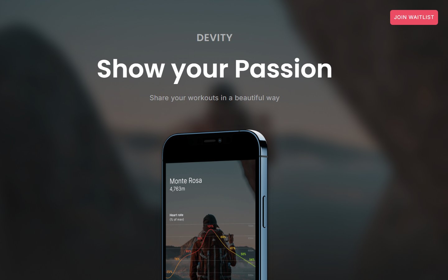
The headline “Show your Passion” sits over a blurred photo, and an iPhone shows a hike to Monte Rosa with a heart rate chart, which explains the app in a second. The only action is a small red Join waitlist button in the top corner, far from the headline. Put the email field next to the phone and it would do its job much better. See the live page.
Teaser visual coming soon pages
Teaser pages let one strong image do the talking. They build atmosphere and work best for brands that already have an audience, or for studios that want to show taste before the portfolio is ready.
10. The magical H-series by Kálmán Magyari
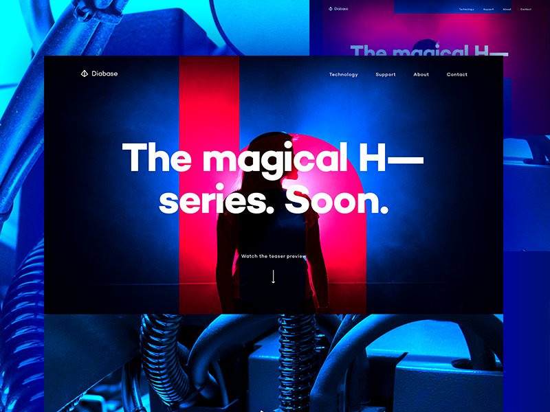
A teaser for Diabase’s H-series machine: a figure lit in hot pink and electric blue among machinery, under a headline that ends with one word: Soon. There is no form, only a “Watch the teaser preview” prompt. That works for buzz among existing fans, but a new brand needs an email field so the interest has somewhere to go. Design by Kálmán Magyari, view the shot on Dribbble.
11. Design studio page by Sergey Lagodzinsky
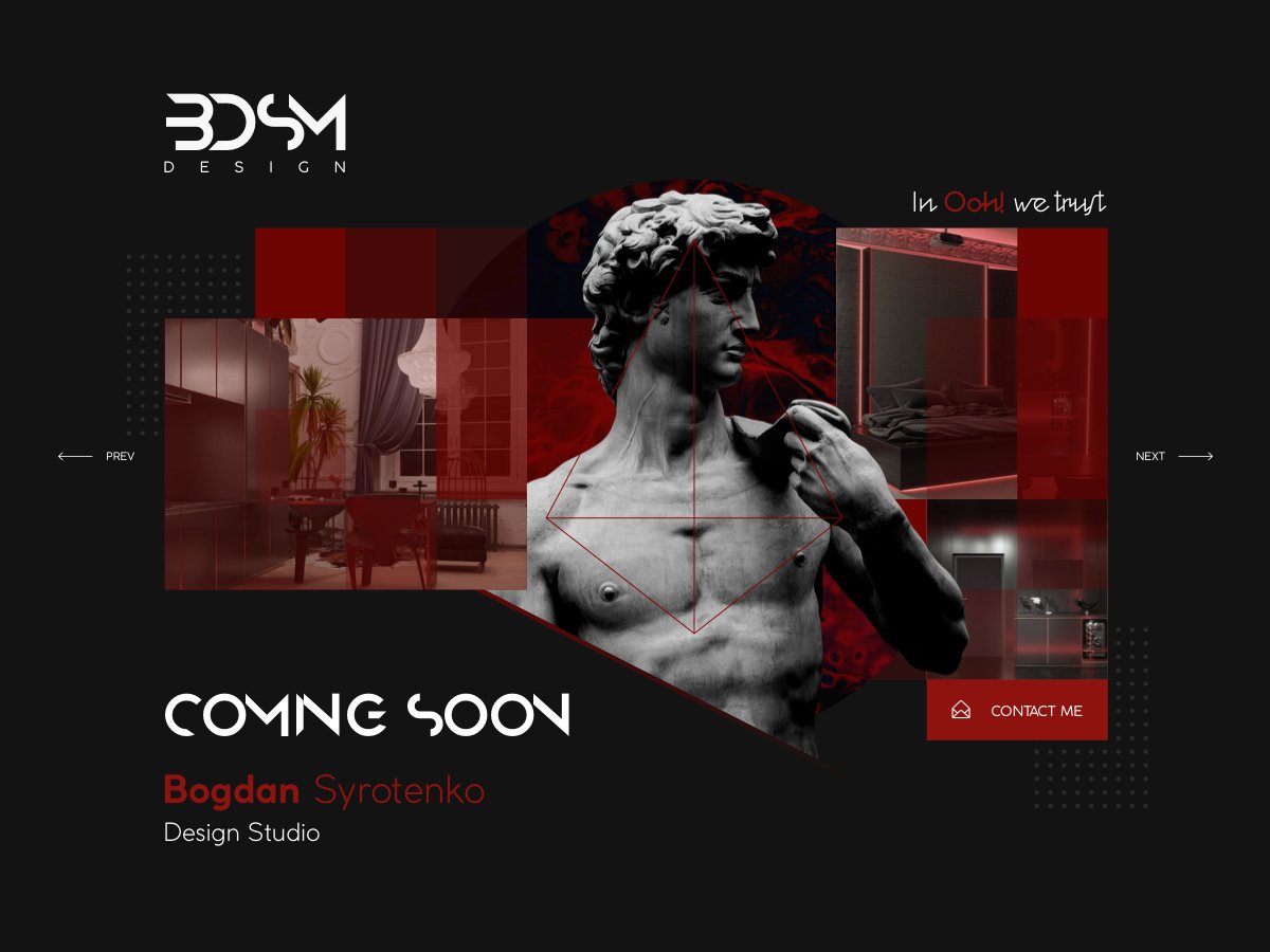
A dark page for Bogdan Syrotenko’s design studio, built around a marble bust over red-toned interior photos, with arrows hinting at a project slider. The only action is a red Contact me button. For a studio, a conversation is worth more than a mailing list, so that is the right call. Design by Sergey Lagodzinsky, view the shot on Dribbble.
12. bureau1872
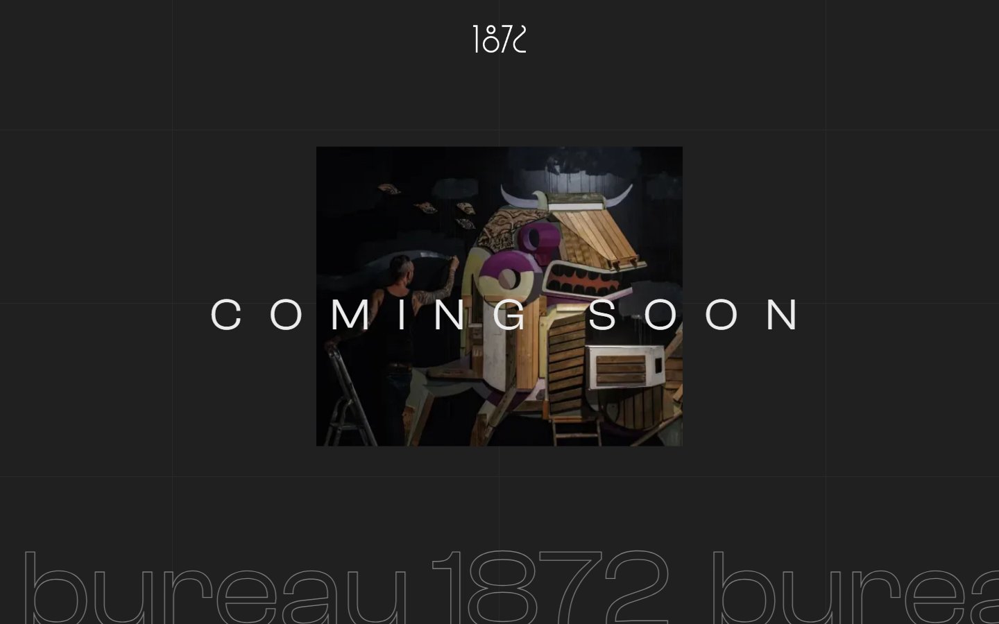
Its maker calls it “a Coming soon page – but not boring”. A sculptural collage sits behind letter-spaced COMING SOON text, with a 1872 monogram above and the studio name in huge outlined letters along the bottom. There is no form, so it is a brand statement rather than a lead tool, which suits agencies that want a holding page with character. View it on Made in Webflow.
13. Rocket illustration by Didi Kurniawan for Pixelz
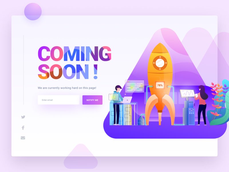
An isometric rocket on a purple launch pad, with a 78% progress tag and two people working at screens, tells the story. On the left, a gradient COMING SOON! headline, one line of copy and a purple Notify me button keep things simple. A friendly style for tech start-ups and agencies. Design by Didi Kurniawan for Pixelz, view the shot on Dribbble.
Minimal coming soon pages
Minimal pages strip everything back to type and space. They load fast and look confident, but they still need a way for people to stay in touch.
14. Space theme by Oksana Polishchuk
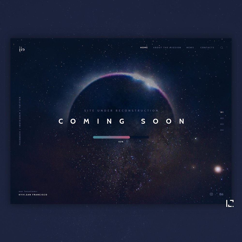
Letter-spaced COMING SOON over a starfield and the glowing edge of a planet, with a “site under reconstruction” line above and a progress bar at 62% below. A progress bar is a softer alternative to a countdown when you have no fixed date. It would need an email field to work as a lead page. Design by Oksana Polishchuk, view the shot on Dribbble.
15. 404studio
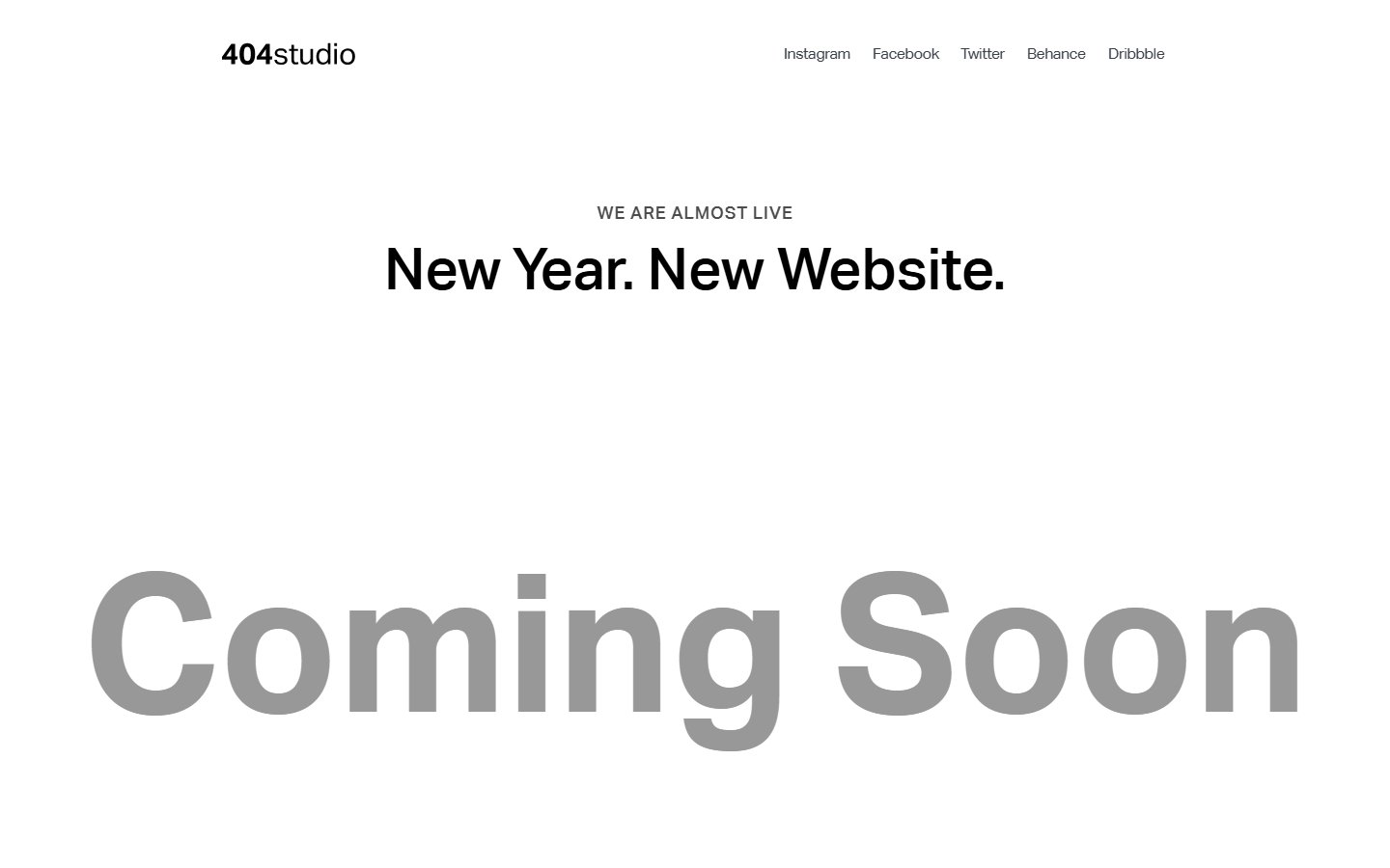
The studio name, social links, a small “We are almost live” label, the line “New Year. New Website.” and a huge grey Coming Soon. It shows how far typography alone can go. The trade-off is that there is no form, so people who want updates have to find the studio on social media. See the live page.
Tips for designing a coming soon page that converts
- Write the value proposition first. If you cannot say what is launching in one sentence, design will not fix it.
- Give the page one goal. One email field and one button. Social links should not compete with the form.
- Design for phones first. Launch links get opened on mobile, so the headline, form and button should fit on the first screen.
- Keep it fast. Compress images and keep video and 3D scenes light.
- Send a confirmation email straight away. It confirms the address and is the first message people get from the brand.
- Track sign-ups as a conversion in your analytics, so you know which channels work.
- Plan the switch. Launch the real site on the same URL, email the waitlist first and remove the countdown the moment it hits zero.
A coming soon page is a landing page with a single job, so the usual rules apply. Read our comparison of landing pages and product pages, our guide to pop-up design and our roundup of form builders. For layout ideas after launch, see our best SaaS website designs and web design examples, plus our notes on visual hierarchy and web design tips for SEO.
Several examples in this list are built in Webflow and Framer, which make it easy to publish a page in a day. If you need one built to a client’s brand, our white label Webflow team can design and build it, and our development team can connect the form to the client’s email or CRM tool.
Frequently asked questions
What should a coming soon page include?
At minimum: the brand name, a one-sentence value proposition, an email sign-up form with a short privacy note, and social or contact links. Add a launch date or countdown only if the date is fixed, and social proof only if it is real.
Should a coming soon page be indexed by Google?
If it is on your final domain and describes a real product, yes. If it is an empty placeholder or a staging copy, add a noindex meta tag and do not block it in robots.txt.
What is the difference between a coming soon page and a maintenance page?
A coming soon page announces something new and collects interest. A maintenance page tells visitors that an existing site is briefly offline. For short planned downtime, the maintenance page should return a 503 status with a Retry-After header so search engines know it is temporary.
Can I use these coming soon page designs?
The Dribbble concepts and live pages belong to their designers and brands, so use them for inspiration only. The Framer templates in this list are free to use under the terms on their marketplace pages.
Need a coming soon page for a client?
Inkyy is a white label design and development team for agencies. Our in-house designers and developers build coming soon pages, landing pages and full websites that you deliver under your own brand. See our design services or book a 15-minute call.