Yellow Color Meaning: Psychology, Shades and Yellow Logos
 8 min read
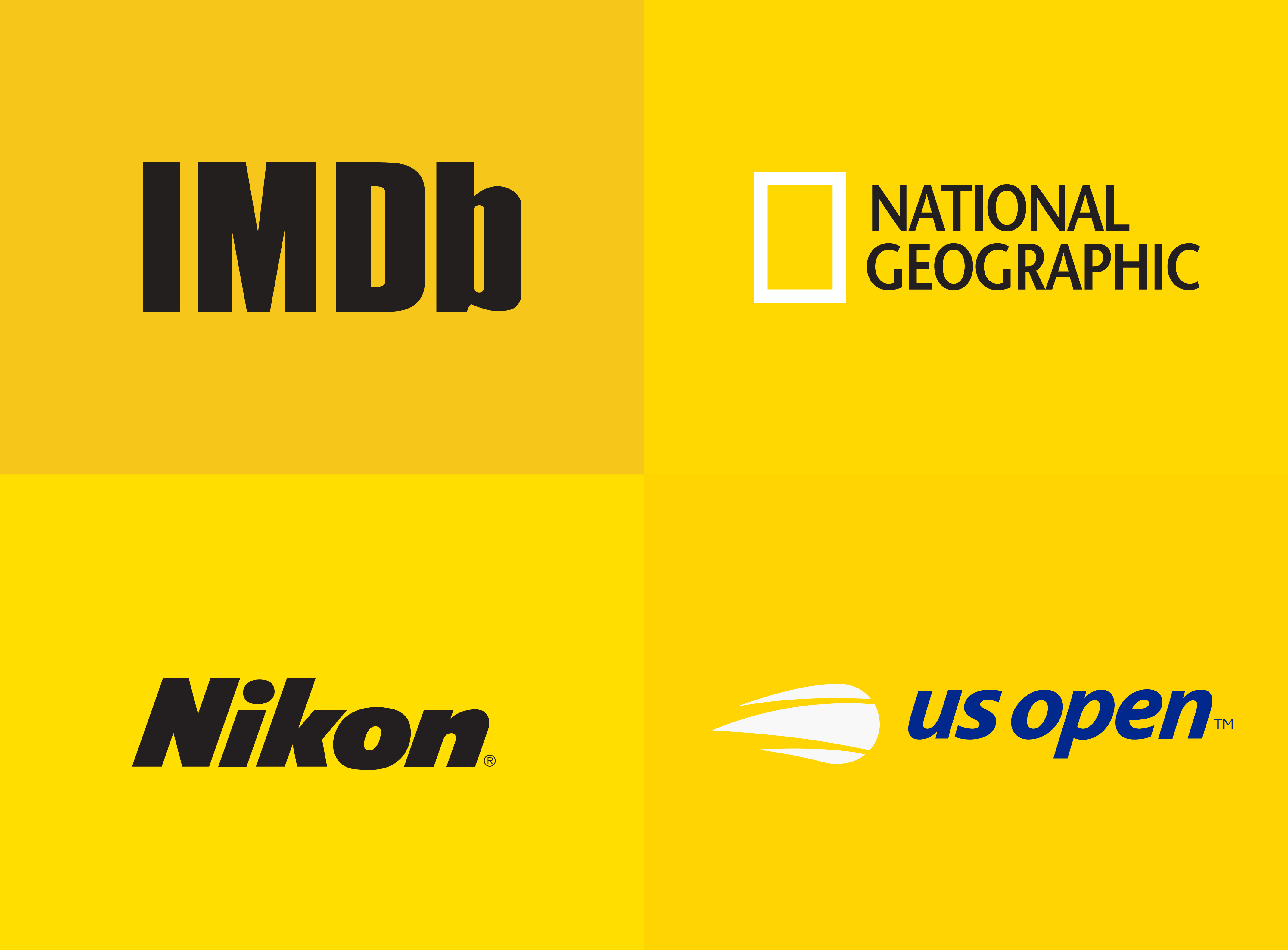
The yellow color meaning most people know is simple: sunshine, optimism and warmth. In branding it does a bit more than that. Yellow is one of the most visible colors there is, so brands use it to be noticed fast, from a road sign to a price tag to an app icon on a crowded home screen.
This guide covers what yellow means in psychology and culture, what different shades of yellow signal (with hex codes), which industries use it and why, and how famous yellow logos put it to work. You will also get palette ideas, a contrast warning every designer needs, and the mistakes to avoid before you build a brand around yellow.
What does the color yellow mean?
Yellow is the color of light. In most cultures it is linked with the sun, warmth, summer and happiness. That is the core of the yellow color meaning: it feels positive, open and full of energy. It is also the color of caution. Warning signs, hazard tape and school buses use yellow because the eye picks it up quickly, even from the corner of your vision.
So yellow carries two messages at once: “this is cheerful” and “look here”. Good yellow branding uses both. A cheerful brand gets attention without seeming aggressive, which is harder to do with red.
What research says about yellow
The link between yellow and joy is real, but it depends on where people live. In a study of 6,625 people in 55 countries, Jonauskaite and colleagues found that people who live further from the equator, and in rainier countries, are more likely to associate yellow with joy. Where sunshine is rare, yellow seems to feel more special.
A larger study across 30 nations by the same team found that many color and emotion links are shared worldwide, with local differences shaped by language and geography. Treat any neat claim such as “yellow makes people buy” with care. The research shows associations, not a switch you can flip.
Yellow in different cultures
- China: yellow was long the imperial color, linked with power and prestige.
- Western countries: yellow means summer, fun and caution. In English idiom it can also mean cowardice (“yellow-bellied”).
- Transport worldwide: taxis, road signs and school buses use yellow because it is easy to spot.
If your brand works across markets, test your yellow with people from each one. For the bigger picture on why colors shape how a brand feels, see our article on the psychology behind branding.
Shades of yellow and what they signal
“Yellow” covers a wide range. A pale butter yellow and a deep mustard send very different messages. The contrast column shows how each shade performs as text on a white background. WCAG asks for at least 4.5:1 for body text and 3:1 for large text.
| Shade | Hex | What it signals | Contrast on white |
|---|---|---|---|
| Butter yellow | #FFF3B0 | Soft, calm, gentle, good for backgrounds | 1.1:1 |
| Lemon yellow | #FFF44F | Fresh, zesty, young | 1.2:1 |
| Golden yellow | #FFD700 | Warm, optimistic, a little premium | 1.4:1 |
| Sunflower | #FFC20E | Friendly, confident, high energy | 1.6:1 |
| Mustard | #E1AD01 | Retro, earthy, crafted | 2.1:1 |
| Dark goldenrod | #B8860B | Heritage, warmth, quality | 3.3:1 |
Look at the last column. Not one of these yellows is safe for body text on white. Even dark goldenrod only passes for large headings. You have to darken yellow to around #8B6F00 before it passes 4.5:1, and by then it reads as olive brown, not yellow. That is the main design challenge with this color, and we come back to it below.
Which industries use yellow, and why
- Fast food and snacks: yellow feels warm and cheerful, and paired with red it is one of the most familiar food combinations.
- Discount retail: bright yellow suggests good value and is easy to spot on a busy street or shelf.
- Logistics and transport: delivery, car rental and taxi brands borrow the visibility of road signs.
- Construction and tools: yellow signals safety and strength on machines, helmets and packaging.
- Kids, leisure and entertainment: it reads as playful and fun.
- Photography and media: a yellow frame or block grabs attention in a feed or on a newsstand.
Famous yellow logos and what they teach
These well-known logos are shown as editorial examples only. Each one is a trademark of its owner.
McDonald’s
The Golden Arches began as part of the architecture of early McDonald’s restaurants and became one of the most recognized symbols in the world. The yellow is warm and happy, and in many markets it sits on red, a classic pairing for fast food. The lesson: a simple shape in one strong color can carry a brand with no words at all.
IKEA
IKEA’s yellow and blue echo the Swedish flag, so the palette tells you where the brand comes from. The yellow oval also makes the wordmark visible from far away on huge blue stores. Note that the text is blue on yellow, not yellow on white. The pairing does the readability work.
Best Buy
For years Best Buy’s logo was a yellow price tag, a clear signal of deals and value. In 2018 the brand moved the wordmark out of the tag and kept a small yellow tag beside it, so the color stayed even as the logo got simpler. Yellow here is a cue for “good price”, which suits retail well.
DHL
DHL took on yellow and red after Deutsche Post, whose own brand color is yellow, bought the company. Yellow vans and uniforms are easy to spot on a busy street, which matters for a delivery brand. The red slanted letters and lines add speed. This is yellow as a working color, not just a decoration.
Hertz
Hertz pairs a bright yellow block with a heavy black italic wordmark. Black on yellow is one of the highest-contrast pairs you can use, so the logo stays readable at airport counters and on small screens. The slant adds motion, which fits a car rental brand.
Yellow color pairings and palettes
Yellow almost always needs a partner. Here are pairings that work, with starting hex codes.
- Yellow and black (#FFC20E + #1A1A1A): maximum contrast, bold and direct. Good for tools, construction, transport and sport. The pair has a contrast ratio of about 10.7:1.
- Yellow and navy (#FFD700 + #0F2D52): optimistic but trustworthy. Works for finance, education and tech that want warmth. About 9.9:1.
- Yellow and red: loud, warm and hungry. The classic fast food palette. Use plenty of white space so it does not feel cheap.
- Yellow and gray: calm and modern. Gray tones down yellow’s energy, which helps for B2B and software brands.
- Mustard and cream (#E1AD01 + #FDF6E3): retro, crafted and warm. Suits coffee, bakeries and lifestyle brands.
Our guide to color schemes in web design shows how to spread a palette like this across a whole site.
Accessibility: the yellow on white problem
This is the most common mistake with yellow. Bright yellow text on a white background has a contrast ratio of about 1.4:1. That is far below the 4.5:1 that body text needs, and many people simply cannot read it. The same goes for thin yellow lines, icons and form borders.
- Use yellow as a background or a large block, and put dark text on top of it.
- If you need yellow text, put it on black, navy or another dark color.
- For links and buttons on white, use a dark version of your brand color, not the bright one.
- Check every pair in the free WebAIM contrast checker before you sign off a palette.
Common mistakes with yellow branding
- Yellow text on white. It fails contrast and looks washed out. See above.
- Too much bright yellow. Large areas of neon yellow tire the eyes. Let it lead in small doses or soften the shade.
- The wrong shade for the audience. Lemon yellow feels young and cheap next to a luxury price tag. A deep gold or mustard fits better there.
- Muddy print results. Bright screen yellows can turn greenish or dull in CMYK. Define a Pantone match and test real prints.
- Ignoring small sizes. A yellow logo on white disappears as a favicon. Plan a version on a dark or yellow background. Our post on logo variations explains which versions every brand needs.
Is yellow right for your brand?
Yellow fits brands that want to feel optimistic, friendly and easy to notice: food, retail, logistics, kids’ products, leisure and some tech. It is a harder fit for brands that need to feel calm, serious or luxurious, unless you use a deep gold and plenty of dark neutrals.
Before you decide, compare yellow with its neighbors. Orange in branding is warmer and more social, while red in branding is more urgent. If yellow feels too loud, look at green, blue, purple, pink or brown. Our hub on brand colors brings them all together, with a step-by-step method for building a palette. Once you choose, record the exact codes in a brand guideline document so everyone uses the same yellow.
Frequently asked questions
What does the color yellow mean in branding?
Yellow usually signals optimism, warmth, friendliness and value. It is also very visible, so brands use it to stand out on shelves, streets and screens.
What are the negative meanings of yellow?
In some contexts yellow suggests caution, cheapness or anxiety, especially in very bright shades used over large areas. In English it can also be linked to cowardice. The shade and the pairing decide which side people see.
What colors go well with yellow in a logo?
Black, navy, dark gray and red are the most common partners. Black and navy give the best contrast for text. Cream and warm browns suit softer, retro yellows like mustard.
Can I use yellow text on a white website?
Not for body text. Bright yellow on white has a contrast ratio of around 1.4:1, well below the 4.5:1 needed. Use yellow for backgrounds and large shapes, and keep text dark.
Can I use these logos?
No. The logos shown here are trademarks of their owners and appear only as editorial examples. Use them to study how yellow works, then design something original for your own brand.
Need a yellow brand identity for a client?
Inkyy is a white label design and development team for agencies. Our in-house brand designers build complete identities, from logo and brand colors to guidelines, that you deliver under your own brand. See our design services or book a 15-minute call.