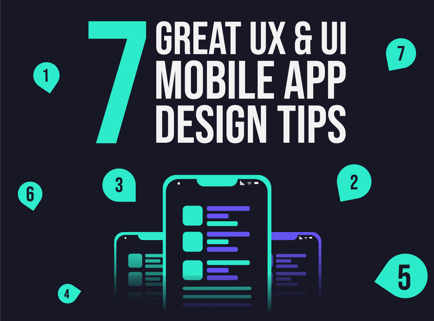
7 Mobile App Design Tips for Better UX and UI
Mobile app design tips. There are billions of different mobile apps and different designs. How to stand out when there is this amount of mobile apps online? Inkyy Web Design & Development team is here to make your mobile app pop up.
 5 min read
These mobile app design tips cover the basics that decide whether people keep using an app or delete it after one try. Good app design is clear, quick to understand and comfortable to use with one hand.
Below you will find the difference between UX and UI, seven practical tips with numbers you can check, and a short guide to testing your design with real users. Each tip comes from the problems we see most often in app projects.
UX and UI in mobile app design
People often use UX and UI as if they meant the same thing. They are linked, but they are different jobs.
- UX (user experience) is how the app works: the structure, the flow between screens and how easily someone can finish a task.
- UI (user interface) is how the app looks and responds: colour, type, icons, buttons, spacing and animation.
Think of a house. The UX designer is the architect who plans the rooms and how you move between them. The UI designer is the interior designer who chooses the colours, materials and furniture. A beautiful interior does not help if the stairs lead nowhere, and a clever plan feels cold without good finishing.
The architect’s drawings for an app are wireframes. Start there, agree the flow, and only then move to visual design. If you want the wider picture first, read our overview of mobile app design and development.
7 mobile app design tips
1. Use a grid and a spacing scale
A grid keeps screens aligned and makes your design feel calm and predictable. Many teams use an 8-point scale for spacing and sizing (8, 16, 24, 32 and so on), because it scales cleanly across screen densities. Set the margins and gutters once, then reuse them on every screen. Our post on grid-based layout design explains the principles.
2. Keep the main actions within easy reach
Most people use a phone with one hand, often with the thumb. The top corners of a large screen are the hardest to reach, and the lower half is the easiest. Put frequent actions, such as the primary button, tabs and navigation, in the lower part of the screen. Keep rare or risky actions, such as delete, further away.
3. Keep screens focused
Scrolling is natural on a phone, and feeds and articles are built around it. The problem is a screen that tries to do too much. Long forms, crowded settings pages and endless lists tire people out. Break long tasks into short steps, show only what is needed now, and hide extra options behind a clear “more” control or an expandable section.
4. Design for different screen sizes
Phones come in many sizes, and people also change the text size and the display zoom in their settings. Design flexible layouts that stretch and wrap instead of fixed positions. Test small phones, large phones and, if your app supports them, tablets and landscape. Let text scale with the system setting, and check that nothing is cut off at the largest size.
5. Support light and dark mode
Most phones let people choose a light or dark appearance, and many choose dark for the evening or all day. Apps that ignore the setting feel out of place. Design both themes from the start, using colour roles such as “background” and “text” instead of fixed values. On OLED screens, dark backgrounds can also use less power, though not on LCD screens. Whichever theme you use, check the contrast. Our guide to colour schemes in design covers the basics.
6. Choose colours and fonts for readability
Your brand colours should support the interface, not fight it. Aim for a contrast ratio of at least 4.5 to 1 for normal text, which is the WCAG AA level. Do not use colour alone to show meaning, such as red for an error. Add an icon or a word too. Pick one clear typeface with several weights, and keep body text at a comfortable size. Read our typography tips for more.
7. Make tap targets finger-friendly
Small buttons cause mis-taps and frustration. Apple suggests a tappable area of at least 44 by 44 points, and Google’s Material Design suggests at least 48 by 48 dp. The visible icon can be smaller if the tappable area around it is large enough. Leave space between neighbouring targets so people do not hit the wrong one.
Keep the experience simple
Every extra element asks the user to think. This is called cognitive load. Reduce it by showing one main action per screen, using familiar patterns for navigation and labelling buttons with clear verbs such as “Save” or “Book now”. Use size, weight and position to show what matters most, as we explain in our guide to visual hierarchy.
Do not forget accessibility
Designing for everyone is also good design. Add text labels for screen readers, make sure every action works without a precise gesture, and let people increase the text size. Small choices, such as a clear focus state or a visible label on an icon button, help many people and cost little to build in early.
How to test and improve your mobile app UX
Designers have blind spots about their own work. User testing finds them quickly. You do not need a large study.
- Build a clickable prototype of the main flow before you write code.
- Ask five or so people to complete real tasks while you watch, such as signing up or finding a setting. Do not explain anything.
- Note where they hesitate or tap the wrong thing. Those moments show where the design needs work.
- Fix the biggest problems and test again. Small, repeated rounds beat one big test.
- Keep measuring after launch. Track where people drop out and which screens get the most use.
To see the mistakes to avoid, read what makes a bad mobile app design. For a shorter checklist, see our 7 fundamental rules of mobile app design.
Frequently asked questions
What makes a good mobile app design?
A good mobile app design is simple, fast to understand and easy to use with one hand. It has a clear structure, readable text, large enough tap targets and a consistent look. It also works in light and dark mode and on different screen sizes.
What is the difference between UX and UI in app design?
UX covers how the app works, including its structure, flows and ease of use. UI covers how it looks and responds, including colour, type, icons and buttons. You need both to make an app people enjoy using.
How big should buttons be in a mobile app?
Aim for a tappable area of at least 44 by 44 points on iOS and 48 by 48 dp on Android. The visible button can be smaller if the area around it is tappable and has enough space.
Do I need dark mode in my app?
It is not required, but most people expect it. Supporting both light and dark appearances follows the system setting, improves comfort in low light and can save battery on OLED screens.
Need an app design for a client?
Inkyy is a white label design and development team for agencies. Our in-house designers handle app UX and UI, from wireframes to finished screens, under your brand. See our design services or book a 15-minute call.