10 Font Trends for Websites, Logos and Branding
There are such a large amount of fonts out there but don't worry, we won't let you get lost. Inkyy Web Design & Branding Studio and our blog team will help you out with this article.
 5 min read
Font trends shape how websites, logos and packaging look, and the typeface you pick changes how customers read your brand before they read a single word. A brand needs a name, a logo and a slogan, and two of those three are made of letters, so the type has to be right.
This guide covers ten font trends for web and brand design, what each one says about a brand and where it works. It also explains how to judge a trend before you use it, so you can pick styles that last. For a wider shortlist of typefaces, see our 15 beautiful fonts for websites.
How to use font trends wisely
Trends move quickly, and type carries a lot of personality. Treat a trend as a flavour, not a foundation. Use it for headlines, logos and special moments, and pair it with a calm, readable typeface for body text. If the font suits your brand voice, you are doing well. If it only suits a moment, you will want to change it again soon.
A useful way to tell a lasting trend from a passing one is to see how it is used:
- Lasting: the style solves a real problem, such as readability, hierarchy or recognition. Geometric sans and characterful serifs fit here.
- Passing: the style is mainly decoration and depends on a mood or a moment. Disco revival and extreme distortion are more likely to date.
Neither group is wrong. Short campaigns can enjoy passing styles, while a logo or a core website should lean on the lasting ones.
10 font trends for beautiful design
1. Distorted fonts
Stretched, twisted, squashed or warped type is one of the most visible trends. Some designs add just one disruptive letter, while others push the shape almost beyond readability. The style borrows from early digital and experimental type and suits independent, alternative and music brands. In vector software such as Adobe Illustrator you can distort individual characters yourself. See our list of the best distorted fonts.
2. Disco revival
Retro never leaves, but the reference point shifts. Rounded, glossy and curvy letterforms inspired by the 1970s bring a party mood to posters, cafés, events and fashion. Use them for short, friendly headlines, not paragraphs.
3. Alpine display fonts
Woodcut and letterpress-inspired display fonts have long been the route for designers who want a vintage feel. Rugged, alpine-style letters work well for craft food and drink, outdoor products and independent lifestyle brands. There is a version for every mood, from heavy and bare to soft.
4. Kinetic type
Moving type has a long history, from film title sequences in the late 1950s and 1960s to today’s websites and short videos. Animated text holds the eye for longer and helps tell a story about a brand or product. Keep it purposeful, offer a way to pause it and avoid motion on long blocks of copy.
5. Alternating baselines
Capitals are useful for titles and names, but a line of all caps forms a boxy shape that can look flat. This trend shifts the height of letters or the baseline to add rhythm, sometimes with changes in spacing or a tilt. The words keep the same capitalisation while the letter shapes become less predictable.
6. Geometric sans
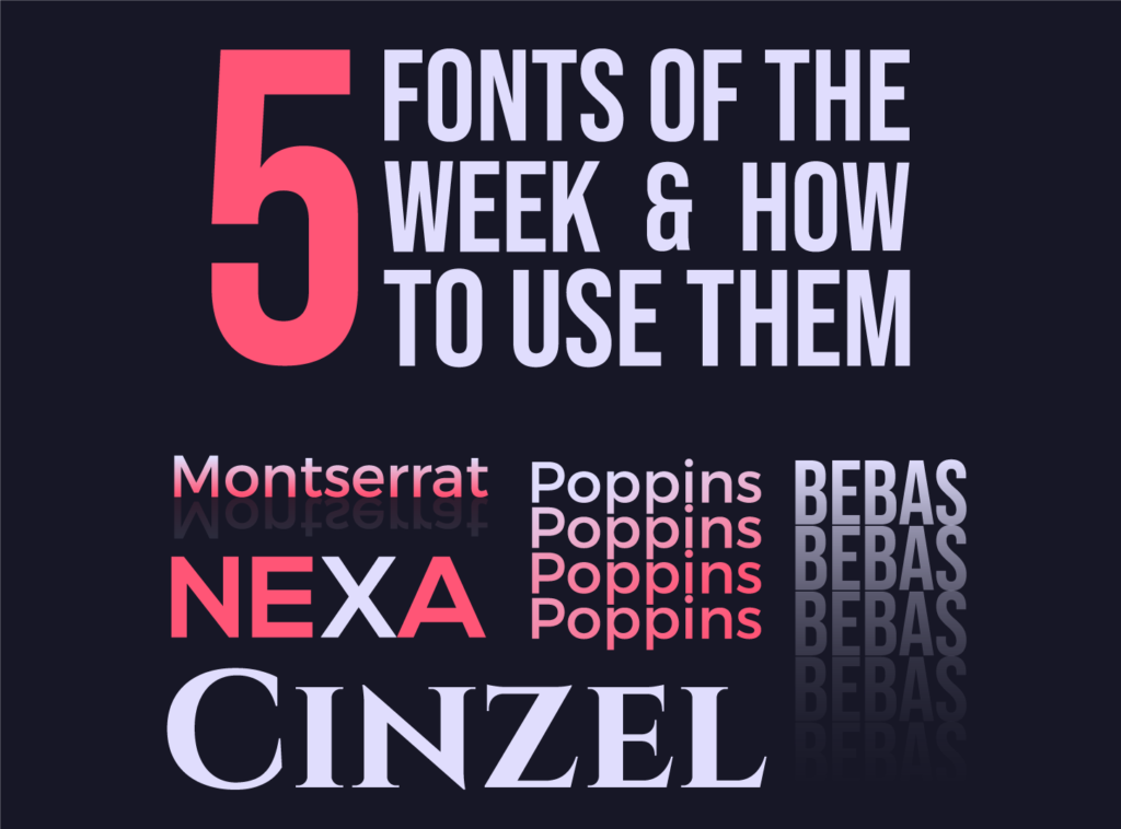
Geometric sans serifs such as Futura, Montserrat and Poppins offer a balance of impact and readability. Built from circles, lines and clean angles, they feel secure, solid and modern, and they work for tech, finance and start-up brands. They are also easy to pair with a serif.
7. Extra sharp angles
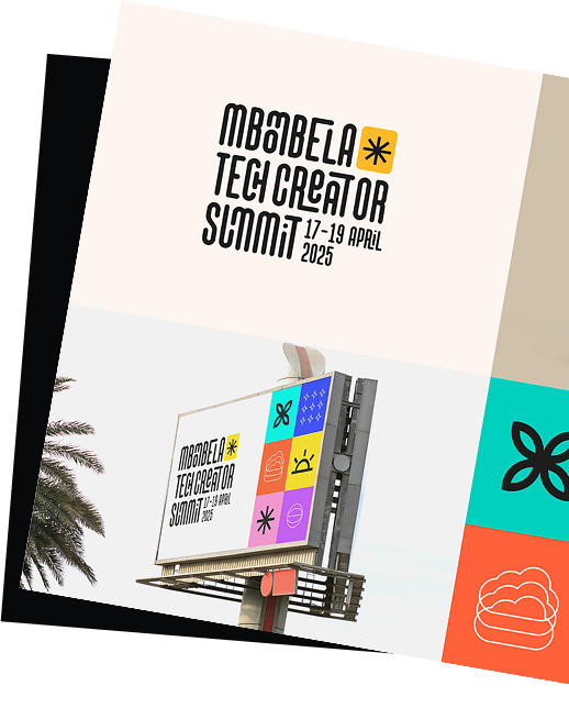
Some fonts push their points and edges as far as they can go. Spiky terminals feel rebellious and energetic, and they combine well with dark colours. They suit gaming, metal and streetwear brands more than banks. Use them at large sizes, because the details can clog at small ones.
8. Characterful serifs
Serifs have become more expressive. Designers now release serifs with soft curves, high contrast and quirky details, and brands that want warmth and personality are returning to them. Playfair Display and Fraunces are two examples on Google Fonts. Most brands use one typeface or a serif and sans pair, so it is rare to see two serifs together because they compete for attention.
9. Minimal, chunky scripts
Handwritten styles bring warmth and friendliness. The newer versions are bold and simple, a long way from the delicate scripts on wedding stationery. They look good over photos, on social graphics and on posters, and they stretch from logos to magazine headings. Check that the letters are still clear at small sizes. Our selection of handwriting fonts is a good place to start.
10. Standout letters
Plain fonts that fade into the background keep the focus on the message, which is usually a good thing. This trend takes a uniform style and lets one or two letters break the pattern, creating a wordmark with a recognisable detail. The key is restraint: one distinctive letter is a feature, three become noise.
Tips for choosing and using a trending font
- Match the font to the brand voice. Write three words that describe the brand, then judge each font against them.
- Check readability. Test on a phone at real size. Display fonts that look great at 80 pixels may fail at 16.
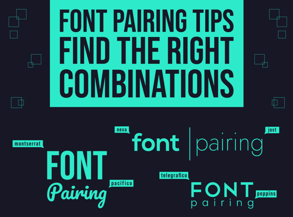
- Limit yourself. Two typefaces are usually enough. See our guide to font pairing for combinations that work.
- Mind letter spacing. Display styles often need adjusted spacing. Read why letter spacing matters.
- Check the licence. Make sure it covers web, app and print use, and for logos check that commercial use is allowed.
- Think about speed. Use WOFF2 files, load only the weights you need and consider a variable font to cover several weights in one file.
For more advice on setting text, read our tips for typography in web design, and if you are still stuck, this guide on how to choose the perfect font may help.
Frequently asked questions
What are the biggest font trends right now?
The ten styles above are the ones we see most often: distorted type, retro and disco shapes, vintage display faces, kinetic type, shifting baselines, geometric sans, sharp angles, characterful serifs, chunky scripts and standout letters.
Should I use a trending font for my logo?
Be careful. A logo has to last for years. If you like a trend, use it in a restrained way or save it for campaigns and headlines, and keep your core typeface timeless.
How many fonts should a website use?
Usually two: one for headings and one for body text. A single family with several weights can work just as well and loads faster.
Are Google Fonts free for commercial use?
Fonts in the Google Fonts library are open source and free to use in commercial projects, but always check the licence on the font page before you build it into a brand.
Need typography and branding for a client?
Inkyy is a white label design and development team for agencies. Our in-house designers choose and set type for logos, websites and full brand identities, and you deliver them under your own brand. See our design services or book a 15-minute call.