


20 Best Comic Fonts (12 Free for Commercial Use)
 12 min read
Comic fonts give a design the energy of a comic book page: shouted speech bubbles, loud sound effects and bold cover titles. They work for comics and webcomics, but also for game titles, kids’ brands, packaging, party invitations and playful social posts. The trick is to pick comic fonts that read well, suit the job and come with a licence you can actually use.
We picked 20 comic fonts and grouped them by job: lettering and speech bubbles, sound effects, titles and display, and handwritten comic styles. Every font has a specimen, its styles, the designer and a licence we checked on the real source page. 12 are free for commercial use. The other 8 are free for personal use only, and we say so. After the list you will find the basics of comic lettering, how to avoid the Comic Sans look, and pairing tips.
What to check before you download a comic font
- Licence first. Most comic fonts on DaFont are “Free for personal use”, which rules out client work, merchandise and anything you sell. Fonts on Google Fonts use the SIL Open Font License or the Apache License, which allow commercial use. On DaFont, “100% Free” also allows it.
- Know the job. Speech bubble text needs a clear, even font that stays readable at small sizes. Sound effects and titles can be loud and distorted because they are used for one or two words.
- Check for bold and italic. Comic letterers use bold italic for stressed words. A lettering font with only one style limits you.
- Test the real text. Many free comic fonts are caps only, or miss numbers, accents and punctuation. Type your actual lines before you commit.
- Plan for the web. Personal-use desktop fonts usually cannot be embedded on a website. Google Fonts can be linked or self-hosted.
Comic lettering and speech bubble fonts
These are the workhorses: fonts for dialogue, captions and narration. They need to stay clear at small sizes, so they are calm compared with the title fonts further down.
1. Comic Neue
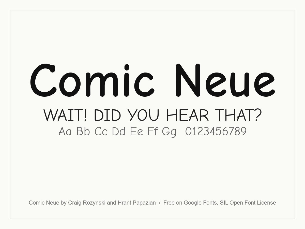
Comic Neue is a modern redraw of Comic Sans, started by Craig Rozynski. It keeps the friendly, hand-lettered feel but fixes the wonky shapes, so it looks deliberate rather than default. Six styles, including bold and italics, make it a real option for speech bubbles, kids’ apps and friendly UI text.
- Style: Casual comic lettering
- Weights: Light, Regular and Bold, each with an italic
- Languages: Latin
- Designer: Craig Rozynski and Hrant Papazian
- Licence: Free for personal and commercial use (SIL Open Font License)
- Source: Download on Google Fonts
2. Comic Relief
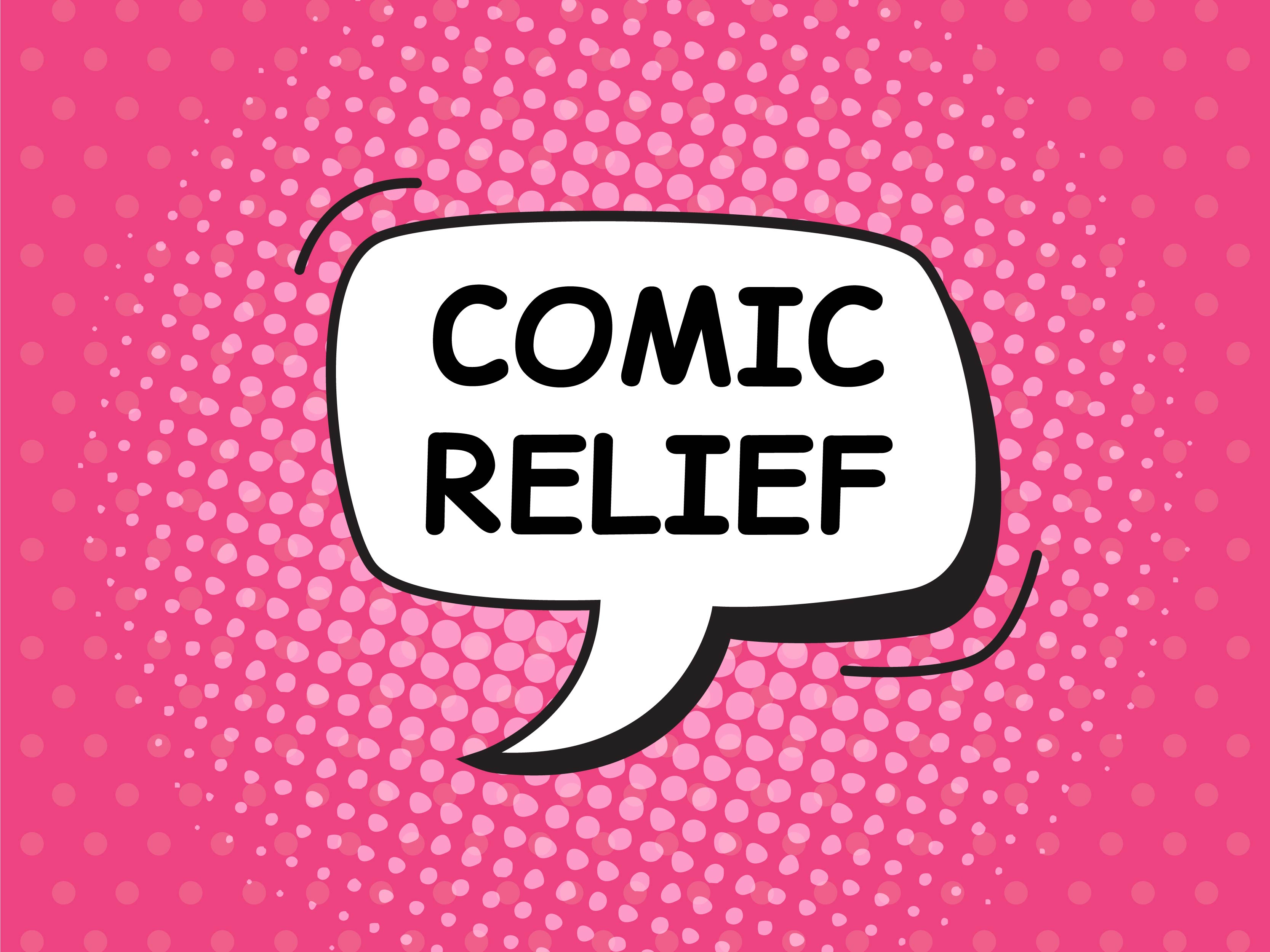
Comic Relief is built to be metrically equal to Comic Sans MS, so you can swap it into an existing layout without the text reflowing. That makes it useful when a client’s old material is set in Comic Sans and you need a free, open replacement. It reads exactly like the classic, so use it on purpose, not by accident.
- Style: Comic Sans compatible lettering
- Weights: Regular and Bold
- Languages: Latin, Cyrillic and Greek
- Designer: Jeff Davis
- Licence: Free for personal and commercial use (SIL Open Font License)
- Source: Download on Google Fonts
3. Patrick Hand
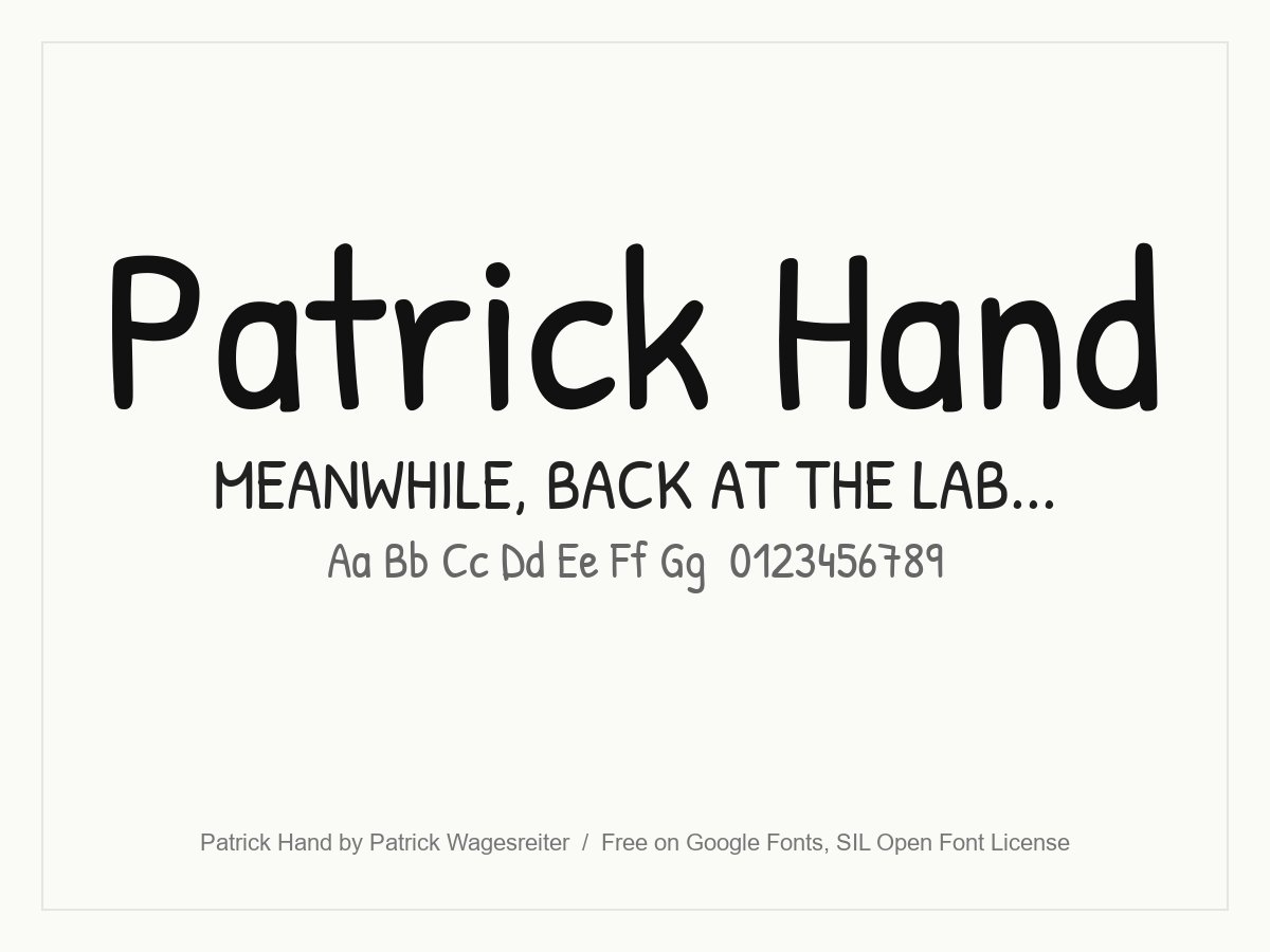
Neat, upright print handwriting with even spacing, close to the way many letterers write dialogue by hand. It stays readable in long captions and works well in all capitals, which is the comic convention. A safe choice for webcomics, explainer comics and education material.
- Style: Print handwriting for dialogue
- Weights: One (Regular)
- Languages: Latin and Vietnamese
- Designer: Patrick Wagesreiter
- Licence: Free for personal and commercial use (SIL Open Font License)
- Source: Download on Google Fonts
4. Adam Warren Pro
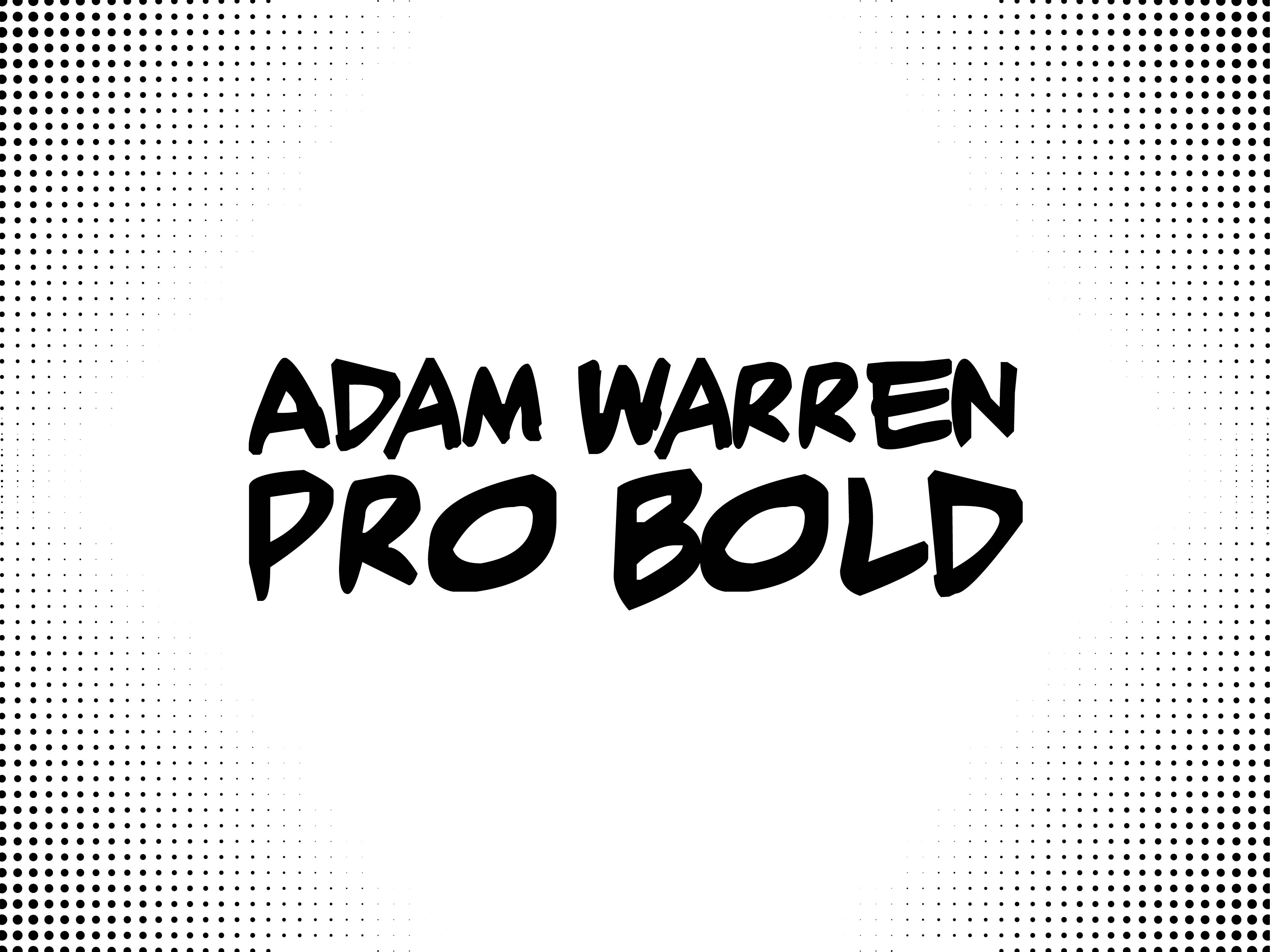
A hand-lettered comic font with the slightly irregular capitals of real balloon lettering. It includes a regular, a bold and a bold italic, which covers emphasis inside dialogue. The free download is for personal use only, so check with the designer before using it in a published or paid project.
- Style: Comic book lettering
- Weights: Regular, Bold and Bold Italic
- Designer: PressGang Studios
- Licence: Free for personal use only (DaFont)
- Source: Download on DaFont
Sound effect and onomatopoeia fonts
BOOM, WHAM and KA-POW need heavy, slanted letters that look like they are moving. Use these for one or two words, and feel free to rotate, stretch and outline them.
5. Badaboom BB

The classic sound effect font from Blambot, the comic font foundry run by letterer Nate Piekos. Heavy, slanted capitals with a built-in outline look like a sound bursting off the page. DaFont lists it as free for personal use. Blambot’s licence page also lets independent comic creators use fonts marked for indie comics without charge, so check the font’s label there before you publish.
- Style: Sound effect capitals
- Weights: One
- Designer: Blambot (Nate Piekos)
- Licence: Free for personal and non-profit use. Commercial licence sold by Blambot (see Blambot licences)
- Source: Download on DaFont
6. Bangers
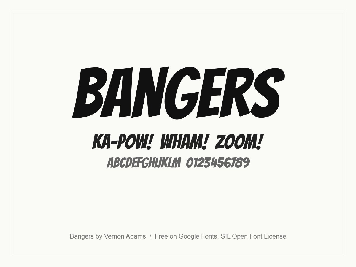
Bangers is modelled on the cover lettering of mid-20th century superhero comics. Its tall, condensed and slightly slanted capitals pack a punch for sound effects, and it is narrow enough to fit a long word into a panel. Because it is open source, it is the go-to free comic font for posters, games and merchandise.
- Style: Condensed comic capitals
- Weights: One (Regular)
- Languages: Latin and Vietnamese
- Designer: Vernon Adams
- Licence: Free for personal and commercial use (SIL Open Font License)
- Source: Download on Google Fonts
7. Titan One
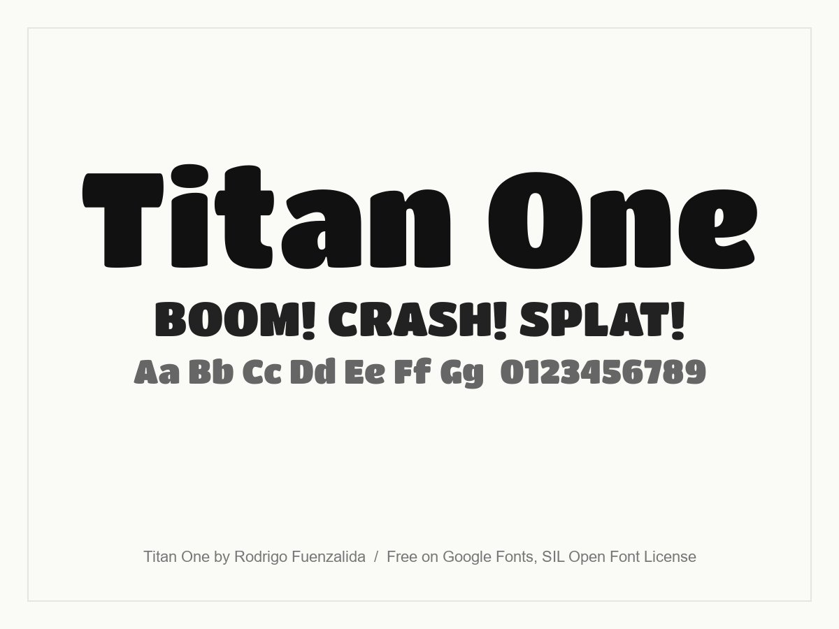
A very fat, rounded display face based on big-brush hand lettering. It has the weight you need for a cartoon sound effect, and its soft corners make it feel friendly rather than aggressive. Add a thick outline and a drop shadow and it looks straight out of a Sunday strip.
- Style: Heavy rounded display
- Weights: One (Regular)
- Languages: Latin
- Designer: Rodrigo Fuenzalida
- Licence: Free for personal and commercial use (SIL Open Font License)
- Source: Download on Google Fonts
8. Go Speeds
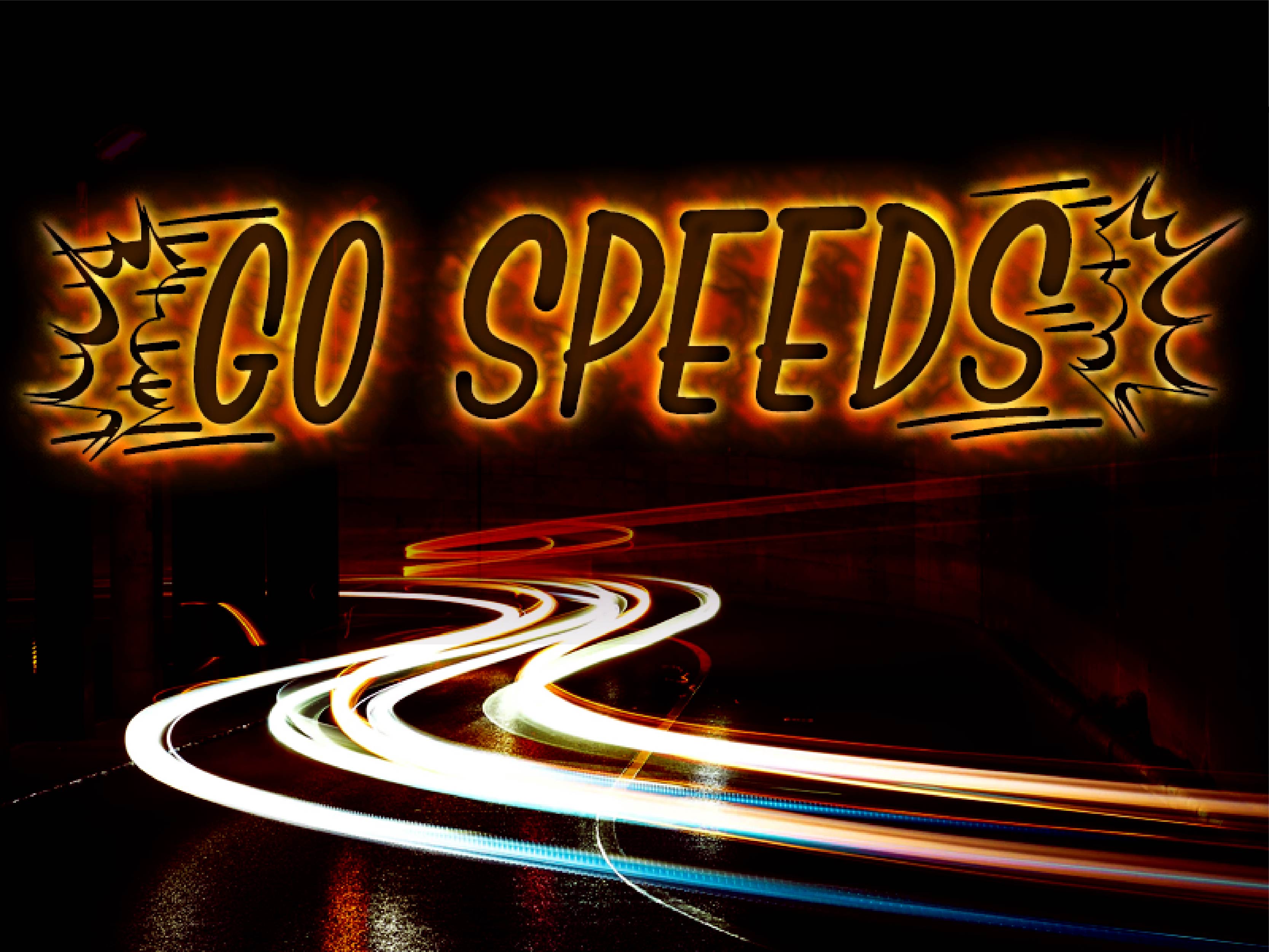
Go Speeds draws motion into the lettering, with burst shapes and lines around the word. It suits racing, action and gaming graphics where you want an instant sense of speed. It is a demo font, free for personal use only, and the designer asks you to get in touch before any commercial use.
- Style: Action and speed lettering
- Weights: One
- Designer: Kotak Kuning Studio
- Licence: Free for personal use only (demo). Commercial licence from the designer
- Source: Download on DaFont
9. Smartie
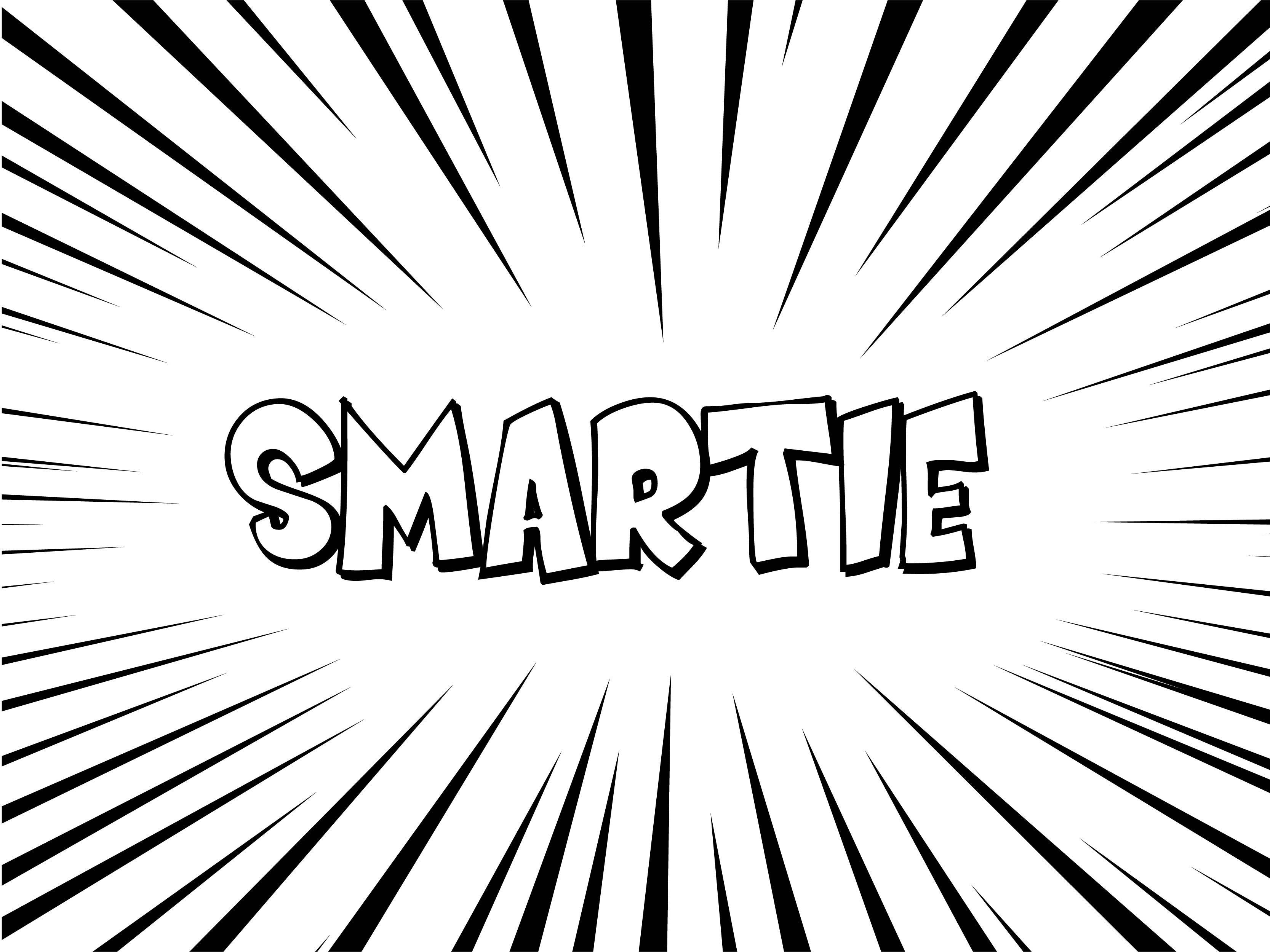
Smartie has wobbly, outlined capitals that look hand-inked, ideal for a cartoon shout or a comic-style badge. The open outline means you can fill it with any colour behind the line. It is free for personal use only; a commercial licence is sold through FontBros.
- Style: Outlined cartoon capitals
- Weights: One
- Designer: Fontalicious
- Licence: Free for personal use only. Commercial licence from FontBros
- Source: Download on DaFont
Comic title and display fonts
Cover logos, chapter titles, game screens and packaging. These comic fonts are made to be big, so they can have more personality than anything inside a speech bubble.
10. Luckiest Guy
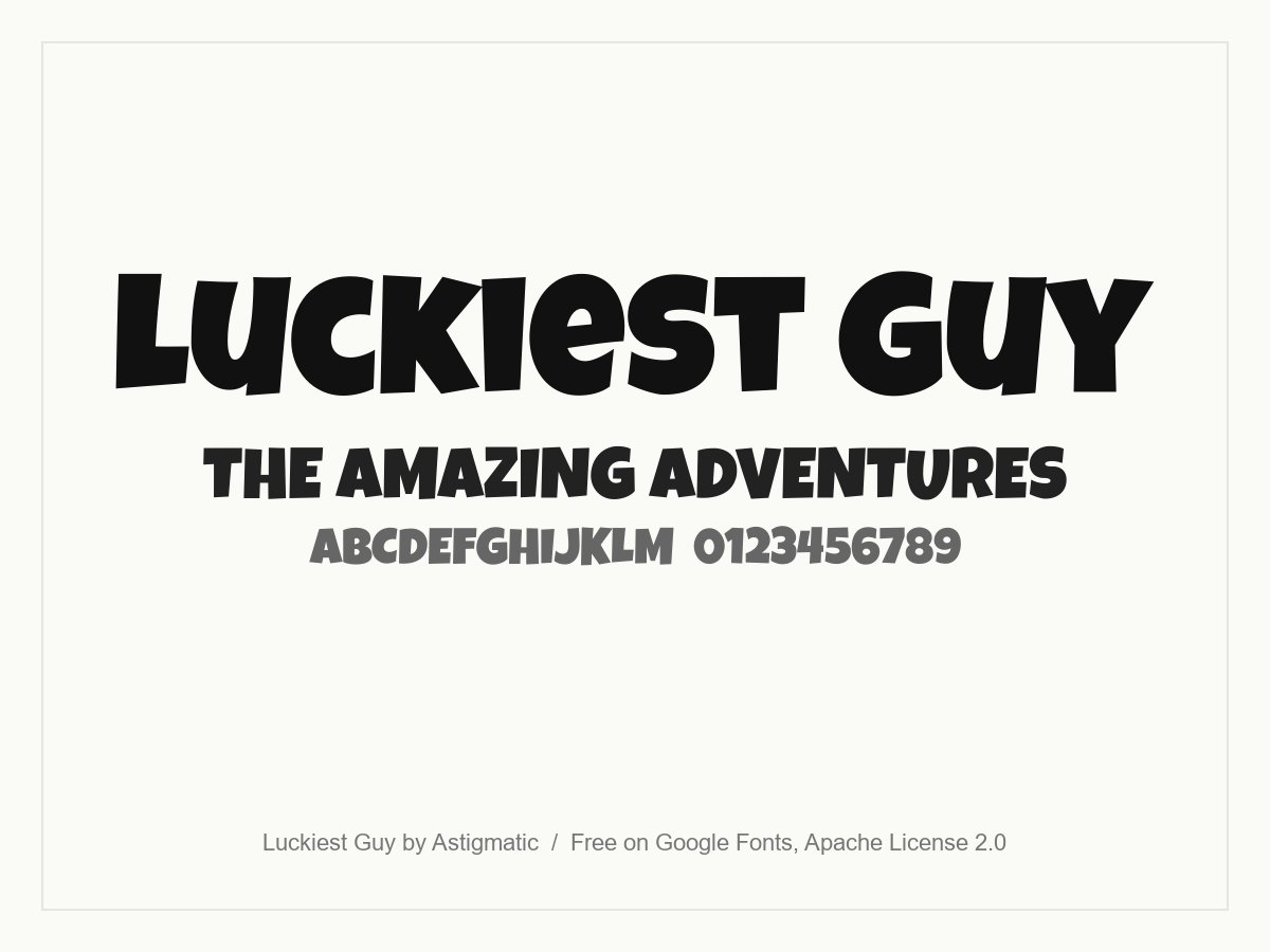
A friendly heavyweight inspired by hand lettering in 1950s advertising. Its chunky, slightly irregular capitals give titles a cheerful, cartoon feel. It is one of the most useful free comic fonts for kids’ brands, game titles and bold social graphics.
- Style: Heavy cartoon capitals
- Weights: One (Regular)
- Languages: Latin
- Designer: Astigmatic
- Licence: Free for personal and commercial use (Apache License 2.0)
- Source: Download on Google Fonts
11. Komika Title
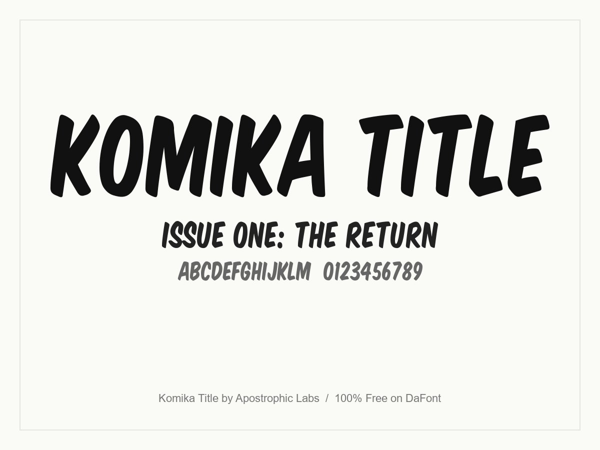
Part of the Komika superfamily from Apostrophic Labs, a complete free lettering system made for comic artists. Komika Title is the cover and title set: bold, slanted capitals that look like a classic comic masthead. The download includes 12 styles, from Tall and Wide to Shadow, Emboss and Paint.
- Style: Comic cover titles
- Weights: 12 styles, including Kaps, Tall, Wide, Tilt, Shadow and Paint
- Designer: Apostrophic Labs (listed on DaFont under Vigilante Typeface Corporation)
- Licence: Free for personal and commercial use (100% Free on DaFont). The readme asks commercial users to give a share of the profit to charity
- Source: Download on DaFont
12. Snacker Comic
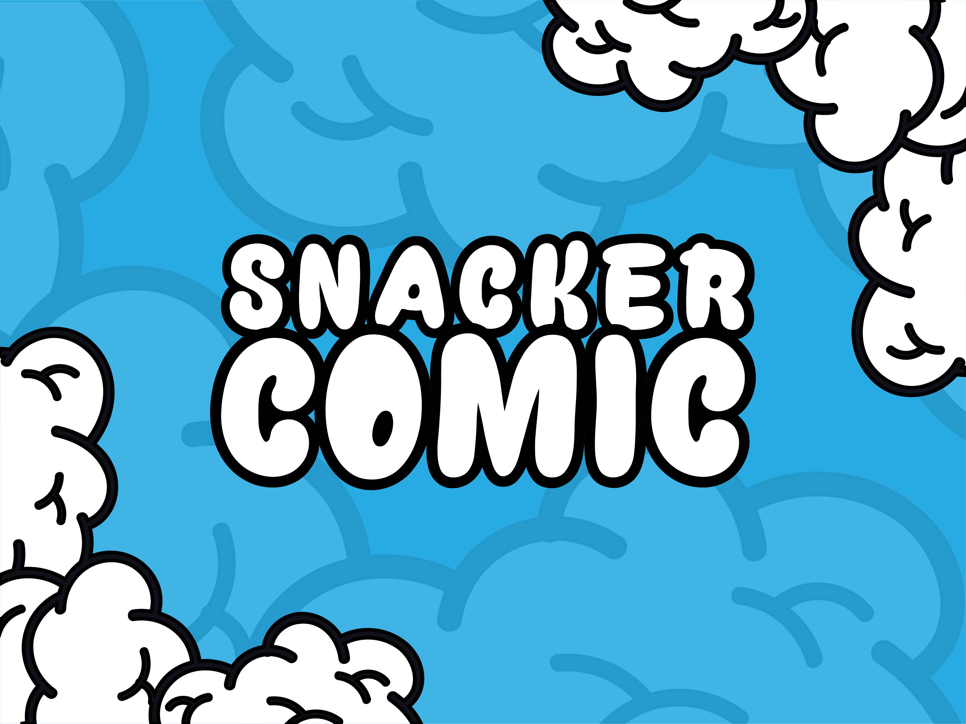
Bubbly, rounded capitals with a thick black outline, like a cartoon logo on a cereal box. It suits children’s products, snack packaging and party graphics. The file is for personal use only, and a commercial licence is sold by the designer.
- Style: Outlined bubble capitals
- Weights: One
- Designer: Måns Grebäck
- Licence: Free for personal use only. Commercial licence sold by the designer
- Source: Download on DaFont
13. Porky’s
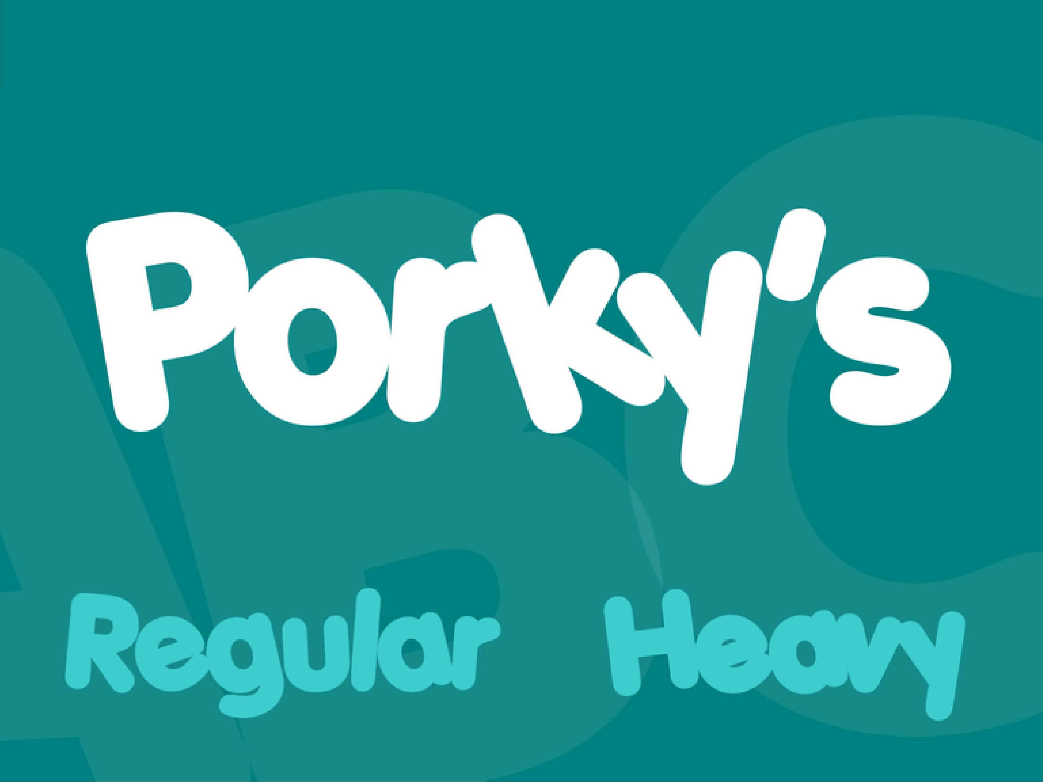
Porky’s is soft, round and heavy, with letters set close together in a playful way. It comes in Regular and Heavy, so you can build a simple hierarchy for a cartoon title. It is free for personal use only; the commercial licence is sold through FontBros.
- Style: Rounded cartoon display
- Weights: Regular and Heavy
- Designer: Fontalicious
- Licence: Free for personal use only. Commercial licence from FontBros
- Source: Download on 1001 Fonts
14. Comic Comoc
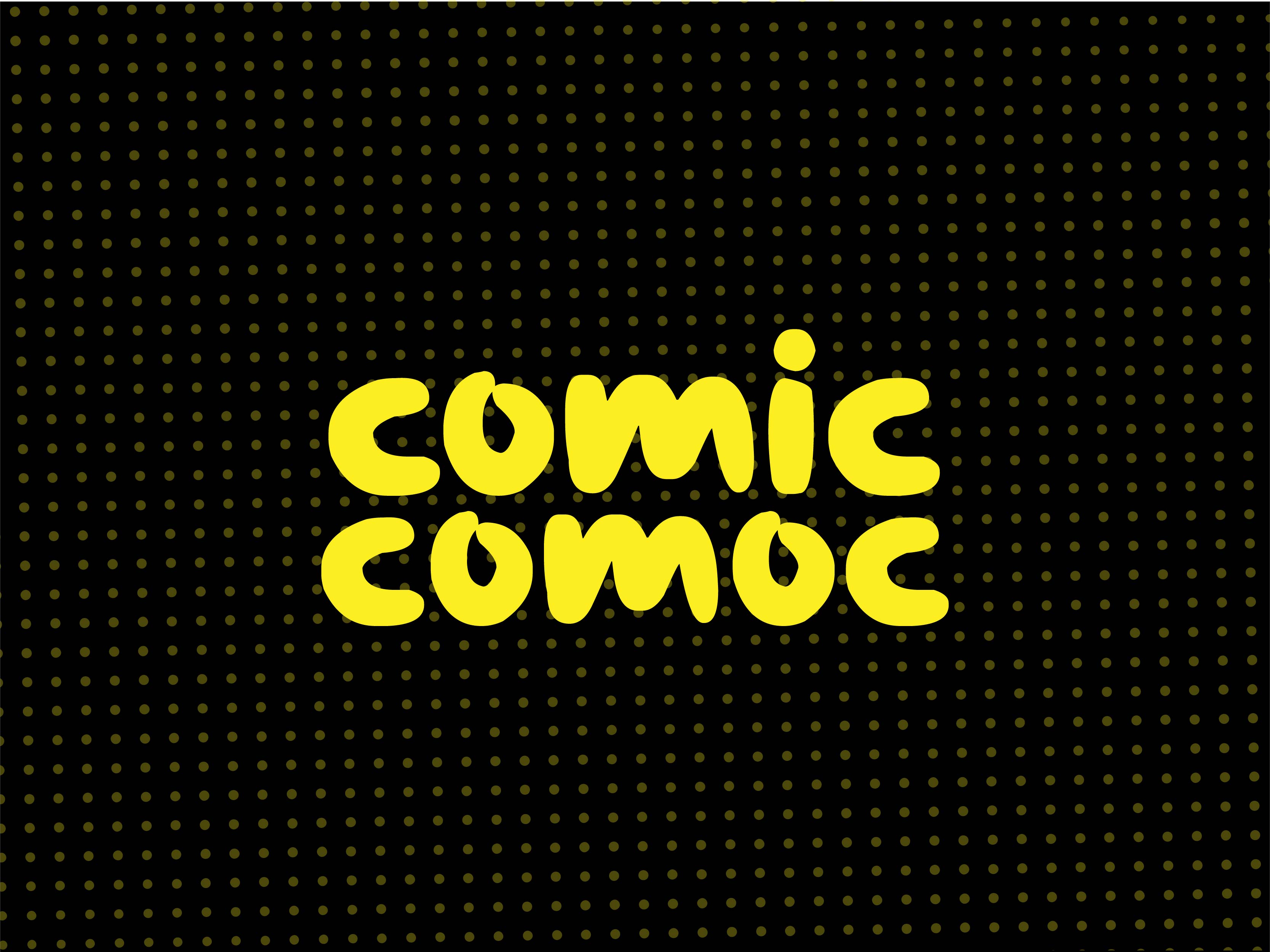
Chunky lowercase letters with a bouncy rhythm, closer to a cartoon brand than a superhero book. It works for snack brands, toy packaging and fun headlines. The designer is strict about licensing: it is for personal use only, and commercial use needs a paid licence.
- Style: Bouncy lowercase display
- Weights: One
- Designer: DumadiStyle
- Licence: Free for personal use only. Commercial licence sold by the designer
- Source: Download on DaFont
15. Chewy
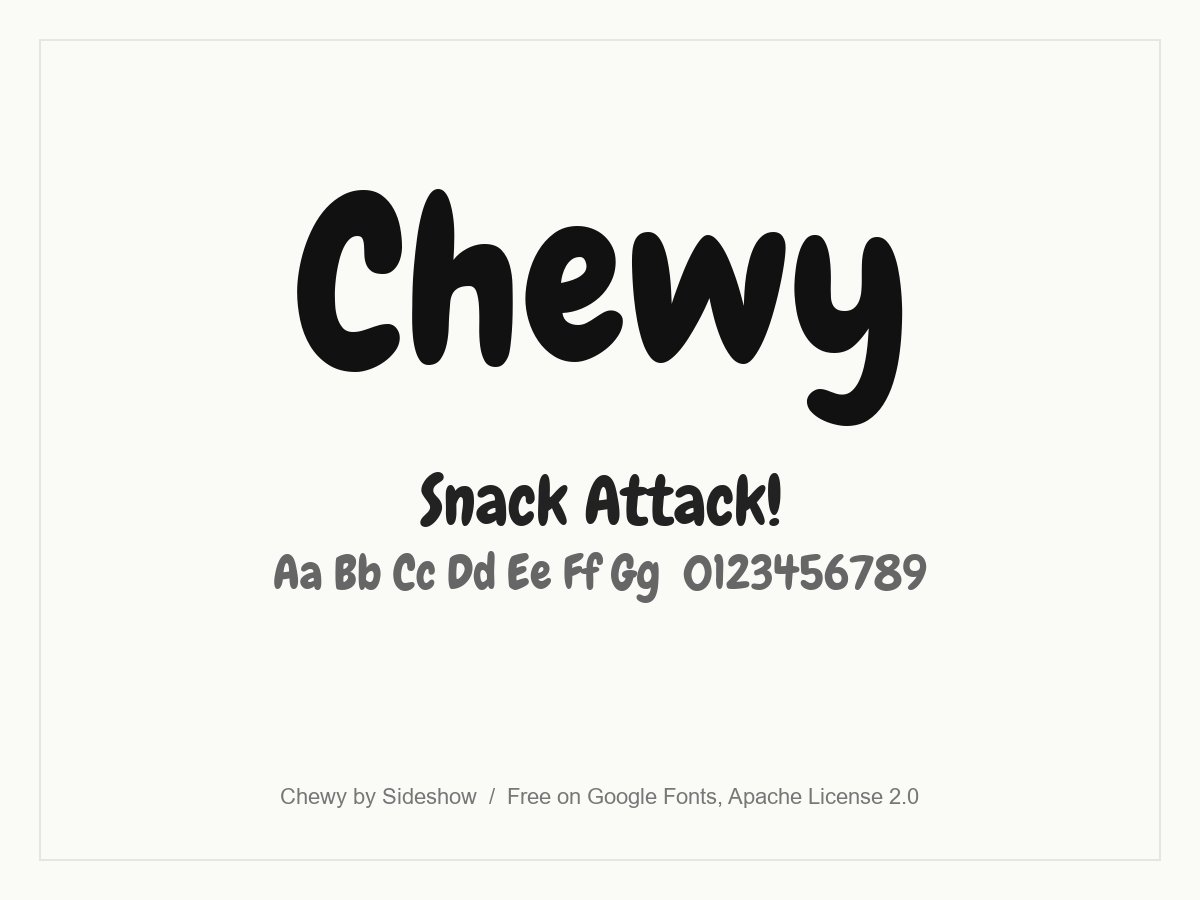
Soft, heavy letters with a squashed, chewy feel, as the name promises. It brings a cartoon mood to headlines without being hard to read, and works in upper and lower case. Good for food, kids’ products and casual games.
- Style: Soft cartoon display
- Weights: One (Regular)
- Languages: Latin
- Designer: Sideshow
- Licence: Free for personal and commercial use (Apache License 2.0)
- Source: Download on Google Fonts
16. Bubblegum Sans
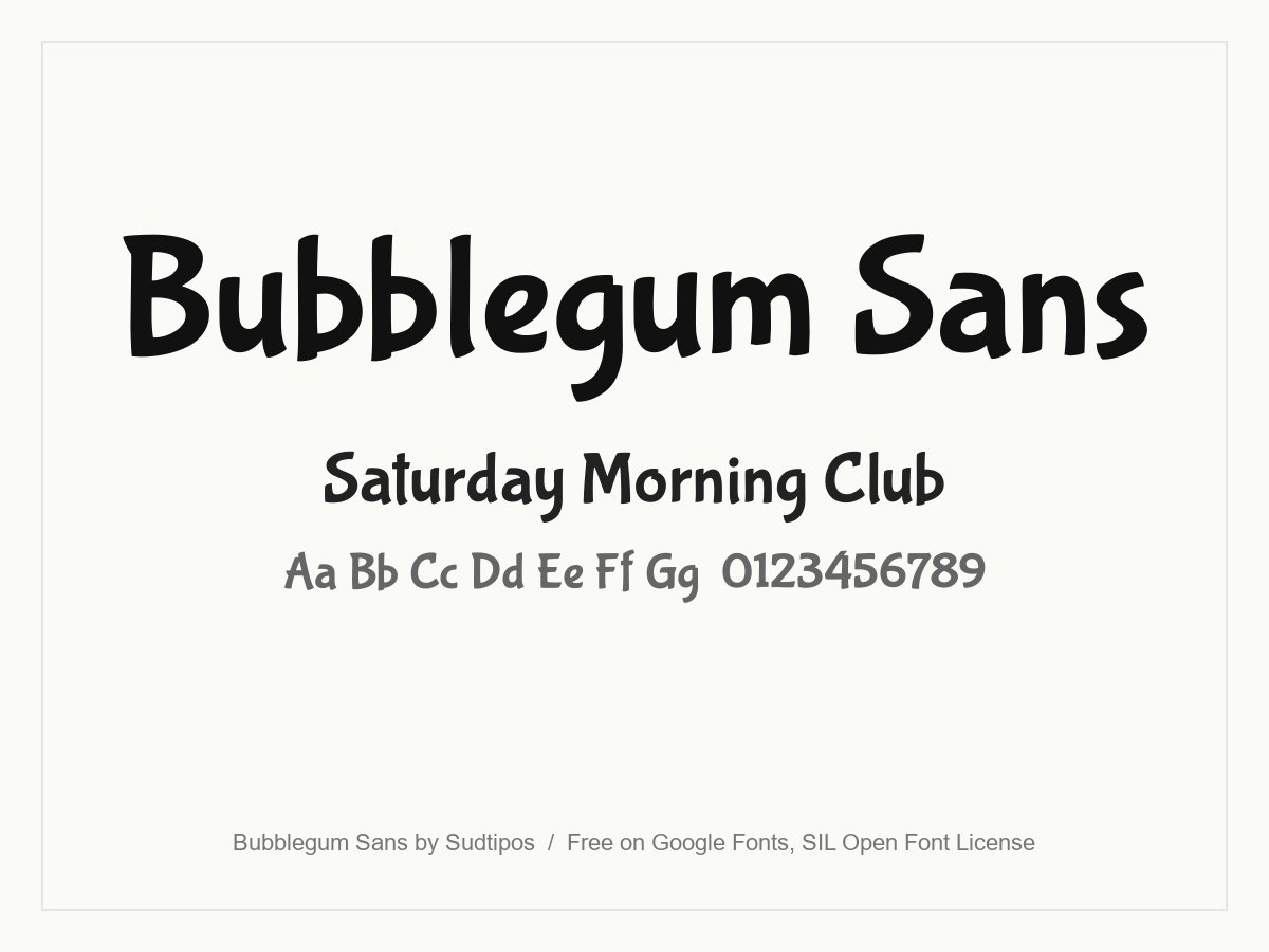
Brushy, upbeat letters inspired by 1930s advertising lettering, designed by Angel Koziupa for Sudtipos. It is calmer than most title fonts, so it can carry a short subtitle as well as a headline. A nice fit for retro cartoons, sweet shops and family events.
- Style: Retro brush display
- Weights: One (Regular)
- Languages: Latin
- Designer: Sudtipos (Angel Koziupa)
- Licence: Free for personal and commercial use (SIL Open Font License)
- Source: Download on Google Fonts
17. Mr Sunshine
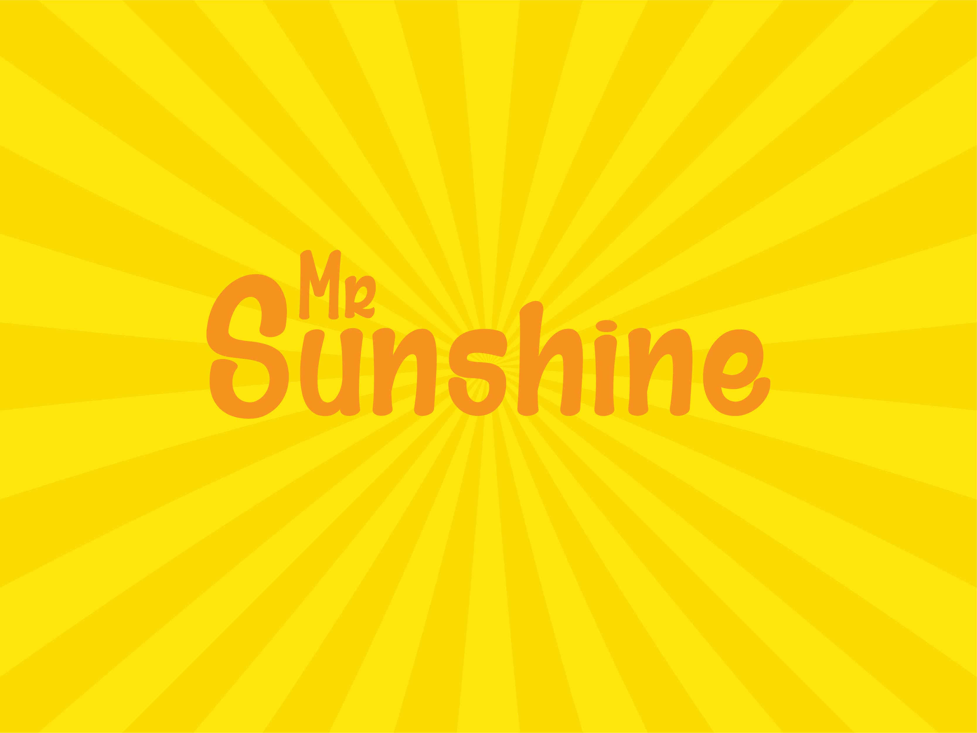
A cheerful, rounded display face with a retro cartoon character. It suits summer campaigns, kids’ events and sunny packaging. It is free for personal use only, and the designer sells a licence for commercial and promotional use.
- Style: Retro cartoon display
- Weights: One
- Designer: dcoxy (Greg Medina)
- Licence: Free for personal use only. Commercial licence sold by the designer
- Source: Download on DaFont
Handwritten comic fonts
For a sketchbook look: diary comics, notes on a storyboard, doodled captions and indie zines. These feel drawn by hand rather than lettered.
18. Kalam
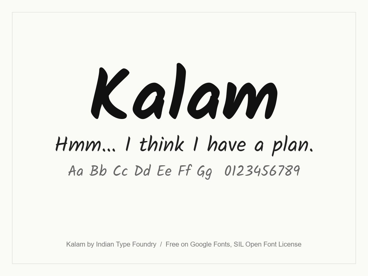
Informal, slightly slanted handwriting from the Indian Type Foundry. Three weights let you set dialogue in Regular and shout in Bold, which is rare in a free handwriting font. It also covers Devanagari, so it works for comics in Hindi and English.
- Style: Informal handwriting
- Weights: Light, Regular and Bold
- Languages: Latin and Devanagari
- Designer: Indian Type Foundry
- Licence: Free for personal and commercial use (SIL Open Font License)
- Source: Download on Google Fonts
19. Augie
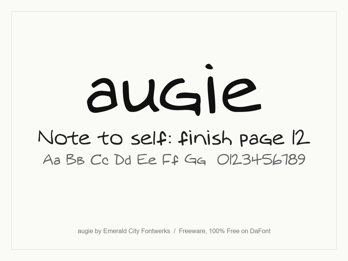
Augie is a casual handwriting font based on a student’s class notes, with loose, slightly uneven letters. It is perfect for doodle comics, notes on a storyboard and friendly captions. The readme says the author places no conditions or restrictions on its use.
- Style: Casual handwriting
- Weights: One
- Designer: Emerald City Fontwerks (Steven J. Lundeen)
- Licence: Free for personal and commercial use (freeware, 100% Free on DaFont)
- Source: Download on DaFont
20. Amatic SC
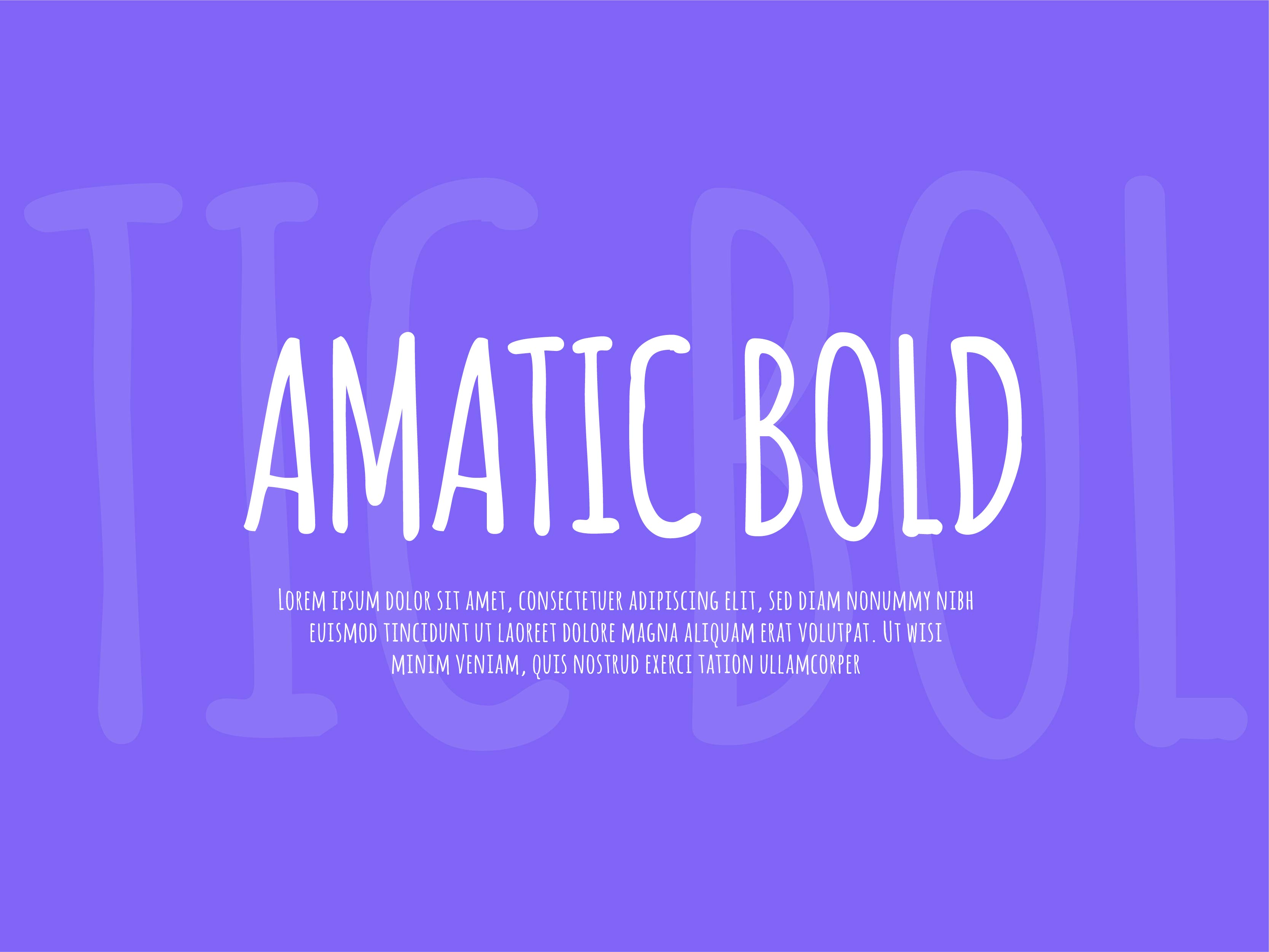
A tall, narrow hand-drawn font where the lower case is drawn as small capitals. It is light and quirky, more indie zine than superhero book, and good for labels, signs and short captions. Use the Bold for anything that needs to be read quickly.
- Style: Condensed hand-drawn capitals
- Weights: Regular and Bold
- Languages: Latin, Cyrillic, Hebrew and Vietnamese
- Designer: Vernon Adams, Ben Nathan and Thomas Jockin
- Licence: Free for personal and commercial use (SIL Open Font License)
- Source: Download on Google Fonts
Comic lettering basics
Good comic lettering is mostly invisible. Readers should follow the story without noticing the type. These are the conventions most letterers follow:
- Use all capitals for dialogue. Comic lettering has been set in capitals for decades, and readers expect it. That is why many lettering fonts draw small capitals in place of lower case.
- Use bold italic for emphasis. Stress one or two words per balloon, not whole sentences. If your font has no bold italic, choose another font rather than faking it.
- Leave room inside the balloon. Keep a clear margin between the text and the balloon edge, and shape the text block like a rough diamond or oval so it fills the balloon evenly.
- Keep sizes consistent. Pick one size for dialogue and stick to it on every page. Change size only to show a whisper or a shout.
- Follow the reading order. Place balloons left to right and top to bottom, and keep tails short and pointing at the speaker.
- Treat sound effects as art. Effects can be skewed, outlined and coloured to match the action. They sit in the artwork, not in a balloon.
Tight, even spacing matters even more in small balloons. Our post on letter spacing explains how tracking changes readability, and our guide on how to choose the perfect font for your design covers the wider decision.
How to avoid the Comic Sans cliché
Comic Sans was designed for speech bubbles in Microsoft software, and it does that job well. The problem is that it has been used everywhere, from office notices to shop signs, so it now reads as “default” rather than “comic”. A few ways to get the feeling without the cliché:
- Use a redraw. Comic Neue keeps the friendly mood with cleaner shapes, and few people will spot the link.
- Letter in capitals. Most of the comic book feeling comes from all-caps balloon lettering, not from the font itself. Patrick Hand or Adam Warren Pro in capitals already looks like a comic.
- Match the font to the art. A rough, inky drawing style needs a rougher lettering font. Clean vector art suits a cleaner one.
- Keep comic fonts for comic jobs. They are great for games, kids’ brands and fun campaigns. For legal text, prices or long reading, switch to a plain sans serif.
How to pair comic fonts
- One loud font per design. Choose a single title or sound effect font, such as Bangers or Luckiest Guy, and let everything else be calm.
- Pair a display font with a lettering font. Komika Title on the cover with Comic Neue in the balloons, or Luckiest Guy with Patrick Hand, gives a clear hierarchy that still feels like a comic.
- Use a plain sans serif for UI and small print. On a website or app, set body text, buttons and forms in a simple sans serif and keep the comic font for headings.
- Match the era. Bubblegum Sans and Luckiest Guy feel retro, so they suit warm, vintage colours. Bangers and Badaboom BB belong with bright pop art colours and halftone dots.
For more combinations, read our font pairing tips. If your project needs a different voice, see our picks of handwriting fonts, graffiti fonts and distorted fonts.
Frequently asked questions
What font do comic books use?
Most modern comics are lettered with digital fonts based on hand lettering, set in all capitals with bold italic for emphasis. Many professional books use commercial fonts from foundries such as Blambot or Comicraft. Free options with a similar look include Comic Neue, Patrick Hand and the Komika family.
What is the best free comic font for commercial use?
For speech bubbles, Comic Neue is the best all-round choice: it has six styles and an open licence. For titles and sound effects, Bangers and Luckiest Guy are both free for commercial use on Google Fonts.
Are DaFont comic fonts free for commercial use?
Only some. In this list, Komika Title and Augie are free for commercial use. Badaboom BB, Adam Warren Pro, Go Speeds, Smartie, Snacker Comic, Comic Comoc and Mr Sunshine are free for personal use only, so buy a licence from the designer before using them for a client or a product.
Is there a free alternative to Comic Sans?
Yes. Comic Relief matches the character widths of Comic Sans MS, so it can replace it without changing a layout. Comic Neue is a redesigned version with cleaner shapes. Both are free under the SIL Open Font License.
Need a playful brand or comic-style design for a client?
Inkyy is a white label design and development team for agencies. Our in-house designers choose, pair and license fonts as part of every logo, illustration, brand identity and website we create under your brand. See our design services or book a 15-minute call.


