



20 Lion Logo Designs, From Royal Crests to Mascots
 9 min read
A lion logo tells people your brand is strong, confident and here to lead. The lion has been a symbol of courage and royalty for thousands of years, from ancient carvings to the royal coats of arms of Europe, and it still works on everything from banks and law firms to football clubs, breweries and esports teams.
Below are 20 lion logo designs, grouped by style: crests and heraldry, geometric and line art, minimal marks, mascots and lion head monograms. For each one we note what the designer did well and what kind of brand it suits, so you can take the thinking, not the artwork, into your own project.
What a lion logo says about a brand
- Strength and courage: a natural fit for sports teams, gyms, security firms and anything that promises protection.
- Leadership and royalty: crowns, crests and upright poses suit finance, law, real estate and premium products. Our crown logo ideas show how much a small crown adds.
- Heritage and trust: heraldic lions make a young brand feel established, which is why they turn up on schools, family businesses, beer and spirits.
- Warmth and protection: a friendly lion mascot works for kids’ brands, dentists, pet products and games.
Famous examples include the Peugeot lion, the roaring lion of MGM, the crowned lion of the Premier League and the orange lion of ING. Each uses a different pose or crop of the same animal.
That is also the main trap. Lions are among the most used animals in logo design, so a generic lion head with a big mane will blend in with thousands of others. Give yours a second idea, like the door knocker or the tooth below. Two other common mistakes: too much mane detail, which turns into a blur at small sizes, and a snarling face on a brand that needs to feel welcoming.
20 lion logo designs for inspiration
Each design belongs to the designer or studio credited in its heading. Click a name to see the original project.
Lion crests and heraldic lion logos
1. Leo by Andrew Korepan
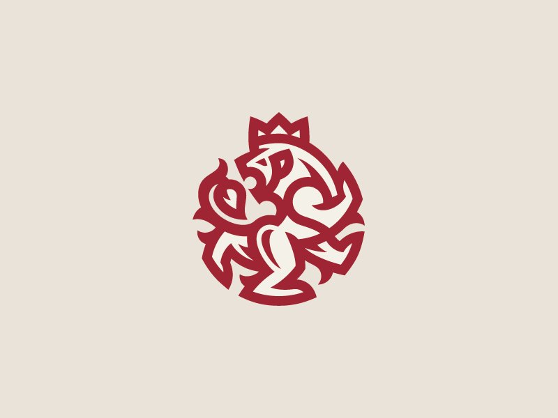
A crowned lion rampant, rearing on its hind legs, drawn with thick red strokes that knot together and fill a circle. It borrows the pose straight from heraldry, but the single colour and the tight round shape make it feel modern. A strong mark for a heritage food or drink brand, a publisher or a family business that wants to look established without a full coat of arms.
2. LEON Crest by HandriSid
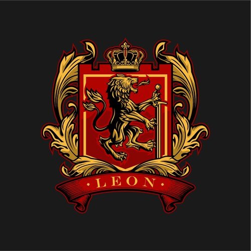
This is the full heraldic treatment: a red shield with a gold lion rampant beside a sword, a crown on top, curling gold leaves on each side and a red ribbon carrying the name. The client asked for a serious logo for a family and the charities and events it supports, and the classic crest delivers that. Use this level of detail for print, signage and merchandise, and plan a simpler version for small sizes.
3. Docendo Discimus Coat of Arms by patrimonio
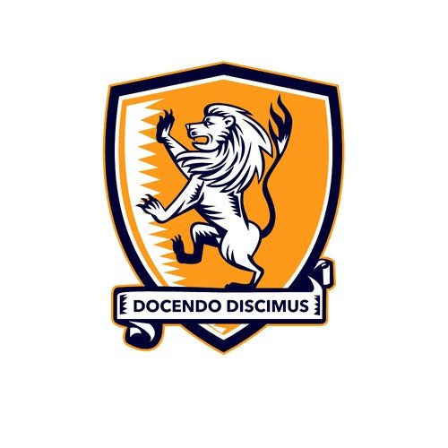
A white lion rampant on a bright orange shield, with a jagged white edge on one side and a navy outline around the whole badge. The Latin motto “Docendo Discimus” means “by teaching, we learn”, which ties the lion to the school’s purpose. The fresh palette keeps the heraldry lively. A good model for schools, clubs and academies.
4. Tesori Del Mondo by olimpio
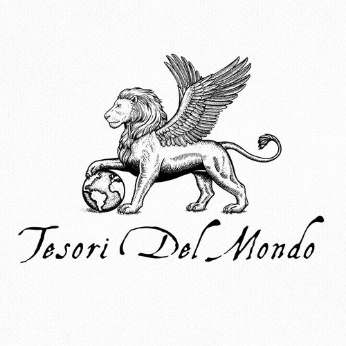
A finely engraved winged lion rests one paw on a globe, above a flowing calligraphic wordmark. The winged lion is the lion of St Mark, the symbol of Venice, so the logo says Italy, travel and old-world trade at a glance. The etched line work suits antiques, wine, fine food importers and luxury travel, as long as the logo is printed large enough to keep the detail.
Geometric and line art lion logos
5. Gradient Lion by Yoga Perdana
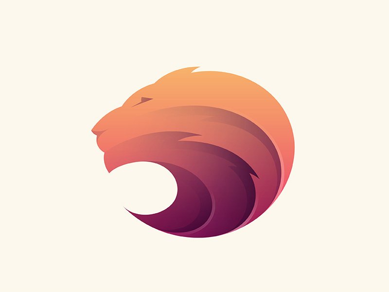
The lion head in profile sits on the edge of a circle, and the mane is built from stacked curved shapes that fade from peach and orange to deep purple. The gradient gives depth without any outlines, and the round shape works well as an app icon. A good fit for tech, media and creative brands that want warmth and energy.
6. Minimalist Lion Icon by Kakha Kakhadzen
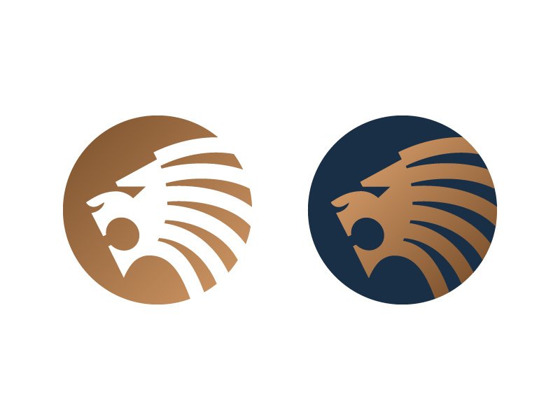
The mane is a set of sweeping parallel stripes that run from the face to the edge of a circle, so the lion feels like it is moving forward. The shot shows two colourways, copper on its own and gold on a navy disc, which is a useful reminder to test your mark on light and dark grounds. Suits finance, consulting and sports brands.
7. LYON INTERIM by Skilline
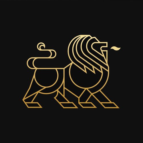
A walking lion drawn with one even gold line, built from circles for the body and mane and straight segments for the legs. The name plays on “Lyon”, which sounds like “lion”. This look suits recruitment, legal and professional services firms that want to look premium.
8. Lion Head Line Art by aleT
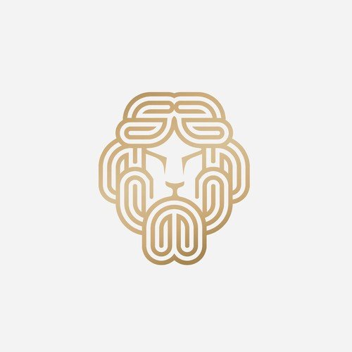
Three parallel gold lines loop and fold around the face to form the mane, a little like a woven cord or a maze. The designer made it as a concept for a clothing brand, and the metallic gradient points to jewellery, fashion and hotel branding.
9. Lion Grid by J_Ivan
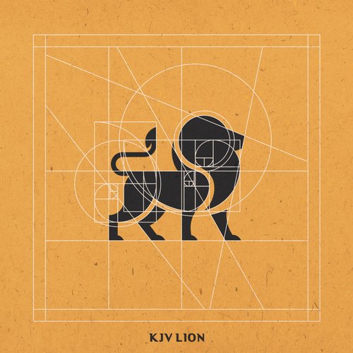
The black lion is shown with the white circles and guide lines used to draw it. According to the designer, every shape comes from golden ratio and Fibonacci circles, which is why the head, back and tail feel balanced. Read more about the golden ratio in design if you want to build a mark this way. A solid choice for publishers, architects and anyone who values precision.
Minimal lion logos
10. Lion Head in Negative Space by Joshua Jevons
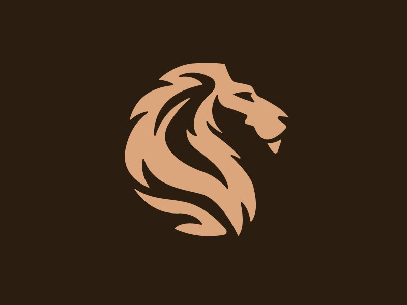
A tan lion head in profile, with the mane carved into flowing locks by thin cuts of the dark brown background. The cuts do the drawing, so the shape stays solid and bold. It would look at home on a whisky label, a barber shop or a leather goods brand.
11. Proud Lion by Sergey Kovalenko
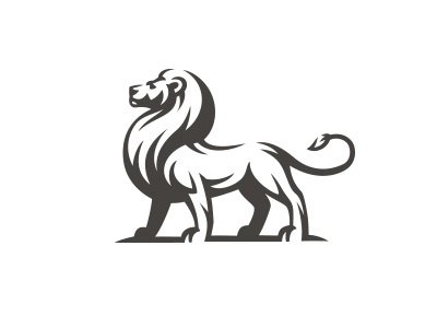
A lion stands side on with its head held high and its tail curled up. A few white cuts mark the mane, legs and belly, and nothing else is needed. The upright pose says pride and calm strength, which suits law firms, private banks and established family businesses.
12. Diamond Lion by Artvin
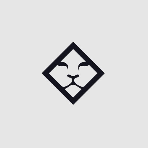
A thick black diamond frames a lion face that is nothing more than two brows, a nose and a mouth. Your eye fills in the rest. The brief asked for a sleek, regal lion head for a luxury athleisure brand that could be made in metal, and a mark this simple is easy to stamp, engrave or cast.
Lion mascot logos
13. Tribal Lion eSport Mascot by Modal Tampang
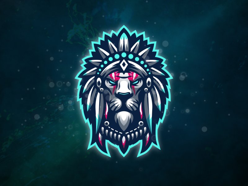
A lion in a feathered headdress with pink face paint, drawn with sharp highlights and a glowing turquoise outline. The strong outline keeps it readable on streams, jerseys and dark backgrounds. Feathered war bonnets are sacred in many Native American cultures, so think carefully before putting this kind of costume on a brand. See more in our esport mascot logo ideas.
14. Striding Lion by Fraser Davidson
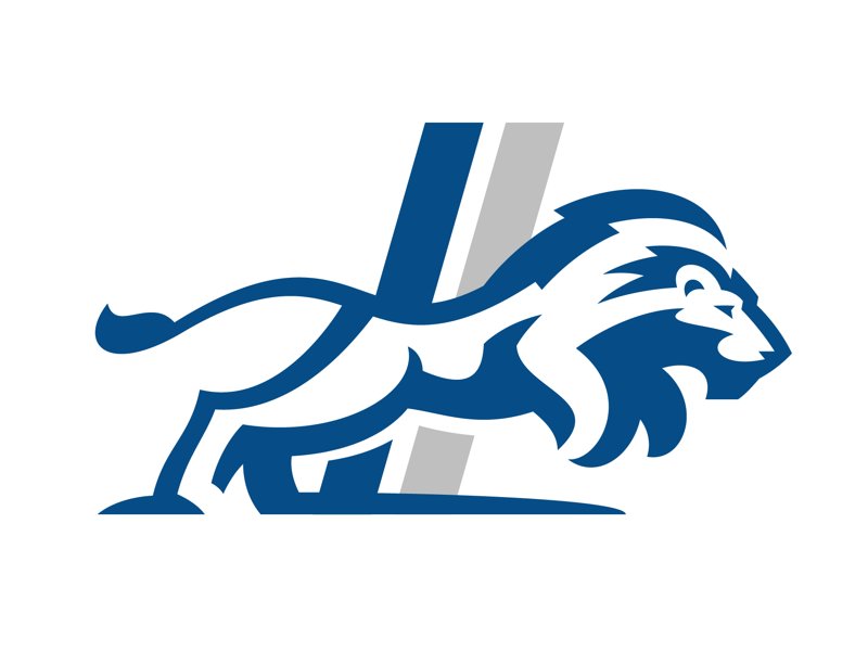
A blue lion stalks forward, low to the ground, with a blue and grey diagonal stripe behind it. White inner lines shape the muscles and mane, so it reads as one powerful shape from a distance. This is classic sports branding, made for team kits, stadium signs and fan merchandise.
15. Royals by designer-98
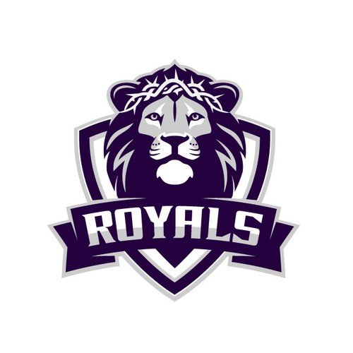
A front-facing lion head in purple and grey sits on a shield, with a bold “ROYALS” banner across it. The designer made it for a Christian school, and the crown of thorns links the lion to the faith side of the brief. A good example of a sports mascot that also carries a meaning.
16. Kids Dental Lion by Cross the Lime
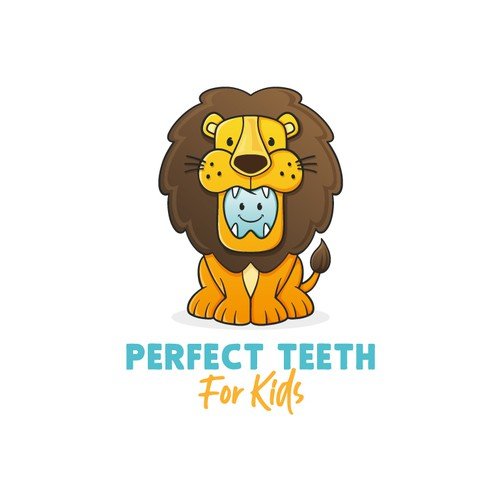
A friendly cartoon lion sits with its mouth wide open, and inside is a small smiling tooth. It was made for a children’s dentist, so the lion feels brave rather than scary. Mascots like this help nervous children and parents relax.
Lion head monograms and icons
17. Kingdom Realty by Andrew Korepan
A dark green lion head with an ornamental mane and a ring in its mouth, just like a brass door knocker. That small detail turns a generic lion into a real estate logo: it says front door, home and security. A smart fit for estate agents, property managers and interior brands.
18. KENZ by nospaces
Thick dark grey strokes form a lion face, with two upward lines on the sides that read as a crest. A small tan circle with the letter K sits on top, so the initial and the lion become one badge. A neat idea for fashion, watches or any brand that wants a monogram and a symbol in one.
19. GALEON by Luis Vásquez
A blue crown sits above a lion face made from a few angular strokes, so the whole icon is a tall stack of simple shapes. The client is a real estate investment holding company, and the clean blue suits finance and property brands that want to look solid and modern.
20. Geometric Lion King by Artetive Studio
A front-facing lion head built from thick black angles, with a three-pointed crown on top and the mane folded into the outline. There are no thin lines, so it holds up at favicon size and in single-colour print. Strong for gyms, sports labels, streetwear and gaming brands.
Tips for designing a lion logo
- Pick a pose with a purpose. A rampant lion feels heraldic and bold, a standing lion feels proud and calm, a striding lion feels fast, and a front-facing head feels direct. Choose the one that matches your brand story.
- Simplify the mane. The mane is what makes a lion read as a lion, but it is also where detail piles up. Reduce it to a few strong shapes or lines, then check the logo at 32px.
- Add a second idea. A door knocker ring, a tooth, a letter K or a crown of thorns ties the lion to one business. That is what stops it from looking like every other lion logo.
- Choose colours with intent. Gold on black or navy reads as luxury, as you can see in our luxury logo ideas. Red and gold feel heraldic, while bright orange or blue feel sporty and modern.
- Plan the small version. Detailed crests and engravings need a simpler icon for favicons, social avatars and embroidery.
Looking for more animal logo ideas? Browse our collections of wolf logos, fox logos, horse logos and cat logos.
Frequently asked questions
What does a lion logo symbolise?
Mostly strength, courage, leadership and royalty. A crowned or heraldic lion adds heritage and authority, a mascot lion feels friendly and protective, and a minimal lion head feels modern and confident.
Can I use these lion logos?
No. Every logo here belongs to its designer or client. Use them for inspiration on shape, style and colour, then have an original lion logo made for your brand.
What is the difference between a lion rampant and a lion passant?
Both terms come from heraldry. A lion rampant stands on its hind legs with its front paws raised, as in the Leo and LEON designs above. A lion passant walks with one front paw raised. The three lions on the English royal arms are passant, with their heads turned to face you.
Which colours work best for a lion logo?
Gold, amber and brown are the classic choice because they match the animal and feel warm and premium. Red and gold suit heraldic crests, navy and gold suit finance and law, and bright blue or purple work well for sports teams and mascots.
Need a lion logo for a client?
Inkyy is a white label design and development team for agencies. Our in-house brand designers create original logos and full identities that you deliver under your own brand. See our design services or book a 15-minute call.


