Crown logos are an essential part of any business that has a word royal, king, queen, treasure or any of their synonyms. A crown is a symbol of wealth, strength, power and domination. A well-designed logo that incorporates a crown will radiate authority and demand respect from customers and competitors alike.
Up until recently, crown logos were used mostly for luxury brands, jewelry, high-end hotels, and restaurants. Now the usage of a crown symbol is far more extensive — covering fitness apparel, music, streetwear, and even eSports mascot logos.
Here are the best crown logo examples we selected for inspiration:
What Makes a Great Crown Logo
A crown is one of the most loaded symbols in visual design. Used well, it communicates authority, exclusivity, and prestige without saying a word. Used poorly, it reads as generic or pretentious.
The difference usually comes down to three things: how much the crown has been customized away from the generic five-point shape, how well it integrates with the wordmark, and whether the overall design feels earned rather than borrowed.
The 25 examples below show the full range of what crown logo design can be — from minimal geometric marks to elaborate illustrative crests.
The 4 Principles of Strong Crown Logo Design
1. Customize the crown shape. The generic five-point crown is the Arial of logo symbols — everyone recognizes it, nobody is impressed by it. The strongest crown logos in this collection modify the form significantly: flattening it, abstracting it, combining it with a letter mark, or reducing it to its essential geometry.
2. Match the crown style to the brand personality. A delicate thin-line crown reads differently than a bold, blocky crown. Ornate and gothic reads differently than minimal and modern. The crown style should match what the brand actually wants to communicate — not just default to whatever looks expensive.
3. Make it work without color. Crown logos appear on embroidery, stamps, foil, and embossed materials — all single-color applications. If the logo only works in full color, it’s not finished. Test it in black and white before finalizing.
4. Balance the crown with the typography. The crown is a strong visual element. If the typeface is too light or too generic, the crown will overpower it. The best crown logos pair the symbol with a typeface that has equal visual weight and personality.
25 Best Crown Logo Design Examples
1. Asif Iqbal
A clean, modern crown mark with precise geometric construction. Strong negative space use keeps it from feeling heavy despite the inherent boldness of the crown symbol.
2. Masum Billah
Minimal crown execution with sharp angles and confident line weight. Works well as a standalone icon — the kind of mark that reads instantly at small sizes.
3. Emir Ayouni
An elegant approach that softens the crown’s authority with refined curves. Suited for luxury or beauty brands that want prestige without aggression.
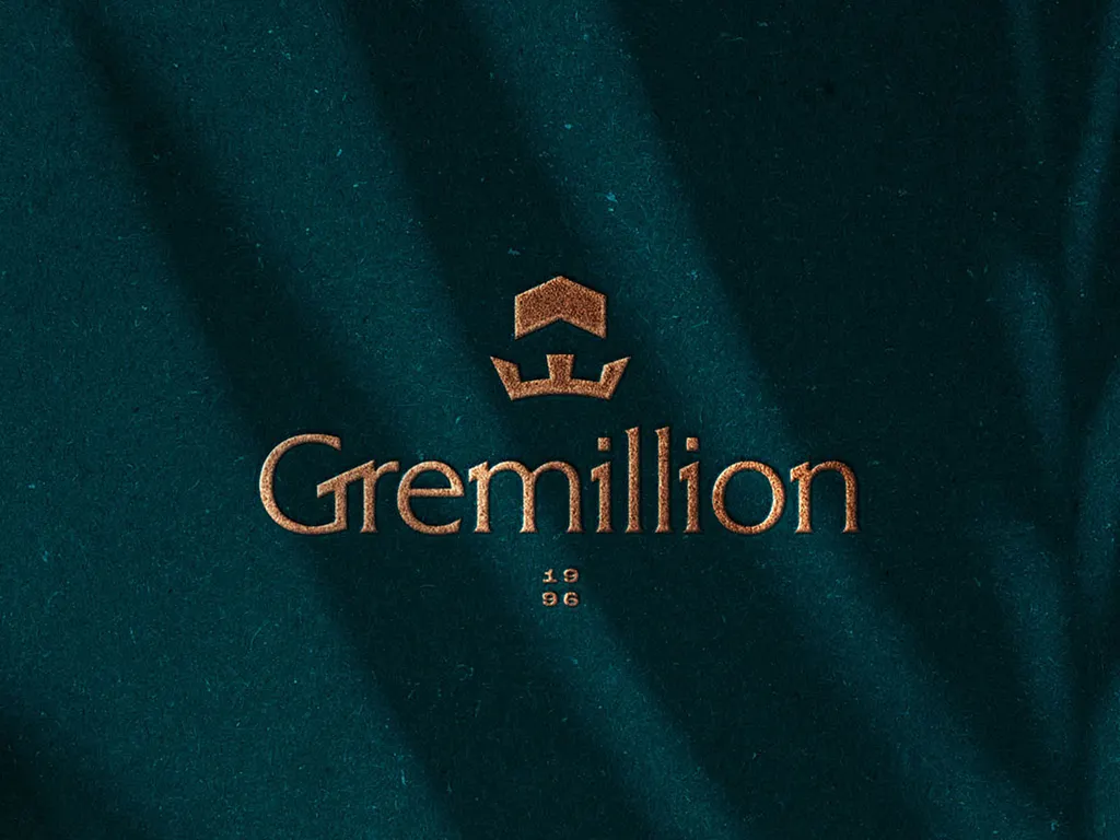
4. Matt Higgins — Doxology Creative
A faith-inflected crown design with careful typographic pairing. The Doxology context adds meaning to the crown symbol — power in service, not just for its own sake.
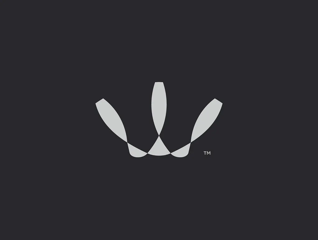
5. Lazar Bogicevic
Strong geometric reduction of the crown form. The mark holds up at favicon size, which is the real test of whether a crown logo has been simplified enough to actually function.

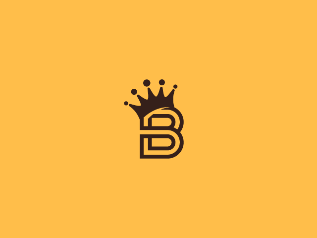
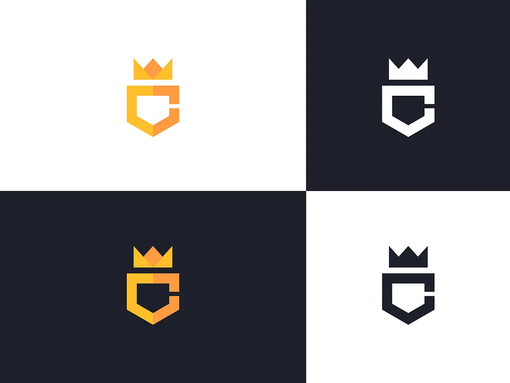
6. Sabuj Ali
A crown integrated directly into a lettermark. When the crown and the initial share the same visual space, the result is more cohesive and harder to knock off than a crown floating above a name.
7. Lucian Radu
Refined linework with a high-end jewelry or hospitality feel. The restraint here is the point — fewer details, more elegance.
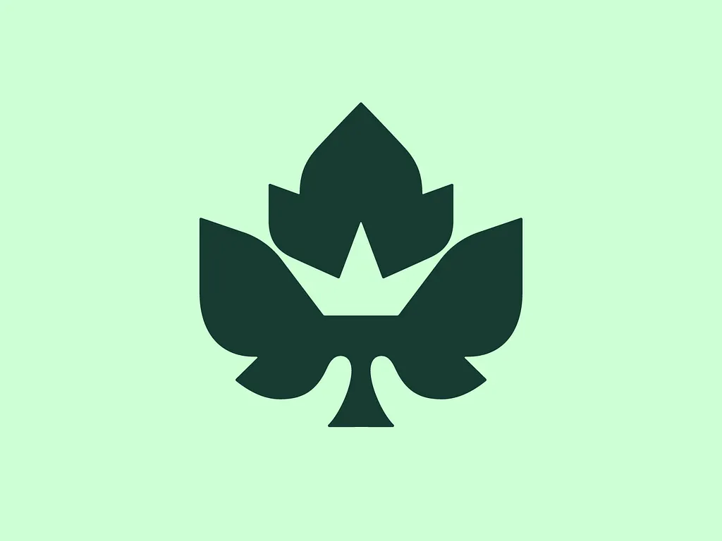
8. Dalibass Design Studio — New Garden Society
A crest-style crown logo with botanical elements. The New Garden Society context earns the complexity — this is a full brand mark, not just a symbol.
9. Alen Pavlovic
Bold and confident with strong contrast. This one would work on merchandise, signage, and digital applications equally well — a versatility test that many crown logos fail.
10. Pamungkas Creative
A creative approach that takes the crown beyond its traditional form. Unexpected geometry makes this one memorable in a category full of similar-looking marks.
11. Peter Giuffria — PGCREATES
Clean American design sensibility applied to the crown form. Confident without being ostentatious — a difficult balance to strike with a symbol that carries this much visual weight.
12. Galmadans
Abstract crown treatment that rewards close inspection. The further a crown logo moves from the obvious shape while still reading as a crown, the more distinctive it becomes.
13. José Rey
Illustrative crown with strong cultural personality. The detail level works because it’s deliberate — every element is doing something specific, nothing is decorative filler.
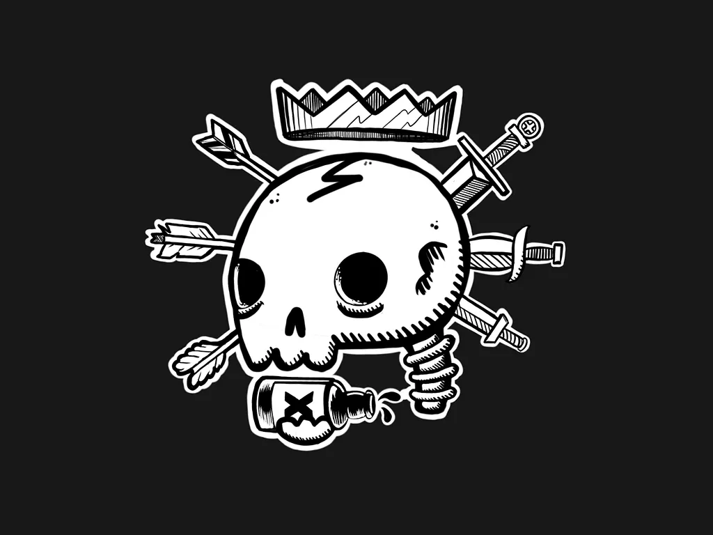
14. Dlanid
A crown combined with character illustration — the mascot approach to crown logos. Works well for sports teams, streetwear brands, and gaming organizations.
15. Bojan Sandic
Minimal and architectural. The crown is reduced to its structural logic — points, arches, base — without any decorative overlay. One of the more restrained executions on this list.
16. Kakha Kakhadzen
Strong Eastern European design influence with precise geometric execution. The mark has a heraldic quality that makes it feel historically grounded rather than trend-driven.
17. Sandro Laliashvili
A crown mark with strong typographic integration. The relationship between symbol and wordmark is well-considered — both elements have compatible visual weight and character.
18. Catalin Podaru
Modern gradient treatment applied to a classic crown form. The color execution is what elevates this beyond a standard crown logo — the gradient feels intentional rather than decorative.
19. Aditya Dwi
Southeast Asian design sensibility with intricate detail. The complexity is earned — this is the kind of crown logo that rewards a second look without being confusing on first glance.
20. N.W. Gunarsa
A crown mark with strong negative space. The white space inside the crown is as important as the crown itself — a sign of a designer who understands that what you leave out matters as much as what you put in.
21. Buqancreative
Bold crown with strong brand personality. The mark communicates confidence — not the quiet confidence of a fine jewelry brand, but the assertive confidence of a streetwear or fitness brand.

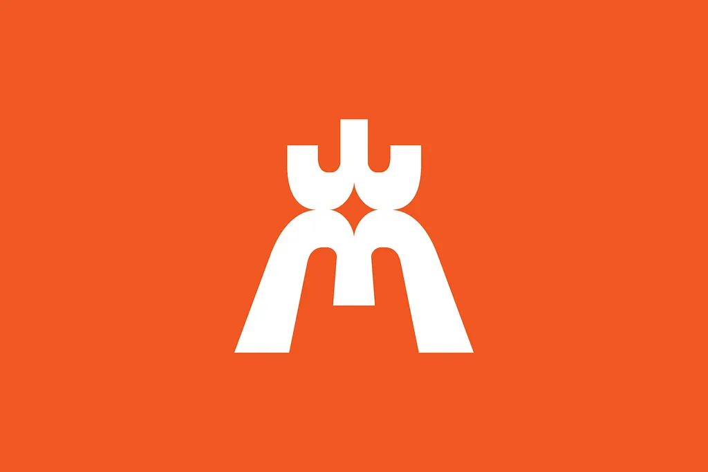
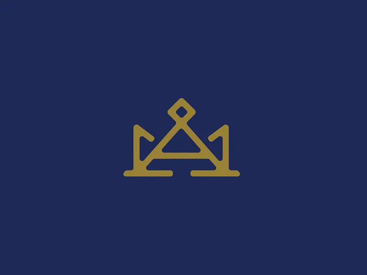
22. Faiz Ahmad
A lettermark-crown hybrid with tight geometric construction. The integration of the letter into the crown form is seamless — you read both the initial and the crown simultaneously.
23. G L Y P H Λ N S E
Experimental typography meets crown symbolism. This one pushes the crown logo into editorial and cultural branding territory — less commercial, more conceptual.
24. Or Eitan
Clean Israeli design with minimal detail and maximum clarity. The mark is confident in its simplicity — it doesn’t need ornamentation to communicate authority.
24. Or Eitan
Clean Israeli design with minimal detail and maximum clarity. The mark is confident in its simplicity — it doesn’t need ornamentation to communicate authority.
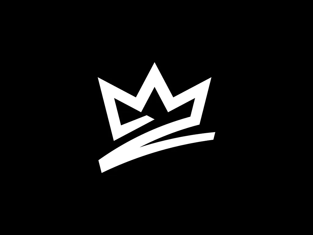
25. Cam Hoff
A strong finishing example with confident line work and clear brand application. The crown is used here as a complete brand asset, not just a decorative element — which is exactly how it should be used.
Common Mistakes in Crown Logo Design
Using the generic five-point crown without modification. There are thousands of crown logos that look identical. If you’re not customizing the crown shape, you’re not designing a logo — you’re picking a clipart symbol.
Making it too ornate for practical use. A crown with 40 tiny details looks impressive at full size and falls apart on a business card or embroidered on a cap. Complexity needs to serve the brand’s actual applications.
Floating the crown above a generic font. The typeface choice matters as much as the crown design. A beautifully crafted crown paired with Impact or an uninflected system font undercuts everything the crown is trying to communicate.
Ignoring single-color versions. Crown logos appear in foil stamping, embossing, embroidery, and screen printing — all single-color. If you don’t have a clean single-color version, you don’t have a finished logo.
Frequently Asked Questions About Crown Logo Design
What industries use crown logos?
Crown logos are used across a wide range of industries including luxury goods, jewelry, hospitality, fitness and apparel, music, streetwear, eSports, real estate, and financial services. The crown symbol is flexible enough to work across categories as long as the execution matches the brand’s specific personality.
How do you make a crown logo feel unique?
The key is customization. Start by modifying the crown’s basic shape — change the number of points, alter the proportions, integrate it with a letter mark, or abstract it into pure geometry. The further your crown moves from the generic five-point default while still reading as a crown, the more distinctive and ownable it becomes.
Should a crown logo be simple or detailed?
It depends on the brand’s applications. If the logo will appear on embroidery, small digital icons, or stamps, simpler is always better. If the primary use is large-format print or packaging where detail can be appreciated, more complexity is possible. When in doubt, design simple — you can always add detail, but removing it from an established logo is painful.
What colors work best for crown logos?
Gold and black is the classic combination — timeless, authoritative, and immediately legible. Deep purple and gold communicates royalty directly. For modern brands, single-color black or white versions with a bold accent work well. Avoid overly complex gradient systems unless the brand’s applications can support them consistently.
How much does a custom crown logo cost?
A custom crown logo typically costs between $200 and $2,500 depending on complexity, the number of concepts included, and the deliverables package. Simple geometric crown marks cost less. Detailed illustrative crests with full brand guidelines cost more. Book a free call with Inkyy to get a quote for your project.
 Book a Meeting