Orange Color Meaning: Psychology, Shades and Orange Logos
 7 min read

The orange color meaning in branding comes down to warmth with energy. Orange has some of red’s excitement and some of yellow’s cheer, without the urgency of one or the glare of the other. That makes it a friendly, confident color for brands that want to feel active and approachable.
This guide explains what orange means in psychology and culture, what different shades of orange signal (with hex codes), which industries use it, and what famous orange logos get right. It also covers color pairings, a contrast trap that catches many orange buttons, and the mistakes to avoid.
What does the color orange mean?
Orange is the color of fire, sunsets, autumn leaves and citrus fruit. Most of its meanings grow out of those images: warmth, energy, enthusiasm, fun and health. Because it sits between red and yellow on the color wheel, it borrows from both. It feels active like red and sunny like yellow, but it is less aggressive than red and less fragile than pale yellow.
Orange is also very visible. That is why it is used for safety orange clothing, traffic cones and life jackets. In branding this gives orange a second message: “notice me”, which is useful for any brand that needs to stand out in a crowded market.
What research says about orange
Research on color and emotion supports broad links, but not magic formulas. A study of 4,598 people in 30 nations found that many color and emotion associations are shared across countries, while language and geography shift the details. In marketing, Labrecque and Milne showed that hue, saturation and lightness all affect how people read a brand’s personality.
The second point matters for orange in particular. A soft peach and a loud safety orange are the same hue family, but they say very different things. A review by Andrew Elliot also warns that color psychology is still a young field. Be wary of any claim that orange “increases sales by X percent”. Those numbers rarely trace back to a real study.
Orange in different cultures
- The Netherlands: orange is the national color, from the royal House of Orange-Nassau. Fans wear it at sporting events and on King’s Day.
- Hinduism and Buddhism: saffron and orange are sacred colors, worn by many monks and holy men.
- North America and the UK: orange means autumn, Halloween and harvest.
- Northern Ireland: orange is tied to Protestant and unionist tradition, so a brand working there should use it with some thought.
To understand why these associations affect how a brand is judged, read our article on the psychology behind branding.
Shades of orange and what they signal
Orange changes character more than most colors as it gets lighter or darker. The contrast column shows how each shade works as text on white. WCAG asks for at least 4.5:1 for body text and 3:1 for large text.
| Shade | Hex | What it signals | Contrast on white |
|---|---|---|---|
| Peach | #FFB07C | Soft, warm, friendly | 1.8:1 |
| Coral | #FF7F50 | Lively, social, modern | 2.5:1 |
| Tangerine | #FF8C00 | Fun, playful, youthful | 2.3:1 |
| Safety orange | #FF6700 | Alert, practical, very visible | 2.9:1 |
| Terracotta | #E2725B | Earthy, natural, handmade | 3.1:1 |
| Burnt orange | #CC5500 | Mature, autumnal, confident | 4.3:1 |
| Rust | #B7410E | Rugged, heritage, outdoorsy | 5.6:1 |
Light and bright oranges feel young and playful, and they suit kids’ brands, food and leisure. Darker oranges such as burnt orange and rust feel more grown up and work well for outdoor gear, craft goods and professional services that still want warmth. Only rust passes 4.5:1 for body text on white.
Which industries use orange, and why
- Home improvement and tools: orange feels practical, hands-on and easy to find in a big store.
- Budget travel and delivery: it signals good value, speed and friendliness.
- Kids and entertainment: it is playful and loud in a cheerful way.
- Food and drink: orange recalls citrus, warmth and appetite, from soft drinks to snacks.
- Creative platforms and tech: it feels open and human next to the sea of blue in software.
- Sport and fitness: orange suggests energy and movement without red’s aggression.
Famous orange logos and what they teach
These logos are shown as editorial examples only. Each one is a trademark of its owner.
The Home Depot
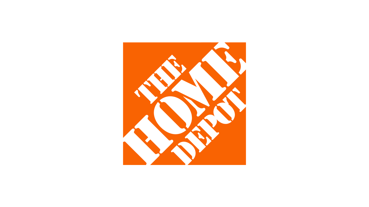
The Home Depot uses a bright orange square with white stencil-style lettering set at an angle. The stencil type feels like something painted on a crate, and the orange carries through to staff aprons and store signs. It is a good example of a color that signals “practical and hands-on” before you read a word.
easyJet
easyJet’s orange wordmark and orange-and-white planes are easy to spot at any airport. Orange suits a budget airline: it feels friendly and good value, not premium and distant. The rounded, heavy letters add to the informal tone.
Nickelodeon
Nickelodeon has used orange for decades, and its 2023 logo brought back the splat shape beside the wordmark. The color and the messy shape both say fun, play and a bit of mischief, which fits a kids’ entertainment brand perfectly.
Etsy
Etsy pairs a warm orange with a serif wordmark that feels a little old-fashioned in a good way. For a marketplace of handmade and vintage goods, the result feels human and crafted, not corporate. Orange keeps it creative and friendly next to blue tech brands.
Mastercard
Mastercard’s symbol is a red circle and a yellow-orange circle that overlap in a band of orange. It shows how orange can work as part of a warm system instead of standing alone. The symbol is so well known that the brand often uses it without the name.
Orange color pairings and palettes
Orange is strong, so it usually leads in small amounts and needs calm partners. These pairings are good starting points.
- Orange and navy (#FF8C00 + #0F2D52): navy is close to orange’s complement, so the pair is lively but trustworthy. About 5.9:1, enough for text either way round.
- Orange and charcoal (#FF8C00 + #1A1A1A): bold and modern. Bright orange on near-black gives about 7.5:1.
- Burnt orange and cream (#B7410E + #FDF6E3): warm, earthy and crafted. Good for coffee, outdoor and lifestyle brands. About 5.2:1.
- Orange and teal: fresh and playful, with a summer feel. Keep text in a dark neutral, since the two colors are too close in lightness to read on each other.
- Orange and green: natural and citrus. It works for juice, health food and garden brands.
For more on spreading a palette across a website, see our guide to color schemes in web design.
Accessibility: watch your orange buttons
Orange is a popular call-to-action color, but white text on bright orange often fails. White on tangerine (#FF8C00) has a contrast ratio of about 2.3:1, and white on safety orange (#FF6700) about 2.9:1. Both are well below the 4.5:1 that normal-sized text needs.
- Use dark text on bright orange: black on #FF8C00 scores about 8.1:1.
- If you want white text, darken the orange to around #C2410C (about 5.2:1).
- Do not use light orange for body text on white.
- Test every pair in the free WebAIM contrast checker.
Common mistakes with orange branding
- Too much of it. Large areas of bright orange feel loud and can look cheap. Let neutrals do most of the work.
- The wrong shade for the price point. Neon orange undercuts a premium product. Deep burnt orange or rust feels more refined.
- White text on bright orange. It fails contrast, as shown above.
- Looking like a warning. Orange plus black stripes or triangles can read as a hazard sign. Avoid these shapes unless that is the point.
- Print surprises. Bright screen oranges often turn dull in CMYK. Define a Pantone match and test proofs. A clear brand guideline document keeps every supplier on the same orange.
Is orange right for your brand?
Orange fits brands that want to feel energetic, friendly and good value: DIY, travel, delivery, kids’ products, food, fitness and creative tools. It is a harder fit for luxury, legal or medical brands, unless you use a deep, muted shade with lots of neutral space.
Compare it with its neighbors before you choose. Red in branding is more urgent and passionate, while yellow in branding is lighter and more optimistic. If orange feels too loud, look at brown for an earthier warmth, or at green, blue, purple and pink. Our hub on brand colors compares them all and explains how to build a full palette. When you design the logo itself, our key principles of logo design will help it work in one color too.
Frequently asked questions
What does the color orange mean in branding?
Orange usually signals energy, warmth, friendliness, creativity and good value. It is very visible, so it helps brands stand out, especially in markets full of blue.
What are the negative meanings of orange?
Used heavily or in neon shades, orange can feel cheap, loud or childish. With black it can also look like a warning sign.
What colors go well with orange?
Navy, charcoal, cream, teal and green are the most useful partners. Navy and charcoal give strong contrast, while cream and brown suit softer, earthy oranges.
Is orange a good color for a call-to-action button?
Yes, it stands out well. Just check the text color: white text on bright orange usually fails contrast, so use dark text or a darker orange.
Can I use these logos?
No. The logos shown here are trademarks of their owners and appear only as editorial examples. Use them to study how orange works, then create something original.
Need an orange brand identity for a client?
Inkyy is a white label design and development team for agencies. Our in-house brand designers build complete identities, from logo and brand colors to guidelines, that you deliver under your own brand. See our design services or book a 15-minute call.