



20 Construction Logo Ideas: Buildings, Tools, Cranes and Badges
 9 min read
A good construction logo has to work hard. It goes on hard hats, vans, site hoardings, hi-vis vests and tender documents, and it has to look dependable on all of them. For many clients it is the first sign of how seriously a builder takes its work.
Below are 20 construction logo ideas, grouped by symbol: buildings and roofs, tools, cranes and heavy machinery, monograms, and badges and mascots. For each one we note what works and which kind of construction company the style suits, followed by design tips and a short FAQ.
What a construction logo says about a brand
The symbol you pick tells clients what kind of builder you are before they read your name. Here is what the common choices usually signal:
- Buildings and roofs: general contractors, developers and home builders. Clear, but crowded, so it needs a twist.
- Tools: hammers, trowels and shovels point to a specific trade and hands-on craft. Great for renovation crews, masons and handymen.
- Cranes, beams and machinery: scale and capability. Suits civil engineering, steel, excavation and plant hire.
- Monograms: a corporate, premium feel for firms with long names or several divisions.
- Badges and mascots: heritage and personality. Popular with family-run contractors and trades that rely on local word of mouth.
Colour matters just as much. Yellow, orange and black borrow from safety signs and plant machinery, so they read as construction straight away. Navy and grey feel corporate, while copper, tan and green feel more residential. Our guides to yellow in branding and orange in branding explain why those colours work so well on site.
The common traps are generic skyline clip art, a hard hat over a plain sans serif, and so much detail that the logo turns into a smudge on a van door. The designs below avoid them with one clear idea each.
20 construction logo ideas
Building and roof construction logos
Buildings, roofs and blocks are the most direct way to say “we build things”. The best ones add a second idea so the mark does not look like every other skyline.
1. Elephant Construction
One thick black line draws an elephant, and its back rises into a pitched roof, so the animal and the house are the same shape. The orange ELEPHANT over a black CONSTRUCTION keeps the safety-sign colours without feeling loud. It suits a builder that wants to feel big, steady and friendly. Credited to archipelogo.
2. Building line logo by Pavlo Plakhotia
A group of buildings drawn with one continuous navy line, with blue and purple blocks offset behind it like a shadow. The line reads as a floor plan and a skyline at once. A good fit for an architect, a developer or a design and build firm. See the original by Pavlo Plakhotia.
3. WK Construction by Ayesha Arsalan
The W is drawn as the ribbed face of a tower and the K sits on its side wall, so the initials become a building in perspective. The single blue and the condensed bold wordmark feel practical, which is right for a drywall and metal framing contractor. See the original by Ayesha Arsalan.
4. Panelit by The Logo Smith
Grey isometric blocks and panels stack into an abstract building, with darker faces that give it depth. It feels technical and calm, which suits engineering, prefab and building science firms that sell expertise rather than muscle. See the original by The Logo Smith.
Tool logos: hammers, shovels and wrenches
Tools tell people exactly what kind of work you do. The risk is clip art, so look at how each designer gives the tool some character.
5. Punchlist Construction by William Racule
A clenched fist grips a claw hammer and breaks out of a yellow square, shown on a denim texture like a workwear print. A natural fit for a general contractor, a renovation crew or a workwear brand. See the original by William Racule.
6. Trenchcore by Del Mauricio
An orange shield is cut by a shovel drawn in negative space, so the icon reads as a spade, a trench and a badge of protection. Built for excavation, groundworks and trench safety firms. See the original by Del Mauricio.
7. Top Quality Remodeling by A | 3
Two crossed hammers sit under a small gold crown inside a round badge, with a strong black banner across the middle. A classic choice for a home renovation company that wants to look established on vans and yard signs. See the original by A | 3.
8. All In One Quality by Niko!a
A hammer and a screwdriver cross in the centre, and the name runs around them in a clean circle. Navy and a thin gold ring keep it tidy and trustworthy. It was made for a handyman and renovation business, and it would suit any small trade that covers many jobs. See the original by Niko!a.
Crane, beam and heavy machinery logos
Cranes, steel beams and diggers show scale. They suit firms that do the heavy lifting, literally.
9. Steel Improvements by Adolfo Teixeira
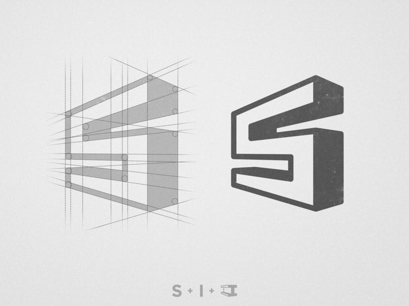
The S is built from a steel I-beam, and the shot shows the sketch lines next to the finished 3D mark. A smart direction for steel fabricators, structural engineers and metalwork contractors. See the original by Adolfo Teixeira.
10. Rhino Excavating by Mike Bruner
An angular black rhino charges forward, and its horn is an excavator bucket, teeth and all. A yellow stripe down the face adds the plant-machinery colour. The animal and the machine share one silhouette, which is what makes it memorable. Ideal for excavation, demolition and earthmoving companies. See the original by Mike Bruner.
11. Wolfe’s Excavating by Siapareza
An excavator arm and bucket reduced to one orange outline, above a wide, spaced-out wordmark. It is a ready-made concept, and the minimal style would suit an excavation firm that wants a modern look on dark kit and hi-vis. See the original by Siapareza.
12. Duffy Crane and Hauling by D'graphic Studio
A detailed mobile crane truck sits on a mint green circle above a chunky, blocky DUFFY wordmark. The soft green stops the detailed drawing from feeling harsh. It was designed for a long-running crane and heavy haul firm, and it suits any business whose machines are the brand. See the original by D'graphic Studio.
Monogram construction logos
Letter marks work well for firms with long names or several trades under one roof. The best ones hide a building idea inside the letter.
13. S hexagon mark by Tri Asmara
A blocky S fills a hexagon and is shown on its construction grid, so you can see every angle was planned. The hexagon hints at a bolt head. A strong option for a construction firm or a building supplier whose name starts with S. See the original by Tri Asmara (Smara Design).
14. Armada Door Construction by Kanades
A thin line arch frames a letter A that doubles as a drafting compass. The fine strokes and wide spaced wordmark feel premium, more architect than site crew. It suits joinery, door and window makers, and high-end residential builders. See the original by Kanades.
15. Rockwood Construction by Bless Creatics
A sharp copper R sits on charcoal, and the same letter is repeated into a pattern for stationery and signage. Copper and dark grey feel warm and solid. A good match for a residential builder or a timber and stone specialist. See the original by Bless Creatics.
16. Horizon Custom Construction by Clevemo
Two tan blocks form an H, and a long line through the middle turns it into a horizon. It is a ready-made concept that would suit a custom home builder or a developer that wants a calm, upmarket feel. See the original by Clevemo.
Badge and mascot construction logos
Badges and mascots feel personal and trusted, which is why so many family-run contractors use them. Keep the detail under control so they still print well.
17. Construction worker by kumpparidesign

A worker in a hard hat is cut from one orange shape, with the face drawn only by the shadows. It is a mascot without the cartoon, so it can work for a serious contractor. It is easy to print on helmets and hi-vis vests. See more work by kumpparidesign.
18. Intermountain Crane Service by Roni5859
A gear-shaped badge with mountain peaks at the top, and a crane hook block takes the place of the O in INTERMOUNTAIN. The hook does the storytelling, so the rest can stay plain black. Perfect for a regional crane, rigging or industrial service company. See the original by Roni5859.
19. CABM Contractors by i – Graphics
A yellow hard hat sits in front of a row of blue line houses, with a hammer on each side and a bold green CABM below. A good fit for a residential design and build firm that wants a friendly look. See the original by i – Graphics.
20. Stremmel Masonry by Arteam_design
A vintage badge topped with a trowel, with a row of bricks along the bottom edge. The condensed type and the “stone, brick, block” line tell you the trade in seconds. Ideal for masonry, stonework and restoration firms that trade on craft and heritage. See the original by Arteam_design.
Tips for designing a construction logo
- Pick one idea. A building, a tool or a letter is enough. The strongest logos above merge two meanings into one shape, like the rhino and the bucket, or the S and the I-beam.
- Design for the real places it will live. Test it on a hard hat sticker, a van side, a site board seen from across the road and a 32px favicon. If it fails any of them, simplify.
- Check it in one colour. Construction logos get printed, embroidered, vinyl-cut and stencilled. A clean black version is not optional.
- Use type with weight. Bold, condensed or slab serif fonts feel sturdy, while thin, wide type feels more architectural and premium. Our guide to choosing the right font covers the basics.
- Plan the variations. You will need a full lockup, a stacked version, an icon on its own and a badge for social media. Here is how to plan logo variations.
- Check the local competition. Before you commit, look at the other builders in your area. If three rivals already use an orange roof, choose another route.
Looking for more ideas? Browse our real estate logo ideas for property brands, the elements for electrician logos for related trades, or our retro and vintage logos if you like the badge style. The key principles of logo design apply to every one of them.
Frequently asked questions
What makes a good construction company logo?
It is simple, bold and easy to recognise from a distance. It uses one clear symbol, strong type and a limited palette, and it still works in one colour on helmets, vehicles and signs.
What colours are best for a construction logo?
Yellow, orange and black are the most common because they match safety gear and machinery. Navy and grey suit corporate and commercial firms, while greens, tans and copper suit residential builders and eco-focused companies.
Can I use these logos for my construction business?
No. Every logo here belongs to its designer or the client it was made for. Use them as inspiration for shapes, colours and ideas, then have an original logo designed for your company.
What file formats should a construction logo come in?
A vector master (SVG, AI or EPS) for signs, vehicle wraps and embroidery, transparent PNGs for the web and social media, a PDF for print, and a one-colour version for stencils and vinyl.
Need a construction logo for a client?
Inkyy is a white label design and development team for agencies. Our in-house brand designers create original logos and full identities that you deliver under your own brand. See our design services or book a 15-minute call.


