
Electrician Logo Ideas: 9 Design Elements That Work
Inkyy's blog team, and our designers have decided to write you an article which includes some elements for logos that we consider are essential for logo design for electrical businesses.
 6 min read
An electrician logo has a simple job. It has to tell customers you are skilled, safe and easy to trust, and it has to look good on a van door, a hi-vis jacket, an invoice and a phone screen. The right symbol does that in a glance.
Below are nine design elements that work for electrician logos, from the classic lightning bolt to plugs, circuits and vintage badges. Each one comes with what it says about a business and where it can go wrong, followed by practical tips for designing your own.
What makes a good electrician logo
People hire an electrician for work that has to be done properly, so the logo should feel reliable first and clever second. Clear shapes, a readable business name and a short descriptor such as “Electrical Services” go a long way.
The common traps are easy to spot. Clip-art lightning bolts that look like every other electrician, thin lines that vanish when the logo is shrunk, neon colours that vibrate on screen and a design that only works in full colour. A strong electrician logo avoids all four.
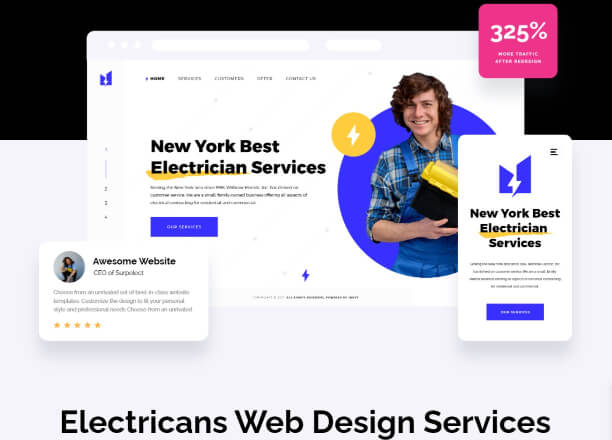
9 design elements for an electrician logo
1. Lightning bolt
The classic symbol of electricity, and for good reason: it is instantly understood. It can sit beside the name, replace a letter or be hidden in negative space. Its weakness is that everyone uses it, so give the bolt an angle, a container or a twist that belongs to your business alone.
2. Light bulb
A bulb says electricity and good ideas at once. It suits electricians who want a friendly, approachable image, especially for domestic work and lighting installation. To avoid the generic look, build the bulb from a second shape, such as a house, a plug or a set of initials.
3. Plug and socket
A plug silhouette is geometric, which makes it easy to turn into a clean, modern mark. Negative space works well here, for example prongs formed by the gap between two letters. Keep the shape simple enough to read at small sizes.
4. Vintage badge or stamp
Circular badges, banners and bold slab lettering give an old-school, craftsman feel. This style suggests experience and a family business. It looks great on vans and uniforms, but fine detail needs care, so test it small before you commit.
5. Sun and solar panel
For electricians who install solar panels or work in renewable energy, a sun or a panel grid shows the specialism straight away. Warm yellows and oranges suit it. Our look at green energy logos shows more ideas for this direction.
6. Wires and circuit lines
Connected lines and nodes suggest technical skill and modern systems. They suit commercial and industrial electricians, smart home installers and electrical engineers. Keep the lines thick enough to survive small sizes and embroidery.
7. Hard hat, tools and house
A hard hat, screwdriver or pair of pliers shows the trade. A house with a bolt through the roof says residential work. These marks feel friendly and local, but make sure the drawing does not look like stock clip art.
8. Lettermark or wordmark
Sometimes the name is enough. A strong wordmark or a set of initials in a distinctive typeface looks established and professional, and it is the easiest option to apply across stationery, signage and uniforms. Add a small spark or bolt to a letter if you want a hint of the trade.
9. Beyond the bolt
The most memorable logos find a second idea. That could be negative space that forms both a bolt and a letter, a thick stroke that glows like light, or an animal and a plug combined in one mark. Be original, but keep the idea simple enough to explain in a sentence.
Where an electrician logo has to work
Before you approve a design, list every place it will appear. For most electricians that means vehicle graphics, work shirts and hi-vis, business cards, quotes and invoices, a website header, social media profiles and a small stamp or sticker left on the fuse board after a job.
Each one has different limits. Embroidery cannot hold fine lines. A profile picture is a tiny square. A fuse board sticker may be printed in a single colour. If the logo passes all of them, it will pass everywhere else.
Colours for an electrician logo
Colour carries a lot of the message, so choose it on purpose:
- Yellow and orange are the colours of energy and caution. They draw attention and work well on dark vans, but need a dark partner colour for contrast. See yellow in branding.
- Blue feels calm, technical and trustworthy, and it is the colour most people link with electricity. Read more about blue in branding.
- Black and white looks premium and prints well in one colour on invoices and stamps.
- Red works as a small accent for safety and urgency, such as an emergency call-out line.
Tips for designing an electrician logo
- Keep it simple. One idea, one or two colours and bold shapes.
- Test it small and large. Check it at 32 pixels for a favicon and on a van-sized mockup.
- Make a one-colour version. You will need it for stamps, embroidery and vinyl lettering.
- Add the trade in words. A short descriptor tells people what you do before they read the rest.
- Keep badges separate. Put registration or accreditation marks beside the logo, not inside it, so they can change without a redesign.
- Check it is original. Run a reverse image search so your bolt does not match a competitor.
- Plan the variations. A full logo, an icon-only version and a stacked layout will cover most uses. See our guide to logo variations.
For the thinking behind these tips, read our key principles of logo design. If you want to see how other trades handle the same problem, browse these construction logo ideas.
A logo works hardest when it sits on a good website. We cover that in our guides to electrical business web design and web design for tradesmen.
Frequently asked questions
What is the best symbol for an electrician logo?
Lightning bolts, plugs, bulbs and circuit lines are the most common, and all of them work. The best choice is the one you can make distinctive, simple and readable at small sizes.
What colours work best for an electrician logo?
Yellow, orange and blue are the most popular because they link to energy and trust. Pair a bright colour with a dark one such as navy or black so the logo stays readable.
Can I use these logo ideas for my own business?
Use them as inspiration for shapes and styles only. Any specific logo you see belongs to its designer, so have an original one made for your business.
What file formats should my electrician logo come in?
A vector master such as SVG, AI or EPS, transparent PNGs for the web and social media, a PDF for print and a small square icon version for profiles and favicons.
Need a logo and website for an electrician client?
Inkyy is a white label design and development team for agencies. Our in-house designers create original logos and websites for trade businesses that you deliver under your own brand. See our design and development services or book a 15-minute call.