


23 Wolf Logo Ideas, from Geometric to Howling Wolves
 9 min read
A wolf logo is one of the most popular animal marks there is, and for good reason. The wolf stands for loyalty, teamwork, instinct and a little bit of danger, so it works for sports teams and security firms as well as coffee roasters and photographers.
Below are 23 wolf logo designs grouped by style: geometric and negative space, minimal and gradient, line art, mascot and esports, and howling wolves with the moon. For each one we look at what the designer did well and what kind of brand the style suits. After the list you will find practical tips for designing your own wolf logo and answers to common questions.
What a wolf logo says about a brand
The wolf carries more than one meaning, and the style you pick decides which one people notice first.
- Loyalty and the pack: wolves live and hunt as a family. That suits agencies, teams, clubs and community brands. Names with “pack” in them are everywhere for this reason.
- Strength and protection: a front-facing wolf head with a steady stare says guard and defender. It fits security, law, outdoor gear and fitness.
- Independence: the lone wolf is a classic story for photographers, freelancers, coffee brands and spirits.
- Wildness and night: a howling wolf under the moon brings mystery and nature. Good for film, music, late-night venues and outdoor brands.
The common traps are aggressive snarling wolves on brands that need to feel friendly, wolf heads that look like a fox, dog or husky, and detailed illustrations that turn into a grey blob at favicon size. Many wolf logos also look alike, so the best ones below add a second idea: a letter, a moon, a leaf or a product.
23 wolf logo ideas by style
Geometric and negative space wolf logos
1. Gray Wolf Games by Jord Riekwel
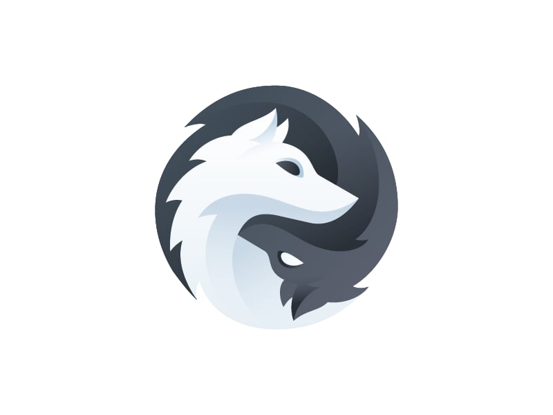
Two wolf heads, one white and one grey, curl around each other to form a yin and yang circle. The soft shading gives depth without breaking the flat silhouette. A strong fit for a game studio or any brand built on balance or a partnership.
2. Free Market Music by Aldo Hysenaj
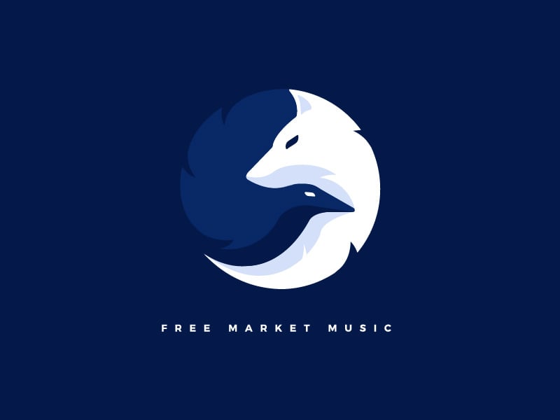
A white wolf head fills the top of the circle, and a dark raven head is cut out of the shape beneath it. Two animals in one mark without any outlines is hard to pull off, and here it reads clearly. Well suited to a music label, a publisher or a creative studio.
3. Northman Brewing by Sean Heisler
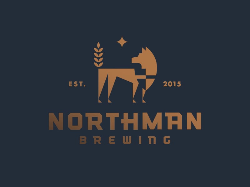
A standing wolf built from blocky, stepped shapes, with a wheat stalk and a small star beside it. The copper on dark navy and the “Est. 2015” detail give it a crafted, Nordic feel. A good model for breweries, distilleries and heritage brands.
4. Wolf by simc
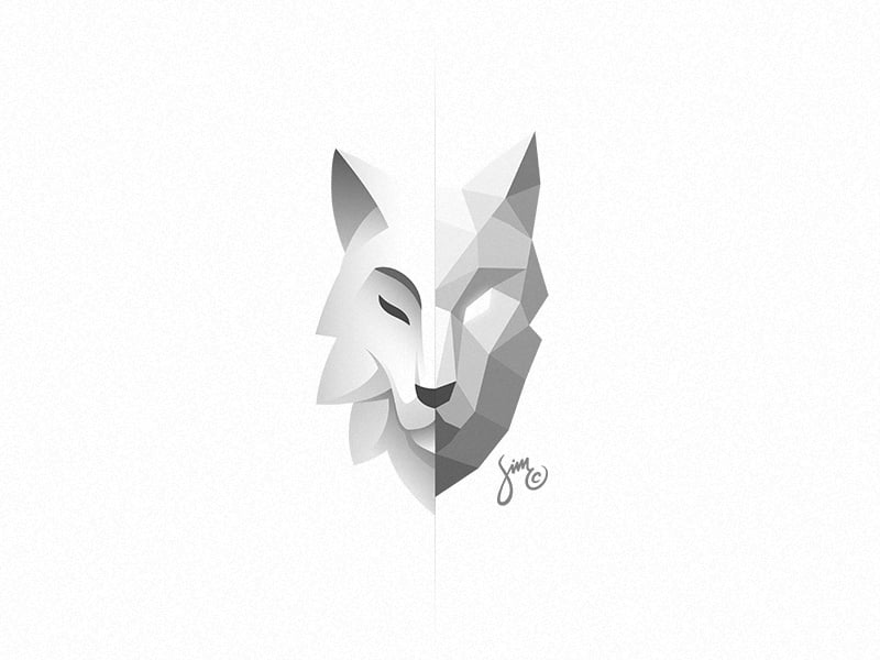
The left half of the face is smooth and calm with a closed eye. The right half is made of sharp polygons with an open eye. The split tells a story about two sides of one character, which suits consultancies, tech brands and anything about transformation. For more faceted styles, see our roundup of low poly logo designs.
5. Wolf Packs by artsigma
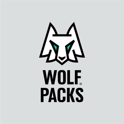
A front-facing wolf head built from straight lines and sharp angles, with a thick black outline and two small teal eyes. The tall condensed wordmark repeats the same weight. Simple enough for a sticker or a product tag, which suits outdoor gear, bags and sports equipment.
Minimal and gradient wolf logos
6. Wolf by George Bokhua
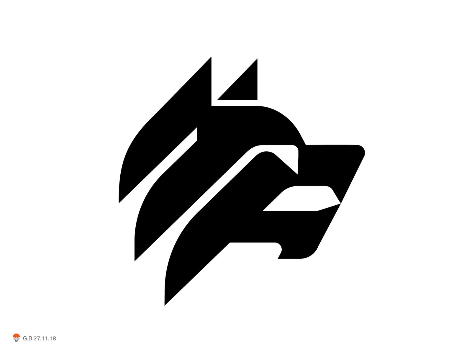
A wolf head reduced to a few slanted black strokes for the ears and brow and one block for the jaw. It is bold, fast to read and still works at 16 pixels. The kind of mark that suits a tech product, an app or a sports brand. More ideas like this are in our minimalist logo design ideas.
7. Wolf wordmark by Yoga Perdana
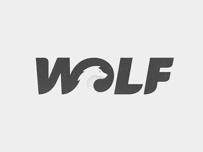
The word WOLF set in heavy italic letters, with a curled wolf head tucked into the O. The animal sits inside the type, so the name and the symbol arrive together. A smart direction when a brand name already contains the word wolf.
8. Amber CrossFit by simc
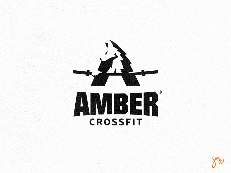
A wolf head sits at the peak of a bold letter A, and a barbell runs through it as the crossbar. Letter, animal and sport in one shape. Gyms looking for ideas can browse our list of the best CrossFit logos too.
9. Wolf by Matthieu Martigny
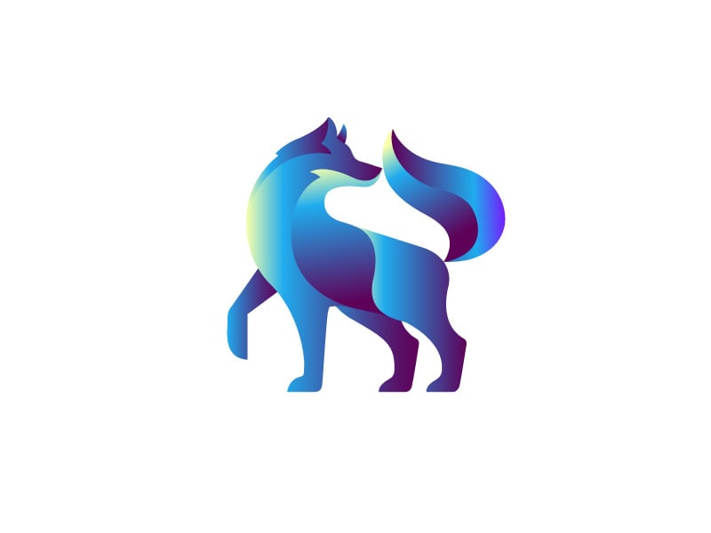
A standing wolf made of smooth overlapping shapes, coloured with a blue to purple gradient. Gaps between the shapes suggest the legs and chest without any lines. It looks at home on screens, so it suits apps, SaaS and digital agencies, but check that a one-colour version still holds up.
10. Wolf Logo by Aaron Sampson
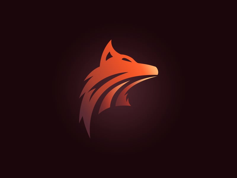
A side profile wolf head in an orange to red gradient, with sweeping strokes for the fur and neck. The glow on the dark background adds drama. The pointed snout sits close to fox territory, so a wolf brand using this style needs a heavier jaw or a name to anchor it.
Line art wolf logos
11. DJ Wolf by Yuri Kartashev
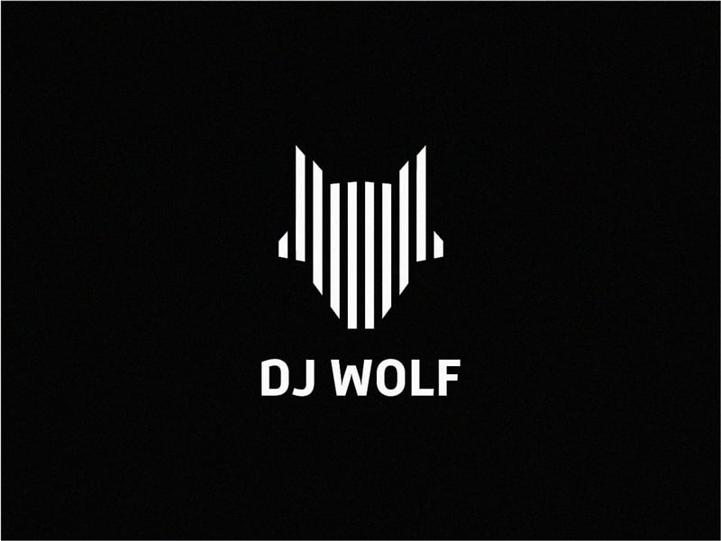
The wolf head is made of white vertical bars of different heights, like a sound equaliser. It is an instant link to music while staying a clear wolf. A clever fit for DJs, radio, podcasts and audio brands. Our guide to using lines in graphic design covers the idea in more detail.
12. Wolf Rock by Chris Kay
A single white line traces the head and shoulders of a wolf, with a few breaks that let the background in. It was made for a coffee roaster named after a local rock. Light, friendly and easy to print on cups and bags.
13. Wolf monoline by -Alya-
A front-facing wolf head drawn with one even black stroke and a few straight angles. The bright yellow background makes it feel energetic rather than aggressive. Monoline marks like this embroider and engrave well, so they suit merch, YouTube channels and outdoor gear.
14. Alpha Crypto Academy by spARTan
A geometric line art wolf head with sharp facets, paired with a wide spaced wordmark where the A has no crossbar. The “alpha” link is obvious, and the thin lines feel technical and precise. A good fit for finance, crypto and education brands that want to look sharp but calm.
Mascot and esports wolf logos
15. Wolf Racer by Ivan Kotliar
A snarling wolf in a vintage racing helmet with flames and goggles, drawn in black and white with hand-inked detail. It has the energy of a classic biker patch. Great for motorsport, garages, custom bikes and apparel, but too detailed to work as a small icon.
16. Storm Wolves by Igor Mariev
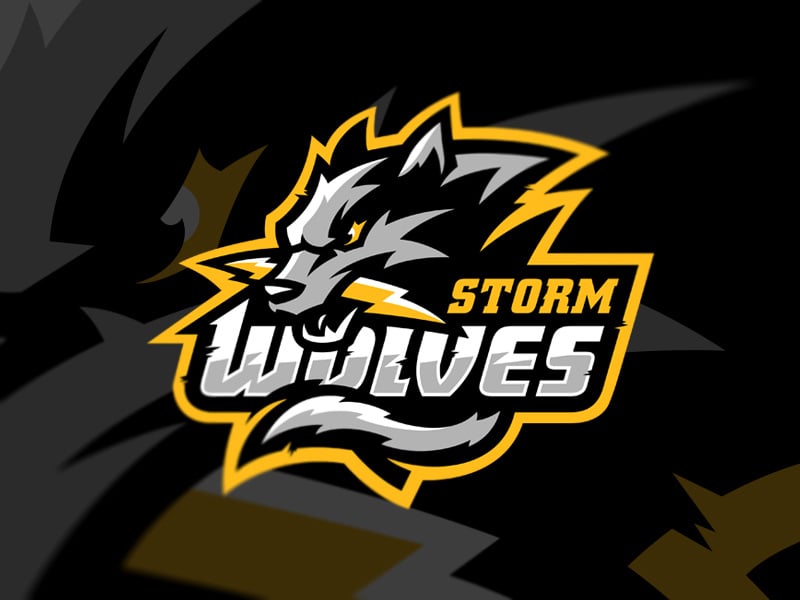
A grey wolf head bites a lightning bolt, wrapped in a thick yellow outline with bold slanted lettering. This is classic esports styling: high contrast, a strong outline and a name that is part of the badge. For more in this style, see our esport mascot logo ideas.
17. Wolfpack Hoops by Bia™
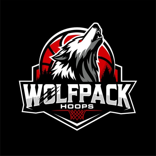
A howling wolf rises in front of a red basketball that stands in for the moon, above a heavy white wordmark and a hoop. It was designed for a youth basketball programme. A good example of how a sports badge can add a story while keeping the outline simple.
18. The Yard by Dexterous™
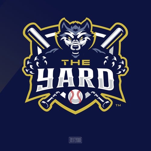
A fierce wolf head with claws grips a shield, with crossed bats and a baseball in the badge. Navy, white and gold keep the detailed artwork organised. Built for teams, leagues and training academies where the logo lives on jerseys and caps.
Howling wolf and moon logos
19. Wolf Leaf by Stefan Ivankovic
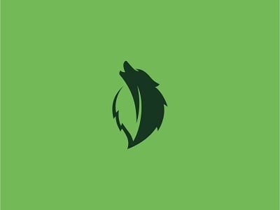
A howling wolf whose body doubles as a leaf, with the leaf’s central vein cutting through the shape. Two colours of green and nothing else. A natural fit for eco brands, landscapers, outdoor schools and anything rooted in nature.
20. Rock & Wolf Coffee Roasters by CHAMBER 5
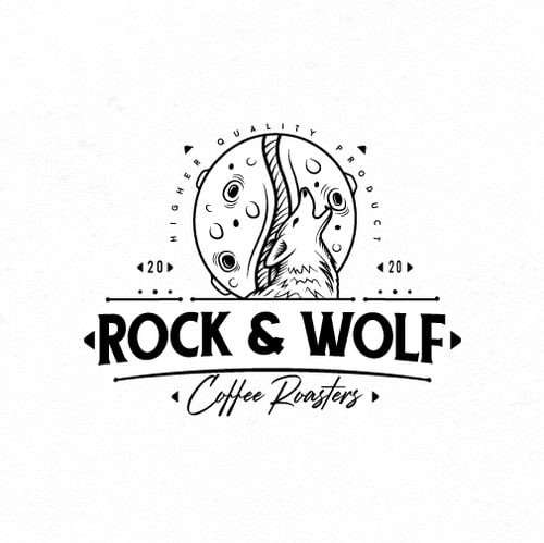
The moon has craters and a centre line, so it also reads as a coffee bean, with a hand-drawn wolf howling inside it. The script and vintage badge layout give it a craft feel. A reminder that the moon in a howling wolf logo can carry a second meaning.
21. Midnight Pizza by maneka
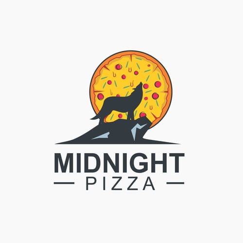
A wolf howls on a rocky ledge, and the full moon behind it is a pizza. It is funny, clear and tells you the shop is open late. This kind of visual pun is the fastest way to make a howling wolf feel specific to one business.
22. ThoughtFeeder by spARTan
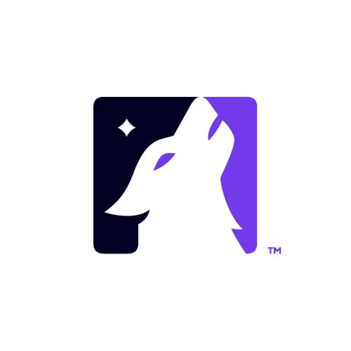
A white howling wolf head is cut out of a rounded square, split between dark navy and purple, with a small star in the night sky. The designer used the star as a spark for ideas. It works as an app icon straight away, which makes it a strong model for tech and media brands.
23. Lunawolf by Juh D.
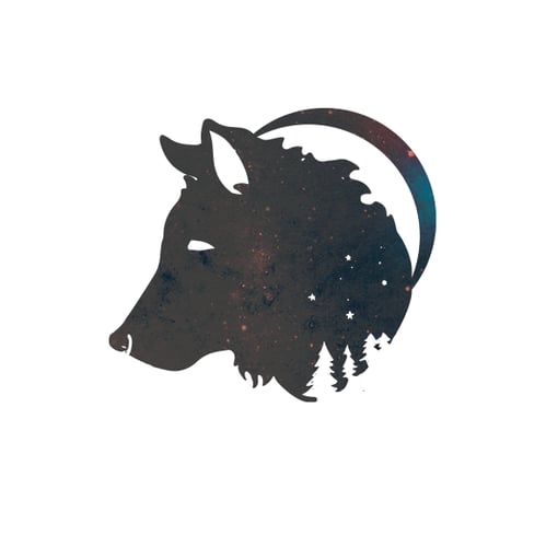
A wolf head silhouette is filled with a starry night sky, a crescent moon curves behind it and a row of pine trees sits at the base. It feels dreamy rather than fierce. Lovely for a lifestyle or e-commerce brand, though the photo fill means it needs a solid version for small sizes.
Tips for designing a wolf logo
- Make it a wolf, not a dog. Wolves have a broader skull, shorter rounded ears than foxes, a thick neck ruff and a longer muzzle than most dogs. Check the silhouette against our fox logos so yours does not drift.
- Choose the pose with intent. A front-facing head says guardian, a profile says movement, a howling wolf says nature and night, and a full body suits outdoor and heritage brands.
- Add one second idea. A letter, a product or a local symbol turns a generic wolf into your wolf, like the barbell, the pizza moon or the equaliser bars above.
- Match the attitude to the audience. Bared teeth suit esports and motorsport. A calm or howling wolf suits coffee, wellness and creative brands.
- Test it small and in one colour. Gradients and fur detail disappear at 32 pixels. Plan a full logo, an icon and a one-colour version from the start, as covered in our guide to logo variations.
For the basics behind all of these, read our key principles of logo design.
Frequently asked questions
What does a wolf logo symbolise?
Mostly loyalty, teamwork, strength, instinct and freedom. A pack of wolves points to family and community, a lone wolf to independence, and a howling wolf to nature, the night and mystery.
Can I use these wolf logos for my business?
No. Every design here belongs to its designer or client. Use them for inspiration on style, shape and colour, then have an original logo made for your brand.
Which famous brands use a wolf logo?
Sports clubs use wolves more than anyone. Wolverhampton Wanderers in English football, the Minnesota Timberwolves in the NBA and VfL Wolfsburg in German football are well known examples.
What colours work best for a wolf logo?
Greys, black and white feel natural and serious. Navy and blue feel calm and trustworthy, red and orange add aggression and energy, and gold reads as premium. Always check that the logo still works in one colour.
Need a wolf logo for a client?
Inkyy is a white label design and development team for agencies. Our in-house brand designers create original logos and full identities that you deliver under your own brand. See our design services or book a 15-minute call.


