The best rock band logos are recognisable from across a festival field, on a faded T-shirt or as a tattoo. A handful of them, like the Rolling Stones tongue or the AC/DC lightning bolt, are among the most famous logos in the world, music or not.
Below are 20 famous band logos from classic rock, punk, alternative and metal. For each one we cover who designed it and when, with sources, and what makes the design work. This is editorial analysis: every logo here is a trademark of its band. Use the ideas, not the artwork.
What makes a great rock band logo
A band logo has a harder job than most brand marks. It has to look right on a bass drum, a stage backdrop, a cheap screen-printed shirt and a streaming thumbnail, and it has to sound like the music before anyone presses play.
- One ownable idea: a tongue, a lightning bolt, a dropped T, four black bars. The best marks rest on a single detail.
- A match with the sound: punk logos look cut, scrawled or sprayed; metal logos look sharp and dangerous; classic rock logos lean bold and showy.
- Cheap to reproduce: many of these were designed to be stencilled, spray-painted or printed in one colour. That is why they spread.
- Room to play: Chicago and Motörhead redrew their marks for every album without losing them.
The common traps are logos so tangled nobody can read them, styles copied straight from the biggest band in the genre, and symbols with meanings the band never intended. Kiss had to make a separate version for Germany for that last reason.
20 famous rock band logos
Classic rock band logos
1. The Rolling Stones
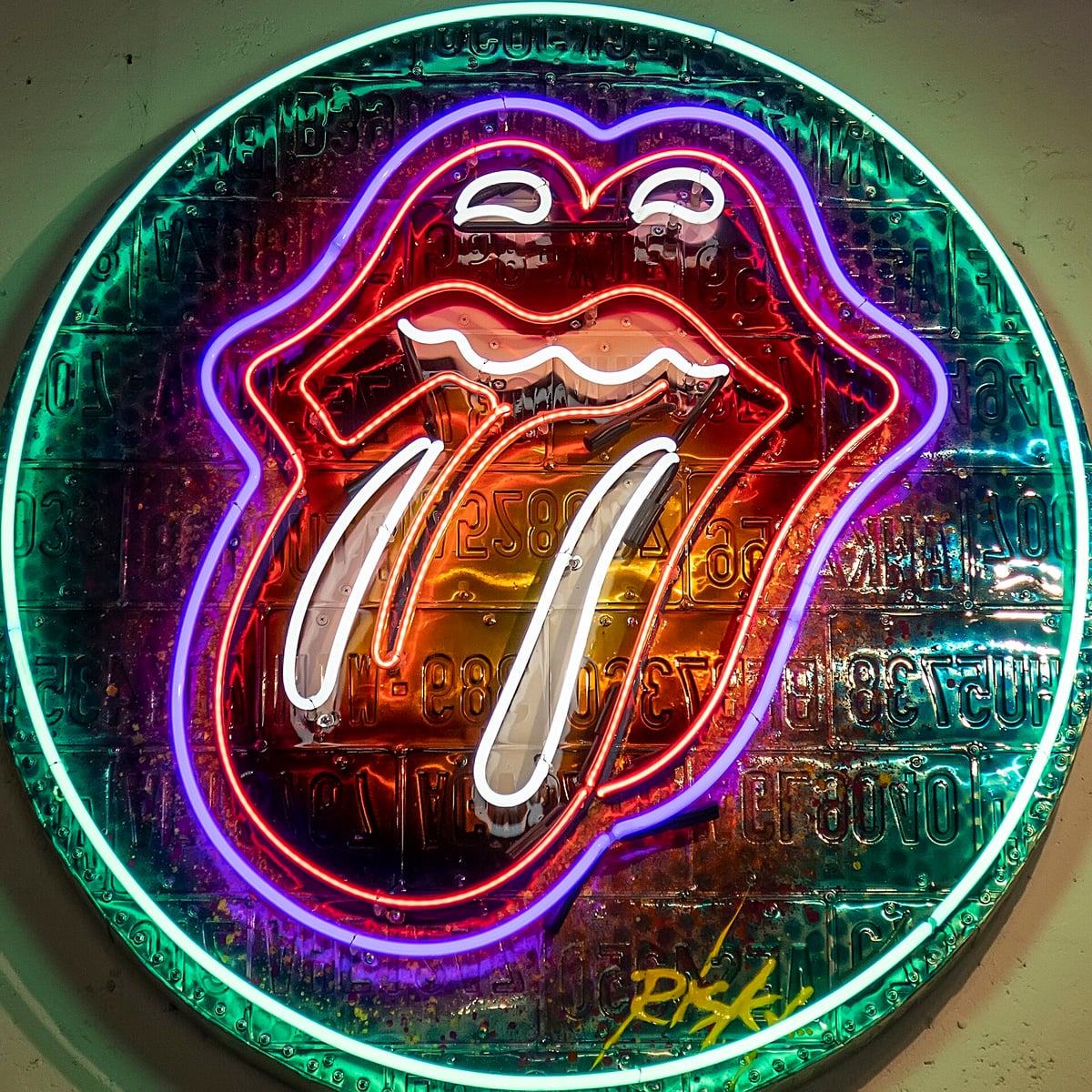
Designed by John Pasche in 1970, while he was a student at the Royal College of Art. Mick Jagger’s brief mentioned the Hindu goddess Kali and her stuck-out tongue. The logo launched on the Sticky Fingers album in 1971, and in 2008 the Victoria and Albert Museum bought the original artwork. It works because it needs no name at all: lips and a tongue say attitude, cheek and rock and roll in one shape that reads at any size. The neon tribute above shows how far it can be reinterpreted and still be recognised.
2. The Beatles
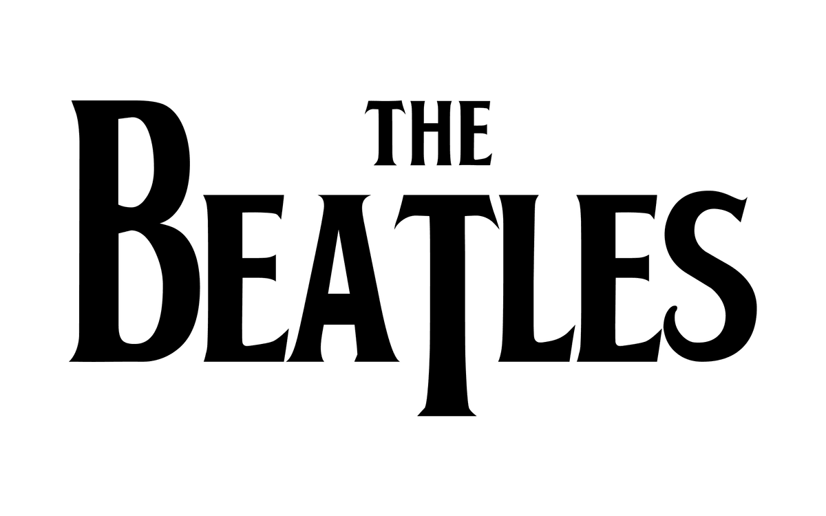
The drop-T logo dates from early 1963. When Ringo Starr bought a new Ludwig drum kit, drum dealer Ivor Arbiter sketched a Beatles logo on the back of a cigarette packet, and sign painter Eddie Stokes was paid five pounds to paint it on the bass drum head. The whole idea is one small quirk: the T drops below the baseline, and the oversized B and T give plain bold capitals a rhythm you remember.
3. Led Zeppelin
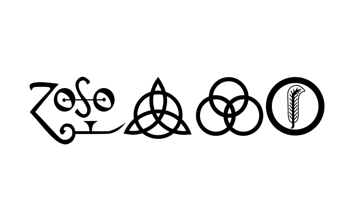
Led Zeppelin’s fourth album, released in 1971, has no title and no band name on the cover. Instead, each member chose a personal symbol for the sleeve and label. Jimmy Page drew his own, the “Zoso” sign, and has never explained it. The four marks became the band’s emblem and gave the album its nickname. It is a rare logo built on mystery: no words, no explanation, just shapes that fans felt they had to decode.
4. Queen
Freddie Mercury studied graphic design at art college and designed the Queen crest himself shortly before the band’s first album in 1973. The full crest combines the members’ zodiac signs (two lions, a crab and two fairies) under a large phoenix, and it echoes the royal coat of arms. Shown here is the lettering on its own: elegant serif capitals with a long sweeping tail on the Q. It shows that a rock logo can be theatrical and refined rather than rough.
5. Chicago
Columbia Records art director John Berg sketched the script, and Nick Fasciano drew the final logo. Its inspiration was the Coca-Cola logo, and the aim was a mark that stood above any single member. From Chicago II onwards it appeared on almost every album cover, redrawn as an American flag, a chocolate bar, a fingerprint, a map and a silicon chip. Few bands treated a logo as a flexible brand system so early.
6. Kiss
Guitarist Ace Frehley drew the first version in 1973, when he wrote the new band name over “Wicked Lester” on a club poster and turned the two S letters into lightning bolts. Paul Stanley later redrew it with a marker and a ruler, and kept the S letters slightly out of parallel rather than have it redrafted. Because the bolts resemble the Nazi SS insignia, most Kiss releases in Germany have used an alternative logo since 1980. A loud, poster-ready mark, and a lesson in checking how a symbol reads in every market.
7. AC/DC
Typographer Gerard Huerta designed the logo, and it first appeared on the international cover of Let There Be Rock in 1977. Huerta, who also drew the HBO logo, used chunky angular capitals with Gothic-style serifs and replaced the slash with a lightning bolt. The band took its name from the AC/DC label on a sewing machine, so the bolt is literal electricity. The shape is strong enough to carry any finish, from flat black to the bevelled orange shown here.
Punk rock band logos
8. Ramones
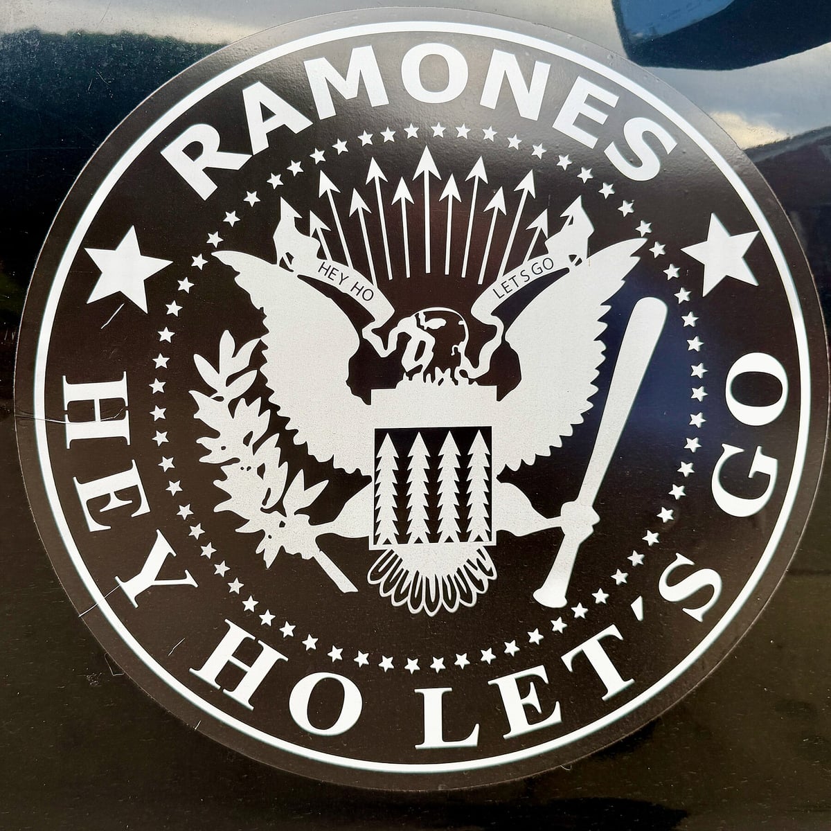
Arturo Vega, the band’s artistic director and often called the fifth Ramone, based the logo on the US presidential seal. In his version the eagle grips a baseball bat, a nod to Johnny Ramone’s love of baseball, and the original put the members’ names around the border. Borrowing the most official symbol in America for a scrappy punk band is the joke, and the round badge shape is made for T-shirts.
9. Sex Pistols
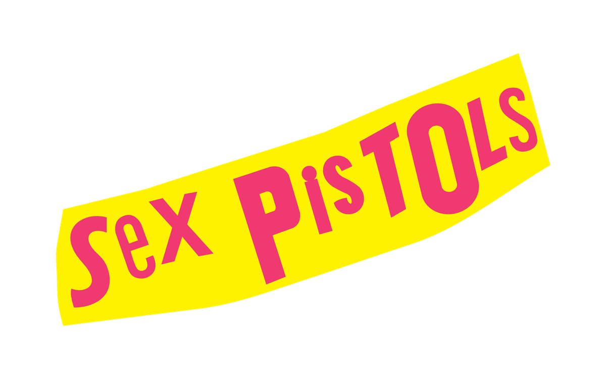
The lettering comes from Jamie Reid, who developed his ransom-note style, letters cut from newspaper headlines, for his radical magazine Suburban Press before working on the band’s sleeves. Mismatched letters in hot pink on a tilted yellow strip look deliberately amateur, and that is the point: it cannot be made to look corporate.
10. Black Flag
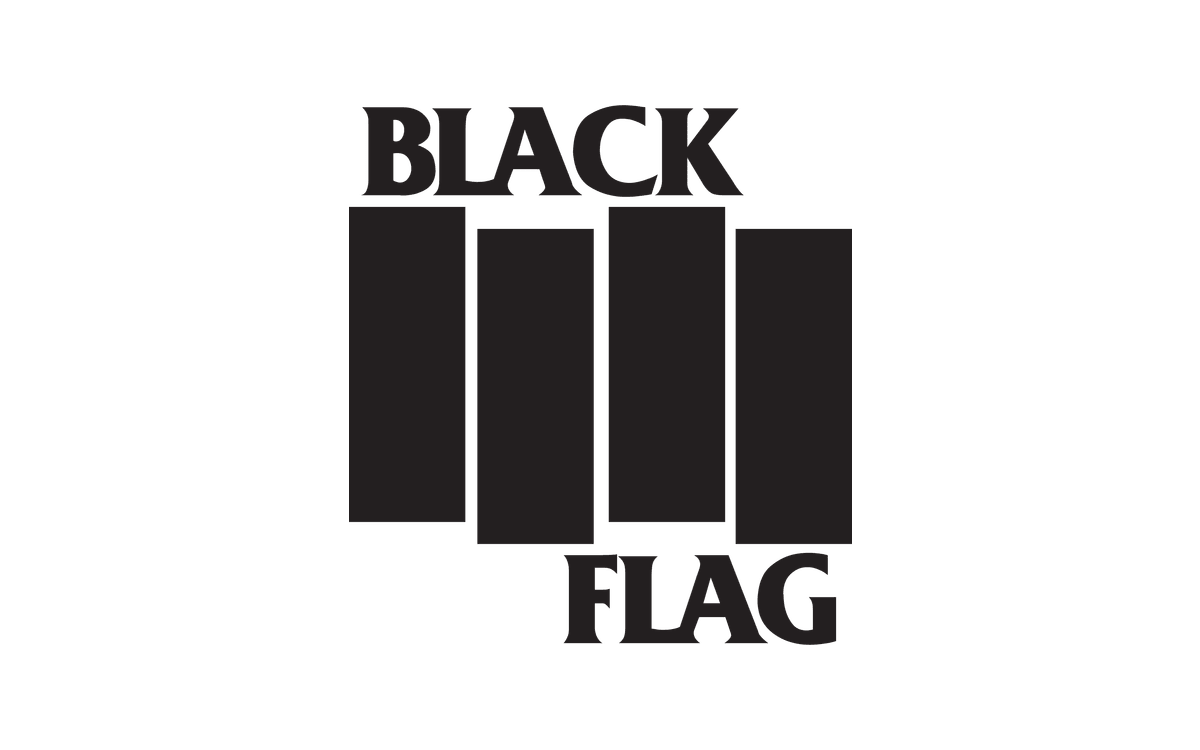
When the band had to change its name from Panic in 1978, artist Raymond Pettibon, the brother of guitarist Greg Ginn, suggested Black Flag and drew the logo: four black bars that form a flag rippling in the wind. The band spray-painted it all over Los Angeles. Four rectangles carry the whole idea, and anyone can reproduce it with a stencil and a can of paint, which is exactly how it spread.
11. Bad Religion
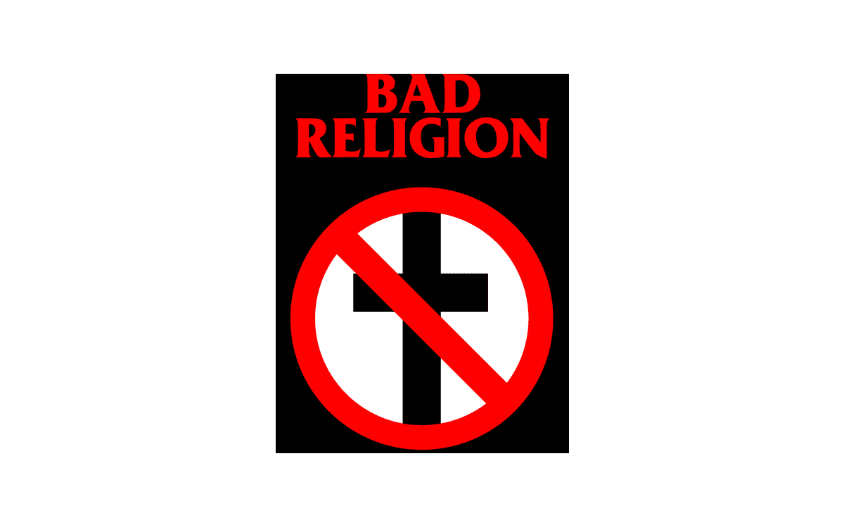
The “crossbuster”, a black cross under a red prohibition sign, was drawn by Brett Gurewitz when the band members were about fifteen. They liked how shocking it was, and it was simple enough to spray paint and print on shirts, so it travelled further than they expected. The band say the cross stands for religion and dogma in general rather than any one faith. Two signs everyone already reads, combined into one statement.
Alternative and industrial rock logos
12. Nine Inch Nails
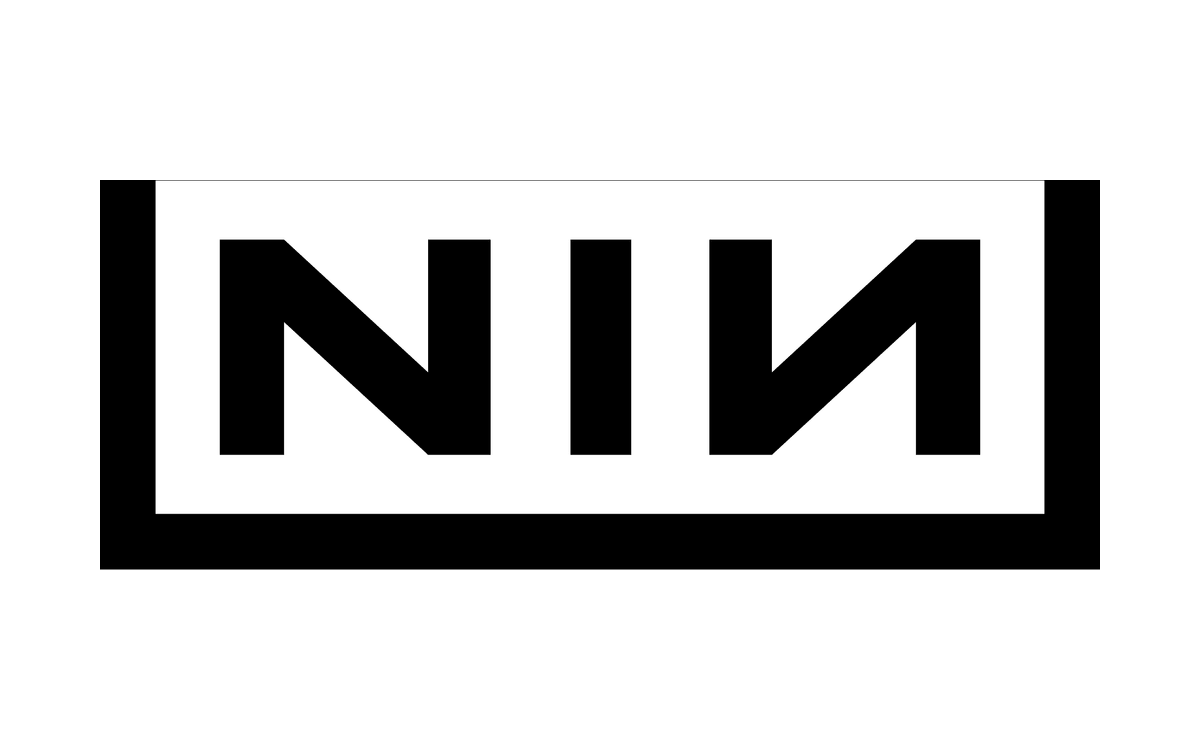
Trent Reznor and Gary Talpas designed the logo, inspired by Tibor Kalman’s typography on the Talking Heads album Remain in Light. It first appeared in the video for “Down in It”, the debut single from the 1989 album Pretty Hate Machine. The mirrored second N and the heavy frame make three letters look like an industrial label or a warning sign. It is symmetrical, easy to stencil and works in one colour.
13. Nirvana
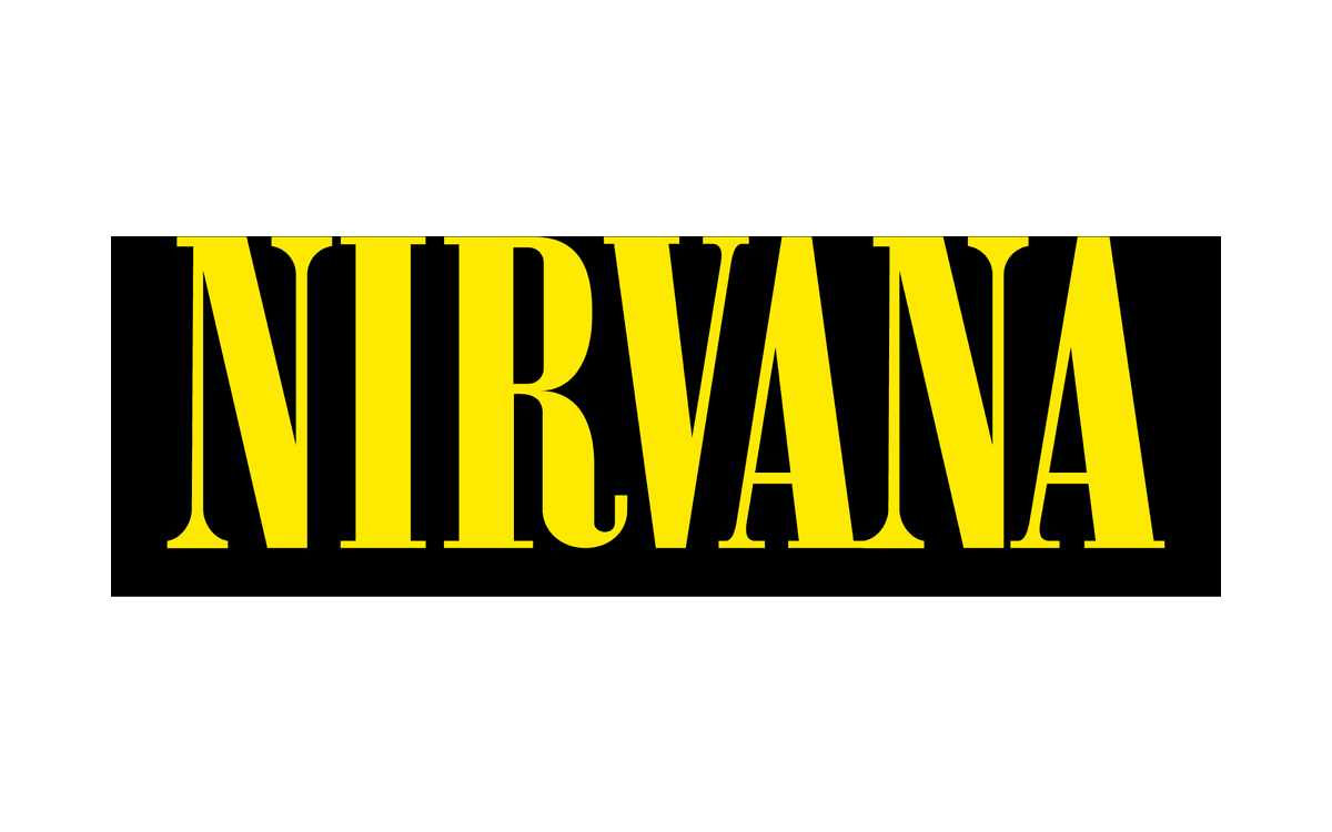
Nirvana has two famous marks. The wordmark shown here is simply the band name in tall, condensed yellow capitals on black. The other is the Nirvana smiley, with crossed-out eyes and a tongue hanging out, created in 1991. It is often credited to Kurt Cobain, although in 2020 a Los Angeles freelance designer claimed to have drawn it, during Nirvana’s lawsuit against Marc Jacobs over a similar smiley. A plain wordmark next to a scrappy doodle sums up grunge.
Metal band logos
14. Motörhead
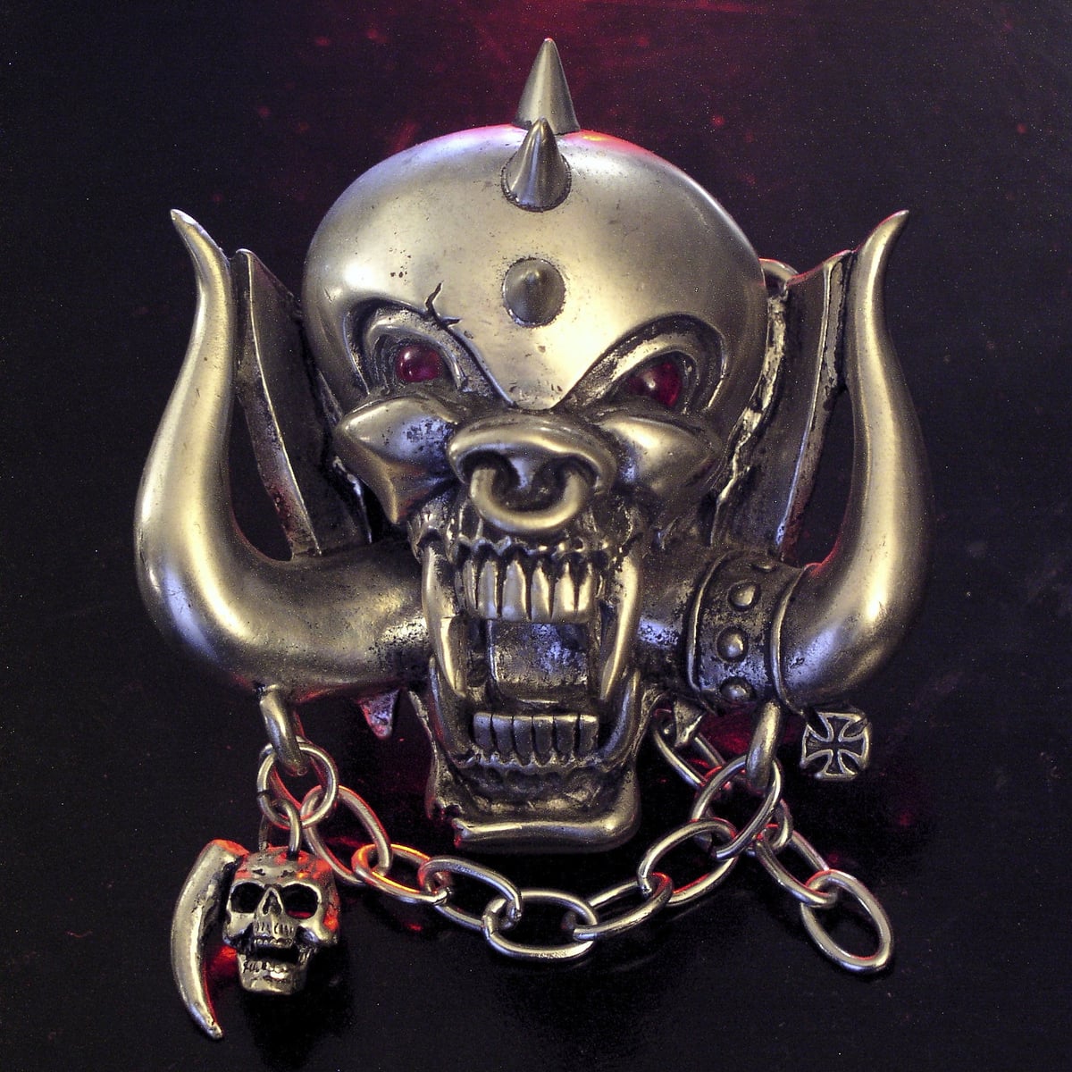
Joe Petagno created Snaggletooth, also known as War-Pig, for the band’s debut album in 1977, after studying the skulls of wild boars, gorillas and dogs. Designer Phil Smee turned the drawing into a negative and added the lettering. The fanged face with tusks, chains and spikes has appeared in countless variations since, from album covers to the buckle above. A mascot this distinctive works as a logo on its own.
15. Iron Maiden
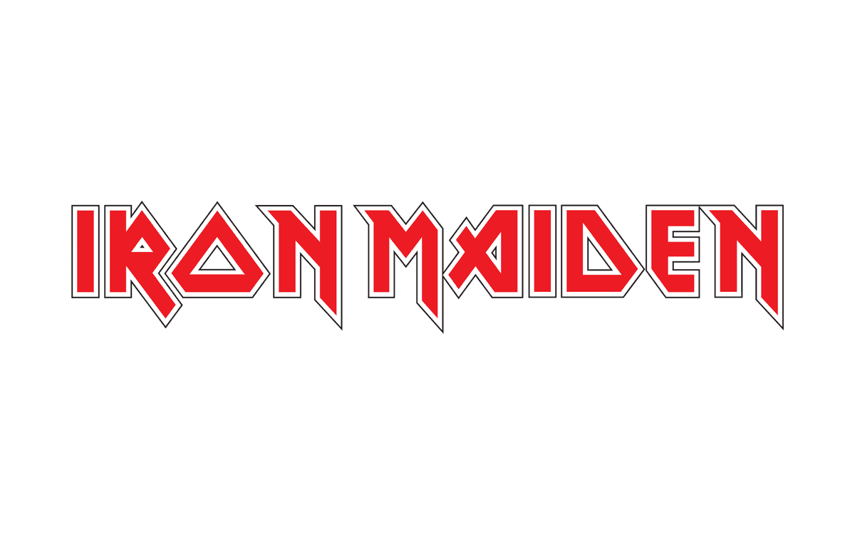
The logo has appeared on every Iron Maiden release since The Soundhouse Tapes EP in 1979. The lettering traces back to Vic Fair’s poster for the 1976 film The Man Who Fell to Earth, although bassist Steve Harris says he designed it himself, drawing on his training as an architectural draughtsman. Pointed serifs and angular letterforms make it look sharp and engineered, yet it stays easy to read.
16. Metallica
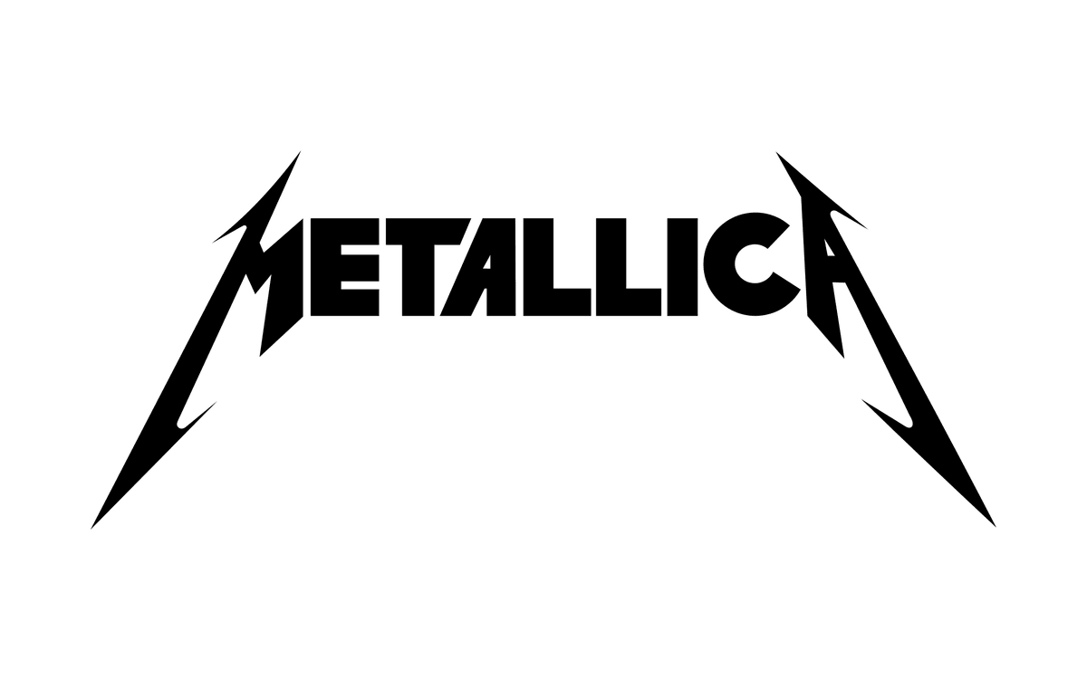
James Hetfield designed the logo, which appeared on the debut album Kill ‘Em All in 1983. The first and last letters are larger, italic and end in sharp spikes, so the name sits between two blades. The band swapped it for a revamped logo around the 1996 album Load, a change some fans did not welcome. Fans get attached to logos, which is why a logo refresh needs care.
17. Slayer
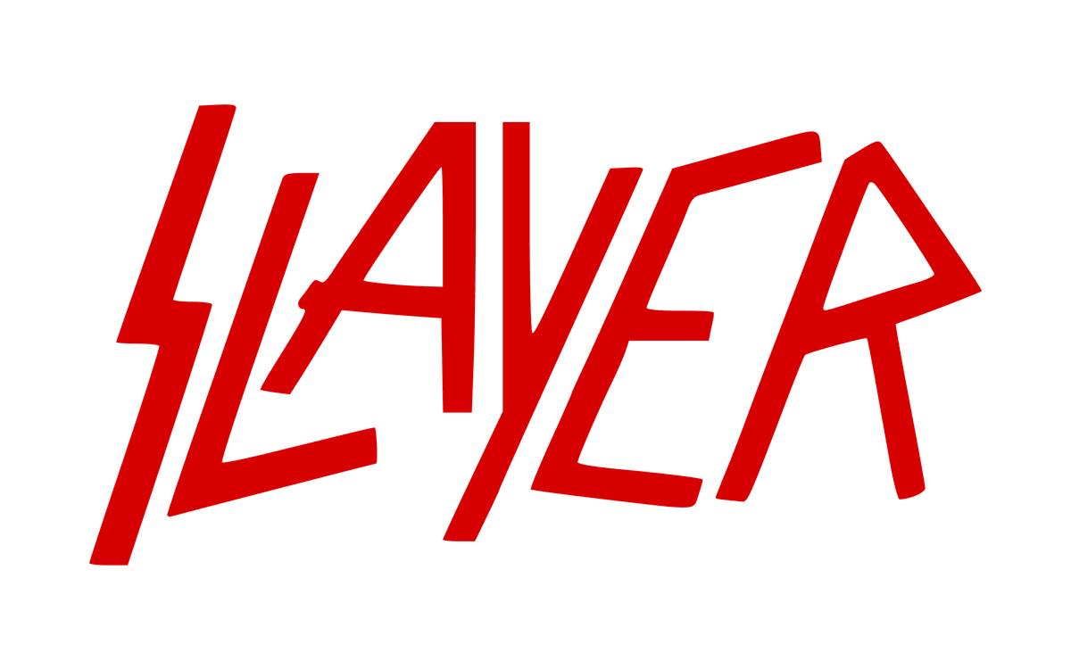
According to drummer Dave Lombardo, he designed the logo by imagining how a murderer would carve the name with a knife. He is left-handed, so the letters lean to the right. The thin, jagged strokes look cut rather than drawn, which is exactly the feeling thrash metal wanted. Red on white makes it read like a warning.
18. Megadeth
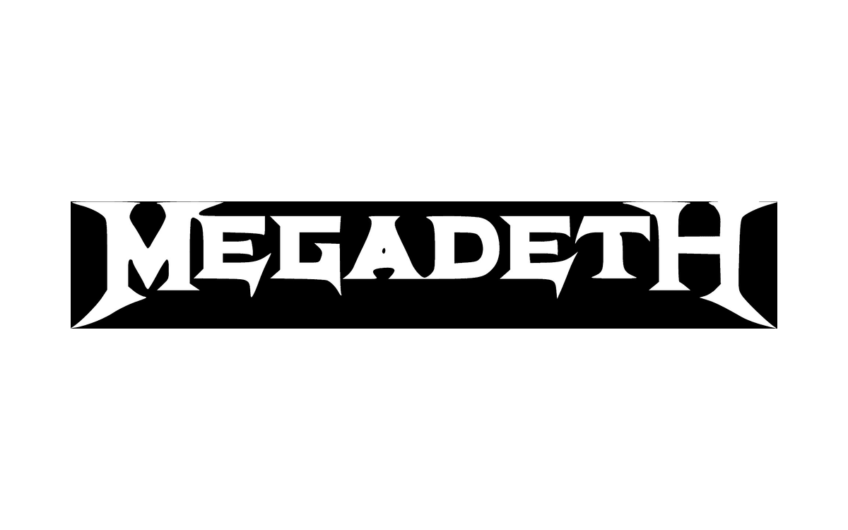
Megadeth’s wordmark uses bold serif capitals with long, sharp angles, set here in a black bar with pointed ends, and is sometimes paired with a hazard symbol. Dave Mustaine also sketched the band’s mascot, Vic Rattlehead, a skeleton in a suit with a riveted visor and a clamped mouth. The bar gives the name a badge shape that sits well on a shirt.
19. Korn
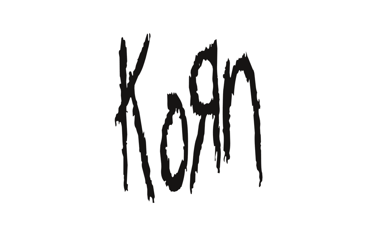
Singer Jonathan Davis designed the logo. The band spelled its name with a K and a backwards R, an idea taken from the Toys R Us logo, as several members had worked for the retailer. The scrawled, childlike letters were the opposite of the polished, spiky logos around them, and they became one of the most recognisable marks of nu metal.
20. Rammstein
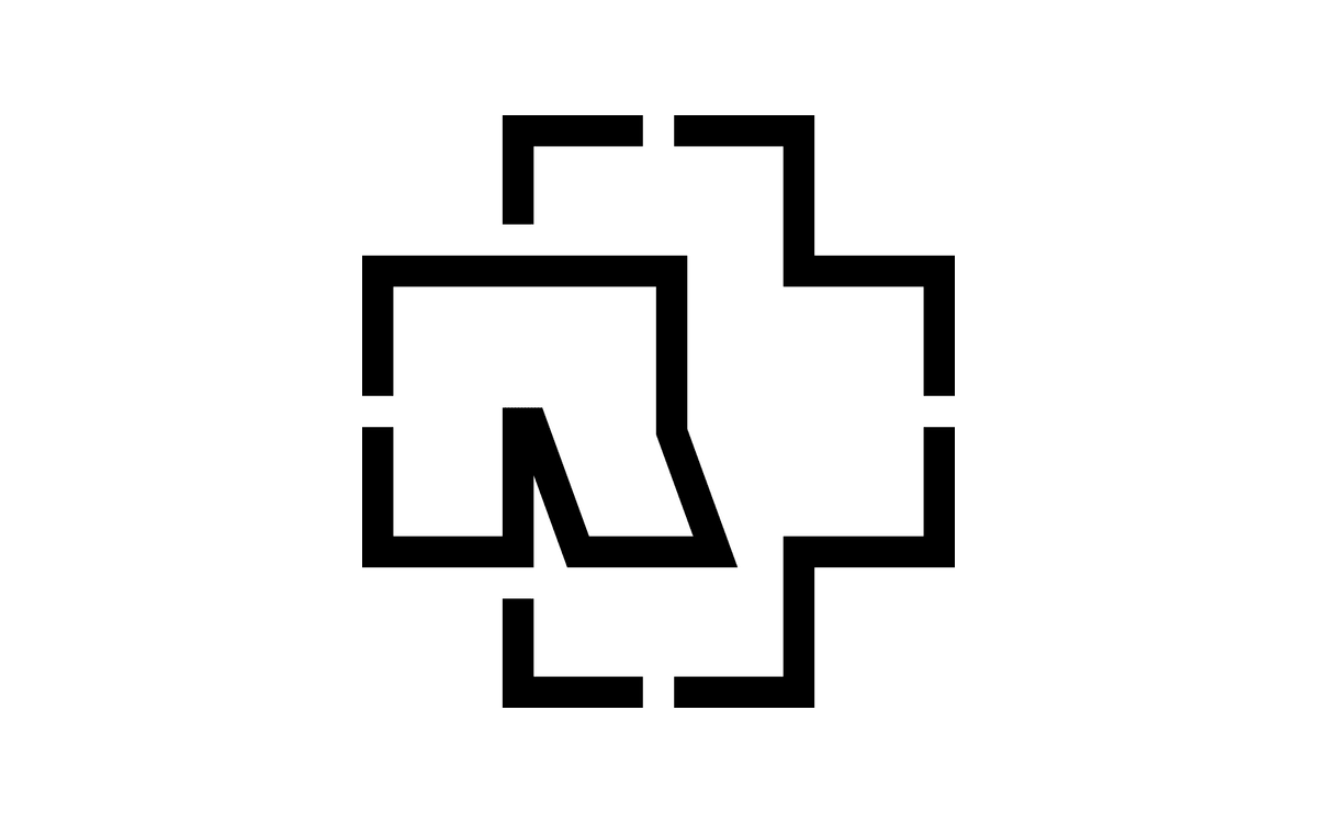
Designer Dirk Rudolph made the band’s first commercial logo for the 1995 debut album Herzeleid and later designed the sleeve for Mutter. The emblem shown is built from right-angled lines around a stencil-like R, so it reads more like an industrial symbol than lettering. That made it ideal for the stage: on tour the band have lit it up as huge lamps on steel towers.
Tips for designing a band logo
- Start with the sound and the attitude. Write down three words that describe the music before you sketch. A doom band and a pop-punk band should never end up with the same logo.
- Draw the lettering, do not just type it. Most logos above are custom lettering, not fonts. If you start from a typeface, change it. Our guides to choosing a font, distorted fonts and graffiti fonts are good starting points.
- Test it as a one-colour stencil. If it still works in flat black on a shirt, a sticker and a bass drum, it will work everywhere. Black Flag, Bad Religion and Nine Inch Nails all pass this test easily.
- Balance mood and legibility. Extreme metal logos can be unreadable on purpose, but a band that wants new fans should be readable at thumbnail size. Iron Maiden manages both.
- Plan the set. You will need a full wordmark, a symbol or monogram for small spaces and a one-colour version. Here is how to plan logo variations.
- Check every meaning. Look up how your symbol reads in other countries and scenes before it goes on merch. The key principles of logo design apply to bands too.
For more inspiration with an old-school feel, see our collection of retro and vintage logos, or read why so many of these marks rely on red in branding.
Frequently asked questions
Who designed the Rolling Stones logo?
John Pasche designed the tongue and lips logo in 1970, after a brief from Mick Jagger. It first appeared on Sticky Fingers in 1971, and the Victoria and Albert Museum now owns the original artwork.
What is the most famous band logo?
The Rolling Stones tongue is usually named first. In 2008 it was voted the greatest band logo of all time in an online poll by Gigwise. The Beatles drop-T, the AC/DC bolt and the Ramones seal are close behind.
Why are metal band logos so hard to read?
Because they are meant to look dangerous first and readable second. Sharp, spiky or carved lettering signals the genre instantly to fans. Mainstream metal bands like Metallica and Iron Maiden keep their names legible, while extreme metal often pushes the lettering into pure texture.
Can I use these band logos?
No. They are registered or protected trademarks of the bands and their companies, even when a simple wordmark has no copyright. You cannot copy them for a band, product or merch. We show them here for editorial analysis only. Study the ideas, then have an original logo designed.
Need a logo for a client?
Inkyy is a white label design and development team for agencies. Our in-house brand designers create original logos and full identities, from bands and venues to any other brand, that you deliver under your own name. See our design services or book a 15-minute call.
 Book a Meeting