Logo Presentation: 14 Professional Examples and How to Present
 9 min read
A logo presentation is the moment a client first sees their new identity, and it often decides whether a good logo gets approved or picked apart. The same mark can feel thin on a blank artboard and convincing when it arrives with a clear idea, a grid, a colour palette and a few real-world mockups.
This guide covers what a professional logo presentation includes, a step-by-step way to present a logo to a client, and 14 logo presentation examples from working designers, with notes on what each one does well. At the end you will find free mockup collections you can use as logo presentation templates.
What a professional logo presentation includes
You do not need every slide for every project. A small business logo might need six slides; a full rebrand might need thirty. These are the building blocks most strong presentations share:
- The concept story. One slide that explains the idea in plain words: which shapes were combined and why. It answers “how did you come up with that?” before anyone asks.
- Construction grid. The logo drawn over its circles, angles and guides. It shows the mark was built with care, not traced, and it helps the developer or printer who rebuilds it later.
- Clear space and minimum size. How much empty space must surround the logo, usually measured in a unit taken from the mark itself, and the smallest size at which it still reads.
- Colour and type. The palette with HEX, RGB and CMYK values, plus the typefaces used in the wordmark and the brand. Our guide to colours and branding explains why these choices matter.
- Variations. Primary, horizontal, stacked, icon-only and one-colour versions, on light and dark backgrounds. Here is how to plan the logo variations every business needs.
- Mockups and applications. The logo on stationery, signage, packaging, a website, an app icon or a social profile, so the client can picture it in use.
- Do’s and don’ts. A short page that shows what not to do: no stretching, no recolouring, no drop shadows, no busy photo backgrounds without a holding shape.
Once the logo is approved, most of these slides grow into a full brand guideline document, so building them well at presentation stage saves time later.
How to present a logo to a client, step by step
- Restate the brief. Open with the client’s goals, audience and the words you agreed on, such as “trusted”, “local” or “modern”. Every slide after that should point back to them.
- Show the logo alone first. Put the primary logo on a plain background, large, before any mockups. First impressions should be about the mark, not about a pretty photo.
- Tell the concept story. Walk through the idea, then the construction grid. Keep it to two or three sentences per slide.
- Show it working. Present the variations, the colour palette and the type, then move to mockups that match the client’s real world: a van for a plumber, a menu for a restaurant, an app icon for a SaaS product.
- Limit the options. If you present more than one direction, keep it to two or three, each with its own short rationale. Ten options make a client feel they have to do your job.
- Present live when you can. If you have to send a PDF, add a short written note to each slide so it can stand on its own.
- Ask focused questions. Instead of “what do you think?”, ask whether the logo fits the words from step one. Then agree on the number of revision rounds and the deadline for feedback.
For agencies presenting white label work: the deck must look like your studio made it. Use your own template, fonts, cover slide and file names, with no trace of the production partner. Ask your design partner for the grid, clear-space measurements and colour values, not just PNGs, so you can answer technical questions on the call. This is how Inkyy works with agencies: we design the logo and the slides, and you present them as your own. The same slides also make it easier to refresh the logo years later.
14 logo presentation examples
The examples are grouped by what they teach: concept and construction, colour and variations, then mood, mockups and applications. Use them for ideas on layout and storytelling, not as artwork to copy.
Concept and construction slides
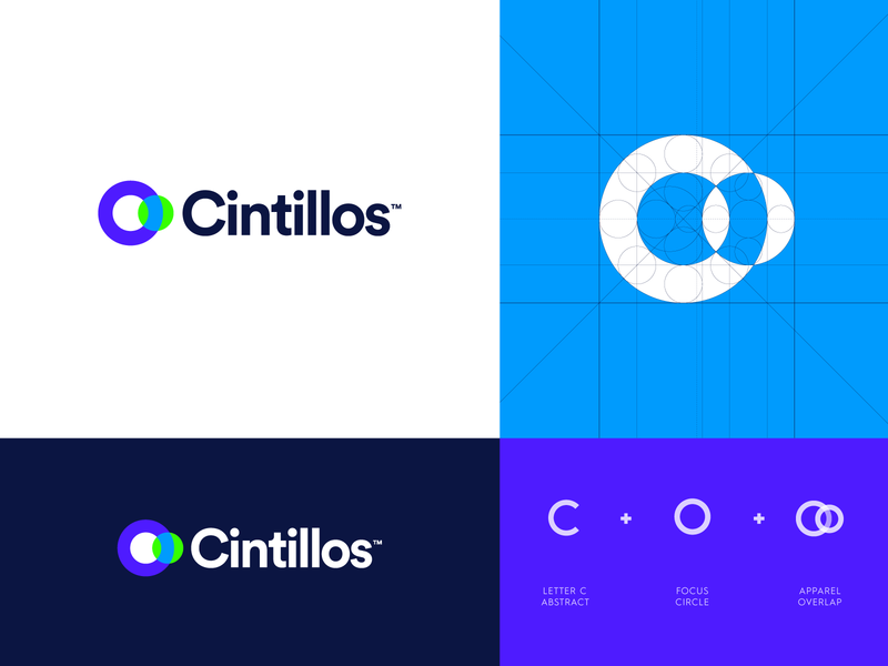
1. Cintillos by Jeroen van Eerden
One board does the work of four slides: the logo on white, the inverted logo on navy, the symbol drawn over its circle grid, and a row of three icons labelled “letter C abstract”, “focus circle” and “apparel overlap”. That last panel answers “where did this come from?” in seconds. A tidy layout for any geometric logo. More work from Jeroen van Eerden on Dribbble.
2. Fluxon by Jeroen van Eerden
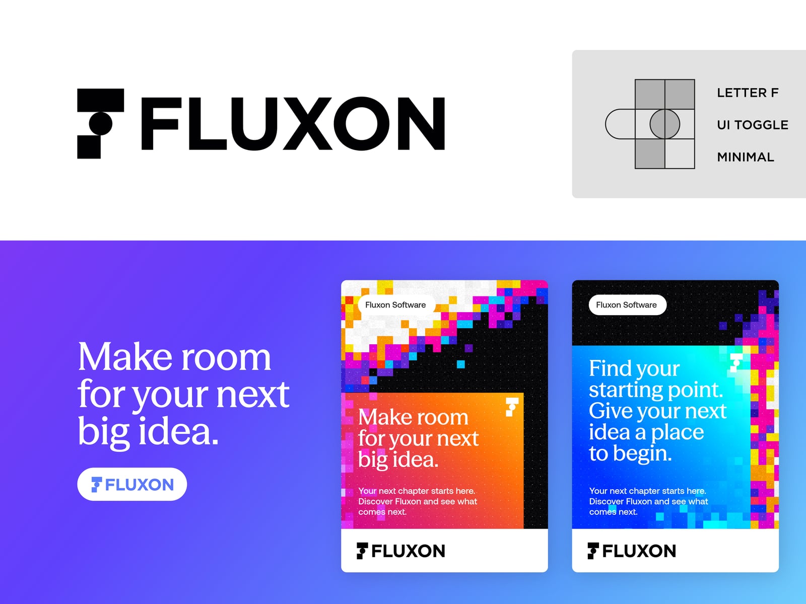
The black logo sits on white next to a grey panel that breaks the symbol into its idea: a letter F, a UI toggle, kept minimal. The lower half jumps straight to use, with a headline, a pill-shaped logo badge and two pixel-art social posts. See the Fluxon visual system on Dribbble.
3. MadeFlow by Jeroen van Eerden
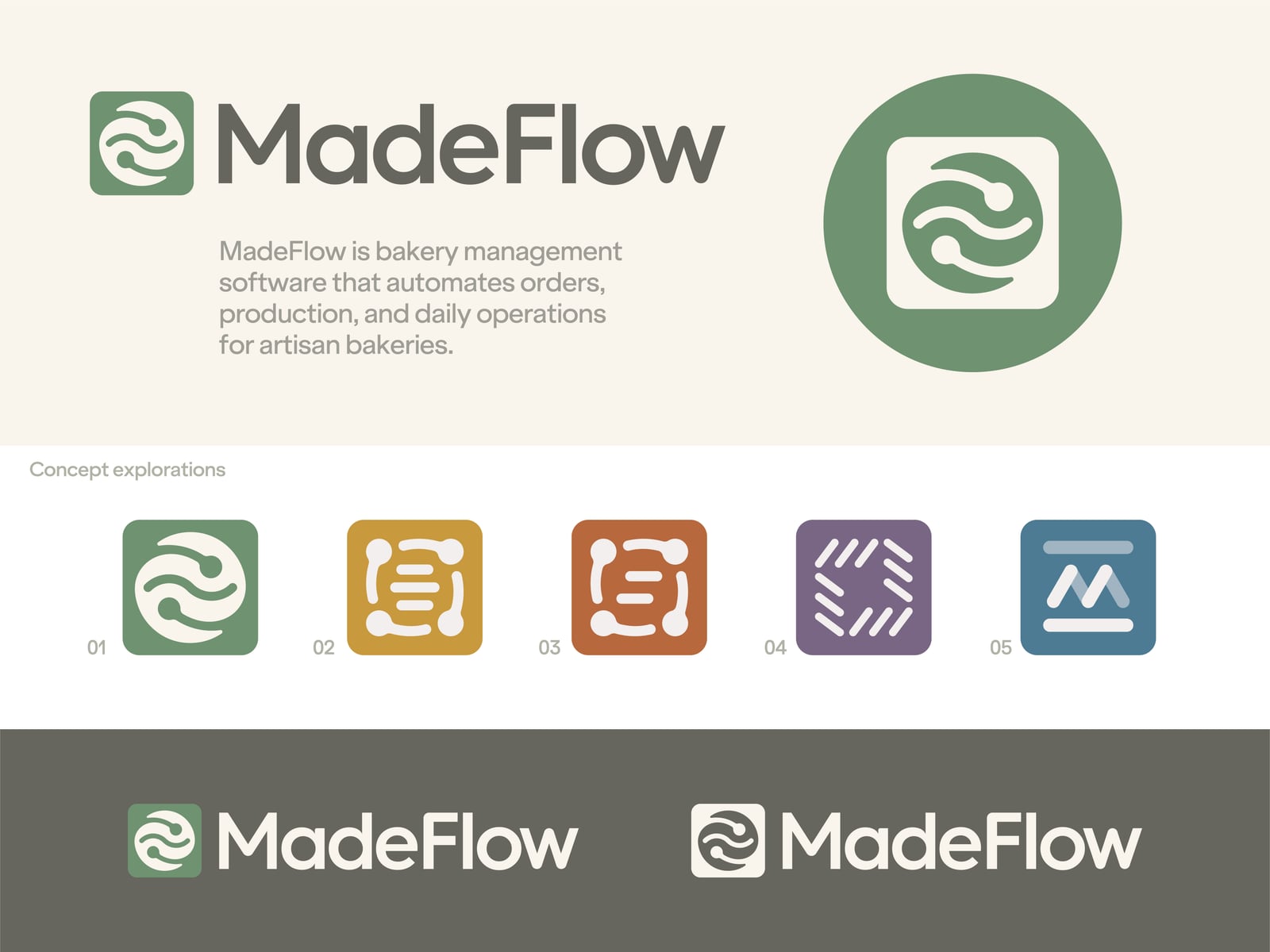
The slide opens with a one-sentence description of the business, bakery management software, so the logo is judged against the brief. Below it, five numbered concept explorations in different colours show the route to the final mark, and a dark band tests two lockups in reverse. It presents one direction while still showing the thinking. See the MadeFlow concept exploration.
4. Vitruvian app icon grid

The wireframe on the left draws the figure inside a circle, a square and a triangle grid, a nod to Leonardo’s Vitruvian Man. The finished mark on the right is a white figure in a gradient app icon. Placing the grid and the result side by side makes the reference clear without a word of explanation.
5. SQR1 by Daniel Rotter
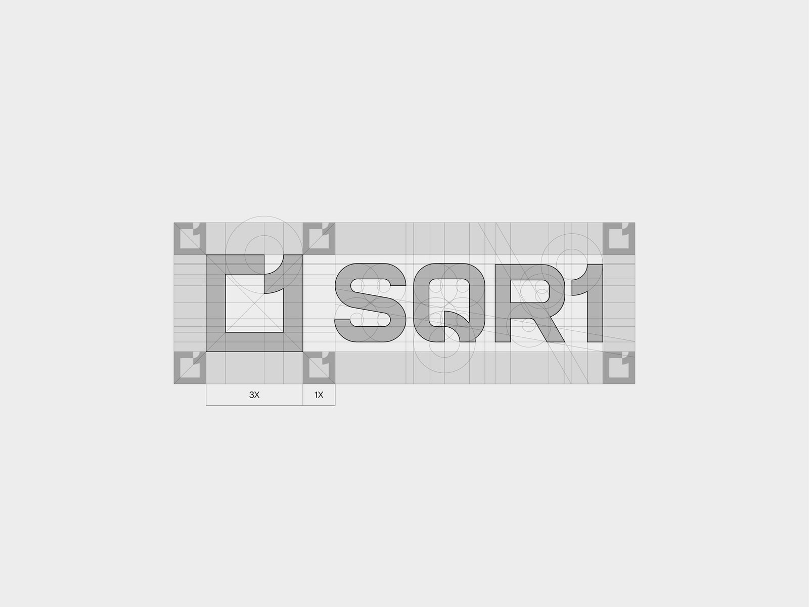
A quiet, all-grey slide that covers construction and clear space at once. Grid lines and circles show how the letters were built, corner markers mark the exclusion zone, and the 3X and 1X labels below show the proportion between symbol and spacing. It is exactly the page a printer or developer needs. See SQR1 logo construction.
6. Monogram from sketch to final
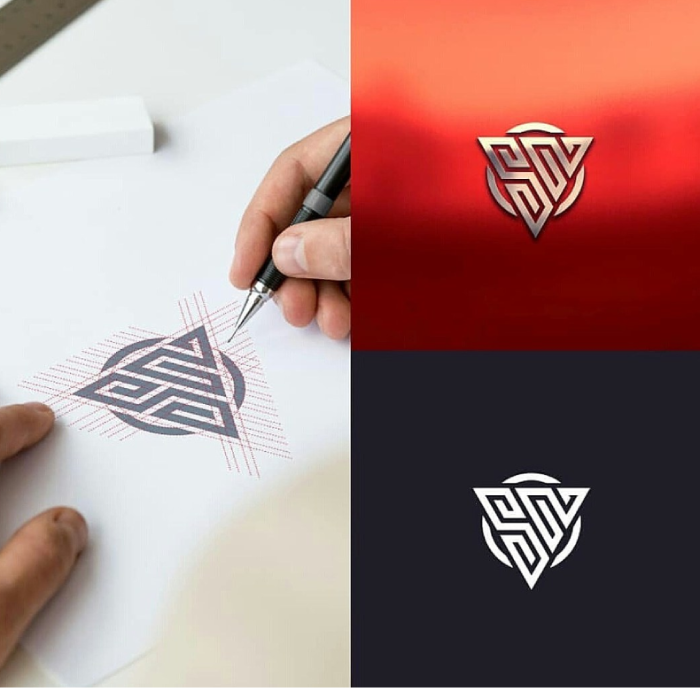
A hand sketching the triangle monogram over red guide lines sits next to two finished versions: a metallic emboss on a red background and a flat white mark on dark navy. The sketch adds a human touch; use it as a process slide, not the opening image.
Colour, type and variation slides
7. Macau by san.dewo

The parrot mascot sits on a warm orange gradient with the “macau natural bird” wordmark below, and a purple side panel holds the full colour palette above a close crop of the mascot. A practical layout for mascots and illustrated logos that have to work on many colours. More from san.dewo on Dribbble.
8. New Horizon by Logo Supra
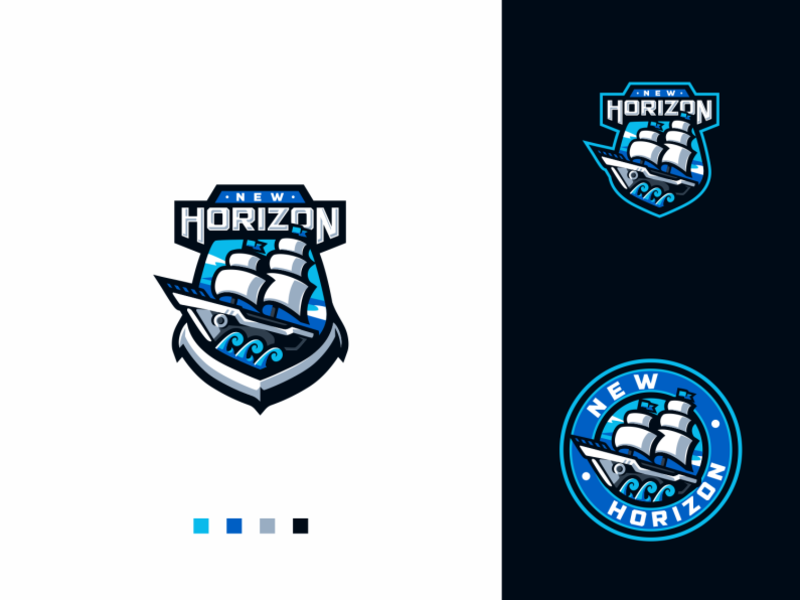
The main shield badge with a sailing ship gets the large white panel and four small colour swatches. The dark panel shows two variations: a smaller shield and a round badge with the name set around the edge. This layout is ideal for esports and sports logos, which nearly always need a circular version for patches and avatars. More from Logo Supra.
9. Lox Farms brand guide by Drew Powers
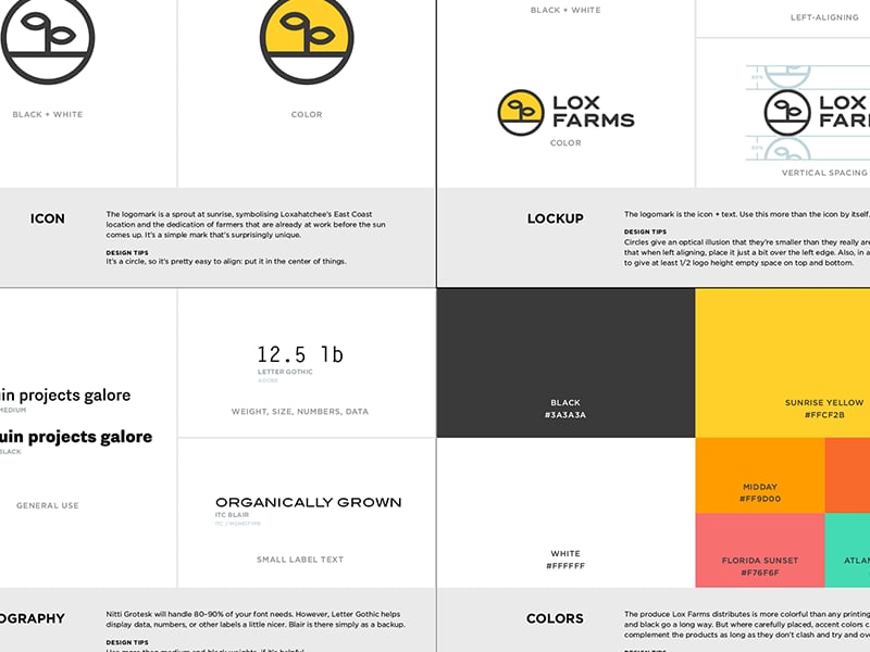
A guide-style page split into icon, lockup, typography and colours. Each block has a short note, from the meaning of the sprout-at-sunrise symbol to the space to leave around the lockup. The swatches carry names and HEX codes, such as Sunrise Yellow #FFCF2B. Copy this format for the closing pages of a presentation, because it turns straight into brand guidelines. See the Lox brand guide.
10. Salesloft by Focus Lab
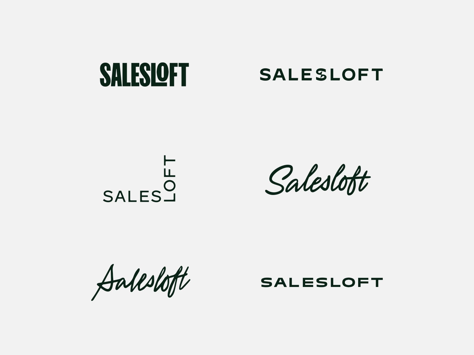
Six wordmark directions on one neutral grey slide: a heavy condensed version, two wide-spaced caps versions, a stacked “SALES / LOFT” lockup and two scripts. Using one colour and one size for every option keeps the comparison fair, so the client reacts to the type and not to styling. See the Salesloft logo exploration.
11. Talent Fest with a colour bar

A multicoloured carnival mask sits above a bold navy wordmark on a plain white slide. The only extra is a thin bar along the bottom, split into the five logo colours, which works as a colour palette without a separate swatch page. A good fit for events and festivals with bright palettes.
Mood, mockup and application slides
12. Triangle mark on a dusk photo by RULL_IT

A white triangular maze mark placed over a dark photo of a dusk landscape. The dark sky and the silhouettes of two people on a hillside give the white logo strong contrast, and the photo sets an outdoor, slightly mysterious mood. Pick a photo that is mostly one tone where the logo sits. Free stock sites such as Unsplash are a good source. More from RULL_IT.
13. Boost sticker bomb

A pink and yellow “Boost Your Lifestyle” die-cut sticker sits on top of a faded pile of the same stickers. If the logo will live on stickers or merch, this feels natural and doubles as a social post. It suits drinks, streetwear and youth brands far better than a corporate one.
14. Pulse stationery by Radek Blaska
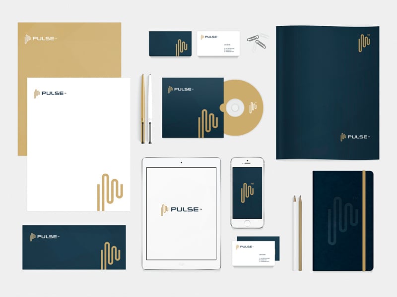
A classic navy and gold flat-lay with letterhead, business cards, an envelope, a folder, a notebook, a tablet and a phone. The same wave mark appears large on some items and small on others, which shows how the logo scales across a whole set. For finance, law and consulting clients, a stationery slide like this is often the one that sells the logo. See Pulse stationery on Dribbble.
Free logo presentation templates and mockups
A good logo presentation template is usually your own simple slide layout plus a few photo mockups with smart objects, where you drop in the logo and the shadows update for you. These free collections cover the common applications:
- 35 free stationery mockups for letterheads, business cards and full brand sets like example 15.
- Free envelope mockups for print-heavy clients.
- 50 free poster mockups and billboard mockups for showing the logo at large scale.
- Free t-shirt mockups for merch, events and sports brands.
Check each licence before you use a mockup in client work, and pick ones that match the client’s industry. If you are new to them, here is what mockups are and why to use them.
Tips for a logo presentation that gets approved
- Lead with the logo, not the mockups. A beautiful photo can hide a weak mark, and clients notice when it does. Show the logo plain first.
- Test it small on screen. Include a favicon or app icon slide. If the mark fails at 32 pixels, it is better you find out before the client does.
- Match mockups to the business. A coffee cup mockup for a cybersecurity firm makes the logo feel wrong even when it is right.
- Write the rationale down. A sentence or two on each slide means the presentation still works when it is forwarded to a manager who missed the call.
- Follow the basics. Simple, memorable, scalable. Our key principles of logo design are a good checklist before you build the deck.
Frequently asked questions
What should a logo presentation include?
At minimum: the logo on a plain background, a short concept explanation, the colour palette and typefaces, the main variations on light and dark, and two or three mockups. Larger projects add a construction grid, clear space rules and do’s and don’ts.
How many logo options should I present to a client?
Two or three strong directions is the usual answer. More than that tends to slow decisions and invites “can we combine these?” requests. Some designers present a single recommended direction with a clear rationale.
What is a logo presentation template?
A reusable set of slides, usually in Figma, Keynote, PowerPoint or Photoshop, with placeholders for the logo, colours, grid and mockups. You drop in each new logo and keep the same structure from project to project.
Can I use these logo presentations?
No. Every logo and presentation shown here belongs to its designer. Use them to study layout and storytelling, then build your own slides around your own work.
Need a logo and presentation for a client?
Inkyy is a white label design and development team for agencies. Our in-house brand designers create original logos and full identities, along with presentation slides that you deliver under your own brand. See our design services or book a 15-minute call.