



17 Bat Logo Ideas: Minimal, Mascot, Line Art and Lettermarks
 8 min read
A bat logo works because almost everyone can read the shape in a split second: two spread wings, a small body and a pair of pointed ears. That one silhouette can say night, mystery, sound, speed or fun, depending on how it is drawn, which is why bats turn up on bars, gaming teams, music labels and tech products alike.
Below are 17 bat logo designs grouped by style: minimal marks, line art and negative space, mascots and esports logos, and lettermarks and wordmarks. For each one we note what the designer did well and what kind of brand it suits, then finish with practical tips for designing your own.
What a bat logo says about a brand
- Night and mystery: bats come out after dark, so they suit bars, clubs, night markets, horror podcasts and anything with a late-night mood.
- Sound and senses: bats find their way by echolocation. Sound waves, ultrasound and audio brands can use that story, as two of the logos below do.
- Speed and agility: sharp, swept wings feel fast, which works for gaming, sports and performance products.
- Luck: in Chinese culture the bat is a traditional symbol of good fortune, because the word for bat (fu) sounds like the word for luck.
The common traps are easy to spot. A spread-wing bat drawn too symmetrically starts to look like a superhero emblem, which is a trademark you cannot use. Very spiky wings can feel aggressive on a brand that needs to feel friendly. And thin wing membranes and finger bones fill in at small sizes, so detail has to be planned, not added.
17 bat logo ideas by style
Minimal and geometric bat logos
Simple shapes, few colours and a silhouette that works as an app icon. This is the safest direction for tech, finance and product brands.
1. Blue gradient bat
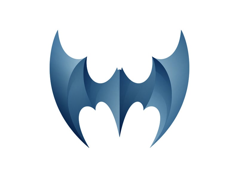
The wings rise into two tall points and the scalloped lower edge does the rest, so the bat needs no face or detail. Overlapping shades of one blue give depth without extra colours. A good fit for a tech product, a VPN or a security app that wants a calm but sharp mark. Design by Yoga Perdana.
2. Bats
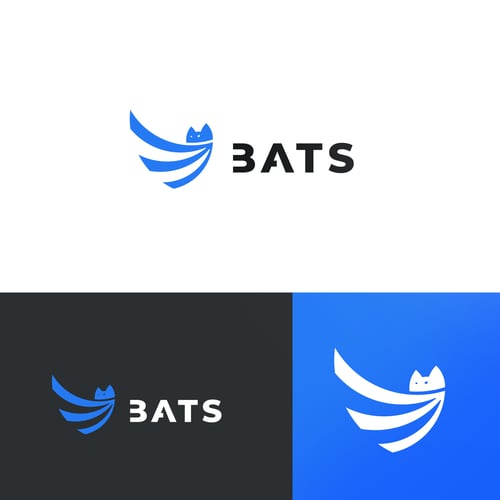
Three swooping stripes form the wing and two small ears turn them into a bat. The designer shows the mark on white, dark grey and bright blue, which is exactly how a logo should be tested. Clean enough for a software company or a delivery app. Design by gemeodois.
3. Mobat
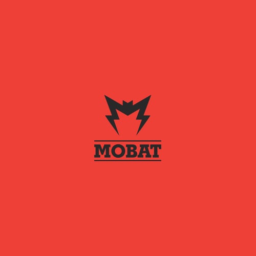
Designed for a battery manufacturer, this bat doubles as the letter M, and its lower wing edges end in lightning bolts to hint at power. The heavy slab serif wordmark between two rules feels industrial and solid. A smart example of one shape carrying the initial, the name and the product. Design by brandeus.
4. Batbrella
An umbrella canopy with scalloped bat wing edges and two ears on top. The pun is instant and the shape is still a simple, flat icon. It would suit an umbrella shop, a rainwear label or a Halloween product line. Design by Rachel Blace Cannon.
Line art and negative space
Here the bat is drawn with lines, bars or cut-out shapes, which leaves room for a second idea inside the silhouette.
5. Sound wave bat
White vertical bars of different heights form a waveform, and the outline of the bars is a bat. It is a neat nod to echolocation and to audio at the same time. A natural fit for a music app, a podcast network or a sound studio. Design by Alex Tass.
6. Sonowied
Made for an ultrasound sales and service company, the wings are stacked curved lines that read as sound waves. Bats see with sound and so does ultrasound, so the idea fits the business closely. The blue-on-navy palette keeps it calm and medical rather than spooky. Design by FDS.
7. Night Music
The body of this white bat is an acoustic guitar, cut out as negative space between the wings. With the wordmark underneath it says live music after dark in one glance. Ideal for a gig venue, a night-time music festival or a band. Design by Arif Firmansah.
8. One Love Cacao
A finely drawn bat sits inside a stained glass style arch of cacao pods and leaves. The soft colours turn a spooky animal into something natural and calm. A good direction for craft chocolate, organic food or an eco brand, though the detail needs a simpler version for small sizes. Design by By Mi.
Bat mascots and esports logos
Faces, expressions and thick outlines give these bats a personality. They work best where a brand wants to feel fun or competitive.
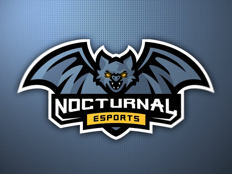
9. Nocturnal Esports
A snarling bat with yellow eyes and fangs spreads its wings over a badge with the team name and a yellow esports banner. The thick white outline keeps it readable on jerseys, stream overlays and dark backgrounds. Classic esports styling done cleanly. Design by Athaya.
10. Noculus
Made for an esports coaching platform, this light blue bat has one large eye as its body, and its wings break up into flame-like strokes. The eye suggests watching and analysing play, which suits coaching. Bold, simple and easy to animate. Design by J_Ivan.
11. Bat Gaming

A grey bat with a game controller as its body, buttons and all. The two-weight wordmark keeps BAT light and GAMING bold. A friendly direction for a gaming channel or a game shop that does not want an aggressive mascot. Design by grafas_studio.
12. Fatbat Firearms
A round, grinning bat whose wing tops turn into two handguns. The chubby body keeps it from feeling too serious, while the guns make the business obvious. The single dark grey colour means it can be engraved, stitched or printed cheaply. Design by mgeorge.
13. Fruit Bat Bar (illustrated)
A purple fruit bat with a pineapple on its head sips juice from half an orange in front of a striped sun. It is busy, but every detail sells the product: tropical, fresh and fun. Great on a shop front or cup, though it needs a simpler icon for social avatars. Design by DISFORIA GRAPHICS.
14. Fruit Bat Bar (cute)
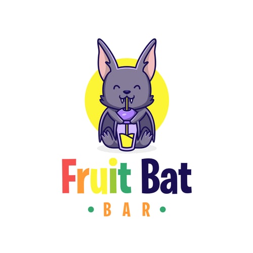
The same juice bar brief, solved more simply: a cute purple bat with closed eyes sips yellow juice through a straw. Compared with the design above it is easier to reproduce at small sizes, and the multicoloured wordmark adds the fruit. A useful pair to show how one brief can go in two directions. Design by O’Laa.
Bat lettermarks and wordmarks
When the name matters most, the bat can sit inside or on top of the lettering.
15. Batcrown
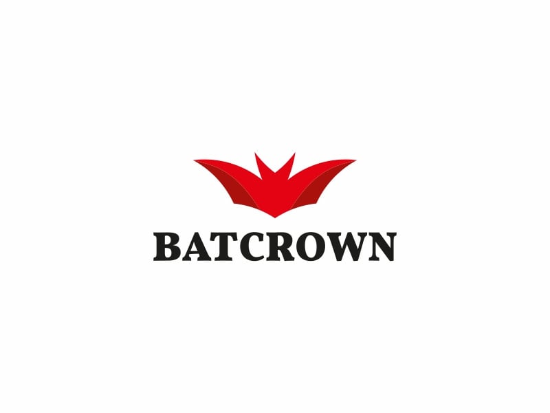
Red bat wings point upwards so the silhouette also reads as a crown. The bold serif wordmark underneath feels established, almost like a heritage brand. A strong idea for a premium nightlife venue, a spirits label or a gaming brand with a royal theme. Design by Dick Blacker.
16. Blind Bat Optics
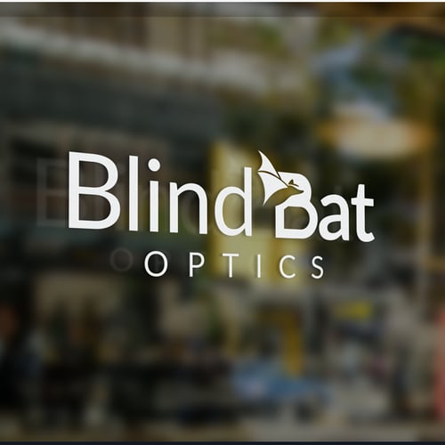
A small bat hangs from the top of the B, and the rest is a clean sans serif wordmark. The name is a playful contradiction for an optician, and the logo keeps the joke subtle. A good model for brands that want a hint of personality without a full mascot. Design by Daniel Tilica.
17. Flyingfox
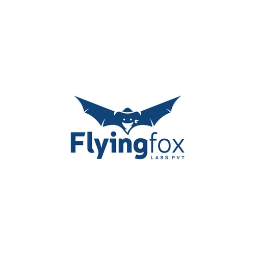
Flying fox is the common name for large fruit bats, and this logo uses a navy bat with wide, spiky wings above a two-weight wordmark. A small neckerchief over the face adds a cheeky, bandit-like character. It suits a tech lab or a digital studio that wants a mark with some attitude. Design by Alexra.
Tips for designing a bat logo
- Start with the wing shape. The wings carry the whole idea. Scalloped edges read as a classic bat, smooth sweeps feel modern and fast, and stacked lines can turn the wings into sound waves.
- Give the body a second job. The strongest marks here replace the body with something that belongs to the brand: a guitar, a game controller, an eye or an umbrella handle.
- Stay clear of the superhero look. A black, symmetrical bat inside an oval is the Batman symbol, a registered trademark of DC Comics. Change the proportions, the wing edge and the framing so your mark cannot be confused with it.
- Test it small. Check the logo at 32px for favicons and app icons. Merge thin wing bones and simplify the ears until the shape still reads.
- Match the mood to the market. Dark palettes and sharp angles suit gaming and nightlife. Purple, rounded shapes and a smile suit food, drink and kids’ brands. Our guide to purple in branding covers one of the most common bat colours.
- Plan the variations. You will need a full lockup, an icon-only bat and a one-colour version. Here is how to plan logo variations.
Want more animal and gaming ideas? See our esport mascot logos, wolf logos and crown logo ideas, browse minimalist logo designs, or read the key principles of logo design.
Frequently asked questions
What does a bat logo symbolise?
Most often night, mystery and the senses, thanks to echolocation. In Chinese culture the bat also stands for good luck and happiness. The style decides which meaning comes through: a cute mascot feels playful, while a sharp black silhouette feels bold and edgy.
Can I use these bat logos?
No. Every design here belongs to its designer or their client. Use them for ideas on shape, style and colour, then have an original bat logo made for your brand.
Can I use the Batman logo for my business?
No. The Batman bat symbol is a registered trademark of DC Comics, and using it, or something close to it, on your own products can lead to a legal claim. Design a bat that is clearly your own instead.
What colours work best for a bat logo?
Black, navy and deep purple are the natural choices for a night-time feel. Bright accents such as yellow, orange or electric blue add energy for gaming and drinks brands. Always check that the logo also works in a single colour.
Need a bat logo for a client?
Inkyy is a white label design and development team for agencies. Our in-house brand designers create original logos and full identities that you deliver under your own brand. See our design services or book a 15-minute call.


