SaaS Website Design: 12 Live Examples and What They Teach
What does SaaS stands for, and how does a proper SaaS website designs look? All that, and much more you will find out in this top 9 list from Inkyy Website Design Studio and our Blog Team.
 9 min read
SaaS website design has a narrow job: explain what the software does in a few seconds, then get a visitor to start a trial, sign up or book a demo. The site also has to feel like the product. If the homepage is slow or confusing, people assume the app will be too.
This guide covers what a SaaS homepage needs, from the headline and call to action to product visuals, proof and pricing. Then we look at 12 live SaaS websites, from Slack and Notion to Calendly and Lucky Orange, with notes on what each homepage does well and what we would question.
What a SaaS website needs
A SaaS site is a sales page, a product demo and a help desk in one. Plan these parts from the first wireframe, and use visual hierarchy to give them the right weight:
- A headline that says what it does. Name the product category and who it is for in plain words. A clever line works only when the product shown beside it explains it.
- One main action. A free trial, a free plan or “Get started”. Add a quieter second path, such as “Book a demo”, for teams that buy through sales.
- The real product. A screenshot, a short loop or a live widget beats stock art. Visitors want to know what they would be using.
- Proof close to the action. Customer logos, review scores or user counts, but only numbers you can back up.
- Pricing and trial terms. Say what is free, what needs a card and how to cancel. Phrases like “No credit card required” remove a worry at the exact moment of decision.
- Short navigation. Product, Solutions, Resources, Pricing, Log in and one highlighted button is the pattern almost every site below follows. Our guide to website navigation goes deeper.
- Speed and mobile. Product videos and animation are heavy. Keep the first screen light, and test the sign-up flow on a phone.
Self-serve or sales-led?
The homepage should follow how people buy. A self-serve tool such as Calendly or Loom can make sign-up the hero. A product sold to larger teams, such as HubSpot or Notion, usually shows both a free start and a demo. If you are not sure which page to send paid traffic to, read landing page vs product page.
12 SaaS website design examples
Every example below is a live site, captured on desktop at 1440 by 900 pixels. Homepages change often, so the notes describe each page as we captured it. For more general inspiration, see our top 30 web design examples.
Show the product straight away
These sites put the app on the first screen. Visitors see what they would be using before they read a feature list.
1. Slack
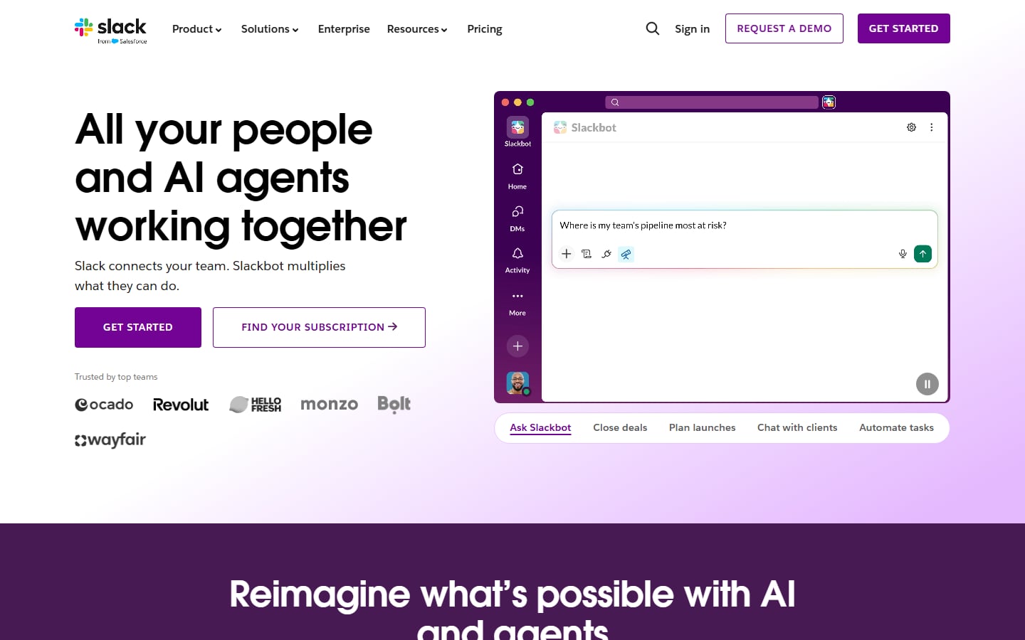
Slack leads with a three-line headline and puts the product right beside it: a purple app window with a Slackbot prompt box and a row of tabs below it (Ask Slackbot, Close deals, Plan launches and more). Two buttons split the audience, a solid purple “Get started” and an outlined “Find your subscription”, with “Request a demo” in the header. Customer logos such as Ocado, Revolut and monzo sit under the buttons in grey, so they support the page without competing with it. Visit Slack.
2. Notion
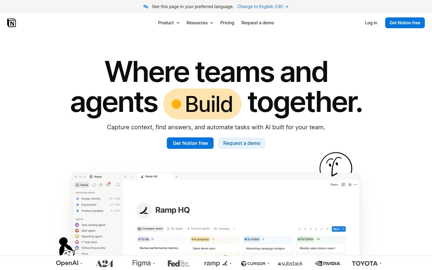
Notion uses a very large black headline with one word, “Build”, set in a pale yellow pill with an orange dot. A blue “Get Notion free” button sits next to a lighter “Request a demo”, so individuals and teams each have a path. Below, a workspace window is cropped by a strip of customer logos, and small hand-drawn doodles add personality. A banner offering the page in English (UK) is a considerate touch for a global audience. Visit Notion.
3. Linear
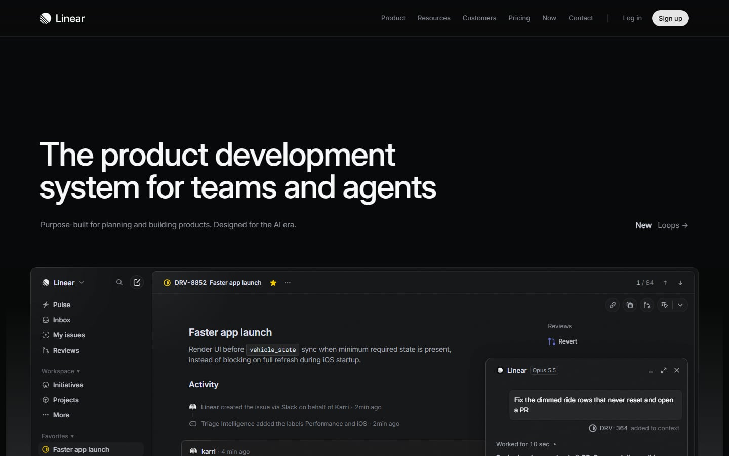
Linear goes dark and quiet. A white two-line headline and one grey sentence sit on near-black, and a large app window appears straight away, showing an issue called “Faster app launch” with an activity feed and an assistant panel. There is no big button in the hero, only a white “Sign up” pill in the header. That suits a tool for people who want to see the product, but it is a risky choice if your visitors need to be told what to do next. Visit Linear.
4. Clockify
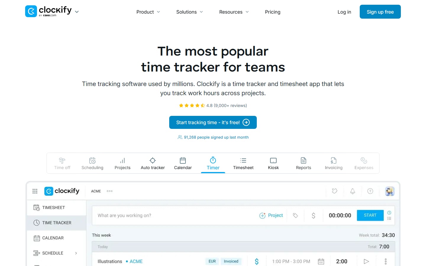
Clockify says what it is in plain words: “The most popular time tracker for teams”. Under the headline sit a star rating from more than 9,000 reviews, a blue “Start tracking time – it’s free!” button and a line saying how many people signed up last month. A row of icon tabs (Scheduling, Projects, Calendar, Timer, Reports and others) sits above a screenshot of the timer, so the first screen works as a small product tour. Visit Clockify.
Make the first step easy
These homepages put the sign-up, or a choice of sign-ups, where the eyes land first.
5. Asana
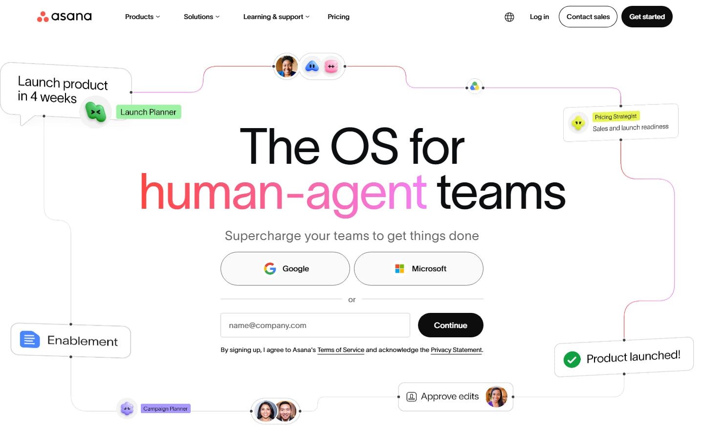
Asana puts sign-up inside the hero. Under the headline there are Google and Microsoft buttons, an email field and a black “Continue” button, so a visitor can start without leaving the first screen. Floating cards joined by thin lines (“Launch product in 4 weeks”, “Approve edits”, “Product launched!”) show a workflow instead of describing one. The headline itself is abstract, so those cards do most of the explaining. Visit Asana.
6. Calendly
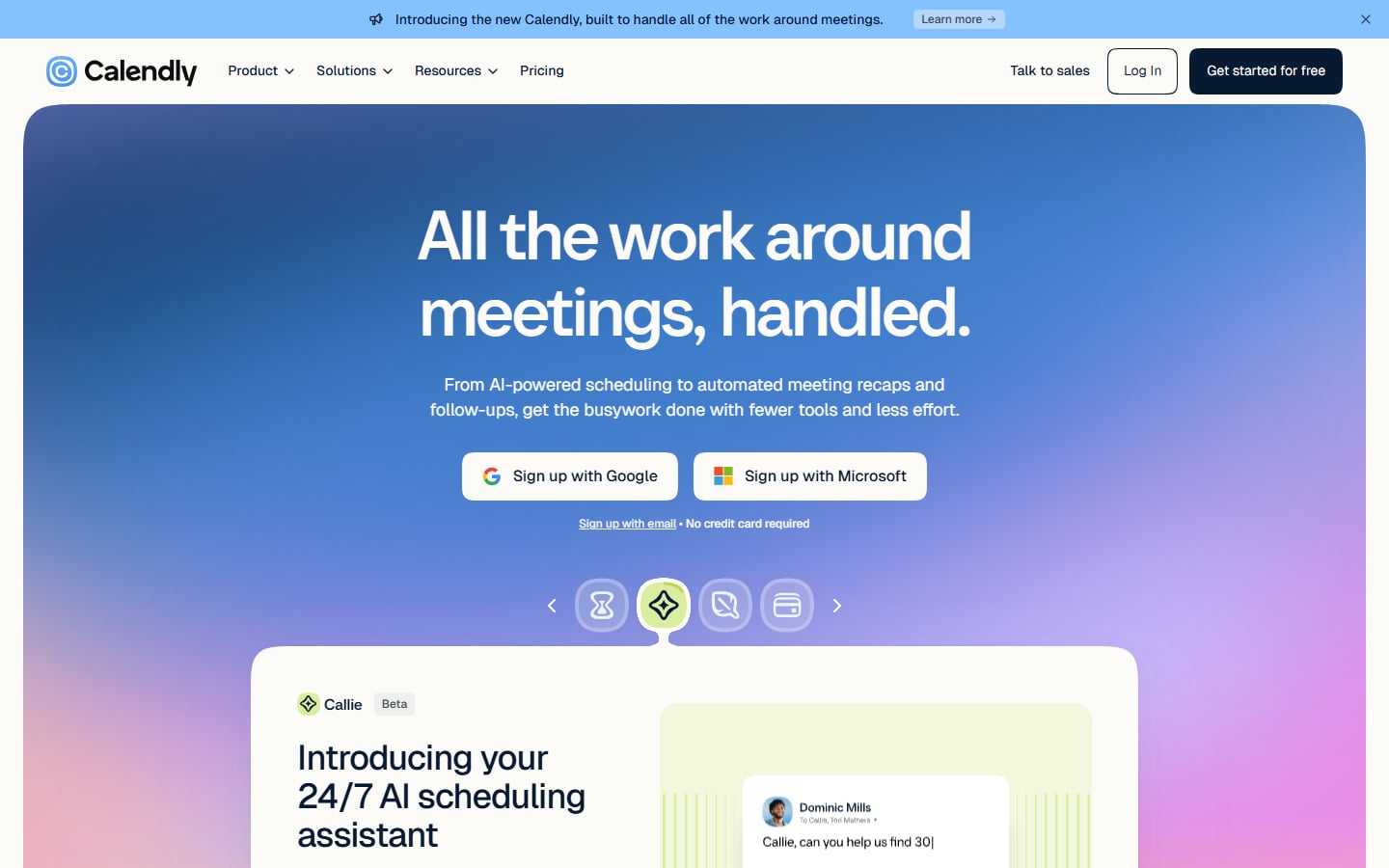
Calendly wraps its hero in a blue-to-pink gradient panel. Under the headline are two white buttons, “Sign up with Google” and “Sign up with Microsoft”, then a small email link and the reassurance “No credit card required”. For a scheduling tool, signing up with the account people already use is the lowest-friction start. A row of four icon tabs below changes the card that introduces Callie, an AI scheduling assistant marked Beta. Visit Calendly.
7. Loom
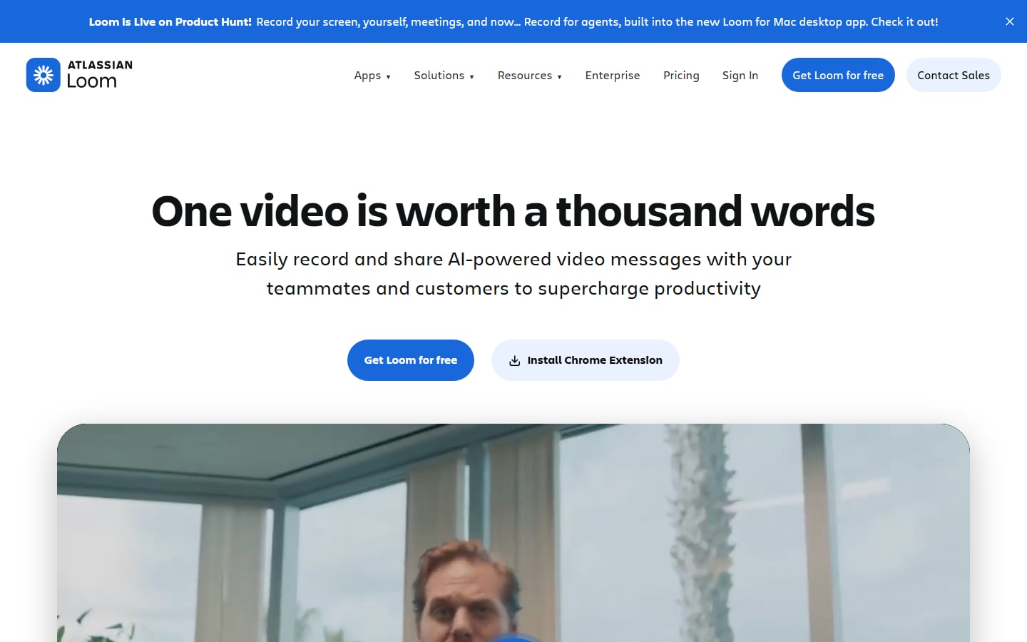
Loom’s hero is mostly white space: a bold headline, one sentence and two buttons. The solid blue “Get Loom for free” is the main action, and a pale “Install Chrome Extension” gives people who prefer to install first a second way in. Below the buttons, a large rounded video frame shows a person talking to camera, which is the product’s own format. A blue banner above the header announces a launch. Visit Loom.
8. HubSpot
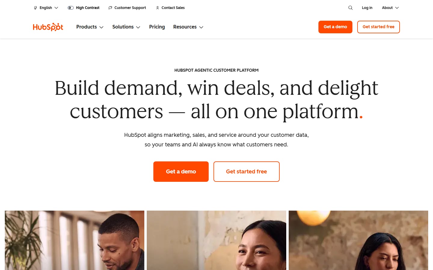
HubSpot offers two clear paths: a solid orange “Get a demo” for buyers who want to talk to someone and an outlined “Get started free” for people who want to try it. The orange full stop at the end of the serif headline is a small brand detail. Utility links above the menu (language, High Contrast, Customer Support, Contact Sales) handle accessibility and help before anyone scrolls. Three close-up portraits start the next section. Visit HubSpot.
Lead with brand, type and proof
Here the headline, the typography and the evidence do most of the work.
9. Typeform
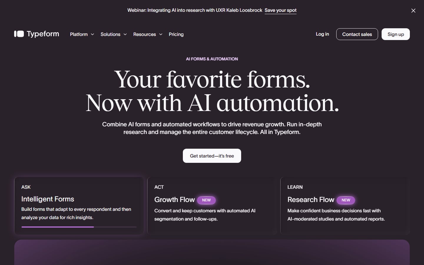
Typeform keeps its personality in the type. A serif headline sits on a deep aubergine background with a single white “Get started – it’s free” button. Three cards underneath, Ask (Intelligent Forms), Act (Growth Flow) and Learn (Research Flow), split the product by job, with “New” tags on two of them. The webinar banner above the header adds noise to an otherwise calm first screen. If cost is a concern, see our cheaper Typeform alternatives. Visit Typeform.
10. Mailchimp
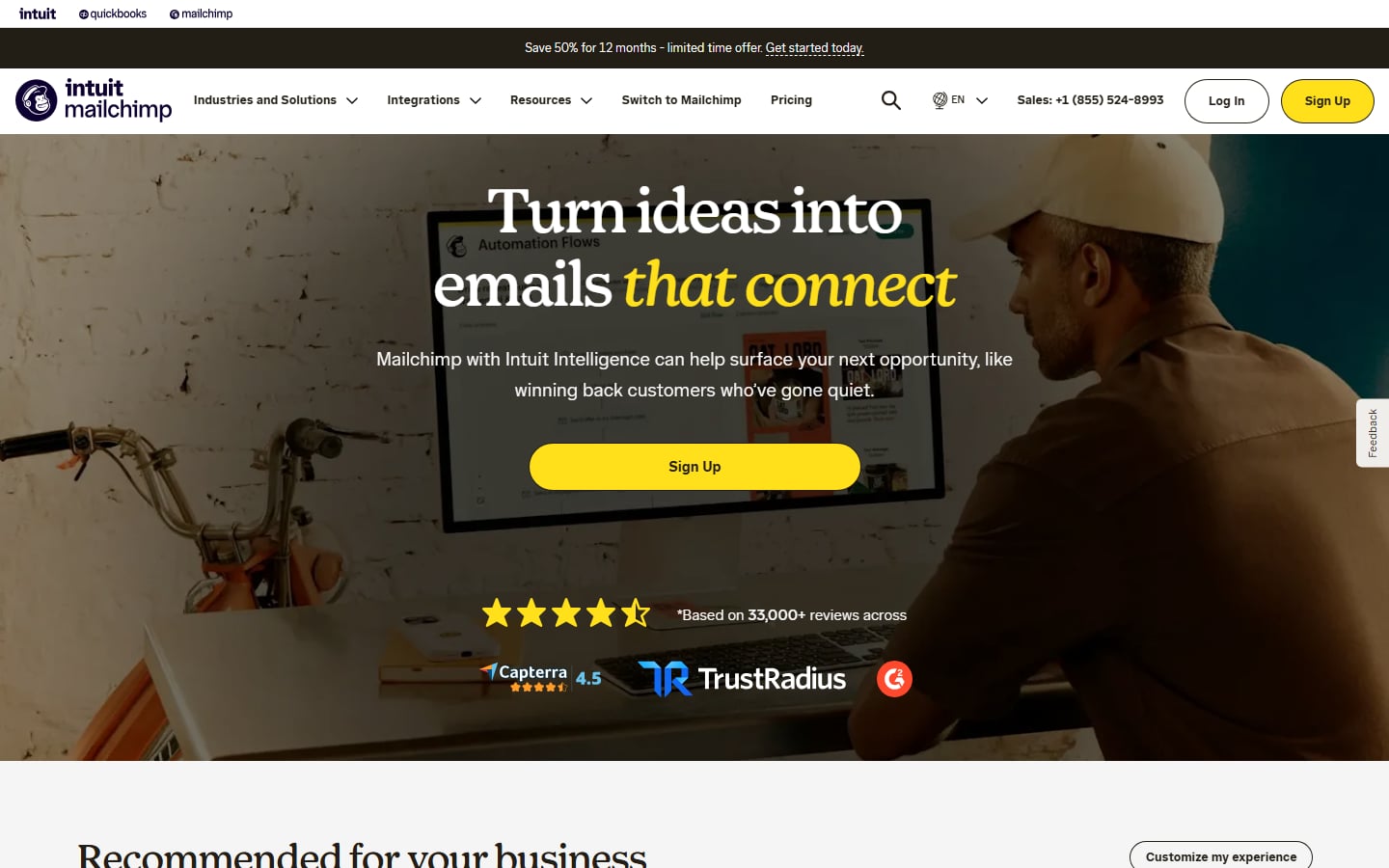
Mailchimp uses a full-width photo of a person at a desk behind a serif headline, with the last words, “that connect”, in yellow italics. One wide yellow “Sign Up” button is the only action, and ratings from Capterra, TrustRadius and G2 sit directly beneath it. A dark bar above the header advertises a limited-time discount, and Intuit and QuickBooks links at the very top show that it belongs to a bigger brand. The photo is darkened so the text stays readable. Visit Mailchimp.
11. Zoom
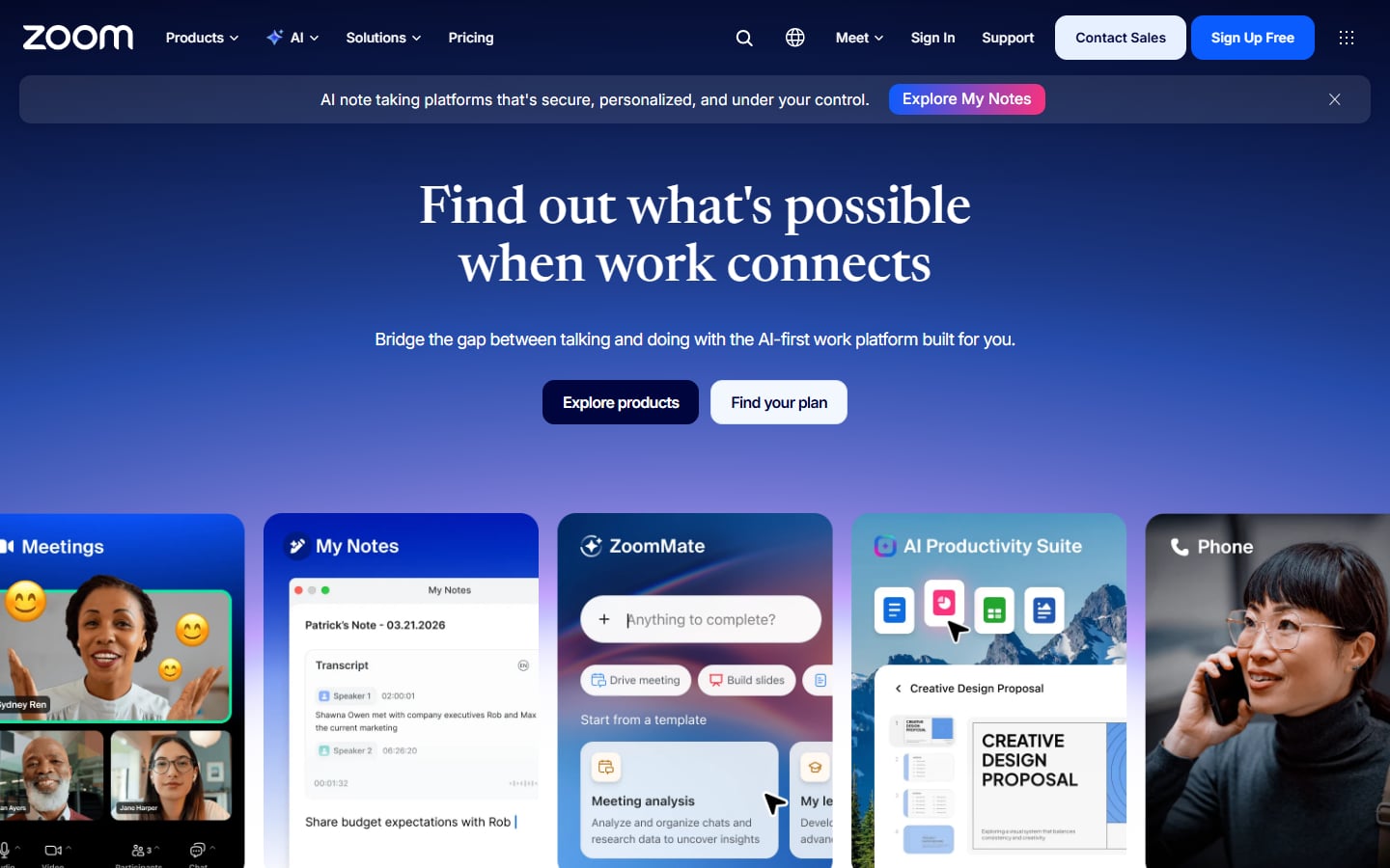
Zoom’s homepage is a deep blue gradient with a serif headline and two buttons, a dark “Explore products” and a pale “Find your plan”. A strip of product cards runs across the bottom of the first screen (Meetings, My Notes, ZoomMate, AI Productivity Suite and Phone), which tells visitors at once that Zoom is more than video calls. The cards are cropped at the edges, which invites scrolling. Visit Zoom.
12. Lucky Orange
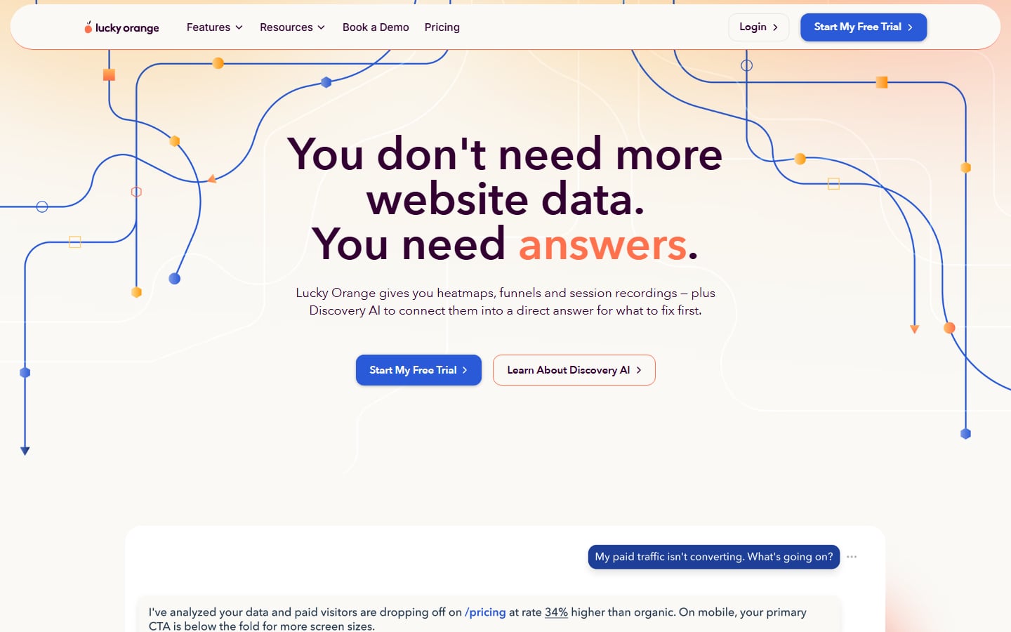
Lucky Orange sells analytics, and the page borrows the look of a user journey: thin blue lines with orange nodes cross a peach gradient. The headline, “You don’t need more website data. You need answers.”, has “answers” in orange, and a blue “Start My Free Trial” button sits next to an outlined “Learn About Discovery AI”. Below, a mock chat asks “My paid traffic isn’t converting. What’s going on?” and starts to answer, a clear way to show what the product does. Visit Lucky Orange.
SaaS website design tips
- Write the headline for a stranger. Say what the product does and for whom. If a new visitor cannot repeat it back, rewrite it.
- Choose one primary button and repeat it. Use the same label in the header, the hero and the closing section so people learn it.
- Show the product in the first screen. Slack, Linear and Clockify all do it. Crop the screenshot so it shows one clear job, not the whole interface.
- Keep proof honest. Logos need permission, ratings need a source and counters need real data. A small, true claim beats a big vague one.
- Choose the hero image with care. Photos work when they show people using the product. Read our notes on hero images before you pick one.
- Design pricing as carefully as the homepage. Show plans side by side, mark one as recommended, answer billing questions on the page and keep the trial button visible.
- Go easy on pop-ups. A chat widget or a banner that covers the sign-up button costs sign-ups. Follow our pop-up design practices if you use them.
- Start from a kit if the budget is small. Our free Adobe XD kit for SaaS gives you a working structure to adapt.
Frequently asked questions
What is SaaS website design?
It is the design of the website that explains, sells and supports a software-as-a-service product. It covers the homepage, feature pages, pricing, sign-up and help content, and it is judged by how many visitors start a trial or book a demo.
What should a SaaS homepage include?
A clear headline, a main call to action, an image or demo of the product, proof such as logos or reviews, a short feature overview, a link to pricing and a simple way to log in. Add a demo option if you sell to larger teams.
How is a SaaS website different from a normal business website?
A business site often asks for a phone call or a quote. A SaaS site asks for a sign-up, and the product itself is part of the sales pitch. That means more weight on product visuals, pricing, trial terms and onboarding.
Can I copy these SaaS website designs?
No. Each site belongs to its company. Use the examples to study layout, copy and calls to action, then have an original design made for your own brand.
Need a SaaS website for a client?
Inkyy is a white label design and development team for agencies. We design and build SaaS websites with homepage, feature, pricing and sign-up pages, and you deliver them under your own brand. See our design services and development services, or book a 15-minute call.