



20 Best CrossFit Logos and Gym Logo Ideas
 8 min read
The best CrossFit logos look as tough as the workouts inside the box. Barbells, kettlebells, badges and bold mascots show up again and again, because a gym logo has to work on a garage door, a chalky T-shirt and a tiny Instagram avatar at the same time.
Below are 20 CrossFit and functional fitness logos worth studying, grouped by style: barbell and kettlebell marks, badges, lettermarks and mascots. For each one we look at what works and which kind of gym it suits, so you can take the ideas, not the artwork, into your own fitness logo.
What a CrossFit logo needs to say
A CrossFit box sells community and hard work more than equipment. The logo is the flag members wear, so it has to feel strong, honest and a little rebellious. Most good examples lean on one of these ideas:
- Equipment as a symbol: a barbell or kettlebell tells people what happens inside before they read a word.
- Badges and seals: round or hexagonal emblems feel like a club you belong to, and they print well on merch.
- Lettermarks: a short monogram becomes a clean icon for apps, socials and chalk bags.
- Mascots: wolves, bulls, warriors and skulls give the community a character to rally behind.
The common traps are clip-art dumbbells that every gym already uses, heavy metal effects that fall apart in one colour, and long names squeezed into tiny type. There is also a legal one. CrossFit is a trademark of CrossFit, LLC, and only licensed affiliates may use the name. CrossFit’s affiliate FAQ sets out naming guidelines for affiliates and says its own logos and slogans cannot be used without prior permission. So design a mark that stands on its own, with the word CrossFit as a secondary line.
20 CrossFit logos for inspiration
The list is split into four groups. Every logo belongs to its designer and its gym, so use them for ideas on shape, type and colour only.
Barbell and kettlebell logos
1. Ground Zero
A heavy kettlebell slams into cracked ground, with small dust clouds puffing out on either side. The impact tells the story of the name, and the single dark slate colour keeps it clean on white. Watch the fine dust details at small sizes, but on a sign or a shirt it hits hard. Design by Kisidar.
2. Sunburst CrossFit
The kettlebell body is a striped sunset in yellow, orange and red, with a rounded orange handle on top. It is friendly rather than aggressive, which suits a box that wants to feel welcoming to beginners. The icon alone would also make a strong app icon. Design by Berin Mršo.
3. Chester Barbell
Two crossed barbells frame a weight plate that holds the founding year, with a laurel wreath underneath and the name arched over the top. Everything is drawn in one even orange line, so it screen-prints in a single colour. A good template for a barbell club or a strength-focused box. Design by Andy Rothwell.
4. Richmond Balance
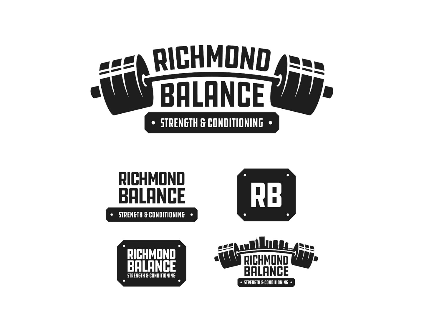
The name sits between two loaded barbell plates, as if the type itself is being lifted. The shot shows the whole family: a main lockup, a stacked version, an RB plate badge and a skyline variant. It is a useful example of how one gym logo grows into a full system. Design by 903 Creative.
5. Evolution Weightlifting
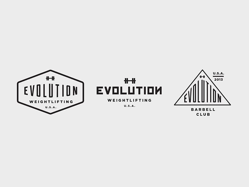
Three versions of one idea: a hexagon badge, a simple wordmark and a triangle badge for the barbell club. A tiny barbell icon above the name is all the equipment it needs. Thin lines and narrow letters give it a vintage athletic feel that suits Olympic lifting clubs. Design by Angie Tomson.
6. Hidden Alley CrossFit
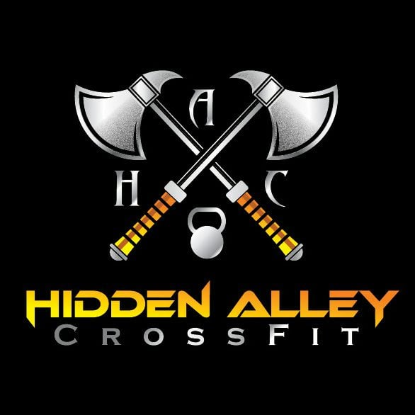
Two crossed chrome axes sit over a kettlebell, with the initials H, A and C tucked around them. The yellow and orange gradient type is loud and confident on black. It needs a flat one-colour version for embroidery and small uses, because the metal effects will not survive there. Design by infernal kiss.
Badge and emblem logos
7. Signal Hill CrossFit
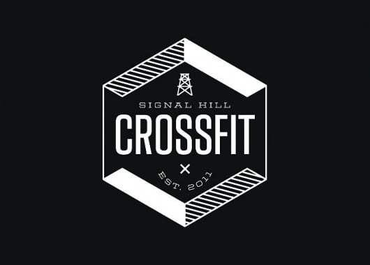
A white hexagon with hatched corners holds a condensed wordmark, a small oil derrick icon and the founding year. It is simple, local and easy to stamp on anything. The hexagon is a quiet nod to the hex plates and hex bars found in most gyms. Design by Bryan Ku.
8. CrossFit Cambridge
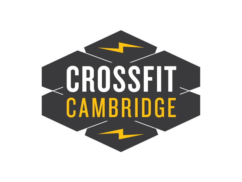
Stacked hexagon shapes in dark grey carry white and yellow condensed lettering, with lightning bolts at the top and bottom. The yellow adds energy without needing a mascot. A solid choice for a box that wants to look sporty and organised. Design by Michael Weinstein.
9. Raise the Bar
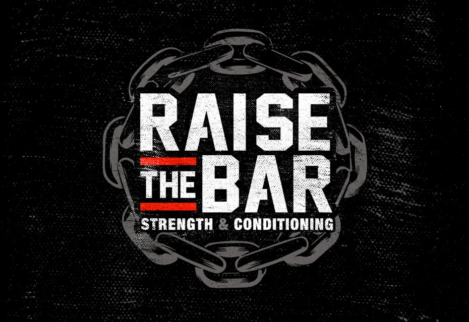
Heavy, distressed lettering sits inside a ring of chain links, with a red bar behind the word “the”. The chain says strength, and the name doubles as a motto members can shout. A good fit for a hardcore strength and conditioning gym. Design by Asael Varas.
10. Forged Barbell Club
A round badge with an anvil resting on a barbell and a small kettlebell under the word “club”. The anvil ties straight back to “forged”, so the badge feels built for this name and nobody else’s. The worn texture suits T-shirts and garage-style boxes. Design by David Elliott.
11. Iron Valley Barbell
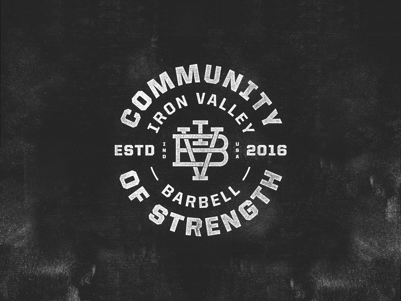
A circular seal with “Community of Strength” around the edge and an interlocking IVB monogram in the centre. It reads like a college athletics crest, which gives a young gym a sense of history. The monogram can also be pulled out and used on its own. Design by ampersandrew.
12. True Grit Kettlebell
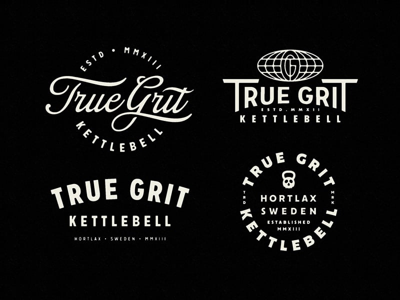
Four lockups for one kettlebell brand: a script version, a condensed wordmark with a globe, a bold stacked version and a round badge with a tiny kettlebell. Each one suits a different piece of merch. It shows how a small fitness logo system keeps a brand fresh without losing its voice. Design by Emir Ayouni.
Lettermark and monogram logos
13. CrossFit Tolland Kids
Slanted white letters burst out of a red ring, with a small TT shield tucked into the corner. The movement and the varsity feel make it fun without looking childish. A smart way to give a kids’ programme its own identity inside a bigger gym brand. Design by Raboin Design Co.
14. CF monogram
A C and an F drawn as one thick, rounded stroke in warm grey. The designer titled it a kettlebell logo, and the round bowl of the C does hint at one. It is quiet and premium, so it suits a boutique studio more than a loud warehouse box. Design by Thalles Borba.
15. YorkFit
A Y and an F merge into one shape, with a navy lightning bolt cut through the middle. Bright green and navy give it the energy of a sports brand. Simple enough to work as an app icon or a small chest logo. Design by Sarah Vargas.
Mascot logos
16. Amber CrossFit
A wolf head becomes the letter A, with a barbell for the crossbar. The negative space trick packs a mascot, a letter and a piece of equipment into one shape. There are more ideas like this in our wolf logos collection. Design by simc.
17. CrossFit Blue Ash
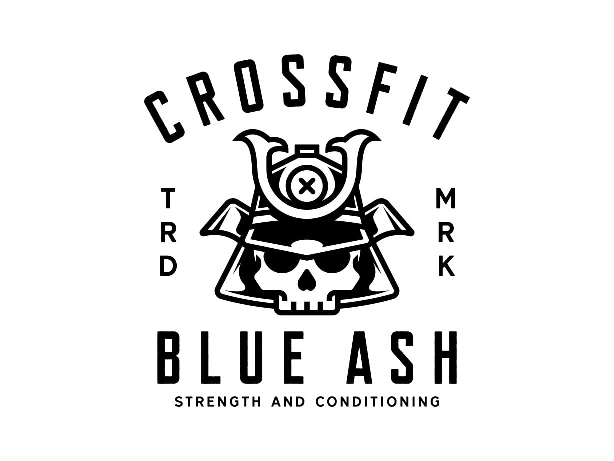
A skull wearing a samurai helmet sits between arched lettering and a tall condensed name, with “TRD MRK” stacked down the sides. It feels like a vintage band tee, which is exactly what members want to wear. Black on white keeps it cheap to print. Design by David Baillie.
18. CrossFit Llantrisant

A geometric bull head with long horns sits above a tall, condensed name and the founding year. The bull says raw power, and the sharp facets keep it modern rather than cartoonish. It works best on dark backgrounds, so plan a reversed version early. Design by Camo Creative.
19. Odin CrossFit
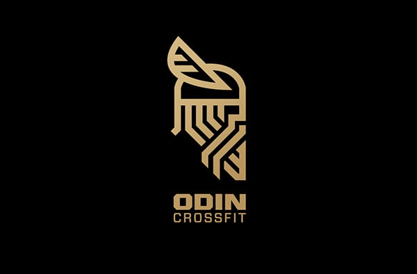
A winged viking helmet and beard are built from parallel gold lines, with the name set below. The line style makes a mascot feel premium and calm instead of aggressive. For more ideas, browse our warrior logos. Design by Seth Sirbaugh.
20. CrossFit Lévis
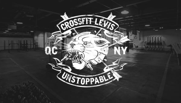
A hand-drawn panther head is crossed by arrows and wrapped in two banners, one with the gym name and one reading “Unstoppable”. It has the detail of a tattoo flash sheet, which makes it great for apparel. It needs a simpler badge for small sizes. Design by Maxime Harrisson.
Tips for designing a CrossFit or gym logo
- Lead with your name, not the brand you affiliate with. Make your own name the hero and set “CrossFit” as a smaller line. If the affiliation ever ends, the logo still works.
- Pick one symbol and give it a twist. A plain barbell is generic. A barbell that forms a letter, holds up an anvil or frames a founding year belongs to you.
- Design for one colour first. Gym logos live on screen-printed shirts, embroidered caps, rubber floors and walls. If it does not work in solid black, simplify it.
- Test it small. Check the mark at 32px for avatars and app icons. Badges usually need a simpler icon-only version.
- Plan a family. You will want a main logo, a stacked version, an icon and a badge, like Richmond Balance and True Grit above. Here is how to plan logo variations.
- Use type with weight. Condensed, bold sans serifs feel athletic and fit long names. Our guide to choosing the right font goes deeper.
- Choose colour with intent. Black and white feels raw, red feels intense and yellow adds energy. Read more about red in branding before you commit.
Badges and crests are a big part of gym culture, so our retro and vintage logos are worth a look too. Before you brief a designer, read the key principles of logo design. And if the gym website is next on the list, our free Power fitness XD template is a quick place to start.
Frequently asked questions
Can I use these logos for my gym?
No. Every design here belongs to its designer and the gym it was made for. Use them for inspiration on style, shape and colour, then have an original logo made for your own box.
Can I put “CrossFit” in my gym name or logo?
Only if you are a licensed CrossFit affiliate. CrossFit is a trademark of CrossFit, LLC, and its affiliate FAQ explains the naming guidelines. CrossFit’s own logos and slogans need prior permission, so your logo should be original.
What makes a good gym logo?
A simple, bold shape that works in one colour, a clear name and one idea that is specific to your gym. It should look as good on a T-shirt as it does on a phone screen.
What file formats does a fitness logo need?
A vector master (SVG, AI or EPS) for signs and merch, transparent PNGs for web and social, a PDF for print, and a small icon version for avatars and apps.
Need a gym logo for a client?
Inkyy is a white label design and development team for agencies. Our in-house brand designers create original logos and full identities that you deliver under your own brand. See our design services or book a 15-minute call.


