


24 Crown Logo Ideas and What Makes Each One Work
 9 min read
A crown logo is the quickest way to tell people a brand sees itself as the best in its field. The crown stands for leadership, quality and reward. You will find it on jewellers, hotels, barbershops, esports teams and streetwear labels.
Below are 24 crown logo designs worth studying, grouped into minimal marks, lettermarks and illustrative concepts. For each one we describe what the designer did and what kind of brand the style suits, so you can take the ideas, not the artwork, into your own project.
What a crown logo says about a brand
- Leadership: “number one in the category” is the oldest message a crown sends. It suits sports teams, agencies and any brand that wants to sound confident.
- Luxury and quality: gold, fine lines and serif type push a crown towards jewellery, fashion, spirits and hospitality. Our luxury logo ideas show the same codes in other symbols.
- Reward and celebration: awards, events and loyalty programmes use the crown to say “you won”.
- Attitude: a rough, hand-drawn or tilted crown says swagger rather than royalty, which is why streetwear and music brands love it.
The common traps are easy to spot. The stock five-point crown looks like clip art, so it needs a twist to be ownable. Fine detail and thin jewels disappear on embroidery and favicons. And a crown on a brand that has no reason to claim the top spot can feel like borrowed prestige.
24 crown logo ideas
The logos are grouped by approach: minimal crown symbols first, then crowns built into letters, then wordmarks, illustrations and concept marks that pair the crown with a second idea.
Minimal and geometric crown logos
1. Brush-stroke crown by Asif Iqbal
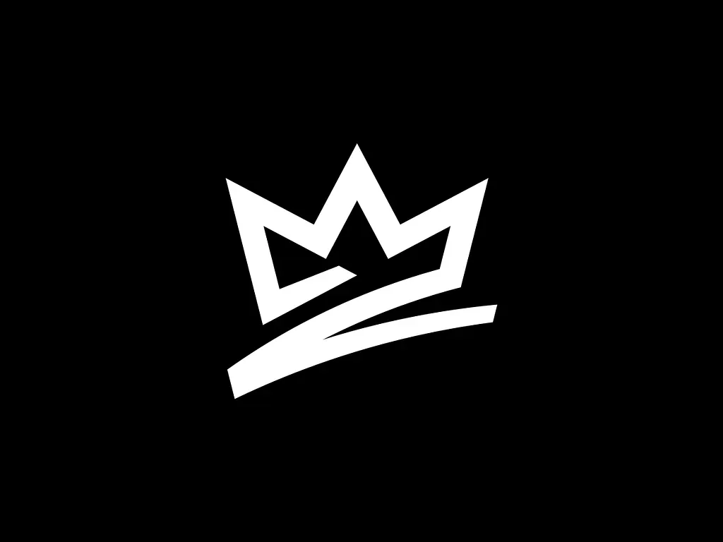
The crown is drawn as a single thick, angular stroke that sweeps into a swoosh along the base. It feels fast and hand-made, closer to a signature than a royal emblem. That energy suits sportswear, fitness brands and music labels that want a crown without the formality.
2. Jewelled line crown by Emir Ayouni
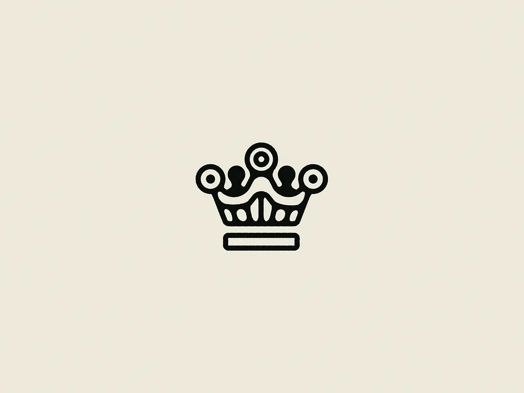
A chunky black outline with ring-shaped jewels on the points and a separate bar for the base. The even line weight keeps the detail tidy, and the round jewels make it friendly rather than stiff. It would sit well on a jeweller’s packaging, a bakery or a boutique hotel.
3. Dotted gold crown by Lazar Bogicevic

The crown is built from gold dots of different sizes, so it sparkles like scattered jewels or confetti. A good direction for jewellery, events and celebration brands. The catch is size: the smallest dots will merge when the mark is printed very small.
4. Crown of people by Pamungkas Creative
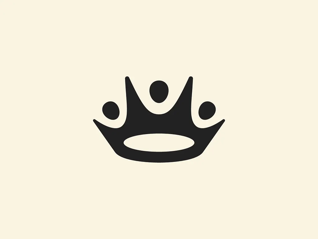
A solid black crown with round tips that double as heads, so the points read as three people with their arms raised. It turns a symbol of rank into a symbol of a team. That makes it a strong fit for awards, community projects, recruitment and coaching brands.
5. Engraved gold crown by Dlanid
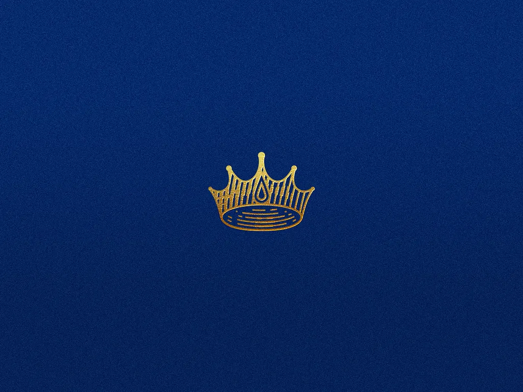
A fine, engraved-style crown in gold with a teardrop jewel at the front, shown small on a textured royal blue background. It looks like foil pressed into paper. Heritage brands, hotels, wedding stationery and premium spirits could use this style, as long as there is a simpler version for small screens.
6. Looped crown badge by Sandro Laliashvili
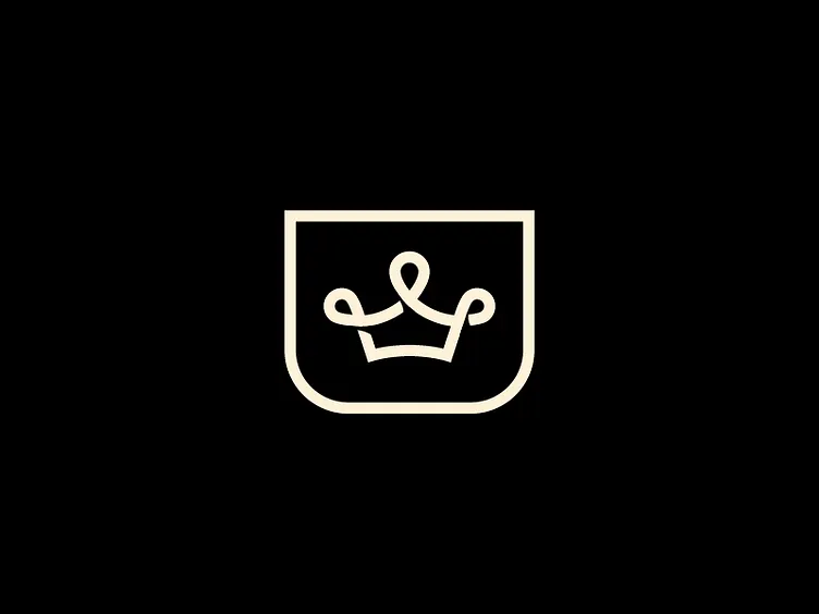
A crown drawn with one continuous cream line that curls into loops, framed by a rounded shield. The loops give it a handwritten, playful feel. It suits a barbershop, a café or a small fashion label that wants a badge for signs, cups and stamps.
7. Gold blade crown by Aditya Dwi
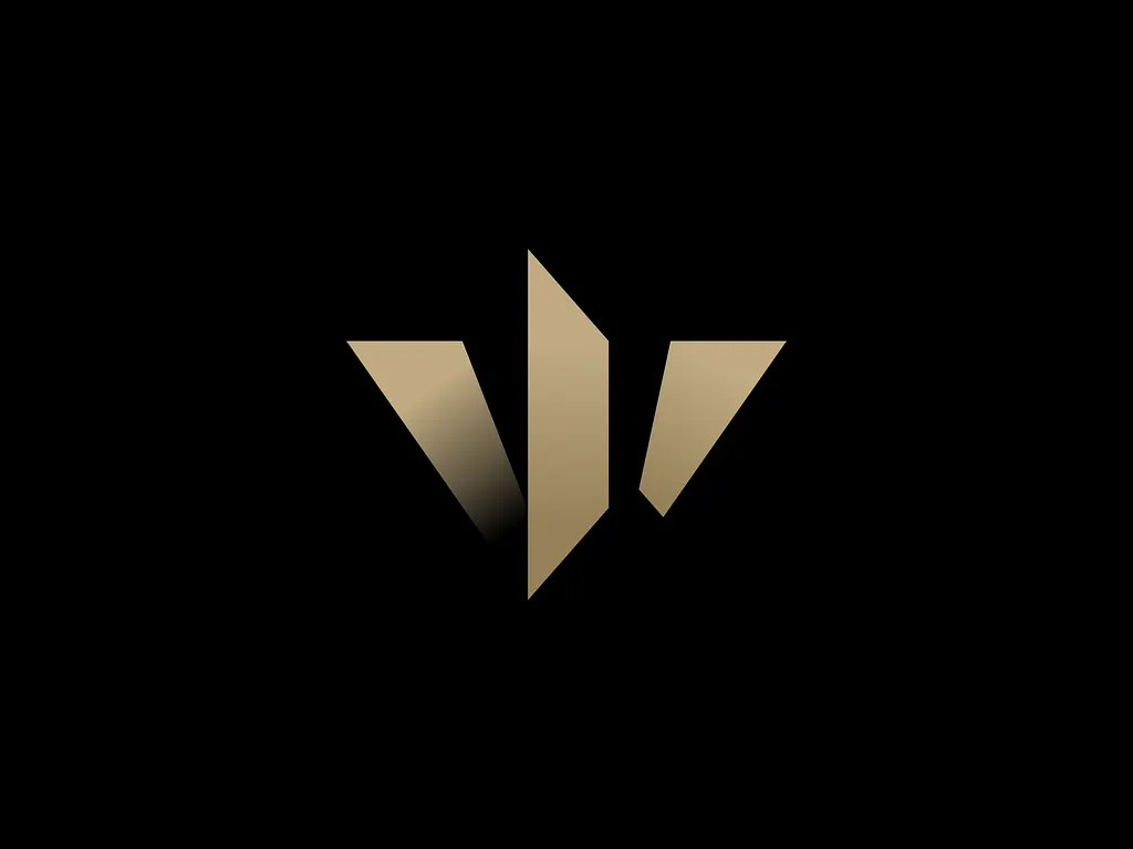
Three angled gold shards, with the middle one tallest, form a crown that is only suggested. A soft gradient shadow adds depth without extra shapes. This level of abstraction suits fashion, finance and luxury brands that want a premium mark that is not a literal crown.
8. Petal crown by Or Eitan
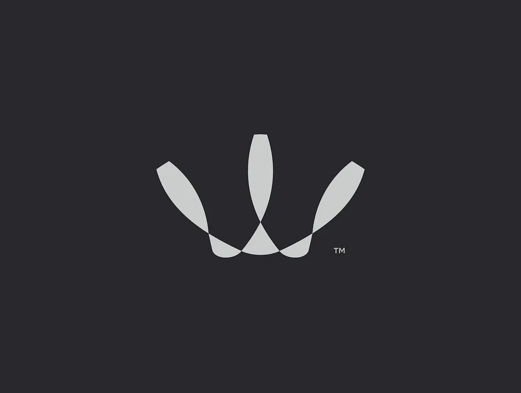
Three tapered, rounded shapes fan out from a single point, and where they overlap they leave a small triangle. The shapes read as a crown, a flower or a W depending on how you look. A soft, flexible mark for beauty, wellness or a lifestyle brand.
9. Navy and gold geometric crown
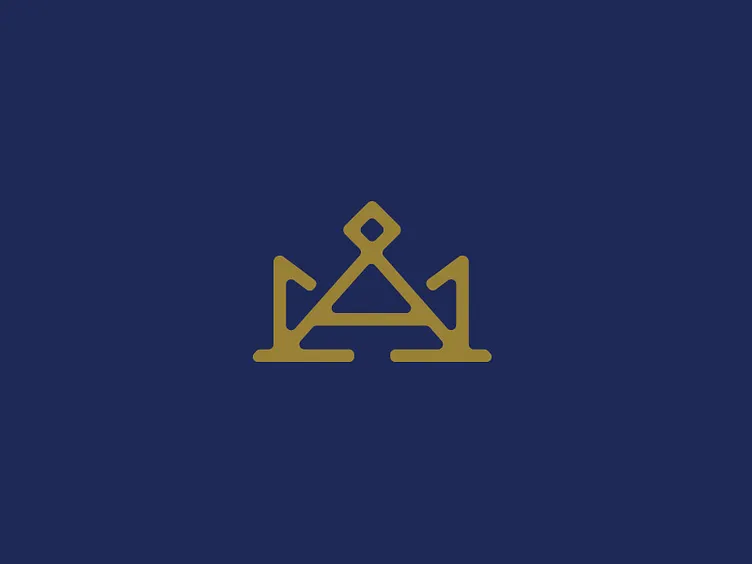
A gold monoline crown built around a central triangle, with a small diamond on the top point and hooked side prongs. It also hints at the letter A. Navy and gold is a classic pairing for law firms, private banks and members’ clubs.
Crown lettermarks and monograms
10. K crown by Masum Billah
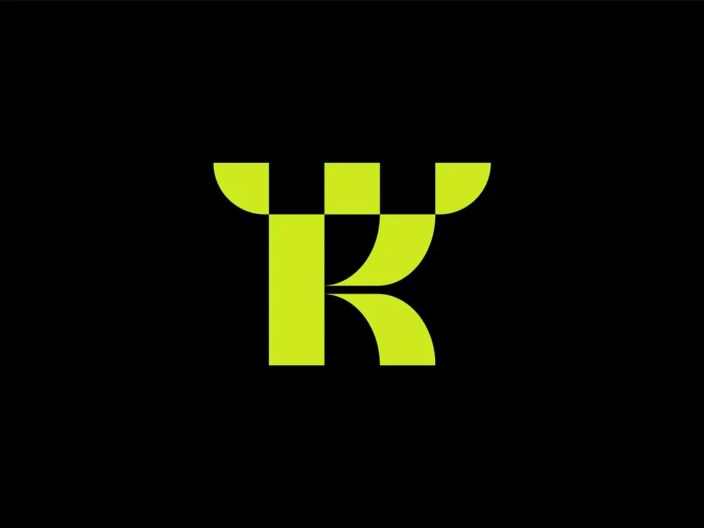
A lime green letter K built from blocks, with a top row that steps like a chessboard and reads as crown points. The bright colour on black keeps it loud and modern. It would work for a gaming brand, a chess app or a sports team whose name starts with K.
11. Crown shield monogram by Sabuj Ali
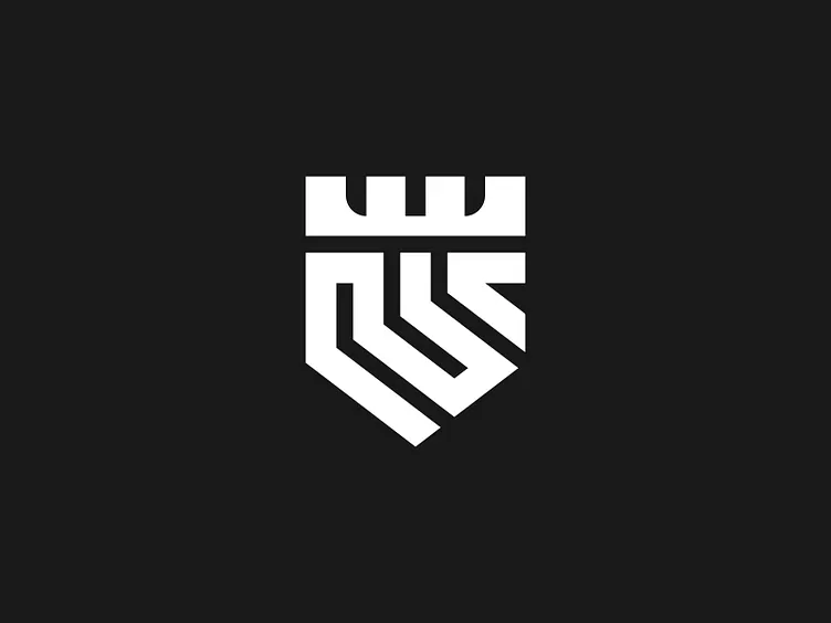
The top edge of the shield is cut into crown notches, and a thick white line folds back and forth inside it like a maze. Everything is one weight, so it stays bold at any size. A good fit for security, construction or a sports club that needs a crest without heraldic detail.
12. Crown and house by Galmadans
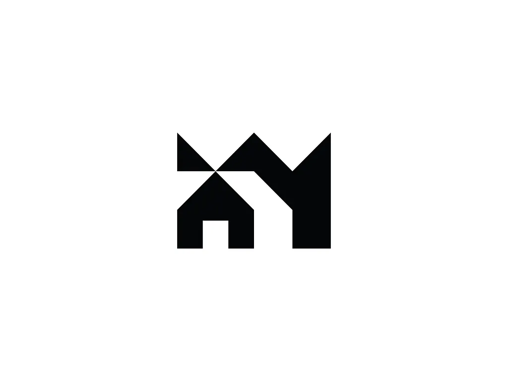
The outline forms three peaks like a crown, and a small house with a door is cut into the lower left. The shapes also suggest the letter M. A smart idea for a real estate agency or property developer that wants to say premium homes in one shape.
13. Crown C shield by Bojan Sandic
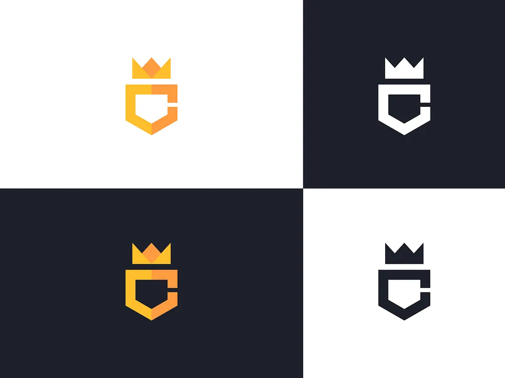
A letter C shaped like a shield with a small three-point crown on top. The shot shows it in four colourways on light and dark backgrounds, which is exactly how a logo should be tested. It suits gaming, coaching or any brand whose name starts with C.
14. M crown by Catalin Podaru
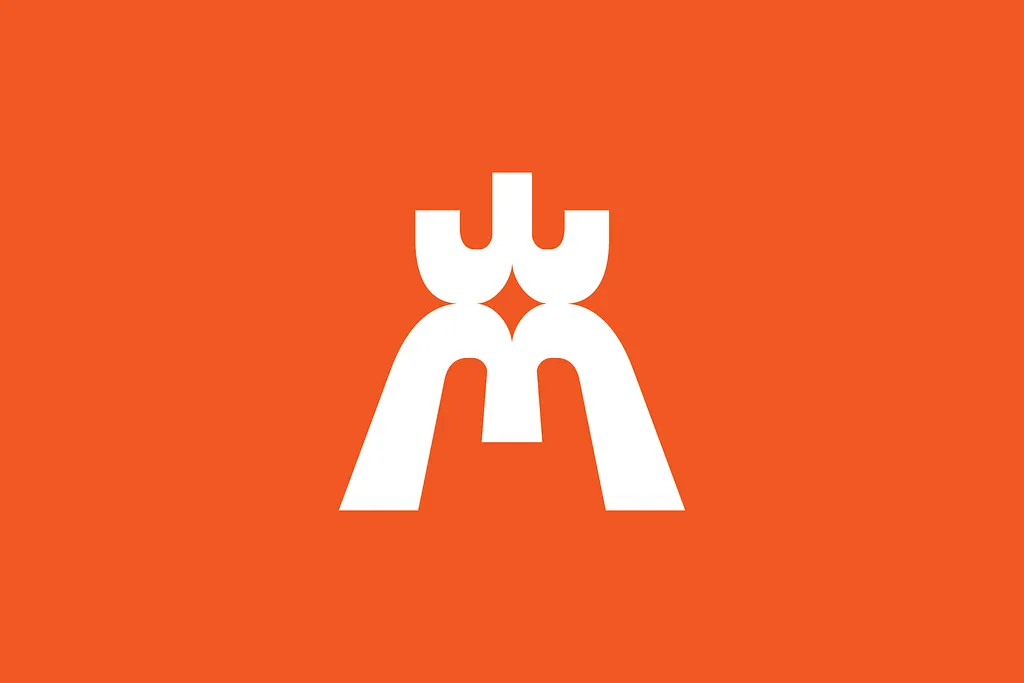
The top of a white M curls into a three-prong crown, and a four-point star sits in the negative space where the two halves meet. It reads as an M, a crown and a gateway at once. The bright orange and rounded shapes suit a friendly consumer brand, a festival or a kids’ product.
15. M and W crown by N.W. Gunarsa
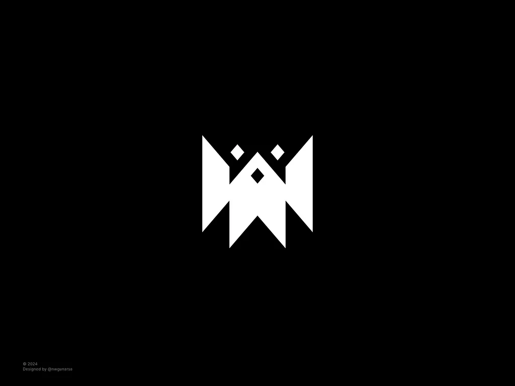
An angular white mark that reads as an M on top and a W below, with three diamond cut-outs that sit like jewels. The symmetry makes it feel solid and official. It would suit a brand with M or W initials, from a law practice to a streetwear label.
16. R crown by Faiz Ahmad

A white monoline R with an open yellow crown sitting on top, shown over a photo of a glass office building. Matching line weights tie the letter and the crown together. That presentation points straight at real estate, property management or consulting firms.
Crown wordmarks, illustrations and concept marks
17. The King’s Cellar by Matt Higgins
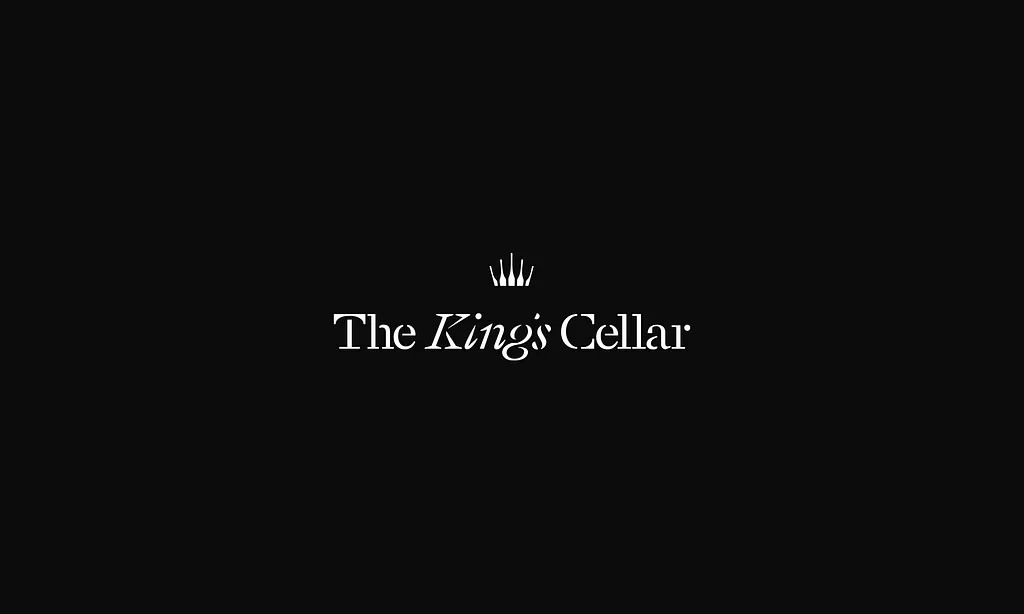
A white serif wordmark with an italic “King’s” and a tiny thin-line crown above it. The crown is an accent, not the hero, which keeps the logo calm and grown up. A good model for a wine bar, restaurant or bottle shop where the name already does the royal work.
18. Crowned queen by Lucian Radu
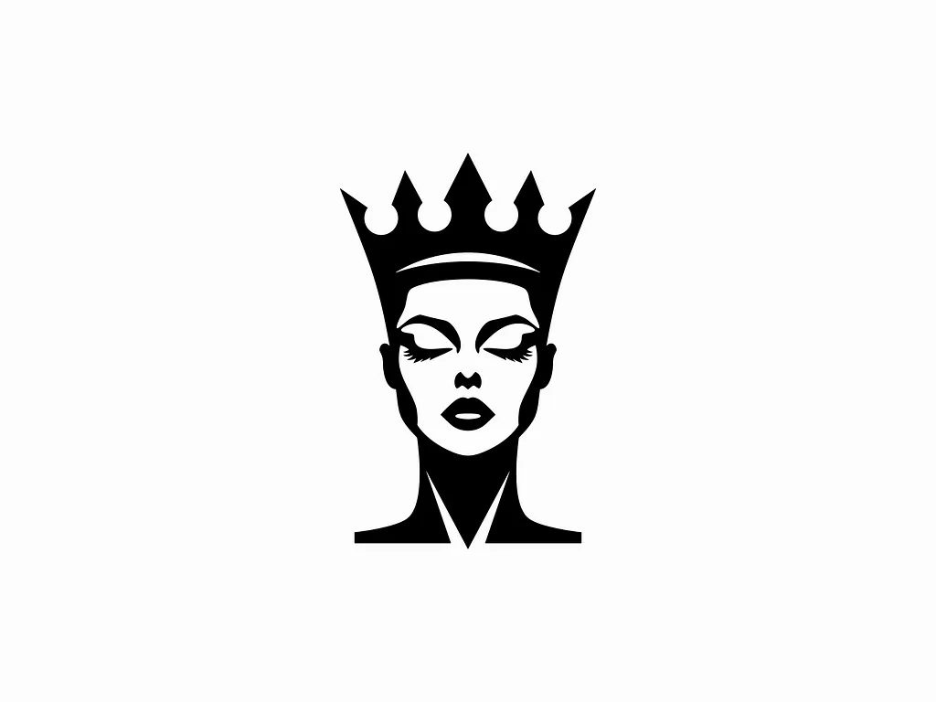
A woman’s face with closed eyes and a tall pointed crown, drawn in solid black with the features cut out in white. It is a strong silhouette that still works in one colour. A natural fit for beauty salons, cosmetics and fashion brands with “queen” in the name.
19. Crown banner by Alen Pavlovic
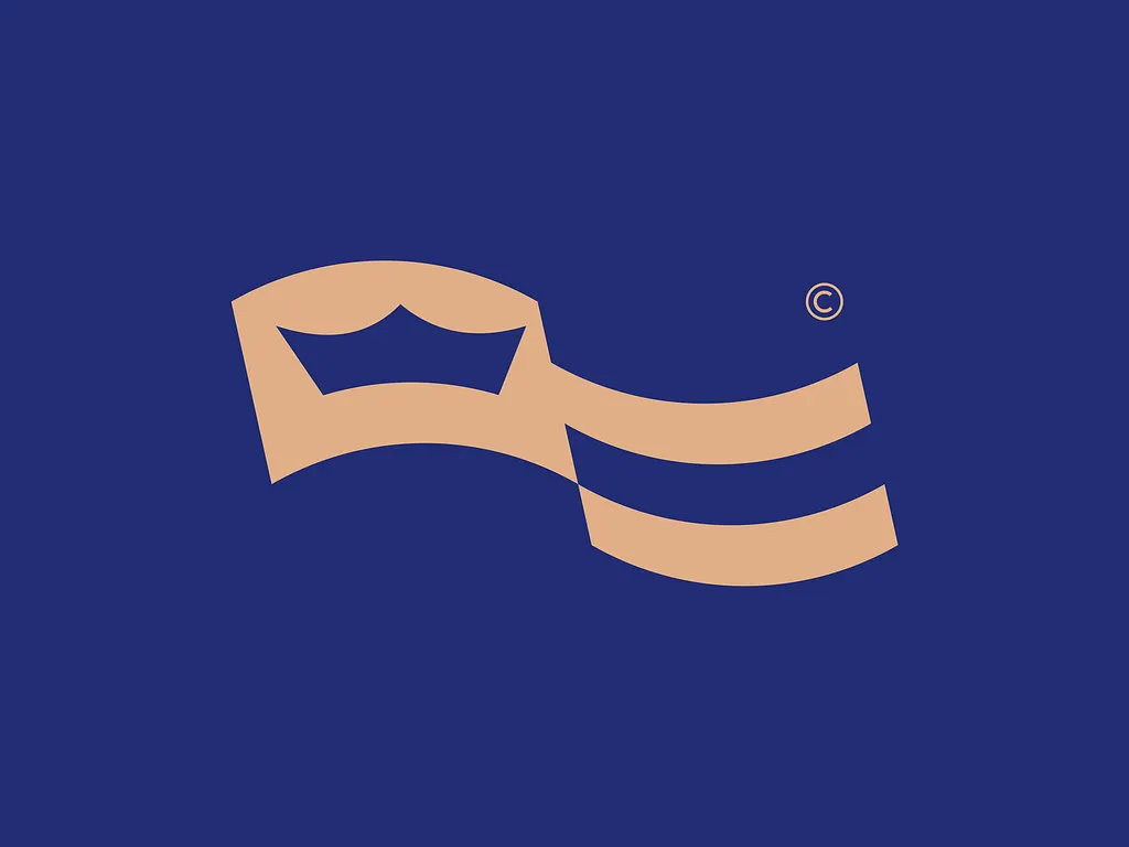
A tan ribbon folds like a waving flag, with a crown cut into the first fold and two wave lines after it. The movement makes the crown feel light rather than heavy. It could work for a coastal hotel, a sailing club or a seafood brand.
20. Gremillion by Peter Giuffria
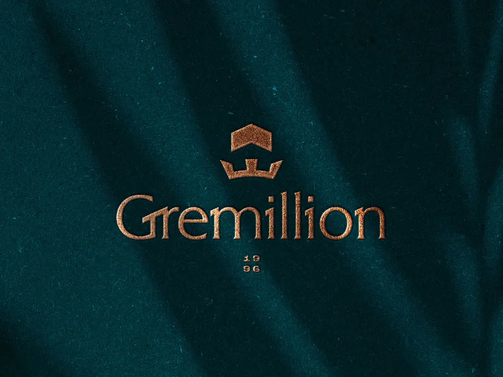
Designed for Gremillion Homes, a custom home builder, this logo puts a small crown with a roof shape above a soft serif wordmark, shown in copper foil on dark green paper. A good reference for builders and architects who want to look premium. See more of his work on Dribbble.
21. Esports crown by Josew Design
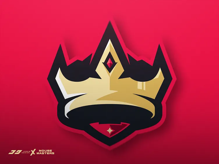
A gold crown with a red diamond, thick black outlines and a red shield behind it, credited in the corner to Josew Design and Mouse Masters. The sharp points and glossy highlights are classic esports style. Built for gaming teams, streamers and tournaments, where it has to read on jerseys and dark overlays.
22. Crown leaf by Kakha Kakhadzen
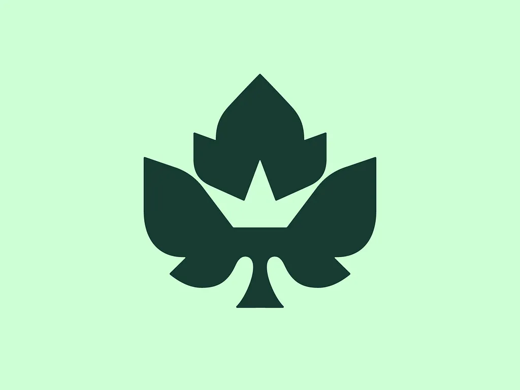
A dark green leaf with a three-point crown cut into its centre in negative space. You see the leaf first and the crown a moment later, which makes it memorable. It suits a garden centre, an organic food brand or a vineyard going for a premium feel.
23. Leaning tower of crowns by Buqancreative
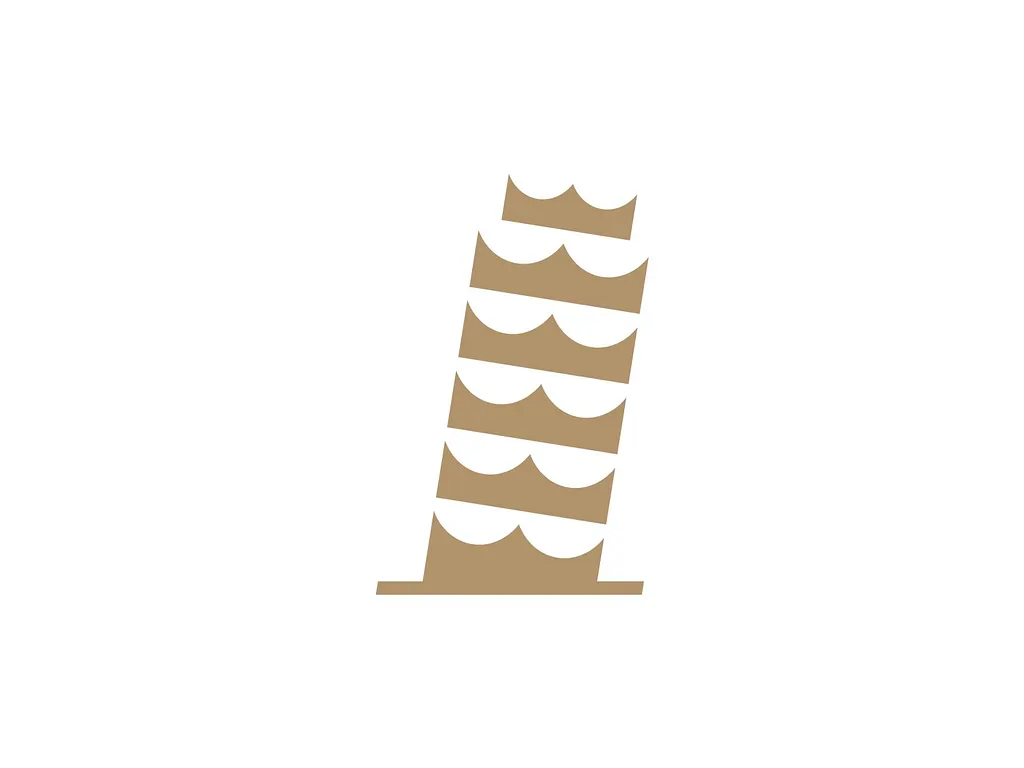
The Leaning Tower of Pisa, built from a stack of tan crowns. A perfect concept for an Italian restaurant, a pizza brand or a travel company focused on Italy.
24. Crowned skull by Cam Hoff
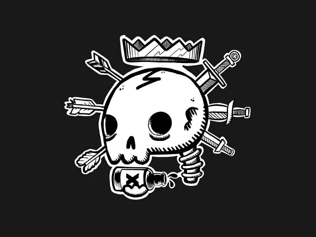
A hand-drawn skull wearing a jagged crown, pierced by arrows and swords, with a poison bottle underneath. The thick white outline makes it work as a sticker or a print. It is pure attitude, right for streetwear, tattoo studios, skate brands and band merch, and wrong for anything corporate.
Tips for designing a crown logo
- Give the crown a second job. The most memorable logos here make the crown do two things: people with raised arms, a house roof, a leaf, a letter or the Tower of Pisa. A double meaning is what turns a common symbol into an ownable one.
- Count the points. Three points read faster at small sizes than five or seven. If you need more detail, keep it for the large version.
- Test it in one colour. Crowns often end up foil-stamped, embossed or embroidered. If the mark falls apart in solid black or white, simplify it.
- Match the type to the crown. A fine-line crown needs a refined serif, and a heavy crown needs a sturdy typeface. Our guide to font pairing can help.
- Choose colour on purpose. Gold and black feel premium, navy and gold feel established, and purple has a long link with royalty. A bright colour, like the lime K or the orange M above, makes a crown feel modern.
- Plan the variations. You will need the full lockup, the crown on its own and a one-colour version. Here is how to plan logo variations.
Want more ideas? Browse our collections of lion logos, esports mascot logos and real estate logos, or read the key principles of logo design.
Frequently asked questions
What does a crown logo symbolise?
Mostly leadership, quality, reward and power. Depending on the style, it can also say luxury and heritage, or attitude and confidence.
Can I use these crown logos for my business?
No. Every design here belongs to its designer or their client. Use them for inspiration on shape, style and colour, then have an original crown logo made for your brand.
How do you make a crown logo unique?
Combine the crown with something specific to the brand: an initial, a product, a place or an idea. Then simplify the shape until it still reads at favicon size.
What colours work best for a crown logo?
Gold with black or navy is the classic choice for luxury. Purple and deep red lean royal. For a modern or playful brand, a single bright colour on a dark or light background works well.
Need a crown logo for a client?
Inkyy is a white label design and development team for agencies. Our in-house brand designers create original logos and full identities that you deliver under your own brand. See our design services or book a 15-minute call.


