



24 Feminine Logo Designs for Inspiration, Grouped by Style
 9 min read
A feminine logo is not a pink logo with a flower on it. The best ones use type, line weight, colour and shape to feel graceful, warm or personal, and they work just as well for a coaching business or a bakery as for a beauty brand.
Below are 24 feminine logo designs grouped by style: script and signature logos, floral and botanical marks, faces and figures, and soft monograms. For each one we note what the designer did well and what kind of brand the style suits, so you can borrow the thinking rather than the artwork.
What makes a logo read as feminine
People read gender cues in a logo very quickly, usually from a handful of design choices rather than from any one symbol:
- Type: high-contrast serifs, thin sans serifs with wide spacing, and flowing scripts feel lighter and more personal than heavy, condensed type.
- Line weight: thin, even lines read as delicate and careful. A female logo can still feel strong, as the warrior in design 18 shows, if the idea is bold even when the line is fine.
- Colour: blush, terracotta, plum, sage, gold and soft neutrals are common. Pink is only one option, and our guides to pink in branding and purple in branding explain what each shade signals.
- Shape: curves, circles, arches and organic forms soften a mark. Sharp angles and heavy blocks push it the other way.
The common traps are clichés: a generic woman silhouette, a lipstick, a high heel, or pink used because the audience is female. Those logos look like templates and age fast. The examples below avoid them by tying the cues to the business.
24 feminine logo ideas by style
The designs fall into four styles. Numbers run across the whole list, so you can jump straight to the style that fits your brand.
Script and signature feminine logos
1. Limitless
A loose navy brush script sits inside a watercolour wreath of roses and eucalyptus, with a small tagline in spaced capitals underneath. The dark script keeps it readable, while the soft wreath adds warmth. It suits a coach, blogger or personal brand, but the watercolour detail needs a simpler version for small sizes.
2. Maizymoo & Lyric Too
A hand-drawn mason jar holds the name in bouncy script, with small leaf sprigs either side of the ampersand. One colour of black ink makes it cheap to print on labels and stamps. A good fit for a home bakery, preserves or a handmade gift shop. Designed by El Maestro.
3. Libbs Lashes
Dark brown script with high-contrast strokes sits next to a detailed eye with long lashes, so the service is obvious at a glance. The blush background and brown ink feel warm rather than sugary. Right for a lash bar or brow studio. Designed by CoffStudio.
4. The Papery
A single line of grey handwriting with long swashes on the “T” and the “y”. There is no icon at all, which works because the lettering has enough character on its own. It would suit a stationery shop, wedding invitations or a calligrapher. Designed by Berlina.
5. Laura Piper McGrath
The initials “lpm” are written like a quick signature, then the full name and “Coaching” follow in thin spaced capitals. Copper on black looks premium without any ornament. The designer made it for a coaching business that helps professional women, and the style suits consultants and personal brands in general. Designed by Bojana..
6. Just Beautiful
A dark green “jb” monogram in one continuous script line, set inside a thin blush circle with the name and a small leaf. Green and pink together feel fresh rather than sweet. It was made for a women’s boutique selling maternity and western wear. Designed by Wanderleaf Design.
Floral and botanical feminine logos
7. Gold lotus
Five pointed leaves drawn in a single gold line form a lotus, shown as foil on textured paper. It has no wordmark, so it works as an icon for packaging, stamps and social avatars. A natural fit for skincare, yoga or a spa. Credited to Ema Andrea, via Pinterest.
8. The Curated Kitchen

Thin gold serif capitals, a small script “the” and “kitchen”, an olive branch and a fine open frame on deep plum. The dark background makes the gold feel rich instead of pale. It suits a caterer, a food stylist or a cookery school. Designed by Becky Lord Design.
9. S & B floral monogram
Two serif initials in terracotta sit either side of a hand-drawn flower stem, all on a blush background. The rust colour gives it more grounding than a pale pink would. It was drawn for a wedding invitation and works for couples, florists and event planners. Designed by Kayla Dzambo.
10. Black Orchid
The orchid is built from a few rounded, symmetrical petal shapes, shown in blush pink and as a black outline. Paired with a clean sans serif name, it looks feminine without any script. A strong direction for a cosmetics line, a nail studio or a modern florist. Designed by Oanna Turta.
11. Messy Pretty
A loose bouquet of wildflowers sits between the word “messy” in script and “PRETTY” in serif capitals. The mix of a casual script and a formal serif matches the name perfectly. It was made for a shop selling gifts for women by female artisans. Designed by Wanderleaf Design.
12. The Flower Market
A circular badge with an engraving-style bouquet in a jar and serif lettering around the ring, all in one shade of teal. Ideal for a florist, a farmers’ market stall or a garden shop. Designed by austinminded.
Feminine logos with faces and figures
13. Belle à Nouveau
A red-haired woman in profile, framed by a ring of flowers and the name in tall lettering, in the style of an Art Nouveau poster. The mustard, teal and copper palette feels vintage and confident. Best for a beauty or fashion brand with a story to tell, and it needs a simpler mark for small uses. Designed by Agnesema.
14. Woman head logo
A calm face sits in a circle of hair drawn as ornamental swirls, all in a single olive green. Using green instead of pink points towards nature and wellbeing. It suits natural skincare, a herbalist or a hair salon. Designed by Veronika Zuvic.
15. Minnie Jean Cookies
A smiling woman with a vintage hairstyle in an oval frame, with the name in bold slab lettering below. The three colourways show it holds up in blue and gold as well as brown. Perfect for a family bakery that wants to feel homely and real. Designed by SHANAShay.
16. Pure Avidity Salon
A line-art woman with full curly hair sits inside the tagline “a safe place for curls”, above the name in spaced capitals. It is shown in teal on white and gold on black. The hair is the point, so it speaks straight to its audience: a stylist who specialises in natural curly hair. Designed by vraione.
17. Sacred Matrescence
A fine line drawing of a pregnant woman sits in a pale pink arch, above “sacred” in script and “MATRESCENCE” in small serif capitals. The thin line feels gentle and personal, which matters for a service this intimate. Made for a birth and postpartum doula. Designed by Sign.Yra.
18. Here’s Towanda
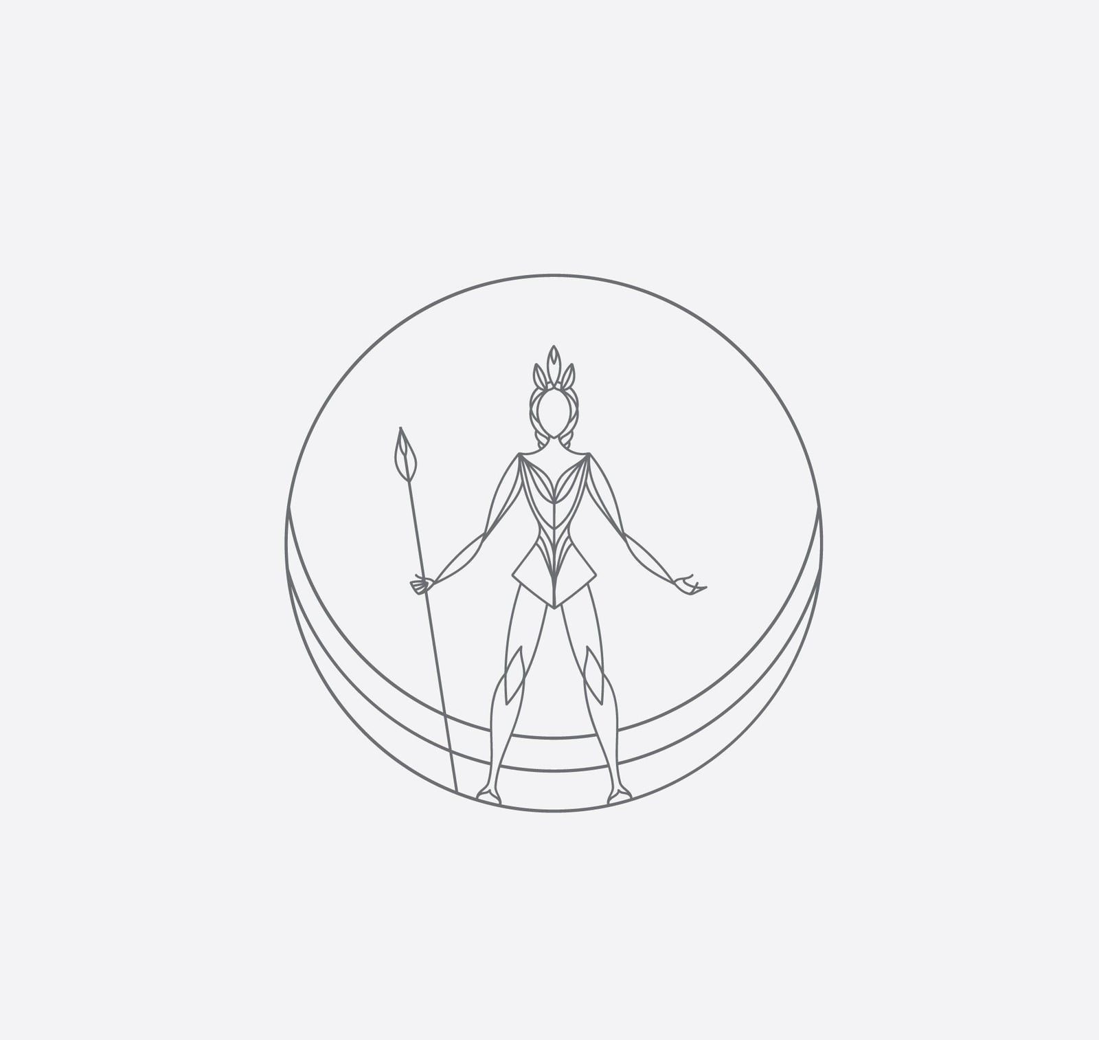
A woman warrior with a spear, drawn in one thin grey line inside a circle. It shows that a feminine logo can feel strong and still use a light, delicate line. A good fit for a women’s network, a self-defence class or a campaign brand. Designed by Moxie Mason.
Soft monograms and minimal feminine logos
19. Q Beauty
Two overlapping rings form the monogram, with “Q·BEAUTY” in thin, widely spaced capitals underneath. White on black keeps it sharp and unisex, while the round shapes keep it soft. Ideal for a beauty brand that wants to look clean and modern. Designed by Panter.
20. Provogue
A coral line pattern of stars and stripes fills a circle, like a decorative tile, with a serif name and the tagline “Taste matters”. It proves that geometry can feel feminine when the line is thin and the colour is warm. It suits a deli, a pattern-led fashion label or a homeware brand. Designed by Magdalena Witczak.
21. Florencia
The name is broken into three rows of thin white capitals inside a square frame, on a dusty pink. A smart choice for a boutique, a café or a lifestyle brand. Credited to the studio Designed by Stella, via Pinterest.
22. Sillage
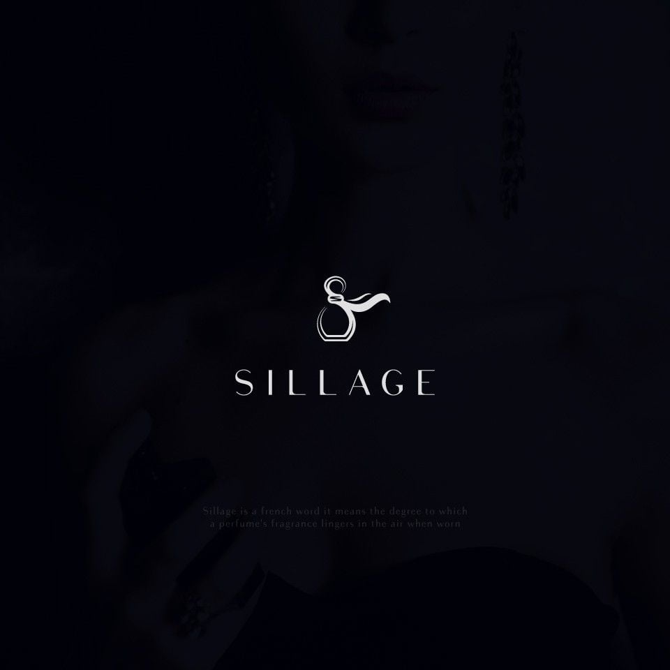
A perfume bottle drawn to look like an ampersand, with a wisp of scent trailing from the cap, above thin spaced capitals. The double meaning makes a tiny mark memorable. Proposed for a perfume brand, and the idea would carry over to any fragrance or candle line. Designed by merci dsgn.
23. S&S Industries
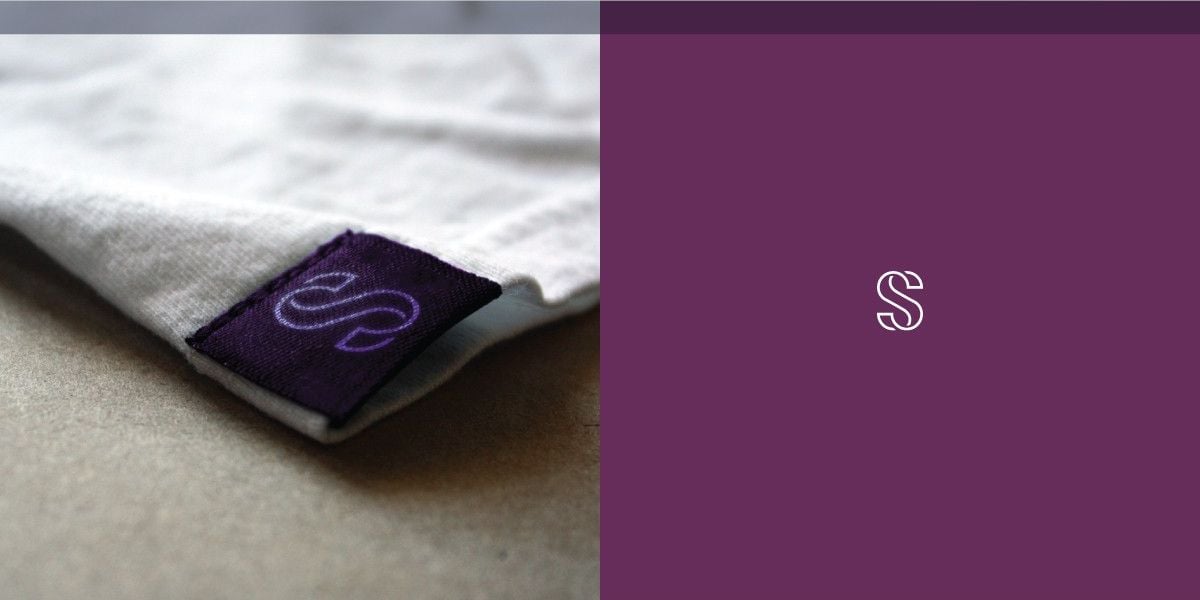
A single “S” drawn in parallel thin lines, shown in white on plum and woven into a clothing label. The designer notes that the line work echoes bra underwires, which is what the company makes. Designed by ludibes.
24. The Brow & Lash Company
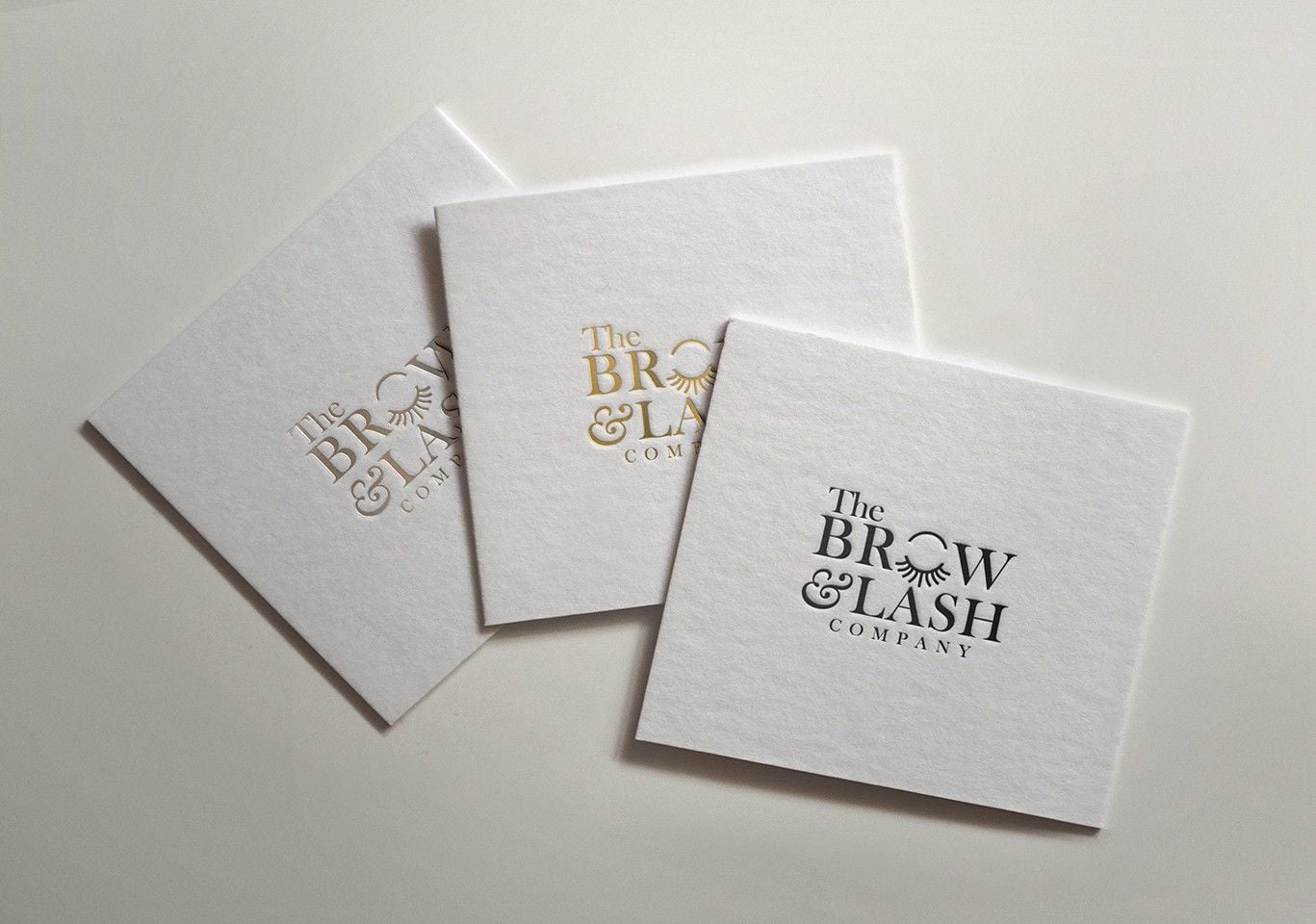
A bold serif wordmark where the “O” in “BROW” becomes a closed eye with lashes, pressed into thick white business cards. It needs no separate icon because the joke is built into the type. Ideal for a brow bar or a beauty salon. Designed by ultrastjarna.
Tips for designing a feminine logo
- Start from the audience, not the gender. A teenager buying lip gloss and a woman choosing a financial adviser want very different things. Decide on the feeling first, such as calm, playful, luxurious or bold.
- Pick one feminine cue and let it lead. A script name, a fine line drawing or a soft colour palette is usually enough. Using all of them at once tips into cliché. If you go with script, our list of handwriting fonts is a good starting point.
- Test thin lines and scripts at small sizes. Hairline strokes and long swashes can disappear on a phone screen or an embroidered label. Check the logo at 32px before you commit.
- Plan a simpler mark. Detailed portraits and floral wreaths need an icon or monogram version for social avatars and favicons. Here is how to plan logo variations, and our free monogram bundle shows how far two letters can go.
- Make the idea specific. The eyelash in “BROW”, the perfume bottle ampersand and the curly hair in the salon logo all say exactly what the business does.
Want more ideas? Browse our beauty brand logos and luxury logo ideas, or read the key principles of logo design.
Frequently asked questions
What is a feminine logo?
A feminine logo uses design cues people associate with femininity, such as flowing scripts, fine lines, curves and soft or warm colours. It does not have to be pink, and it does not have to show a woman.
What colours work best for a female logo?
Blush, dusty pink, terracotta, plum, sage, cream and gold are popular because they feel warm and refined. Strong colours like black, deep green or navy also work well when paired with delicate type.
Which fonts make a logo look feminine?
Script and handwritten fonts, high-contrast serifs and thin sans serifs with wide letter spacing. Pair a script with a simple serif or sans serif so the name stays readable.
Can I use these logos?
No. Every design here belongs to its designer or client. Use them for inspiration on style, type and colour, then have an original logo made for your brand.
Need a feminine logo for a client?
Inkyy is a white label design and development team for agencies. Our in-house brand designers create original logos and full identities that you deliver under your own brand. See our design services or book a 15-minute call.


