12 Modern Website Design Examples to Learn From
 7 min read
Modern website design is less about trends and more about a few clear choices: a strong type scale, a tidy grid, room to breathe and motion used with care. The 12 live websites below show those choices in practice, from dark product pages to a quiet magazine front page.
For each site we describe what the homepage shows and what you can borrow for your own projects. First, a short look at the principles most modern sites share. After the list you will find practical tips and answers to common questions.
What makes a website design modern?
Modern does not mean minimal at any cost. It means every element has a job, and the page is easy to read on any screen. Most of the examples below follow these principles:
- Confident typography. One or two typefaces, a large headline and only a few text sizes. Our typography tips and guide to minimalistic fonts go deeper.
- A clear grid and plenty of whitespace. Space groups related items and tells the eye where to look. See how to use a grid-based layout.
- Restrained colour. A neutral base with one accent usually looks more modern than five bright colours. Our guide to colour schemes in web design explains why.
- One strong visual. A product screenshot, a photo or a single graphic carries the first screen. Read about choosing a hero image.
- Motion with a purpose. Subtle hover states and gentle transitions guide attention. Animation that cannot be turned off, or that slows the page, does the opposite.
- Speed and access. Fast loading, readable contrast, keyboard support and a layout that works on a phone are part of the design, not extras.
These are the same ideas behind the 5 rules of web design and the basic principles of successful web design. Modern sites just apply them with more discipline.
12 modern website design examples
Every site below was live when we checked it, screenshotted on desktop at 1440 by 900 pixels. Company websites change often, so the headline text you see may differ from our notes. The layout lessons stay the same.
Dark, minimal product sites
1. Linear
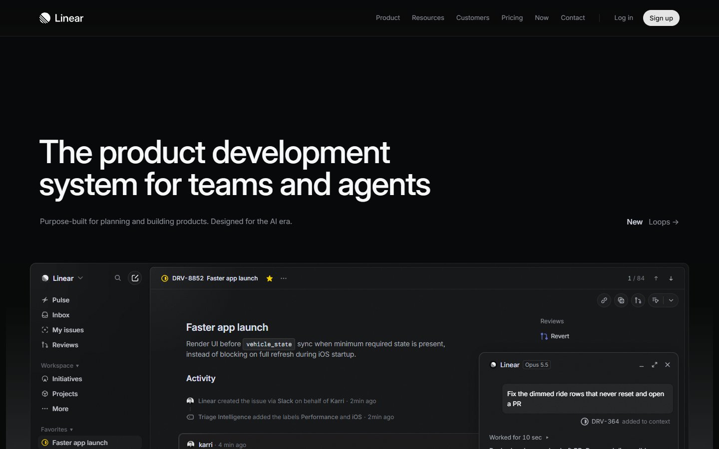
The Linear homepage uses a near-black background, a two-line white headline at the left and one short line of grey text under it. A slim top bar holds a few links and a pill-shaped Sign up button. Below the headline, the real product interface appears in a window with a task list. What to learn: a calm layout and a real screenshot sell better than decoration. Check that the small grey text still has enough contrast. Visit Linear.
2. Vercel
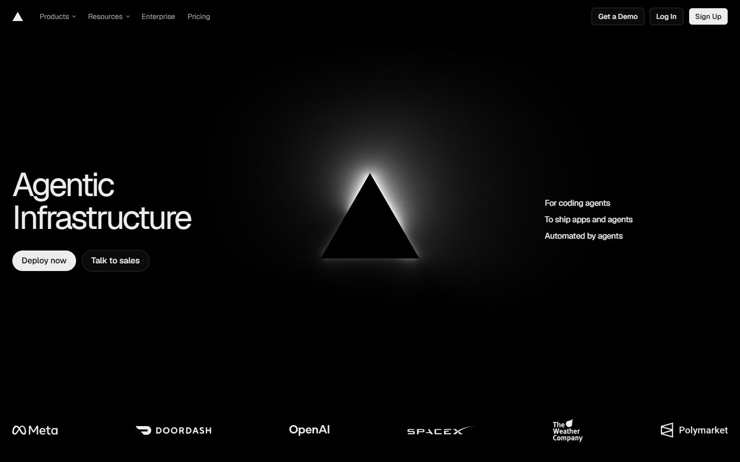
Vercel splits its first screen into three zones: the headline and two buttons on the left, a glowing black triangle in the middle and three short lines on the right. A row of white customer logos runs along the bottom as proof. The palette is only black and white. What to learn: one symbol, a few words and a tidy row of logos are enough for a confident first screen. Visit Vercel.
3. Resend
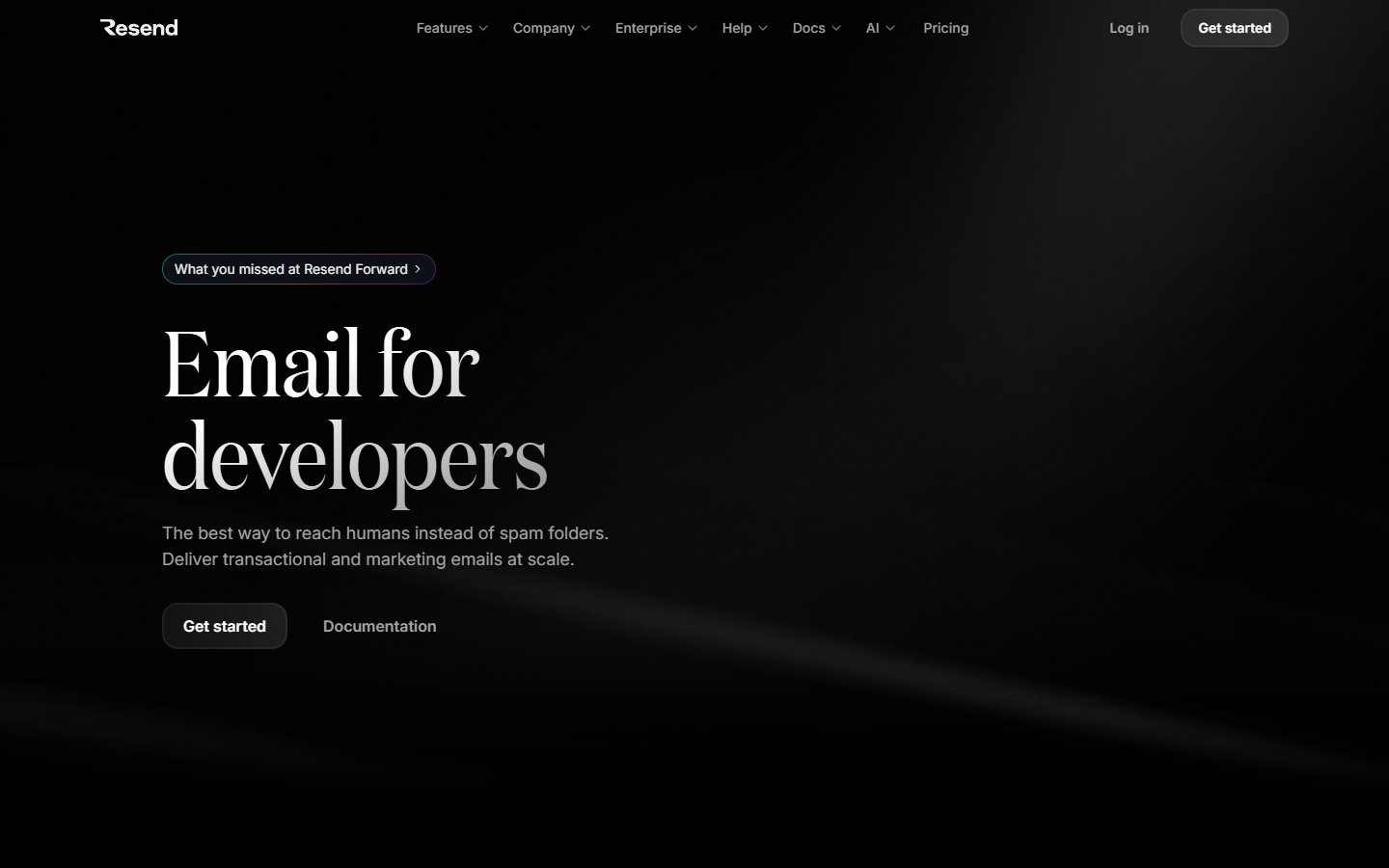
Resend is a developer tool, yet its headline is set in a large, light serif on a dark page with faint streaks of light. A small pill above the headline announces news, and just two actions follow: a filled button and a plain text link. What to learn: a serif headline gives a technical product personality, and offering only two choices keeps the first screen easy to act on. Visit Resend.
4. Raycast
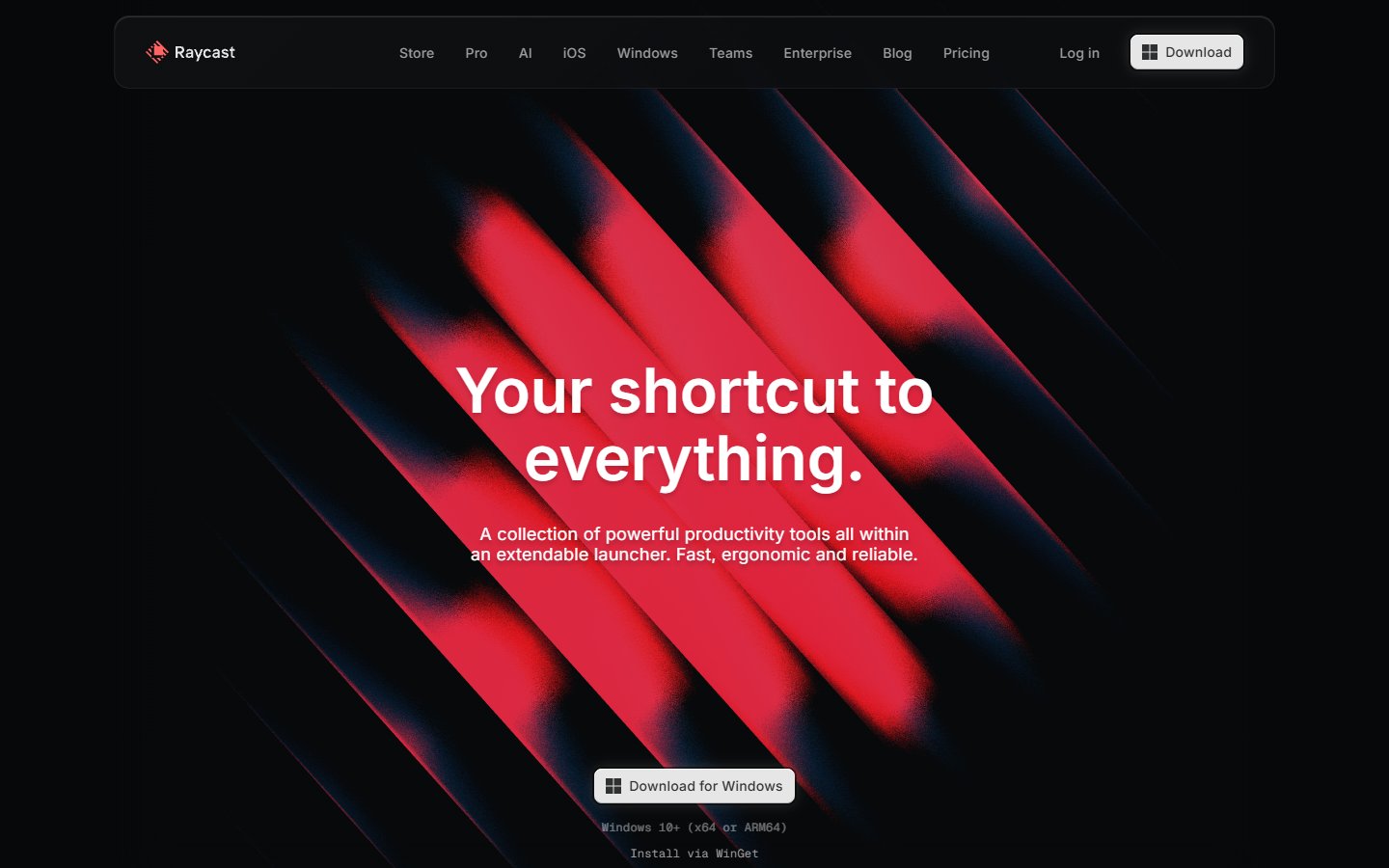
Raycast puts one bold graphic behind its message: blurred red and black diagonal stripes on a dark background, with a centred white headline and a short paragraph on top. The navigation floats as a rounded bar at the top, and a single download button sits below the text. What to learn: one strong graphic can replace a stock photo. White text over bright red needs a contrast check, so test it before you copy the idea. Visit Raycast.
Light and friendly layouts
5. Notion
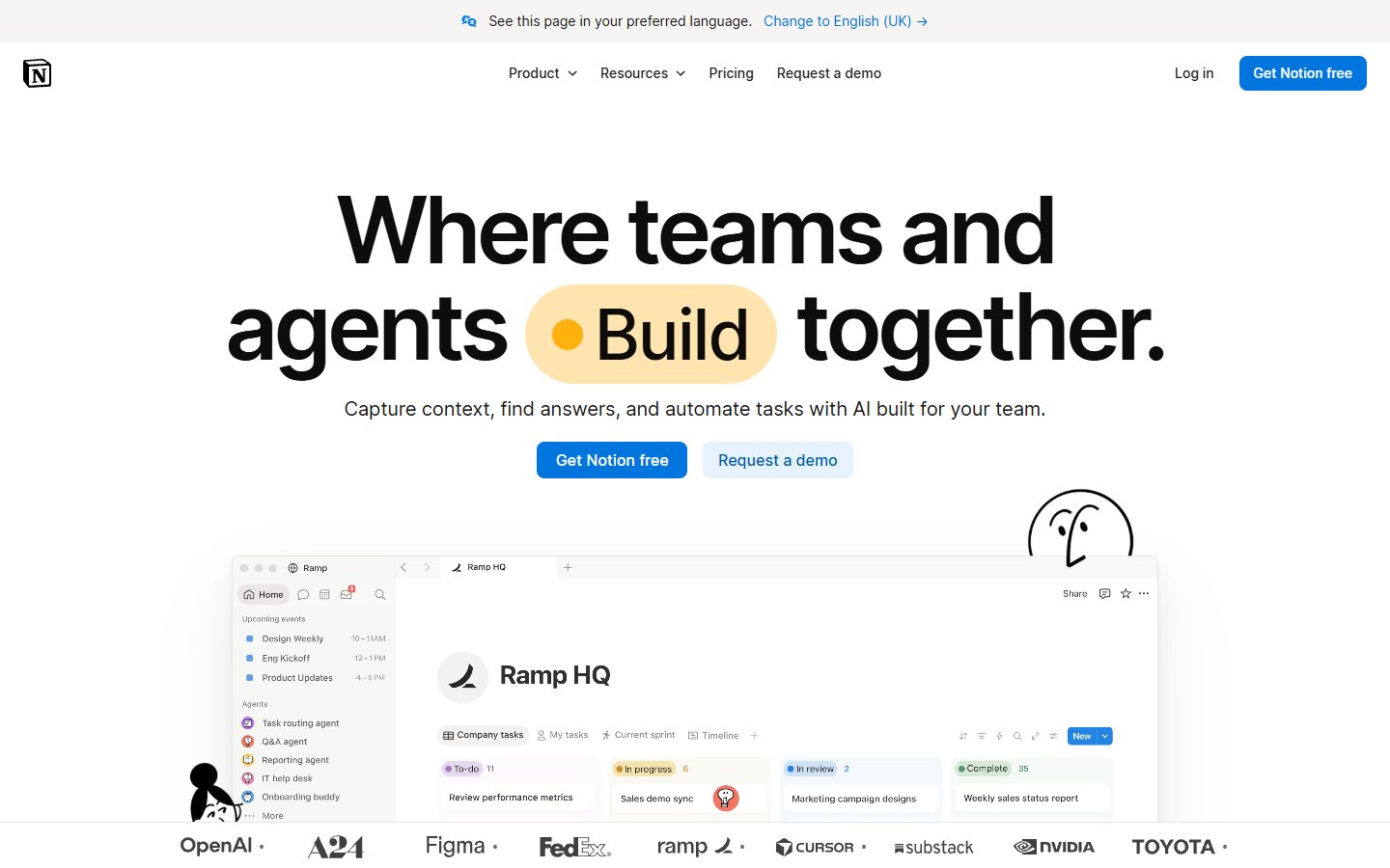
Notion centres everything on a white page: a heavy sans-serif headline with a coloured pill holding one word, a short subtitle and two buttons, one filled blue and one pale. The product window is cropped at the bottom, with a row of customer logos beneath and a small hand-drawn character beside it. What to learn: a single primary button and a touch of illustration make a plain layout feel friendly. Visit Notion.
6. Figma
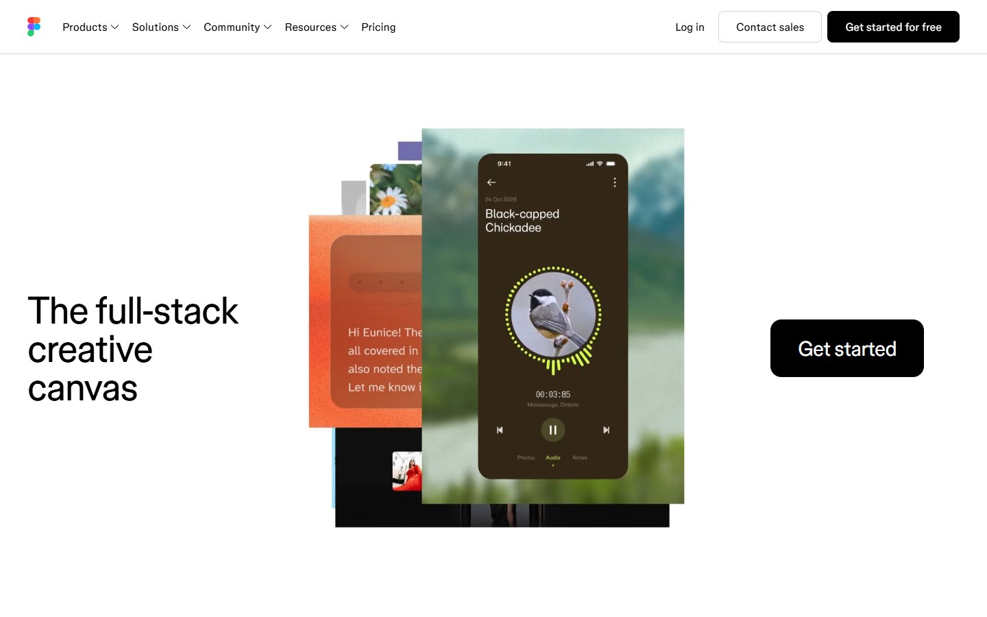
The Figma homepage leaves most of the screen white. A short black headline sits at the left, a stack of overlapping app screens fills the centre and a large black button sits at the right. A slim top bar carries the login and sales links. What to learn: layered cards add depth without effects, and whitespace lets one black button stand out. Visit Figma.
7. Headspace
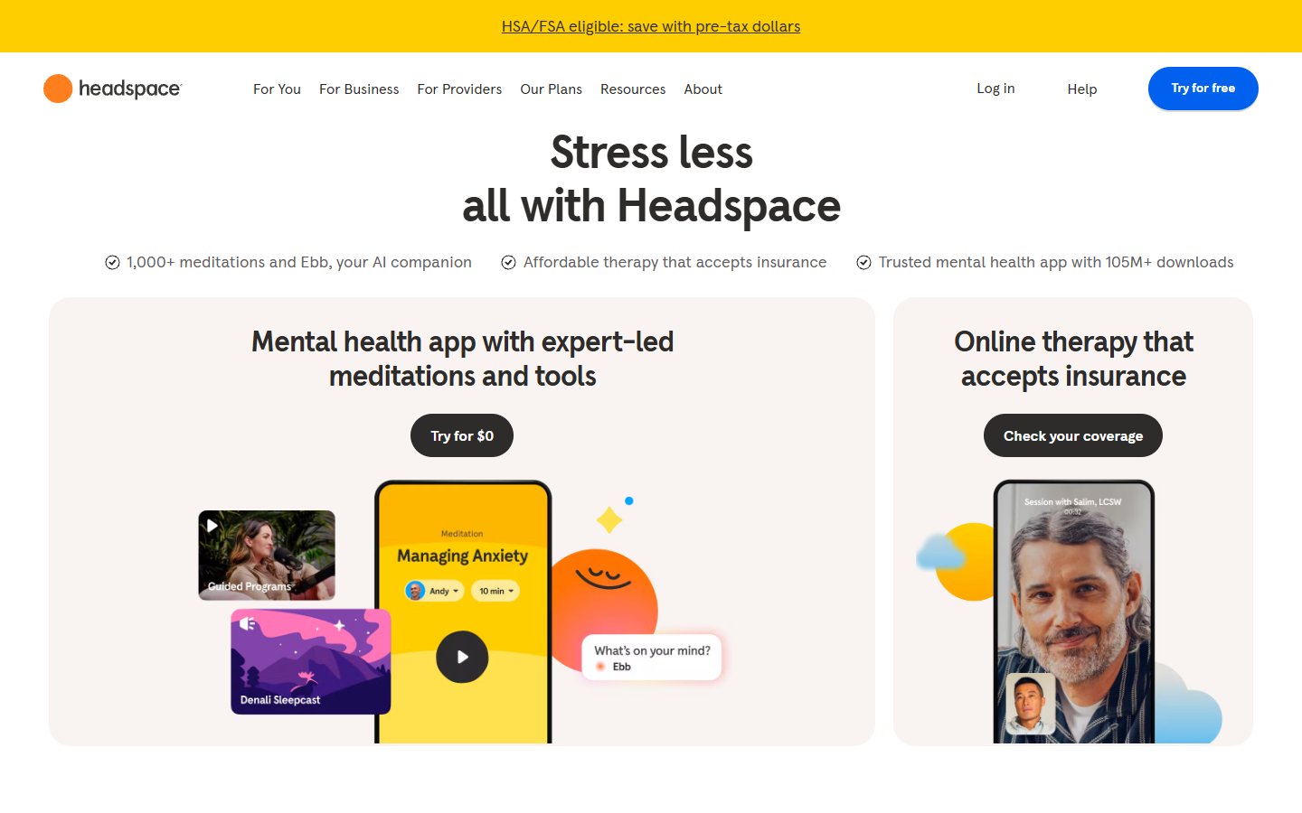
Headspace uses rounded shapes everywhere: pill buttons, soft cards and a round blue button in the top bar. The first screen has a centred headline, three short trust points and two side-by-side cards, each with a phone mockup and a small illustration. What to learn: splitting the first screen into two cards lets two audiences find their path at once. It is a good model for a service with more than one offer. Visit Headspace.
8. Monzo
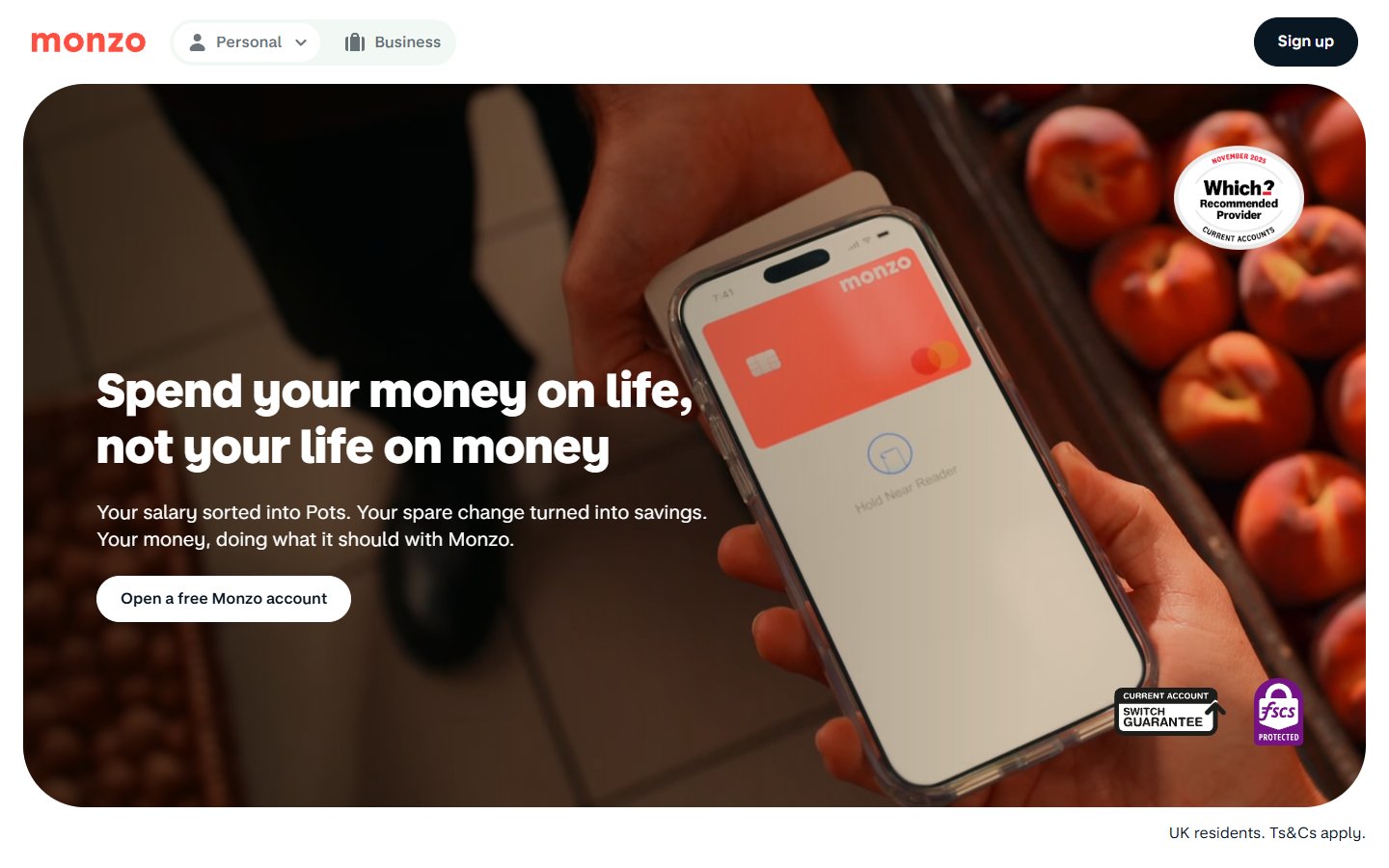
Monzo places its hero photo inside a large rounded panel. A hand holds a phone showing a coral card, with blurred fruit behind it, and the bold white headline, short paragraph and one pill button sit on the darker left side of the image. What to learn: round the corners of big containers to match your buttons, and place text where the photo is quiet so it stays readable. Visit Monzo.
Editorial layouts and bold type
9. Kinfolk
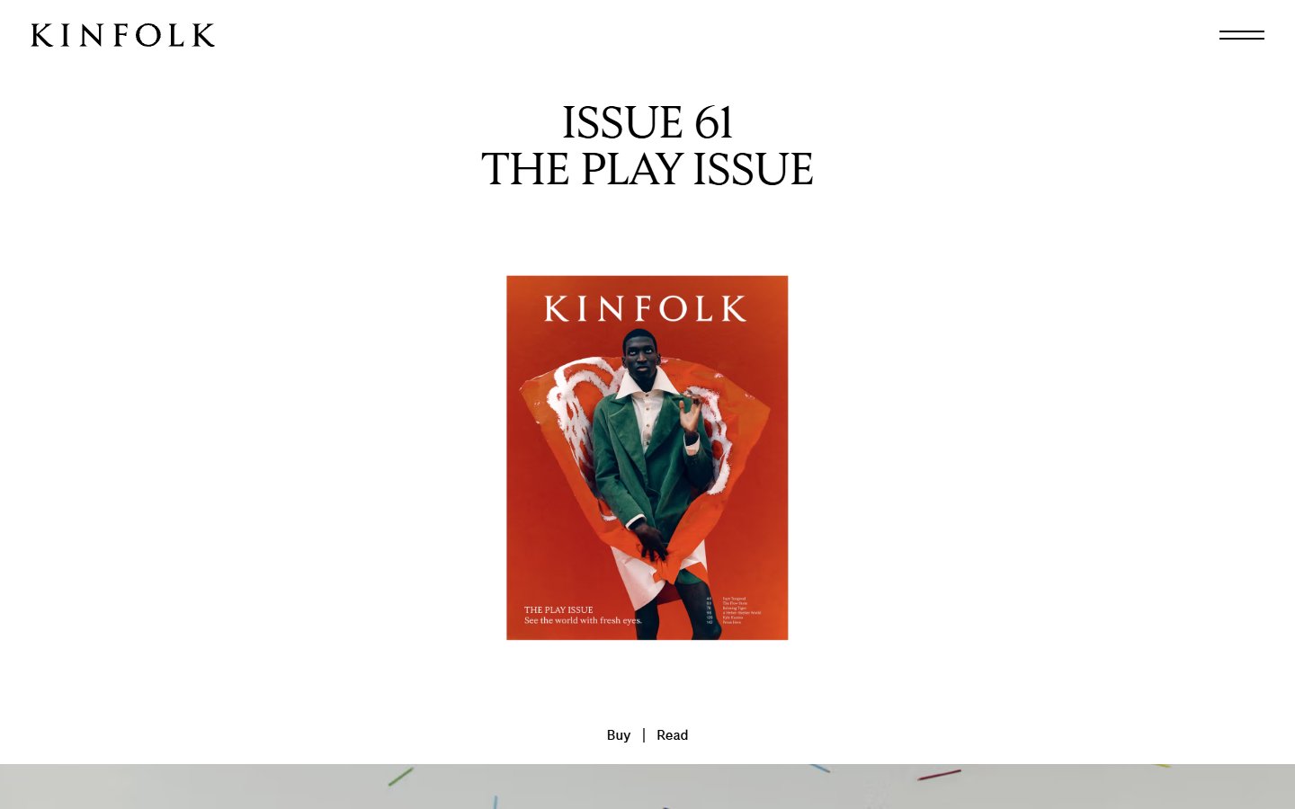
Kinfolk treats the homepage like a magazine page. A centred serif title sits in a wide white margin, one small cover image follows and two tiny links, Buy and Read, sit underneath. The menu is a simple two-line icon at the top right. What to learn: whitespace is a luxury cue, and a single image with two clear actions can be enough for a content site. Visit Kinfolk.
10. Teenage Engineering
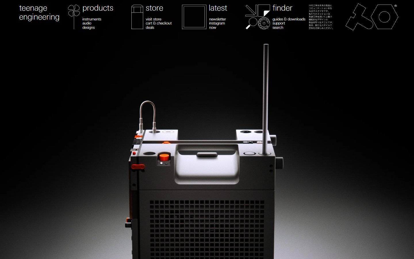
Teenage Engineering opens with a strict row of thin line icons and tiny labels along the top, covering sections such as the store and the latest news. Below it, a large product photo of a boxy grey device lit from above fills the black screen, with no headline at all. What to learn: a rigid grid and a great product photo can replace copy. The small labels are easy to miss, so keep them larger on your own design. Visit Teenage Engineering.
11. Oatly
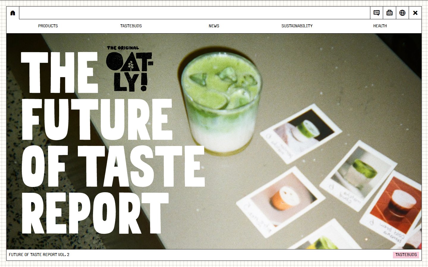
Oatly makes type the main picture. Heavy white condensed letters are stacked over a photo of a green drink and instant prints. The page sits inside a frame that looks like a browser window, on pale grid paper, with small capital links along the top and little icons at the corner. What to learn: a distinctive frame and chunky type give a brand a voice, but check readability when the text sits over a busy photo. Visit Oatly.
12. Pitch
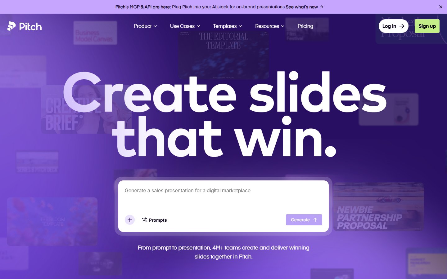
Pitch fills the first screen with a purple gradient and an oversized white headline in a rounded sans-serif. Under it, a white prompt box with a Generate button works as the main call to action, and faint slide thumbnails sit in the background. What to learn: turning the main action into an input box invites people to try, and a single saturated colour with very large type is easy to remember. Visit Pitch.
How to use modern website design in your own project
- Set the type scale first. Pick a headline size, a body size and a small size, then stick to them.
- Build on a grid. A 12-column grid with consistent spacing makes pages look tidy without extra effort.
- Limit the palette. Use neutrals plus one accent for buttons and links.
- Choose one hero visual. A product shot, a photo or a single graphic is stronger than three competing images.
- Give every page one main action. Make the button look different from everything else, and keep the navigation short.
- Use motion lightly. Animate to guide attention, respect the reduced-motion setting and never block the content behind an intro.
- Test on a phone. Check contrast, tap sizes and loading speed on a mid-range device, not just on your desktop. Our list of common web design mistakes is a useful checklist.
For more layouts to study, see our top 30 web design examples, the round-up of interactive websites and the round-up of creative websites. You can also see our design services for agencies.
Frequently asked questions
What is modern website design?
A way of designing websites that favours clear layout, strong typography, generous whitespace, a limited palette and purposeful motion, while working well on every screen size and loading quickly.
What are the key elements of modern website design?
A readable type scale, a consistent grid, a clear focal point on the first screen, simple navigation, accessible colour contrast and a responsive layout. Animation is optional and should always serve a purpose.
Is modern website design the same as minimalism?
No. Minimalism removes anything that is not needed. Modern design can also be bold, as Oatly and Pitch show, as long as the layout stays clear and every element has a job.
Can I copy the layouts on this list?
You can learn from them, but the designs, code and images belong to their owners. Borrow principles such as spacing, type scale and button placement, then create your own version for your brand.
Need a modern website for a client?
Inkyy is a white label design and development team for agencies. We design and build clean, fast websites under your brand. See our design services and development services, or book a 15-minute call.