


20 Shopping Cart Logo Ideas for Ecommerce Brands
 9 min read
A shopping cart logo tells visitors in a split second that they can buy something here. It is the most common symbol in ecommerce, which is both its strength and its problem: everyone understands it, and everyone else is using it too.
Below are 20 shopping cart and ecommerce logo ideas, grouped by approach: cart icon marks, carts that show the product, letter monograms, minimal line carts, and shopping bag and basket logos. For each one we look at what works and what kind of store it suits, followed by practical tips for designing your own.
What a shopping cart logo says about a store
- A cart says catalogue, choice and checkout. It suits marketplaces, supermarkets, grocery delivery and general stores.
- A shopping bag feels more personal and more like fashion. It suits boutiques, beauty, gift shops and social commerce.
- A basket feels local, fresh and handpicked. It suits farm shops, hampers, handmade goods and organic grocers.
- Speed lines or wheels in motion say fast delivery, which is why quick commerce and courier brands use them.
The common traps are a generic cart icon from a clip art library, a cart that looks exactly like the “add to cart” button on the site itself, and detail that disappears at favicon size. The best examples below change the cart in one clear way, so it belongs to one brand only.
20 shopping cart logo ideas
Each design belongs to its designer. Where we could confirm the source, the designer is credited with a link to the original.
Cart icon marks
These logos keep the classic cart silhouette and change one thing about it: the shape, the movement or the attitude.
1. Faceted Cart
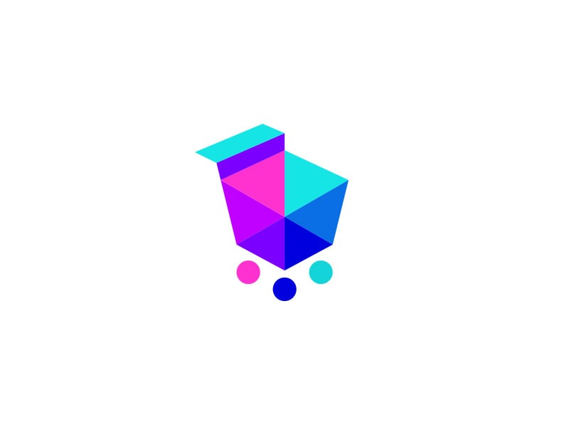
The basket is cut into flat triangles of pink, purple, blue and cyan, and the wheels are three coloured dots. The facets make a very familiar icon feel digital and modern. It suits a tech-led marketplace or an app, though gradients like these need a one-colour fallback for print.
2. Speeding Cart
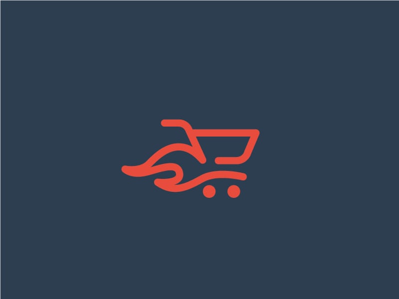
A single coral line draws the cart, and the strokes behind it read as flames or wind. It says fast delivery without a word of copy. A natural fit for same-day delivery, quick commerce and courier apps.
3. Angry Cart
The basket grid becomes a row of gritted teeth, and two eyes with heavy brows sit on top. It is funny and memorable, which is the whole point of a mascot. It works for a discount store or a deals site with a cheeky voice, not for a premium brand.
4. PartCart
The basket is a chequered racing flag, so the icon says car parts and online shop at once. The shot shows a yellow version on navy and a navy version on white, which is exactly the kind of variation planning a real brand needs. Good for auto parts, motorsport merchandise or any shop with a racing angle.
5. DashBear by InkSay Design
A white bear rides the cart with speed lines streaming behind it, which spells out the name DashBear in a picture. The bold italic wordmark carries the same sense of speed. A friendly option for a delivery app or a general store that wants a character people remember.
Carts that show what the shop sells
The fastest way to make a cart logo specific is to put the product inside it, or to turn the product into the cart.
6. The Plant Store
A simple outline cart carries a red pot with a two-leaf sprout. The bold black and white wordmark on a green background keeps it easy to read. It shows how one small object turns a generic cart into a plant shop, a garden centre or an online florist.
7. Avocado
The avocado is tipped on its side so its neck becomes the handle, and two grey dots finish the cart. It takes a second to spot, which makes it more satisfying than a cart with a fruit dropped inside. A good direction for an organic grocer, a healthy food delivery service or a meal kit brand.
8. Agrohub
A green leaf stands in for the basket, with two dots underneath for wheels. It is one of the simplest marks here and it would still read at app icon size. Suited to a farm produce marketplace, an agri supply shop or an eco store.
9. Canada Baby Depot
The crib sits on wheels and has a handle, so it doubles as a shopping cart, and a little mobile hangs above it. The thin lines and soft blue and brown colours feel calm and caring. It is a lovely website header, but the fine detail would need a simpler icon version for small sizes.
Letter and number cart monograms
Building the cart out of letters or numbers gives you an icon that is tied to the name, which makes it easier to own.
10. Grandbei
The cart doubles as a capital G, and the two-tone wordmark repeats the green on “bei”. The shot also shows the icon on a green panel with a tagline, so you can see how it works as an app icon. A clean model for a supermarket or marketplace brand.
11. 123 Shop
The top of the 1 is the handle and the base of the numbers runs into the cart body, with two wheels below. Numbers are rarely used this way, which makes it stand out. It suits a shop that sells on simplicity, like a one-click or “easy as 123” store.
12. Consumer Brands Direct by Neatlines
The basket is drawn from a lowercase c and b, the brand initials, and red speed lines and wheels add movement. The blue and red pairing feels dependable and a little bit urgent. A strong option for a direct-to-consumer retailer or a wholesale brand.
Minimal line carts
A minimal shopping logo lives or dies on one clean idea. These two use a single line weight and very little else.
13. CoCart by spARTan
Two geometric C shapes are stacked to form the cart, drawn in one even blue stroke. The rounded wordmark matches the line weight, so icon and text feel like one piece. Ideal for a SaaS checkout tool, a plugin or any ecommerce product that needs to look tidy in a dashboard.
14. Coiled Cart

A yellow line cart with a playful wavy top edge, and a base that turns into loose coiled strokes like a spring. It feels lively and handmade. The loose strokes will fill in at favicon size, so it would need a simpler cut for small uses.
Shopping bag and basket logos
Not every ecommerce logo needs a cart. A bag feels more like fashion, gifts and boutiques, and a basket feels local, fresh and personal.
15. Hokus.no by CostinLogopus
Designed for a Norwegian webshop selling magic tricks, the top hat has a handle so it also reads as a shopping bag, with rabbit ears popping out of it. One black shape tells you both the product and the channel. A great example of a bag logo built around what the shop sells.
16. OKpazar by onripus
The handle of the bag is an OK hand gesture and a small curve on the bag reads as a smile. It is bold, flat and works in a single colour. Good for a marketplace that wants to feel friendly and trustworthy.
17. Shopsee by kuina
Made for a live-stream shopping service, the red bag holds a record button and a curved line, which together also look like a happy face. The navy wordmark keeps the red icon in check. A smart fit for social commerce, live selling and video shopping apps.
18. Pandealo by MarkCreative
The name comes from “panda” and “deals”, so a smiling panda hugs an orange bag marked with a P and a heart. The warm orange makes it feel like a bargain without looking cheap. Suited to a deals site, a gift shop or a family-friendly marketplace.
19. Long River Commerce by twin.ali
A winding river cuts through a simple red bag outline, a quiet nod to the name. The shot shows the full lockup on white and the icon alone on red, and both hold up. Good for an ecommerce agency, a marketplace seller or a brand that sells across many channels.
20. The Market Space by PopMdesign
A sketchy wicker basket with a yellow bow sits above handwritten lettering. Made for an online market for homemade goods, it feels personal and crafted rather than corporate. A basket like this suits handmade shops, gift hampers and farmers’ market brands.
Tips for designing a shopping cart logo
- Avoid generic cart clip art. If your icon could be the cart button on any store, it will never feel like yours, and it is hard to protect as a trademark. Change one thing: the shape, the material, a letter or the product inside.
- Decide between cart, bag and basket. Pick the container that matches what you sell and how you sell it. A fashion label with a supermarket trolley sends the wrong message.
- Test it at favicon and app icon size. Check the icon at 16px and 32px in a browser tab, and at 180px as an app icon. Thin lines, gradients and small wheels are the first things to vanish.
- Keep the icon apart from the UI. Your logo will sit right next to cart and bag icons in the site header. Make it different enough in style and colour that shoppers do not confuse the two. Our post on design tips for ecommerce covers the rest of the header and store layout.
- Pick colours with intent. Green feels fresh and fair, blue feels safe, red and orange push urgency and deals. Our guide to colours and branding explains the trade-offs.
- Plan the variations. You will need a full lockup, an icon-only mark for social and marketplace profiles, and a one-colour version for packaging and stamps. Here is how to plan logo variations.
Want more ideas? Browse our minimalist logo ideas and fruit logo designs for grocery brands, read the key principles of logo design, or see the features every successful ecommerce website has once the logo is done.
Frequently asked questions
What makes a good shopping cart logo?
A good shopping cart logo is simple enough to read at 16px, has one idea that makes it different from a stock cart icon, and fits what the store sells. It should also work in one colour.
Does an ecommerce logo need a shopping cart?
No. A cart is the clearest signal, but a shopping bag, a basket, a tag or simply a strong wordmark can make just as good a shopping logo. Many big online stores use no cart at all and let the name do the work.
Can I use these logos for my store?
No. Every design here belongs to its designer or client. Use them for ideas on shape, colour and concept, then have an original logo made for your brand.
What size should an ecommerce logo be for a favicon?
Design a simplified icon and export it at 32 by 32 pixels and 16 by 16 pixels for browser tabs, plus 180 by 180 pixels for Apple touch icons and 512 by 512 pixels for Android and web app manifests. Keep a vector master (SVG) for everything else.
Need an ecommerce logo for a client?
Inkyy is a white label design and development team for agencies. Our in-house brand designers create original logos and full identities, and our developers build the stores to match, all delivered under your own brand. See our design services or book a 15-minute call.


