12 Portfolio Website Examples From Designers and Studios
 8 min read
Good portfolio website examples show one thing clearly: the work comes first, and the person or studio behind it is easy to find and easy to hire. The 12 live portfolio sites below come from designers, developers and studios, and each takes a different route to the same goal.
For every site we describe what the first screen shows and what you can learn from it. Before the list, a short section covers what makes a portfolio website work. After it you will find tips for building your own, with links to free portfolio templates.
What makes a good portfolio website?
A portfolio has one job: to turn a visitor into an enquiry. The best examples share a few habits:
- Work before words. Visitors should see projects or a strong sample on the first screen, not a long biography.
- A one-sentence introduction. Say who you are, what you do and who you do it for. Short and plain beats clever.
- Easy navigation. Three to five links are enough: work, about and contact. Keep the navigation predictable even when the design is playful.
- Selected projects, not every project. Show your strongest work and explain your role in each one.
- A visible way to get in touch. An email address or a contact link should never be more than one click away.
- Speed and mobile support. Recruiters and clients often look on a phone, so large images must load quickly and layouts must adapt.
The personality is yours to choose. The examples below range from a text-only page to full-screen photography, and all of them still follow the habits above.
12 portfolio website examples to learn from
Every site below was live when we checked it, screenshotted on desktop at 1440 by 900 pixels. Portfolios change often, so the text on the live site may differ from our notes. For more general inspiration, see our top 30 web design examples.
Designer and developer portfolios
1. Nathan Taylor
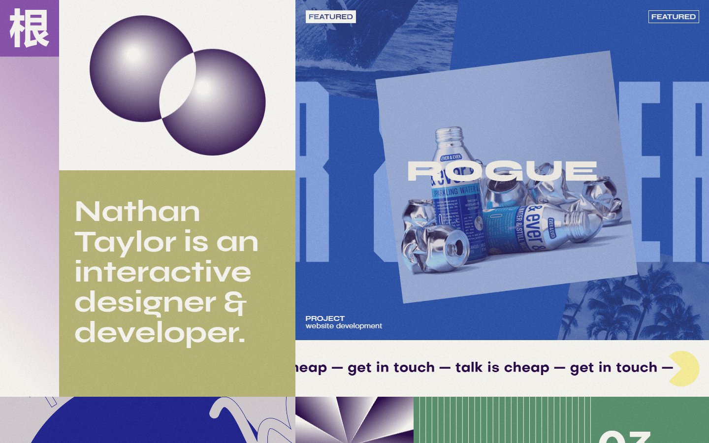
The page is divided into colourful panels. An olive block holds one plain sentence that says Nathan Taylor is an interactive designer and developer, next to a pale panel with two overlapping purple circles. A blue card shows a featured website project, and a strip of repeating text below says talk is cheap, get in touch. What to learn: say who you are in one sentence and put a featured project next to it. The collage is busy, so keep your own menu obvious. Visit Nathan Taylor.
2. Rauno Freiberg
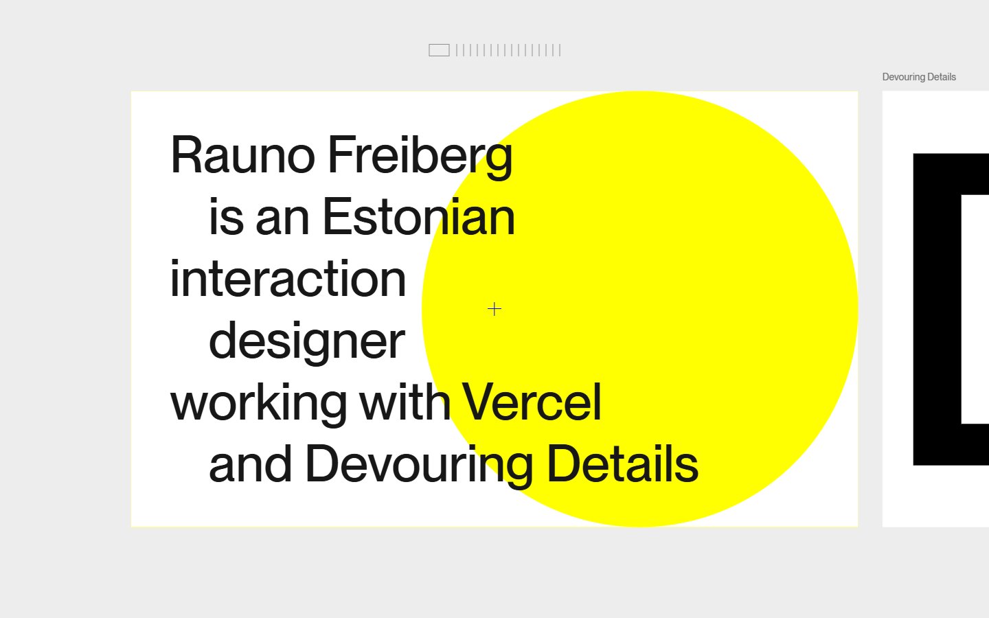
A row of small tick marks sits at the top of a light grey page. The introduction is set in large black type on a white card, with a big yellow circle behind it, and the next card peeks in from the right edge. What to learn: one bright shape on a neutral page gives a portfolio a signature. The peeking card hints that there is more to see without a single instruction. Visit Rauno Freiberg.
3. Emil Kowalski
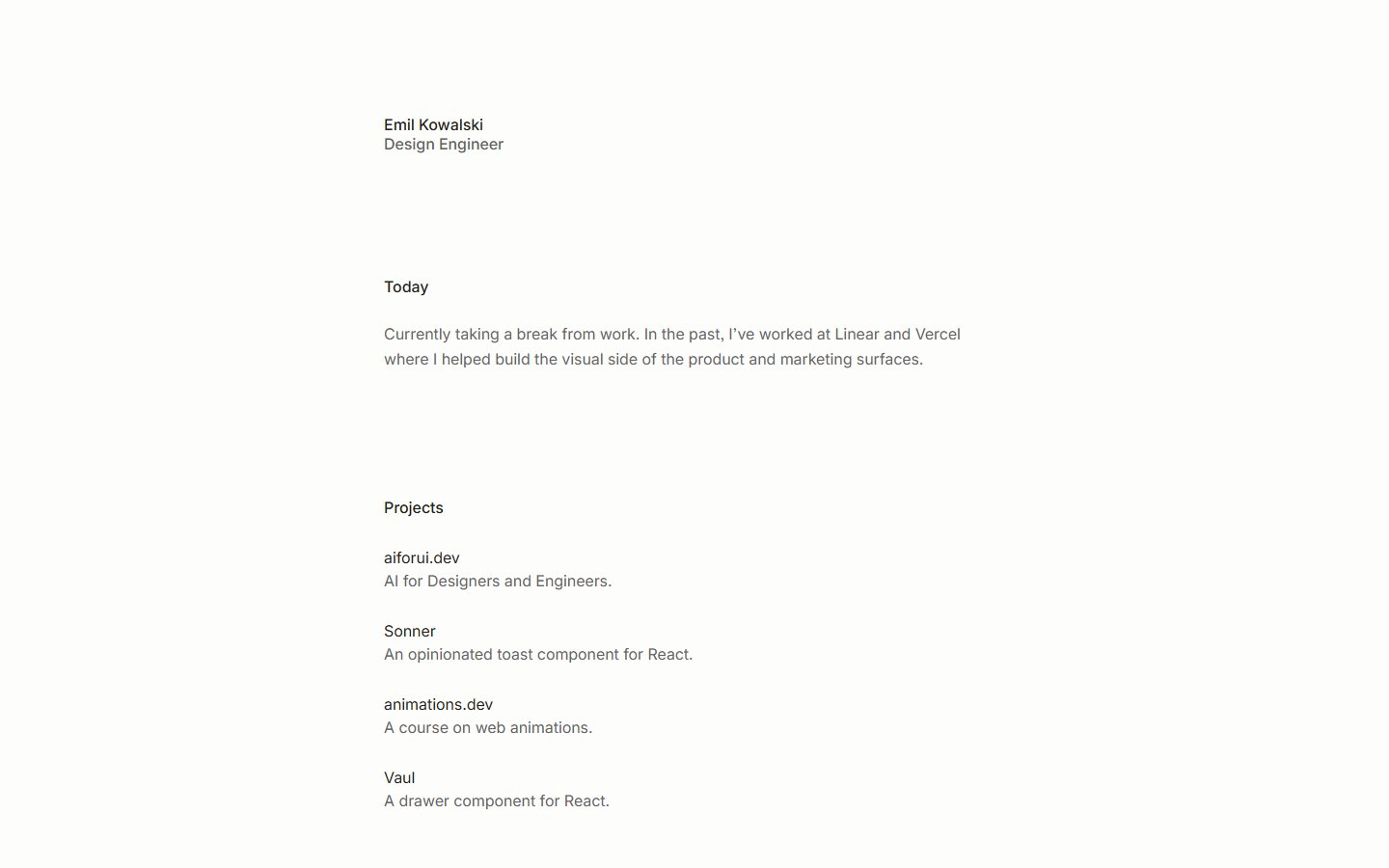
This site has no images at all. A narrow column of small grey text on an off-white page shows a name and role, a short paragraph and a list of four projects, each with a one-line description. What to learn: when your work is software, clear spacing and tidy type can be the whole design. Add a thumbnail or two if your projects are visual, since this text-only approach is hard to scan for a client. Visit Emil Kowalski.
4. Paco Coursey
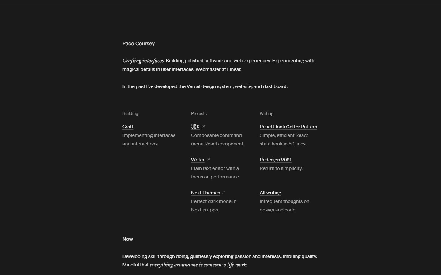
A dark charcoal page holds a narrow column of small text. The introduction mixes sans-serif with italic serif phrases, and three short columns titled Building, Projects and Writing work as an index, followed by a Now section at the bottom. What to learn: an italic serif is a cheap way to add personality to a minimal page, and grouping links into a few labelled columns keeps everything on one screen. Visit Paco Coursey.
5. Brittany Chiang
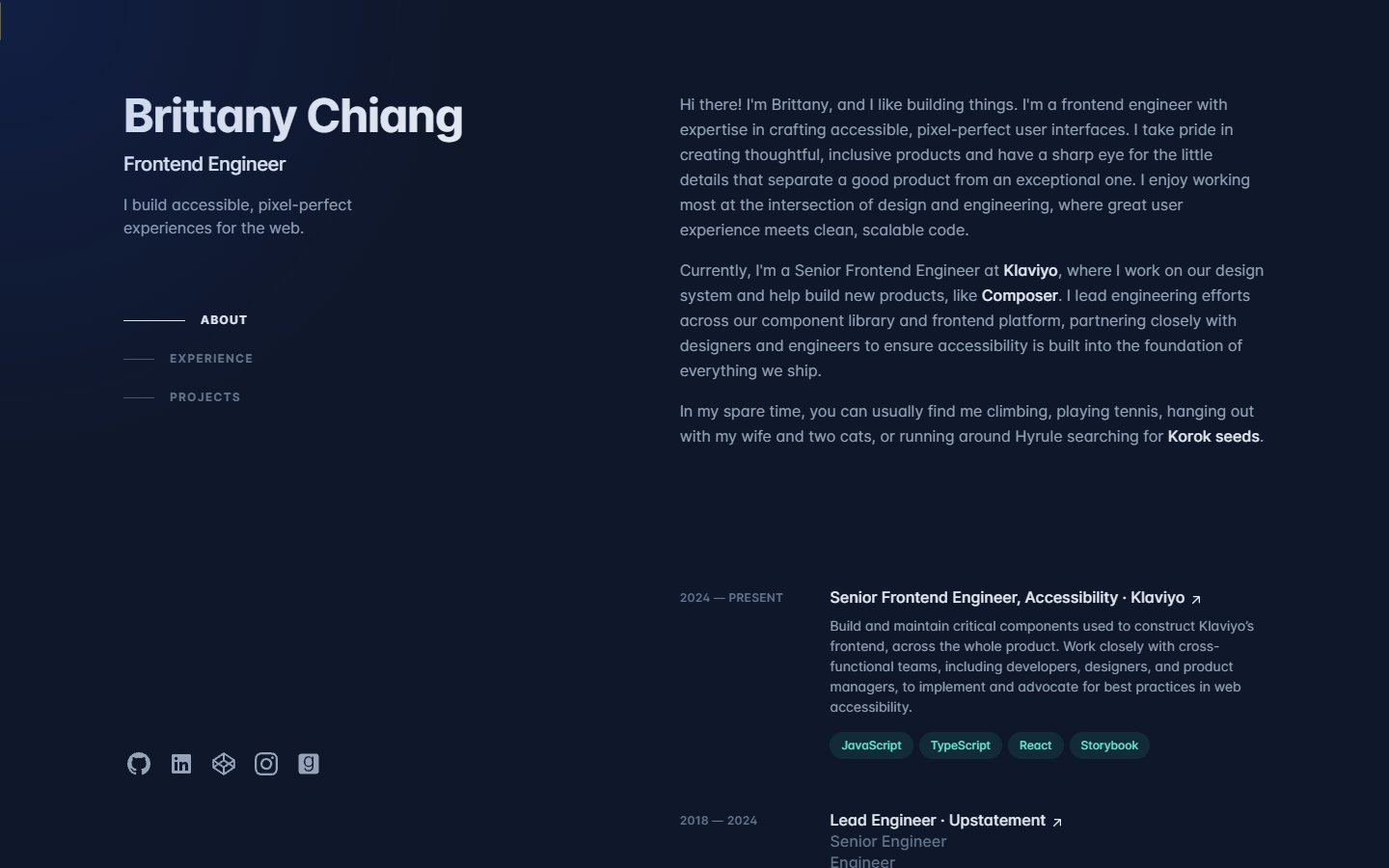
The layout is a split screen on a dark navy background. The left column holds the name, role, a short pitch, a three-link menu with line indicators and social icons. The right column scrolls with an about text and a job list with dates and small technology tags such as JavaScript and React. What to learn: keeping the introduction fixed while the details scroll makes a long page easy to scan, and tags show your stack at a glance. Visit Brittany Chiang.
6. Tomas Janc
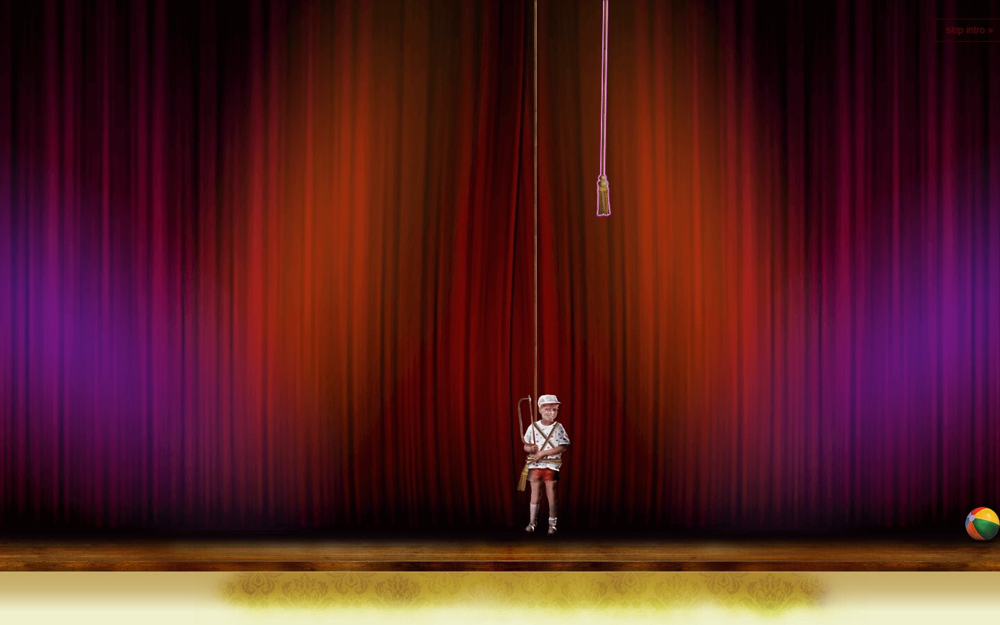
Tomas Janc is a full-stack web developer, and his site opens like a puppet theatre: red stage curtains, a small boy hanging from a rope and a beach ball at the edge of the stage. A skip intro link sits in the top corner. What to learn: humour makes a developer memorable, and the skip link shows good manners. Always let visitors bypass a long intro. Visit Tomas Janc.
Independent creative portfolios
7. Amanda Braga
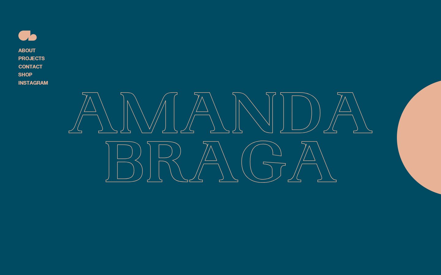
Amanda Braga is a jewellery designer, and her site is built from two colours: deep teal and peach. Her name appears in large outlined serif capitals, a short menu of five links sits at the top left and a peach half circle enters from the right edge. What to learn: a tight two-colour palette feels like a brand. Thin outline type is only for big headings, because it is hard to read at small sizes. Visit Amanda Braga.
Studio and agency portfolios
8. Special Offer
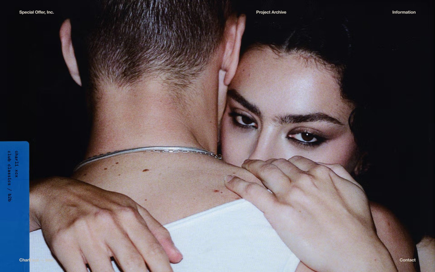
Special Offer fills the whole screen with one dark photograph of two people in an embrace. A small blue card with vertical text sits at the left edge, and the only navigation is a few tiny links such as Project Archive and Information. What to learn: a single powerful image says more about a studio than a paragraph. Keep the links readable and check that full-screen media loads fast on mobile. Visit Special Offer.
9. Order
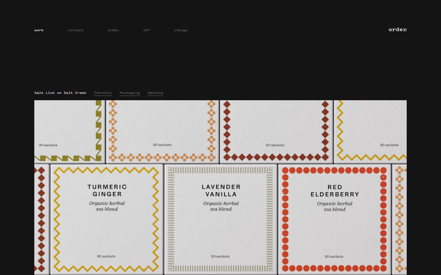
Order describes itself as a design office that specialises in brand identity. Its page is dark grey with a small monospace menu and a wordmark in the corner. The project row offers Identity, Packaging and Website links, above a grid of tea packaging with geometric borders in mustard, rust and orange. What to learn: let the work be the interface. A dark neutral background makes colourful projects stand out, and filters by type help clients find what they need. Visit Order.
10. Locomotive
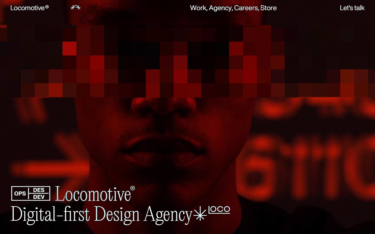
Locomotive, a web agency from Montreal, opens with a full-screen red photo of a face whose eyes are covered by pixel blocks. The menu runs across the top with a Let’s talk link, and a large serif label at the bottom states what the agency does. What to learn: a pixel effect blends photography with digital craft, and stating your service in plain words on the first screen helps visitors and search engines. Visit Locomotive.
11. Collins
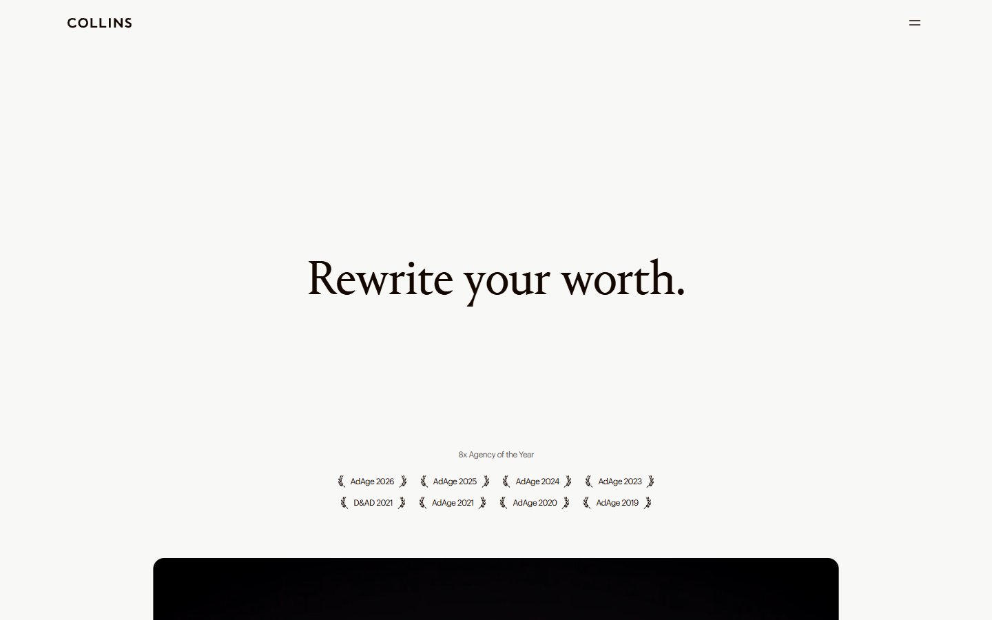
Collins keeps its first screen almost empty: one centred serif sentence on a warm off-white page, a small block of award laurels below it and the top edge of a dark panel rising at the bottom. The menu is a small two-line icon at the top right. What to learn: put proof, such as awards, small and calm rather than loud. Large serif type on a plain background feels editorial and confident. Visit Collins.
12. Studio Dumbar
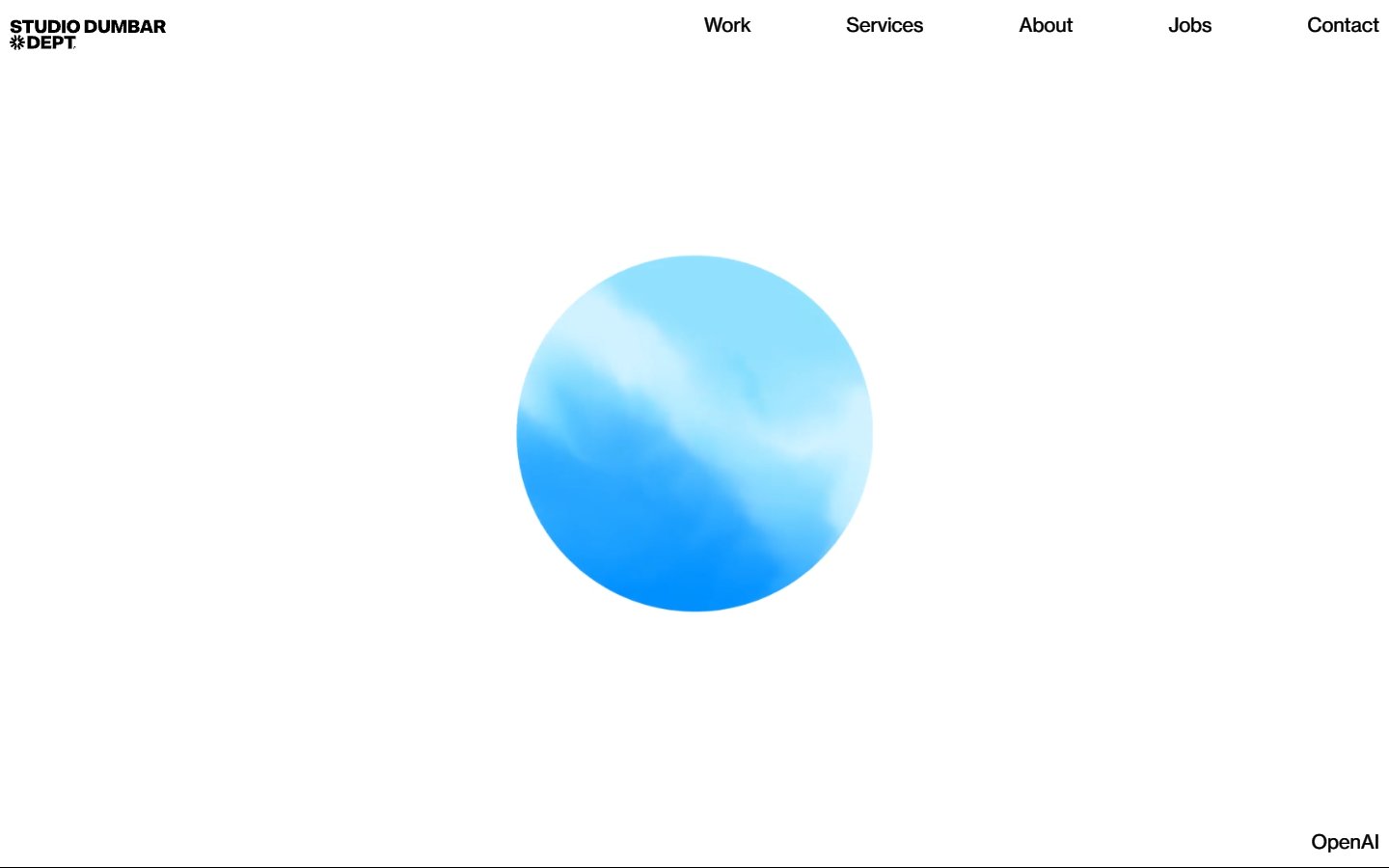
Studio Dumbar describes itself as a studio that creates bespoke identities. Its homepage is white, with a five-link menu at the top right and one soft, cloud-textured blue circle in the centre. A small label at the bottom right names the featured project. What to learn: a single image and a lot of white space give the work room to speak. A short, honest menu is all a studio site needs. Visit Studio Dumbar.
Tips for building your own portfolio website
- Start from the visitor. Decide who should hire you, then show the projects that prove you can do that job.
- Write case studies, not captions. For each project, state the problem, your role and the result in a few short paragraphs.
- Keep the first screen simple. A name, a one-line role, a featured project and a contact link are enough. A strong hero image helps if you use one.
- Choose type with care. One good font pair does more than five effects. Our typography tips can help.
- Use a template to save time. We share free layouts in Adobe XD: a designer portfolio template, a coder portfolio template, a personal portfolio file, a green portfolio template and a general portfolio template.
- Show photography at its best. If you are a photographer, see our photographer portfolio website example.
- Test it like a client. Open the site on a phone, check how fast it loads and make sure the contact link works.
Looking for more? Read the round-ups of interactive websites and creative websites, or our examples of effective web design presentation.
Frequently asked questions
What should a portfolio website include?
A short introduction, a selection of your best projects with a line or two about your role, an about section, your services or skills and an easy way to contact you. A CV or resume link is a useful extra.
How many projects should a portfolio have?
Show a handful of your strongest projects, often between six and twelve. Quality matters more than quantity, and you can link to an archive or a profile for older work.
Is a website better than a PDF portfolio?
A website is easier to share, update and find in search, and it shows your taste directly. A PDF is still handy to send with a job application, so keep both if you can.
Can I copy these portfolio designs?
No. The designs, code and images belong to their owners. Use the examples to learn about layout, structure and tone, then build something that fits your own work.
Need a portfolio website for a client?
Inkyy is a white label design and development team for agencies. We design and build portfolio websites for creatives and studios under your brand. See our design services and development services, or book a 15-minute call.