The Gestalt Principles are a set of theories developed in the 1920’s by German psychologists researching visual perception. The human brain tends to group similar objects, form patterns, and simplify images.
This ability allows us to make sense of our surroundings.
Sometimes, our visual perception has some fascinating effects and can play tricks with our minds.
I bet we can all recognize multiple different objects just by watching at the clouds above us. Or better yet, connect the ‘dots’ and form a full picture just by looking at a couple of shapes on the paper.
But what does that all mean for designers? How to apply Gestalt theory in your design work?
Most of the people will be able to recognize some, if not all, of the Gestalt principles listed below. Designers, as visual types especially.
Even if you don’t know the names or definitions and who was first to define them, you use them instinctively.
Still, having a full understanding of why and how the people will perceive specific patterns can elevate your work. A simple change in layout and arrangement can have a massive impact on your work.
Without further delay, six main Gestalt Principles are:
- Principle of Proximity
- Law of Continuation
- Law of Similarity
- Gestalt Principle of Closure
- Principle of Figure/Ground
- Law of Symmetry and Order
1. Gestalt Principle of Proximity
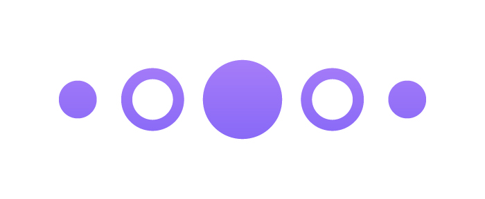
Proximity, or grouping, refers to how close are the elements in relation to each other. Overlapping, or objects that are really close to each other have the strongest proximity effect. At the same time, the further far apart the objects are, it is usually harder for us to attribute them as a part of the same group.
Please take a look at the following examples:
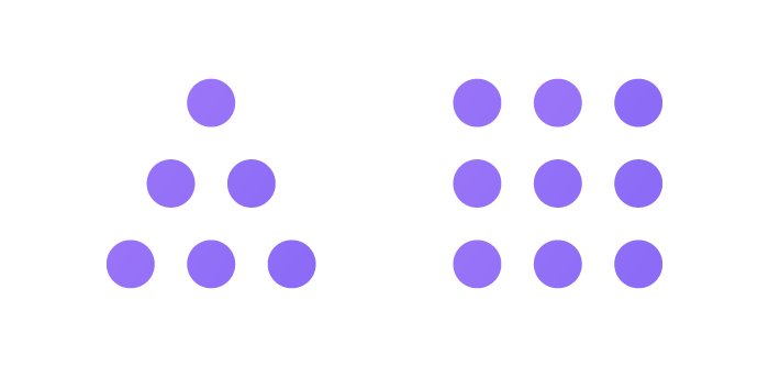
You should be able to recognize how the purple circles apparently form a triangle and a square.
Your attention has moved away from the dots itself. Most of us will see only 2 objects, instead of 15.
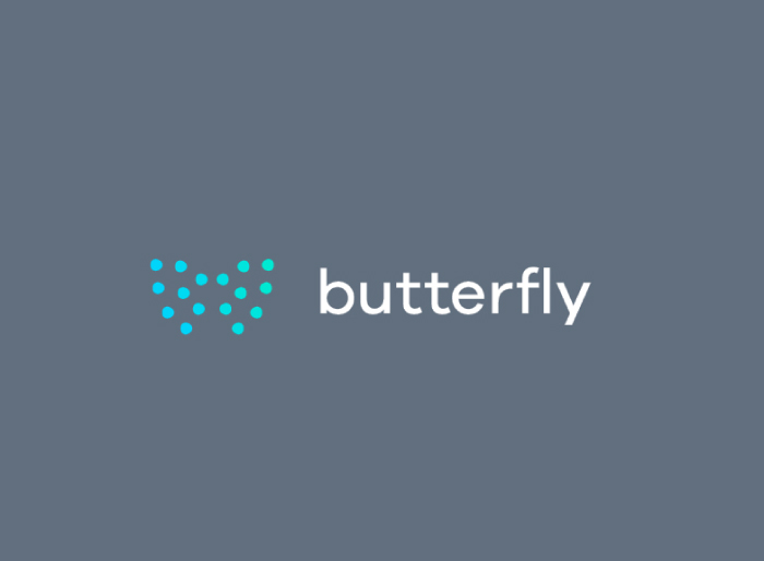
Here is an example of the Gestalts principle of proximity used on a company logo design. The individual dots are placed in a way that, when grouped, strongly resembles a butterfly.
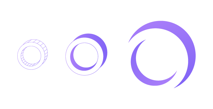
2. Gestalt Law of Continuation
The Law of Continuation allows us to recognize a shape created by the flow of the lines, paths, or curves. We will not see them as individual lines, but rather as a single, continuous object or shape.
The ability to lead the user’s attention to where we want it is invaluable in design. By using this principle correctly, we can achieve exactly that.
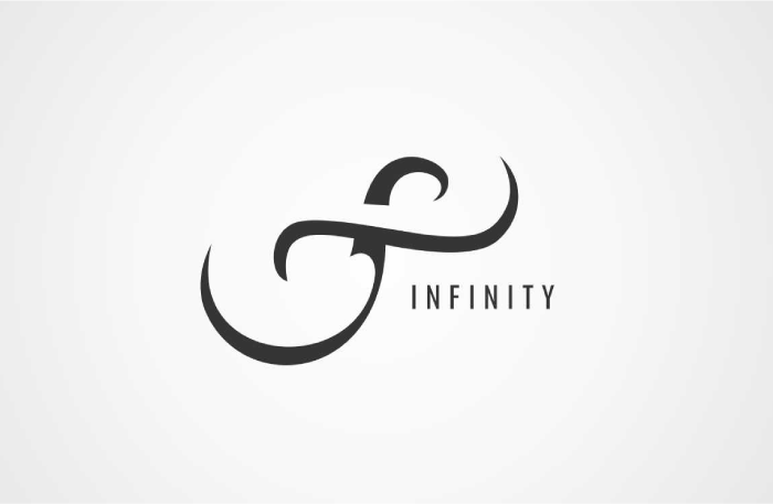
Here is a great example of creating a composition of seemingly endless loop.
If we focus and look at them as 4 individual lines, the ‘magic’ is gone.
Notice how the infinity sign is implied in this example? A huge part of the shape is up to us to ‘fill in’, but the design works perfectly.
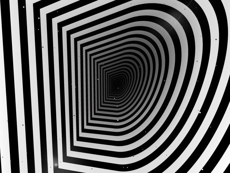
Another example is a 3d optical illusion created by using the Gestalt principle of continuation. One line would like a letter D. However together they for a tunnel in the shape of letter D.
3. Gestalt Law of Similarity
As we mentioned before, the human brain creates groups of elements based on proximity. However, that is not the only way we form groups and patterns.
Regardless of how close the elements are, we can group them by color, shape size, and even texture.
Check out the examples below.
There is another way we can use the Gestalts principle of similarity.
If you make one of the elements dissimilar, it will stand out and bring our attention to it instead.
Try to think of this the next time you design a call to action button.
If you have multiple repeating elements on the page, you can highlight the ones that are the most important.
Usually, featured elements or items will have a different color. Still, you can freely experiment and see what works best for you.
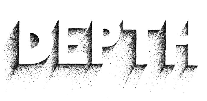
4. Gestalt Principle of Closure
Filling in missing information and focusing on a ‘bigger’ picture is what our brain does very well.
Our eyes can, without a problem, follow the dotted line, close up the circle, and fill out the missing details.
See just how much of the details we can take out, and you will still know what is on the image.
Also, are you able to read all of the letters on the image below?
Gestalts’ principle of closure is widely used in logo design. Logo designers enjoy the fact that they can keep their work minimalistic, but meaningful.
Negative space logos are a perfect example of how the closure works.
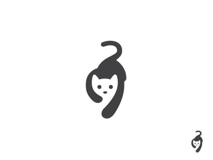
If our universal visual perception was even slightly different, we would never be able to see the cat’s head on the example below.
5. Gestalt Principle of Figure/Ground
Figure/Ground is a principle that enables the human eye to view two separate figures in one shape. One is in the foreground, and one in the background. It is really similar to the closure principle. You could say that they are inseparable and work together.
Again, the best way to understand it is by looking at the negative space designs.
For example, you can see a smiley face is in the foreground, while the chat bubble is in the background.

This is an amazing example, here we have two shapes in the foreground. A bear and an eagle. While in the background we have a question mark filled with stars on the sky.

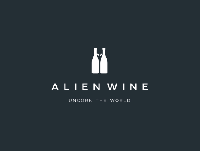
And another, more minimalistic, but still a very good use of figure/ground principle.
In the background, we have to bottles of wine, while in the foreground you can see the head of an alien.
6. Gestalt Principle of Symmetry and Order
The human brain continually seeks patterns, rules, and balance that will bring order to the chaos around us. Our perception of beauty and balance is closely related to symmetry and order.
Gestalts’ principle of symmetry, although last on our list, is one of the more dominant.
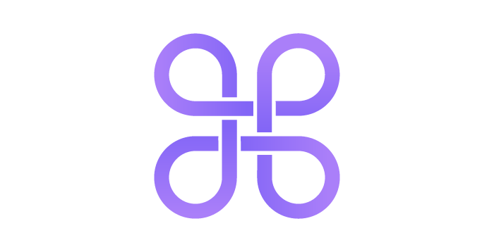
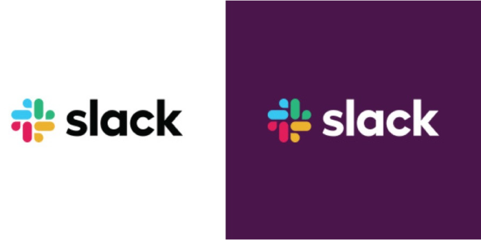
For example, we can see a couple of principles applied to a new ‘Slack’ logo. Most noticeably Gestalts principle of Proximity and Gestalts principle of Symmetry and Order.
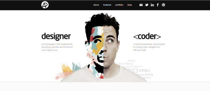
Here is an inspiring example of how to apply the principle of symmetry and order in UI design.
The designer/developer creatively presented the duality of his personality and professional characteristics.
One side of him (and the website) is fun, creative, and artsy designer personality. The other side is more down to earth and analytical developer side.
 Book a Meeting